I had such an experience in the autumn of 1995. I visited a small exhibition of assistive technology products for the blind, which took place at the Hamburg-Farmsen Vocational Promotion Agency. At that time I had just started my studies in business informatics at the University of Applied Sciences Wedel and needed a notebook with a refreshable Braille display. Up to that point, I had already visited some exhibitions and Hamburg-based representatives of assistive technology vendors, but by then I had not found anything that I had been really convinced of. Either there was no mobile solution at all, or the systems on offer were so unwieldy that they were simply too heavy to carry around. I had to go by public transit for an hour each direction, from the place where I lived to the place I was studying at. Weight was therefore a key factor for me.
I had heard that Help Tech, which at that time was still called Handy Tech, would be present at this exhibition. Handy Tech had just emerged from another company called Blista-EHG a year earlier. In addition, the company had no representative in Hamburg, so I had not yet been able to try their products. According to the announcement, they would exhibit their new innovative line of Braille displays, combined with a first version of the screen reader JAWS for Windows. That definitely piqued my curiosity.
I arrived at the exhibition place and found the exhibit hall right away. An employee showed me the table where Handy Tech had set up a Braille display connected to a desktop computer. The Handy Tech representative was in conversation with another interested party at that moment. I just sat in front of the display and started exploring what was in front of me.
And what can I say? It was love on first touch, so to speak! The Braille display that stood in front of me was a model called "Braille Window Modular 84". Unlike all the other displays I had looked at, it had no flat, but cells that were curved inwards, with an upward tilt towards the user. These felt very gentle under my fingertips. The hand automatically fell into a slightly curved posture, similar to what is ideal for pianists to play the most relaxed. The dot caps were pleasantly round, and the fingers glided over the displayed information effortlessly in this natural hand posture.
The keyboard mounted on the display had clearly noticeable dots on the common keys, so that orientation was a breeze. The PC was open to MS Word in a document in which someone had written the mandatory "This is a test". I started writing something into the document to see how the keyboard felt, then opened the menu bar using the Alt key, then flipped through other applications and the program manager of Windows 3.11 with Alt-Tab. Surprised, I found that I was just using Windows all the time, and the Braille display always showed me the current location. I didn't have to learn awkwardly complicated keyboard shortcuts. In contrast to many other screen reader experiments at the time JAWS followed a different philosophy. Right from the start, JAWS had the aim of not standing in the way of the user, but to put the usage of Windows and its programs at the forefront.
At that moment I knew I wanted this system for my studies. The Handy Tech employee had since ended his conversation and turned to me. He was blind himself, which pleased me very much. This meant that he would probably be able to answer some more in-depth questions, which had caused stuttering, long faces, and other signs of lack of knowledge in mostly sighted representatives from other AT vendors before.
The conversation was indeed very constructive, informative and illuminating. We discussed my requirements, he noted down my details, and a few weeks later, they made me an offer. At that time, however, I needed the mobile version of the system, i.e. the little sibling display "Modular 44". Using an auxiliary construction, I could connect this display to a suitable notebook in a way that it formed a stable unit. Just as easily, however, the notebook could be undocked, and the keyboard and the corresponding number pad could then be clipped on. I could then use the display comfortably with the stationary PC at home.
Just in time for the 2nd semester at the beginning of 1996, I had mastered the administrative procedures and received the system along with my first JAWS version. A few weeks later I programmed my first Windows application in Borland Delphi. I reported on my experience in the Henter-Joyce Forum on CompuServe, and how I managed to make the development environment itself more accessible using configuration adjustments and JAWS macros.
In July, I received a surprising call that I was being invited to a workshop, which would take place in a lovely remote hotel somewhere in the Black Forest, in the south-west of Germany. This workshop was jointly hosted by Handy Tech and the European importer of JAWS. During the first day, I spontaneously took over the guidance of the Macro Beginner group because I was already familiar with macro programming. In August, in parallel with my studies, I started working as a translator for JAWS. Together with another colleague, I translated the user interface, macros and help into German. The rest, as they say, is history.
In conclusion, this contact with Handy Tech not only got me my first Braille display, but also my first job. I worked at Freedom Scientific, makers of JAWS, until 2007.
Through my work at the JAWS vendor, I also made my first appearance at Reha (later RehaCare) trade show in Düsseldorf in 1997. Handy Tech had announced a world premier for this occasion: A Braille reader for the trouser or vest pocket. I had always been a passionate reader of Braille books, so I was naturally very curious. I went to Düsseldorf and experienced a real surprise.
When Sigi Kipke, the managing director, showed me the bookworm for the first time, it was like a revelation. The bookworm was a box with eight concave Braille modules that I had come to love and rely on heavily on my Braille display. The box was as wide as one hand's spread, Right and left buttons were inserted to the left and right of the modules to scroll forward and backward, and above were an Escape and Enter key. The modules were protected by a movable lid. The battery-powered device switched on the moment the lid was pulled back to reveal the Braille cells. The case almost snuggled into the palm of my hand. One used the index finger to read the displayed information. You could scroll back or forward with the other hand or leave the scrolling to the auto-advance feature, which was incorporated into the software and which you could adjust quite well to your reading speed.
The data was uploaded to the bookworm from an MS-DOS-based software called BWCom. This was later replaced by the Windows version HTCom, which is still part of the Handy Tech Braille systems until now. The software converted TXT or HTML files and translated them into Grade 2 if desired. The resulting files had not only paragraphs, but also a heading structure. The bookworm actually had a multi-level heading navigation facility, making scrolling even in large files easy.
Unfortunately, this heading navigation was lost in their later Braille notetakers, so you have to make do with the search function of the editor to find the next heading. But it was precisely this heading navigation that showed how much the bookworm was ahead of its time. Screen readers received the ability to navigate by headings on websites only two to three years later. And the development of the digital audiobook format DAISY, which also has the ability to navigate by different heading levels, was still in its early iterations at the time.
Many criticized that eight Braille modules were too few to read sensibly and fluently. However, I found that the high level of mobility outweighed this argument, at least for me. In any case, by saving up, and receiving a subsidy from my parents as a gift, I made sure that I got one of the first market-ready Bookworm devices for my 25th birthday in April 1998. Over the course of the following years, on many long transit and train journeys as well as long-haul flights, it kept me good company and helped kill time.
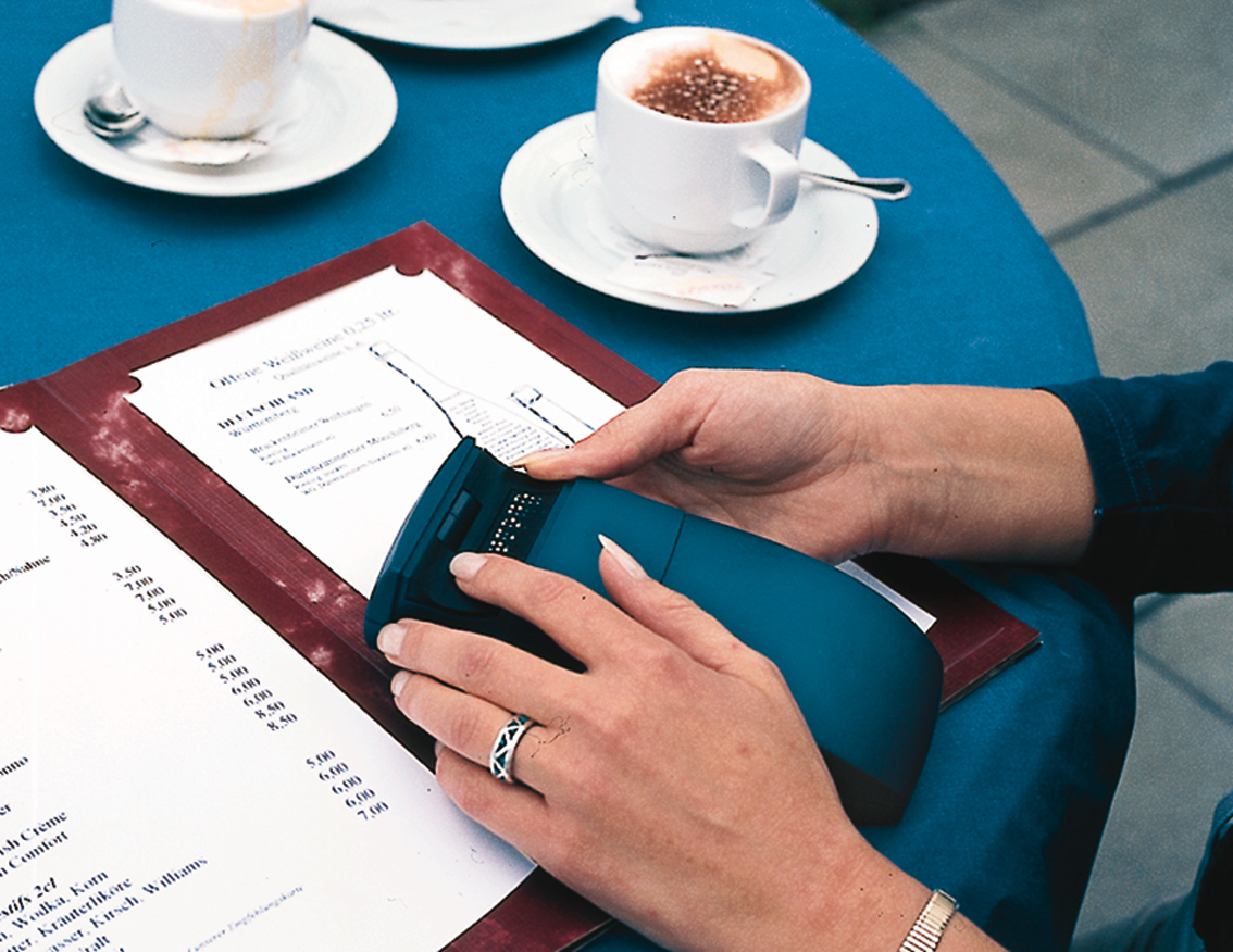
Figure 1: Bookworm on a standing table at a café (Source: Help Tech)
In 2000, a small German newspaper called Taz was one of the first newspapers in Germany to offer digital subscriptions, not only in the mostly inaccessible PDF format, but also in HTML and plain text formats. The HTML version was a bit too bloated to be easily consumed by the bookworm software. So, I wrote a small program in Delphi that converted the plain text version of an edition into a simple HTML framework so that BWCom could structure it and load it into the bookworm. I could then navigate from main to main part on the first, between departments on the second, and between articles at the third heading level. I very often took the daily edition of the Taz with me when going on longer trips or lying on the couch and browsed it like others could skim the daily newspaper. In the same year, Der Spiegel also offered its weekly edition in a format that BWCom could process and make accessible to the bookworm. Here, too, navigation at different heading levels was possible.
Even my first guide dog Falko liked the bookworm: One morning during the acclimatization phase, he grabbed it from the bedside table and chewed on it slightly. I had gone to take a shower and had carelessly left the bookworm lying there. Handy Tech kindly built a new, again hand-flattering, housing around the interior later.
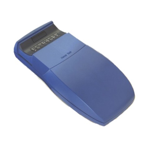
Figure 2: The Bookworm (Source: Help Tech)
The bookworm accompanied me for a long time until a few years ago, when it fell victim to a leaked battery, which irreparably damaged its electronic parts. Today, it found a worthy successor in an Actilino. I will write about this one in a later article. However, I still miss the heading navigation, and may I say, dearly.
In 1999, my workplace, now converted into a full-time job, was upgraded with both a Braille Window Modular 84 and a notebook display called Braille Top. This was slightly smaller and more handy than the Modular 44 and accompanied me on many national and international trips over the next few years. It was the only Help Tech display I ever owned that had no concave modules.
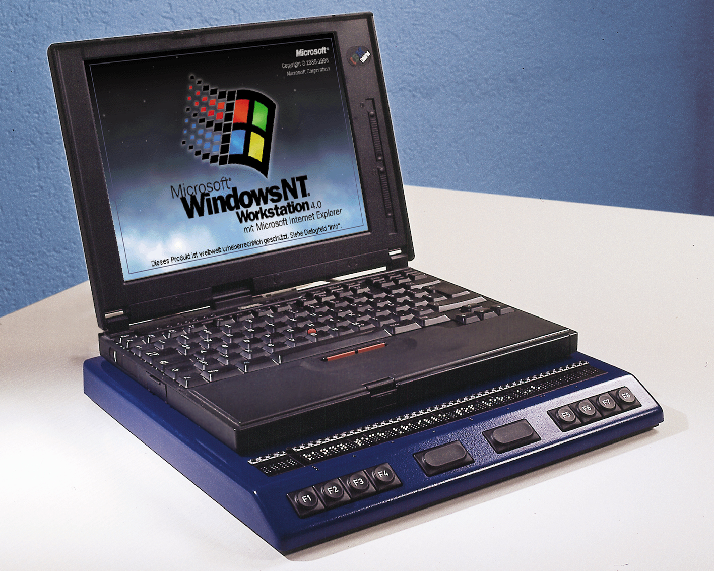
Figure 3: The Braille Top with flat Braille cells clearly visible
In 2007, the displays were sold and found new homes with nice people, who certainly made good use of them for a few more years. I got both a Modular Evolution 88, the first display that had ATC technology, and a notebook display called Braille Star 40. The former now lives with a lady near Potsdam because I only work with notebooks nowadays and simply have no use for large desktop-line displays anymore. The Braille Star still works theoretically, but is now old and has age-related failure symptoms. I hope to replace it soon with its successor, the Active Star.
But even aside from the devices I used myself, I kept an eye on the development at Handy Tech, which was renamed Help Tech in 2018. For example, several times during visits or exhibitions, I played with the Braillino, the first 20-cell Braille display they made. At the time, the Braillino was pretty much tailored to the Nokia Communicator, one of the first accessible smartphones. It is the precursor of the already mentioned Actilino, which I use as a reader and for note-taking.
I also saw the Braille Wave first at the fair where it was debuting. It was released a year after the bookworm and was their first display with built-in smart functions. This included not only a notepad and calculator, but also a scheduler and other useful functions that could be used when away from a computer. The functions introduced at that time have been continuously developed further and are still part of many Braille systems from Help Tech. The key difference was that, unlike other notetakers, Help Tech's Braille Wave was Braille first, not Speech first with Braille developed as an add-on.
I even got a chance to test the successor to the Braille Wave, the Active Braille, for a few weeks, when hardly anyone knew yet that it had been released. I got to try the music Braille feature. This is a feature where one can enter musical notes in Braille and immediately hear the note played back. This feature is also available in Actilino and Active star.
In general, Actilino and its bigger sibling, Active Braille, are the most exciting Braille systems Help Tech is currently offering. This is because of their features and portability. Reading without ATC Is really starting to bother me when I am using other Braille displays. ATC means that the Braille display automatically recognizes the position of my finger. When it reaches the last displayed character, the display automatically pans to the next segment. This means that I'm no longer bound to a fixed time interval when reading one Braille display segment, as is the case in virtually all Braille auto-advance features in screen readers and was also the case in the Bookworm. If there is a term or name somewhere that I want or need to inspect more closely, I have all the time in the world. When I am ready to continue, I swipe to the end of the cells. ATC recognizes the movement of my finger and advances the display. I move my hand back to the left and continue reading. On the Actilino I can read for hours without getting tired. The natural hand posture, which I have already described above, does the rest.
Well, there are several reasons for this. It's not like I hadn't worked with other Braille displays, for a time, even for a living. I was using displays made by my former employer, such as the Focus or PAC Mate displays. So, I was in fact working a lot with displays that weren't from Handy Tech. This included noticing the differences during day-to-day productive use. But when I had the choice, I kept coming back to Handy Tech displays time and again.
On the one hand, it is not only the displays themselves that are really cleverly thought out. The Braille Top included a backpack with all sorts of useful compartments, which matched exactly the display and an accompanying notebook. The bookworm's carrying case contained a rain cape. You could pull a rain protection from the side pocket so that all surfaces were protected from water, including those parts of the Bookworm that were left exposed when it was in the case.
Ergonomics is unparalleled, not only because of the concave modules, but also because of the arrangement of the braille keys. The controls always have exactly the right pressure point-for my fingers. The housings are also very robust, due to their design, but still very pleasant to the touch. Nothing wobbles or slags at the buttons. And in my case, the concave modules are even a real health factor: I have found that when I work on a braille display with flat modules for longer, I get a pain in the finger joints and the palm of my hand when doing extensive reading or working with code. If I stop reading on such a display and return to one with concave modules, the pain disappears, and I can read for hours, as I already mentioned.
On the other hand, there are the features of the Braille systems themselves. They are simple enough for beginners, but also have features for real power users like me. We can squeeze a lot out of the editor or other parts. They even offer learning and training opportunities, for example via the drivers for JAWS or within Music Braille, especially when displays that have ATC are used. I will cover more details about that in the article about Actilino. And with every function, I have the feeling that it was carefully developed and actually designed by people who would use something like this themselves, from users for users.
I hope that Help Tech will remain true to this philosophy when developing future products as well. There are enough experiments to develop Braille notetakers with an Android base, which always feel rather half-baked or inconsistent to me, as if not all parts want to fit together. This is particularly noticeable when, in addition to the proprietary blindness-specific functions, there are parts of the operating system that use the screen reader integrated into Android and the BrailleBack component. The differences are often so profound that it almost bites one in the fingers. With Help Tech systems, everything feels like a very consistent and coherent piece, no matter what the task at hand may be.
Another point is the superb documentation. The manuals are extensive. I still vividly remember the two thick volumes for the DOS screen reader Braille Window Pro, which was included with my first Braille display. I think because I was a programmer myself, e.g. using Turbo Pascal for DOS, and other not every-day programs, I already got a lot out of this DOS screen reader. These manuals were definitely a great help.
Even for current braille systems, the manuals are very well-structured and describe all functions in detail without bloating the text unnecessarily. For manuals, this is almost a form of art, describing functions of a product exhaustively without getting into a shamble.
But if there is a problem, I haven't seen any other company that is so committed to the interests of its customers. There is no attempt to sugarcoat bugs, to sweep current problems under the carpet or to pass on the "guilt" of the malfunction to the user. The problem is methodically recorded, analyzed and then determined where it is stuck: on the hardware, the software or indeed a user error, or quite simply the fact that the user has tried something that no one has ever thought of. Or an opportunity for a new function is detected and then possibly even implemented in a later version of the device software. As a customer, I feel that I am being taken seriously and treated with honesty and respect. And there are companies, even in the assistive technology industry, where I have had to experience this not to be the case. This kind of thing creates lasting trust, and when trust is there, I like to come back as a customer.
And one more point is crucial: At Help Tech, blind and visually impaired people work on the company's products in various key areas (development, support, sales) that blind people are supposed to use afterwards. One simply notices. It makes a difference whether blindness-specific products are being developed for the blind by sighted people who believe they know what a blind user might need, or whether devices and functions are being developed by the blind for the blind.
Therefore, my choice will always fall on Help Tech products in the future. They are exactly what I need in the Braille space.
I am not an employee of Help Tech and have never been one. I am just an avid customer who wrote an article on the occasion of the 25th anniversary of his first encounter with these extraordinary braille displays.
The pictures used in this article were thankfully provided to me by Help Tech and are for illustration purposes only.
]]>Matrix itself is an open standard protocol that defines how a chat client, such as Element, talks to a server, such as Synapse, and how servers communicate to each other to exchange messages in shared, or as is the jargon, federated, rooms. In the Matrix network, rooms can be federated across the whole network, so no matter which server you choose as your home server, you’ll get the messages in rooms you join no matter where they originated from.
You can imagine this as if you were signing up to a particular e-mail or news server, and then getting messages from other servers depending on which newsgroups you subscribe to or e-mail lists you joined.
IRC, on the other hand, is pretty self-contained. You have to connect to a particular server to join a particular network. And federation was not built into the platform. There are a few non-standard ways for servers to communicate with one another to share the load on any single network, but as this is non-standard, it is also error-prone. Ever heard of net splits? Pretty not pretty.
But one thing both networks have in common is the fact that there are client choices available. There are clients for mobile platforms, the command line, the web, and first native offerings are also in the works. Check out this non-exhaustive list of clients for inspiration.
The client most people will, however, probably come in contact with initially is Element, the client primarily developed by Element Matrix Services, a company behind many Matrix offerings. Element for web/desktop, iOS, and Android are all open-source, with repositories on Github. Filing issues or submitting pull requests is therefore possible for anyone who wants to improve them.
Initially, accessibility was terrible across the board. And there are still a number of issues open for the web client. But things have improved massively since the one-month trial Mozilla did in September and October 2019.
But the team didn’t stop there and is improving accessibility, with also some help by yours truly, until now and beyond. So by the time you read this, there may already be more things working than described here.
The web client, once you signed up and logged in, consists of a top part that has a header, a Communities button which currently doesn’t do much, and a User sub menu button. That sub menu, when opened, has shortcuts to notifications, privacy, and all settings, feedback and Logout options.
The Settings, when opened, come up in a modal dialog. The buttons at the top are actually kind of tabs, just not exposed that way yet. They control various settings which then appear below. The settings apply once you change them. Some screens offer a Save button at the bottom. To close the dialog, choose the Close button at the top.
Back in the main UI, following the top bar is the left side bar. You first get a Search field. This is to filter your active rooms shown in the room list below. You can press DownArrow to move straight from the search field to the room list. This is arranged as a tree view. The top-level nodes are direct messages and rooms, and sometimes system alerts. Below those, when expanded, are the actual persons, rooms, and bots that sent those alerts. Use standard navigation like in Explorer’s folder tree to navigate.
Direct messages are private messages. They can be one-on-one, or small groups of people. You can focus the edit field for search, then tab forward once and use the arrow keys to navigate. Press Enter to switch to the selected room. You can also invoke a context menu by usual means to access more options. You can also start a new chat when in the People group, or create your own room when within the Rooms group.
If from the search field, you press Tab instead, you land on an Explore button. This allows you to explore other rooms on the server or the whole Matrix network. Type in a phrase you want to search for, and below, you will get a table of found rooms that you can either preview or join. Matrix usually keeps a history of what was being said, so if you are allowed to view the contents as a non-member, you will get a list showing recent messages. Otherwise, you can also join the room either from the table or the preview.
Press tab again, and depending on your settings, you may reach a toolbar of recently visited rooms. Use left and right arrows to navigate in this toolbar, Space to jump to that room, or tab to move to the room list that was described above.
If you are in a room, the main area, also denoted by a landmark, contains the room view. At the top, there is the name and topic, a Room Settings button, a means to manage Integrations, such as Github or other bots you have connected, or perform a Search.
Below that, you will find a set of tabs like Members List, Files, and Notifications. These pertain to the landmark right below them. Initially, no tab is selected, so the complementary landmark may not be there yet. Select one of the tabs to make it appear.
Below those tabs is that landmark with the side bar content in it. Visually, this side bar is displayed to the right of the main chat area. This can contain either the list of members in this room, files, or your Notifications. This depends on which tab is selected above.
If the room member list is displayed, you can invite others to the room as well if you know their handle. You can jump from button to button for each member. If you press Enter or Space, you’ll get more info about that member below the list. You can also bring up a context menu to get more options. You do this via regular shift+F10 or Applications Key. There is also a search facility available.
The Files tab contains files shared within this room.
Once that landmark ends, the main chat area begins. The first two elements are either a Jump To First Unread button, or one that is labeled Jump To The Latest Message. The other may or may not be there, and is labeled Mark Channel As Read. The Jump To the Latest Message button will often mark the whole room as read as well. Only if you haven’t visited a room in a long time and there are many unread messages, the Mark Channel As Read button, or hitting Escape while focused in the message composer, will mark all messages as read.
So, to get to the first unread messages, press the „Go To First Unread message „button. This will scroll the message list up. The list of messages is a live region, which means your screen reader will speak updates as they come in. After pressing the button, once your screen reader starts speaking, press s (in JAWS or NVDA) to move to the first separator. That is then usually the beginning of new messages.
Tip: The new messages separator disappears after 3 seconds, or 3,000 milliseconds, when the room is being displayed, by default. In the Settings dialog, on the tab also named Settings, you can change this threshold to a larger value, for example 15,000. This will give you much more time to actually jump to that separator, depending on how fast your screen reader is speaking. I found this to work much more reliably, too, when coming back to a room, and the new messages separator is being displayed right on the screen I arrive at. Adjusting this setting makes keeping up with channels regularly over the course of a day much more efficient.
Below those buttons, the main list of messages is shown. It is dynamically updating, so when you get close to either edge, new messages are pulled in. A separator marks where each new day begins, and also is the unread marker in case you have viewed this room before. You navigate either using the virtual cursor arrow keys, or by skipping between list items. In NVDA and JAWS, you press i and shift+i quick navigation keys, for example. Refer to your screen reader documentation on how this is done.
Once focused within a message, action items become available following the message, like adding a reaction, replying, or more options. If you are on your own message, you can also edit that, to correct typos, for example. Those are all labeled buttons. These appear either on mouse hover or when focus is within the message container. However, due to some browser quirks, sometimes things may disappear still, so if things aren’t working as you expect them to, route the mouse there to hover. Also, these buttons are contained within a toolbar, which responds to the usual pattern that arrow keys on the keyboard move between buttons, and tab moves out of the container to the next element. That is, if you are using a keyboard, or your screen reader is in focus or forms mode.
Full keyboard support for the message list, similar to what Slack is offering, for example, is planned, but not implemented yet. For screen reader users, it is best to rely on browse or virtual cursor mode to navigate around.
Below the messages, outside the list, is the composition area for new messages or replies if you chose to reply to a message. You can type as usual, use Markdown, and autocomplete people starting with an @ sign, or emojis starting with a colon. These auto-completes are accessible, although right now, you should complete with Space, not Enter or Tab yet. This is being worked on to meet expectations and comply with the WAI-ARIA authoring practices, but as of this writing, isn’t in a release yet.
Below that compose area, there are buttons to add files, start an audio or video call, and add stickers.
Apart from the problem that the messages list cannot yet be navigated with the keyboard, there are a few other things that don’t work so well yet, but which are in the works of getting improved. One of them is the members list itself. It should be easier to navigate with the keyboard.
One other area that is currently problematic is adding a reaction to a message. The emoji picker for that is not keyboard accessible yet, and the screen reader list has only menu items. Using NVDA, I can indeed add a reaction reliably, by using character or word navigation when in virtual mode inside the list, but it isn’t pretty.
Also, the fact that things you can do with a message are not as reliable as desired can pose some problems still. It is far better than it was, but the true solution will come with the work that makes the whole thing fully keyboard accessible. So, sometimes, for the messages list, you will need your screen reader’s mouse emulation commands to pull the mouse somewhere in order for certain controls to appear. But use this as a last resort if, for some reason, you get stuck.
Both Element for iOS and Element (formerly RiotX) for Android, the newer of the two flavours that are on the Google Play Store, have received accessibility improvements and are much more usable than they were a few months ago.
On iOS, I suggest ignoring the Home tab for now, since that doesn’t work at all with VoiceOver. Instead, use the Direct Messages and Rooms tabs to navigate your messages and room chats. You can also add some to favourites, which is the second tab, which also works. Communities are in the same “in development” state as they are on the web. Inside chats, double-tap and hold or use the context menu gesture to interact with elements. There is a button in the top middle below the header that allows you to jump to the first unread message. From there, you can swipe to the right to read through your chat log. Sometimes, if something in the room changes, the position may shift slightly, and you may lose position. This also happens to sighted people and is nothing VoiceOver specific.
On Android, the former Riot app has been deprecated, and people are migrated over to Element. This is also the only app that gets the attention and is a continuation of the former app named RiotX. That also gets the new TalkBack enhancements when there are some. I must admit I haven’t used it myself, since all this started when I already had switched back to iOS, but I hear good things from others in the #element-accessibility:matrix.org channel.
I must say I share the excitement the Matrix team expressed in their announcement of the collaboration with Mozilla. It is an open standard, with open-source software, with choices for clients to use, and the possibility to improve the accessibility by reporting issues or fixing bugs. New Element versions are released frequently, so those fixes also will get deployed to the Mozilla instance and other hosted Matrix offerings which also use Element as their front-end.
I hope this guide helps you find your way around Element and the Matrix Eco system more easily. It still has issues, but so have proprietary offerings like Slack or the like. And as we all know, accessibility is a process of constant improvement.
I would personally like to thank my colleagues for making accessibility one of the deciding factors for choosing the replacement. Big thanks also go out to the members of the Matrix and Element teams who were super responsive to accessibility concerns, and have kept the momentum going even after the trial was over and nobody knew if Matrix would be chosen in the end. It is a pleasure working with you all!
See you in the Matrix!
]]>After a lot of research, some pros and cons soul searching, and some experimentation, last week I decided to go through with the migration. This blog is hosted with the Ghost Foundation's Ghost(Pro) offering. So not only do I get excellent hosting, but my monthly fee will also be a donation to the foundation and help future development. They also take care of updates for me and that everything runs smoothly. And through a worldwide CDN, the site is now super fast no matter where my visitors come from.
The following should, however, also work the same on a self-hosted Ghost installation. I am not consciously aware of anything particular that would only work on the hosted Ghost(Pro) instances. So no matter how you have your Ghost site running, the following all assumes that you have, but the details are up to you.
One of the main reasons to choose Ghost also was the ability to publish from my iPad without any hassle. My favorite writing app, Ulysses, has had the ability to publish to Ghost since June 2019. Similar to its years long capabilities to publish to WordPress and Medium, it now also does the same with Ghost through their open APIs. The Markdown I write, images, tags, and other bits of information is automatically translated to concepts Ghost understands. For a complete walk-through, read the post on the Ulysses blog about this integration.
My journey began by following the Ghost tutorial on migrating from WordPress. In a nutshell, this consists of:
Sounds easy, eh? Well, it was, except for some pitfalls. With some trial and error, and deleting and importing my content from and into my Ghost site a total of three times, I got it working, though. Here's what I learned.
Before exporting your content from WordPress, make sure that the author's profile e-mail address matches that of the author account in Ghost. Otherwise, a new author will be created, and the posts won't be attributed to you. That is, of course, assuming that you are doing this import for yourself, not for a team mate. The match this is done by is the e-mail address of the actual author profile, not the general admin e-mail from the WordPress general settings.
This is another bit that differs between Ghost and WordPress. WordPress puts images into a wp-content/uploads/year/mo/filename folder. The Ghost exporter tries to mimic that, puts the images in content/wordpress/year/mo/filenames. But the links in the actually exported JSON file are not adjusted, you have to do that manually in your favorite text editor with a find and replace operation. And don't forget to zip up the changed JSON file back into the export you want to upload to the Ghost importer.
This was actually the hardest part for me, and with which I struggled for a few hours before I got it working. In default WordPress installations, the permalink structure looks something like mysite.com/yyyy/mm/dd/post-slug/
. Some may omit the day part, but this is how things usually stand with WordPress. Ghost's permalink structure, which you can also change, by the way, is different. Its default permalinks look something like mysite.com/post-slug/
. Since this was all new, I wanted to stick with the defaults and not reproduce the WordPress URL structure with custom routing.
The solution, of course, is one that, if someone brings up a link to my previous posts from another site, or a not yet updated index from Google searches, they will still get my post displayed, not a 404 Page Not Found error. And the proper way to do that is by permanent 301 redirects. Those are actually quite powerful, because they support regular expressions, or RegEx.
Regular expressions are powerful search phrases. They can, for example, do things like „Look for a string that starts somewhere with a forward slash, followed by 4 digits, followed by another slash, followed by 2 digits, another slash, another 2 digits, another slash, and some arbitrary string of characters until you reach the end of that string“. And if you've found that, return me only that arbitrary string so I can process it further. You guessed it, that is, in plain English, the search we need to do to get WordPress permalinks processed. We then only have to use the extracted slug so we can actually redirect to an URL that only contains that slug part.
The tricky part was how to get that right. I have been notoriously bad with Regex syntax. Its machine readable form is something not everyone can understand, much less compose, easily. And I thought: Someone must have run into this problem before, so let's ask Aunt Google.
What I found was, not surprisingly, something that pertained to changing the permalink structure in WordPress from the default to something that was exactly what Ghost is using. And the people who offer such a conversion tool are the makers of the YOAST SEO plugin. It is called YOAST permalink helper and is an awesome web tool that outputs the redirect entries for both Apache and NGINX configuration files.
Equipped with that, I started by looking at another web tool called Regex101. This is another awesome, although not fully accessible, tool that can take Regex of four flavors, you also give it a search string, and it tells you not only what the Regex does, but also if it works on the string you gave it. So I tried it out and could even generate a JavaScript snippet that then translated my Regex into the flavor that JavaScript uses. Because, you know, Regex isn't complicated enough as it is, it also needs flavors for many languages and systems. And they sometimes bite each other, like flavors in food can also do.
The Ghost team has a great tutorial on permanent redirects. but as I found out, the Ghost implementation has a few catches that took me a while to figure out. For example, to search for a forward slash, you usually escape that with a backslash character. However, in Ghost, the very first forward slash in the „from“ value must not be escaped. All others, yes please. But if you actually try the JavaScript flavor out on the Regex 101 page the tutorial recommends, it shows all forward slashes as to be escaped. Also, you better not conclude with a slash, but let the regex end in whatever character comes before that last forward slash Regex101 recommends.
The „To:“ value then also starts with a forward slash, and can then take one of the groups, in my case the 4th group, denoted by the $4
notation. I banged my head against these subtleties for a few hours, even went out on a completely different tangent there for a while only to discover that my initial approach was still the best bet I was getting.
Compared to the above, redirecting the RSS /feed/
to the Ghost style /rss/
was, after that previous ordeal, a piece of cake. Some RSS readers may struggle with this, so if yours doesn't pick up new posts any more, please change your feed URL setting.
My final redirect JSON file looks like this. If you plan to migrate to Ghost from WordPress, and have a similar permalink structure, feel free to use it.
[{
"from": "/([0-9]{4})\/([0-9]{2})\/([0-9]{2})\/(.*)",
"to": "/$4",
"permanent": true
},
{
"from": "/feed/",
"to": "/rss/",
"permanent": true
}]
There are some more things that only partially translate between WordPress and Ghost. For example, while tags carry over, categories don't. The only way to do that is via a plugin that converts categories to tags. It is mentioned in Ghost‘s tutorial, but as I was looking at it, I saw that it had been updated last 6 years ago, and the last tested version was equally old. And while I don't think this part of WordPress has changed much, at least from the looks of it, I didn't trust such an old plugin to mess with my data. Yes, I had a backup anyway, but still.
So here I was, having imported all my stuff, and opening one of the posts for editing in the Ghost admin. And to my surprise, I could not edit it! I found that the post was put into an instance of the CodeMirror editor.
CodeMirror has, at least in all versions before the upcoming version 6, a huge accessibility issue which makes it impossible for screen readers to read any text. It uses a hidden textarea for input, and this is actually where the focus is at all times. But as you type, the text gets grabbed and removed, and put into a contentEditable mirror that never gets focus. It also does some more fancy stuff like code syntax highlighting and line numbers. Version 6 will address accessibility, but it is not production-ready yet.
But wait, Ghost was said to work with Markdown? And I had actually tested the regular editor with Markdown. That was a contentEditable that I could read fine with my screen reader. So why was this different?
The answer is simple: To make things as seamless as possible, the Ghost WordPress Exporter exports the full HTML of the post, and imports it in Ghost as something called an HTML card. Cards are some special blocks that allow for code or HTML formatting. They are inserted as blocks into the regular content. And no, this is not actually a Gutenberg clone, it is more like some special areas of the post. Only that with these imported posts, the whole post was this special area.
Fortunately, if you need to work on such an older post after the import, for most simple formatting, there is a way to do it. You edit the HTML card, and when focused in the text area, press CTRL+A to select all, CTRL+X to cut the whole contents, then escape out of that card once. Back in the regular contentEditable, paste the clipboard contents. For not too complicated formatting, this will simply put the HTML into your contentEditable, and you get headings, lists, links, etc. The one thing I found that doesn't translate, are tables. This is probably because Markdown has such different and differing implementations in its flavors for tables.
If you need to insert HTML, write it in your favorite code editor first. Then, insert an HTML card, and paste the HTML there. I did so while updating my guide on how to use NVDA and Firefox to test your web pages for accessibility. Worked flawlessly. Also, the JSON code snippet above was input the same way.
But believe me, that moment where I opened an older post and could actually not edit it, was a scary moment that almost made me give up on the Ghost effort. Thankfully, there was help. So here we are.
I would like to extend a special thank you to Dave, the Ghost Foundation's developer advocate, who took it upon himself early on to help me with the migration. He answered quite a number of very different questions I was having, sent me helpful links, and also was a great assistant in understanding some of the quirks of the Ghost publishing screen. Some of which has led to some pull requests I sent in to fix these quirks. You know, I can't help it, I'm just that kind of accessibility guy. ;-)
But John O'Nolan, Ghost's founder, and others from the team have been very helpful and welcoming, merging my pull requests literally from day 1.5 of me using Ghost, answering more questions and offering to help.
This was a pleasurable experience through and through. And even the two hiccups I encountered were dealt with eventually, or are, in the case of the inaccessible CodeMirror bits, things I can somehow work around.
My blog has been running smoothly since May 29, and I hope to have some of the kinks with the theme smoothed out next, especially the color contrast bit, and the bit about the fonts some people have given me feedback on. I will work with the maintainer of the Attila theme to work through these.
Again, welcome to this new blogging chapter!
]]>Well, after 13 years, I felt it was time for something new. Also, as I wrote recently, Mozilla now has a dedicated accessibility blog, so I feel that I am free to do other things with my blog now. As a sign of that, I wanted to migrate it to a new platform.
This is not to say the old platform, WordPress, is bad or anything like that. But for my needs, it has become much too heavy-weight in features, and also in the way how it feels when performing day to day tasks. 80% of features it offers are features I don't use. This pertains both to the blog system itself as well as its new block editor. But those features don't get out of the way easily, so over the months and actually last two to three years, I felt that I was moving mountains just to accomplish simple things. It has nothing to do with the steadily improving accessibility, either. That is, as I said, getting better all the time. It just feels heavy-weight to the touch and keyboard when using it.
So one day earlier this year, I read a post on my favorite publishing editor's web site, where they told the story how they migrated to the Ghost platform. I must admit I had never heard of Ghost before, but was curious, so I started poking around.
As I did so, I quickly stumbled on the term JAMstack. Some of you may now ask: "Stumbled upon? What rock have you been living under these past 5 or 6 years?" Well, you know, I had heard of some of the software packages I am going to mention, but I didn't have the time, and more recently, energy, to actually dig into these technology stacks at all.
The truth is, I started asking myself this question as I became more familiar with Ghost itself, static site generators, and how this can all hang together. JAM stands for JavaScript, APIs and Markup, and describes the mental separation between how and where content is created, how it's being transferred, and then finally, output to the world.
In a nutshell - and this is just the way I understand things so far -, applications like WordPress or Drupal serve the content from a database every time someone visits a site or page. So every time an article on my blog was being brought up, database queries were made, HTML was put together, and then served to the recipient. This all happens in the same place.
However, there are other ways to do that, aren't there? Articles usually don't change every day, so it is actually not necessary to regenerate the whole thing each time. Granted, there are caching options for these platforms, but from past experience, I know that these weren't always that reliable, even when they came from the same vendor as the main platform.
JAMstack setups deal with this whole thing in a different way. The content is generated somewhere, by writers who feel comfortable with a certain platform. This can, for all intents and purposes, even be WordPress nowadays since it also offers a REST API. But it can also be Ghost. Or NetlifyCMS together with a static site generator. Once the content is done, like this blog post, it is being published to that platform.
What can happen then depends on the setup. Ghost has its own front-end, written in Ember, and can serve the content directly using one of the many templates available now. This is how my blog is set up right now. So this is not that much different from WordPress, only that Ghost is much more light-weight and faster, and built entirely, not just partially, on modern JS stacks.
However, it doesn't have to be that way. Through integrations, web hooks and by leveraging source code management systems like Github or Gitlab, every time my content updates, a machinery can be set in motion that publishes my posts to a static site generator or fast JavaScript application framework. That then serves the content statically, and thus much faster than a constant rebuild, whenever it is being called from a visitor.
Such static site generators are, for example, Hugo or Eleventy, which both serve static HTML pages to the audience with only minimal JavaScript. Or they can be application frameworks like Gatsby.js, which is a single page application serving the content blazing fast from a local build which is based off of the content created in the publishing platform. That way, the actual presentation is completely decoupled from the publishing workflow, and the developer who works on the front-end doesn't even have to know Ghost, WordPress, or what not, just the API, to get the content and present it, in a way they feel most comfortable with.
As I mentioned, my blog currently serves the content directly from Ghost. But if I feel like it, I might also set up a Gatsby mirror on another domain that will also be up to date whenever something is being published here. The steps to do that are not that difficult at all.
One path I was researching as a possible alternative to Ghost was going with Hugo. To get started, I read this excellent migration report by Sara Soueidan, and did some more research. One show stopper was that I like to blog from an iPad nowadays, and there was not a very elegant way to integrate Ulysses with Hugo or a Github repository. Yes, there is a workflow (umm, Siri Shortcut) available that could do that with an iOS Github client named WorkingCopy, but this all felt too fragile and cumbersome. So in the end, because I want to concentrate on the writing most, I decided not to go that route. Nothing beats native publishing from an app to the CMS.
The same was true for Eleventy, which I looked at just because there is such a great diverse community behind it, including quite a number of people I know and highly respect. And as hinted above, none of these packages is out of my mind yet when it comes to tinkering, researching, and getting up to speed with modern web technologies. After all, these packages are all interoperating with one another in an open fashion. They are the modern versioon of what the web stands for, an open, collaborative, interoperable resource for everyone.
And let's be honest, there are enough silos out there. Yes, even when open source, a platform that powers over a third of the web sites out there can be considered its own silo.
Here's another piece of good news: All these communities, which are interconnected and exchanging knowledge and wisdom, also have members with accessibility in mind. Some are strong advocates, some more the background worker, but all have in common that accessibility is no stranger to them. Ghost itself welcomes reports and pull requests, some theme authors have mentions of accessibility in their goals and theme features. Projects like Gatsby and Eleventy have people with strong voices among their staff or supporters, and just by looking at the project web sites shows that.
As for this blog, before I officially launched, I submitted some fixes to the theme I wanted to use, as well as Ghost itself, which were all quickly accepted. I am using a copy of the theme with these fixes on this blog already.
Yes, those have indeed gone from this site. They proved to be more trouble than they were worth in the last few years. Most of them were spam, and hardly any other comments came through. A recent informal survey I conducted on Twitter also showed that two thirds of my readers actually don't care much for comments.
Informal survey: When you read a blog post by someone, how important is the ability of publicly commenting on it? — Marco Zehe (@MarcoInEnglish) May 25, 2020
So I decided that I am not going to integrate any commenting system into my Ghost setup for now, even though it is certainly possible using some 3rd party providers. If I change my mind in the future again, there are certainly some options available.
I hope you'll enjoy this new chapter of the journey with me, and stay a loyal reader! This blog will, as previously hinted, in the future focus more on personal topics, research, and other related items. For a glimpse, well, reread this post. ;-)
In a future article, I will go into some of the Ghost-specific details I dealt with when migrating from my WordPress setup.
Let's do this!
]]>For years, this blog was a mixed bag between information about my official work at Mozilla and my personal views on accessibility. Now that Mozilla has its own accessibility blog, my personal blog at this space will contain less work-related material and more personal views on the broader subject of accessibility. I am also co-authoring the Mozilla accessibility blog, and will continue to inform the community about our work there. But this blog here will no longer receive such updates unless I find something personally noteworthy.
So, if you continue to follow this blog, I promise no duplicated content. If you are interested about what‘s happening at Mozilla, the new official source is linked above, and it also has an RSS feed to follow along.
]]>When editing a block, the tab order has been adjusted. Rather than tabbing to the next block, for example from one paragraph to the next, pressing tab will now put focus into the side bar for the active block. Further tabbing will move through the controls of said side bar. Shift+Tab will go in the opposite direction.
Likewise, when in the main contents area of a block, Shift+Tab will now move focus to the toolbar consistently and through its controls. It will also skip the drag handle for a block, because this is not keyboard operable. Tab will stop on the items to move the block up or down within the current set of blocks.
This makes the keyboard focus much more consistent and alleviates the need to use the custom keyboard shortcuts for the side bar and toolbar. These do still work, so if you have memorized them, you can continue using them. But you do not need to, tab and shift+tab will now also take you to expected places consistently.
The modal for the Welcome guide has been enhanced. The modal now always gets a proper title for screen readers, so it no longer speaks an empty dialog when focus moves into it. The current page is now indicated for screen readers so it is easy to know which of the steps in the current guide is showing. The main contents is now a document so screen readers which apply a special reading mode for content sections can provide this functionality inside the modal.
This was one of the first two code contributions to Gutenberg by yours truly.
The justification radio menu items in the formatting toolbar are now properly exposed as such. This was the other of the two code contributions I made to this Gutenberg version.
The Social block now has proper labels.
The block wrapper, which contains the current set of blocks, now properly identifies as a group rather than a section. This will make it easier when dealing with nested blocks or parallel groups of blocks when building pages.
Gutenberg continues to improve. And now that I am a team member as well, I’ll try to help as time and capacity permit. The changes especially to the keyboard focus and semi-modality of blocks is a big step in improving usability.
One other thing that will hopefully land soon once potential plugin compatibility issues are resolved, will be that toolbars conform to the WAI-ARIA design pattern. That will mean that every toolbar container will be one tab stop, and elements within will be navigable via arrow keys. That will reduce the amount of tab stops and thus improve efficiency and compliance.
]]>That’s it, folks! This concludes 30 days of continuous blogging. Over the last month, I shared a few tutorials, a few web development tips, thoughts on Gutenberg in various shape or form, told you how I made a graph accessible, was a bit sentimental, had a bit of reviews, some hints on products on sale that are accessible, and more. Feel free to dig around the blog if you like, they’ll all be there. This was a fun experiment, but if I do this again next year, I’ll probably stick to a classic advent calendar. 😉
As you read this, my wife and I’ll already be with my parents and sister. In Germany, it is tradition to do the presents on Christmas eve, under the Christmas tree, and spend the 25th and 26th of December either receiving family visitors, or visit others. And yes, we’ll have Kartoffelsalat und Würstchen, as is tradition on Christmas eve in northern Germany as well. 😉
By the time you read this, we’ll already be Home for christmas, as Robbie Williams sings it so beautifully on his current album The Christmas Present. So from my family to yours: A very merry Christmas!
]]>This year, Chanukka started at sundown on December 22 and runs through December 30. It coincides with Christmas. And as it so happens, the muslim mayor of London kicked off the Chanukka celebrations from a Christmas tree last night. In a world where there are so many separating thoughts and actions becoming more prominent again, endangering the free and open societies of some western countries, these connecting events are more important than ever.
Welcome to london…where the Muslim mayor of London kicks off the Jewish festival of Chanukah metre from a giant Christmas tree on one of the most famous sites in the world @JLC_uk@JewishLondon@ChabadUK@JewishNewsUK@sadiqkhanpic.twitter.com/5V8sUtaeE5 — Justin Cohen (@CohenJust) December 22, 2019
Let me close by sharing with you a musical wish for a happy Chanukka by one of my favorite bands, the Canadians Walk Off The Earth, featuring Scott Helman.
]]>One change is that my profile on WordPress.org now shows that I am also contributing to the accessibility effort. The accessibility team mostly consists of volunteers. And now, I am one of them as well.
I also started contributing more than issuesto Gutenberg. I can also review and label issues and pull requests now. There are some exciting changes ahead that I helped test and review in the past few days, and I promise I’ll blog about them once they are in an official plugin release.
It is my hope that my contributions will help bring the accessibility forward in a good direction for all. I’d like to thank both the other members of the WordPress accessibility team as well as the maintainers of Gutenberg for welcoming me to the community.
]]>Threema is a messenger alternative for smartphones and tablets, with a web version also available that connects through your installed app. All offerings are accessible to screen reader users. It is not a free app, and it is only partially open-source. But its privacy focus has won it several recognitions since it was started in 2012.
Threema offers text, voice messaging, voice calls, photo, video sharing, sharing of various other document types, you can send locations. It offers one-on-one as well as group chats. In group chats, it also offers polls so you can easily find common times or other agreement with friends without having to use any external services.
Unlike many other messengers, you don’t need to provide a phone number or e-mail address to use the service. You generate a completely anonymous ID on your device. You can share your phone number and/or e-mail address so others can find you, but you don’t have to. Likewise, you can share your contact info, and Threema will see if any of your other contacts are on Threema and have opted in to share their details.
Threema has three trust levels: Unverified, verified via e-mail or phone, and verified via personal contact and mutual scanning of QR codes. This verification also serves as a mechanism to guard against possible man-in-the-middle attacks. Threema have great documentation about all of this in their frequently asked questions.
I use Threema frequently as one of my main messengers now with friends, some colleagues, and in some grup chats. And if you like, you can drop me a line there as well.
]]>You may first have to enable it. You’ll find the setting under each blog/site you have in the WordPress app. It is called “Use the new visual editor”. Check its checkbox, or turn on its toggle switch, to use it.
Now when you compose a new post, you have many of the features of Gutenberg available. With each release, new blog types are supported on mobile devices. If you are unsure of what blocks are, read my introduction to Gutenberg from recently.
Initially, you will land in the title, as usual. Enter it and press Enter.
Pressing Enter will by default create a new paragraph block. Unlike on the desktop, there is no Slash command available here to change the block type on the fly. But usually, the first block you want is a paragraph block anyway, and if not, you can add one and simply move it up as you wish.
To add a new block, find the Add Block toolbar item that is located above the keyboard, or if you are using an external one, in the lower left corner of your screen. That will open a popover with all the blocks it currently knows about. Choose a More block, a Heading block, a List block, etc., whatever you prefer. It is an intelligent list that shows you your last used block types first.
Go ahead and choose a new heading block. You can then write a heading. By default, this is a heading level 2. With each block, there is a toolbar associated with it. The elements except the Add Block, undo, redo, and some other common actions, each block has a few specific items. The Heading block, for example, has a group of buttons where you can switch which level the heading should have. You can easily switch to a heading of levels 3 or 4 here. In a paragraph block, you’ll find items to bold, italicize, underline text, or insert a link.
Notice as you are now in the Heading block, as you swipe left, you will encounter the previous paragraph block and the title. To the right of the currently focused block, you have buttons to move the block up a position, down (if available), or remove it alltogether. Depending on some blocks, you may even have the ability to move blocks right or left a column.
Each block item speaks its type nicely along with the text that is in the block. The order is pretty efficient: Block type, maybe the level if available, position information, followed by the text. This is a feature that is currently being worked on for the desktop/browser version, too, so when in selection mode, the blocks are spoken more nicely by screen readers as well. The aim is to unify the experiences so they are consistent across platforms.
Inserting a block is always relative to the current block, it does not insert a block at the end by default. So if you have 10 blocks already, and are focused on block 8, the next block you insert will be at position 9 of then 11 blocks, not at position 11. If you want to insert a new block at the end, pfocus the last existing block first, then either choose a new block from the Add Block popover, or go to the end of your text and press Enter to just insert a new paragraph block at the end.
Inserting a link can be a bit confusing. There is no OK button, you add the link, and just close the popover. The only explicit action there is to remove the linkage.
The mobile version of Gutenberg inside the WordPress apps is more consistent and less dynamic than the desktop counterpart currently is. There is work being done to better the situation there, too, and when the time comes, I will blog about it here. The mobile version is actually a great option to play around with blocks, move them, get a feel for what you can do with posts, see what happens in the preview, etc.
So if, after reading my introduction for the desktop, you find it daunting, this mobile option may be a way for you to familiarize yourself with blocks in a little more controlled environment. The toolbar buttons are always visible, regardless of whether text is selected in a block or not, for example. And with the mobile version being very touch friendly, there is also no mouse hover state that can do seemingly unpredictable things.
Have fun playing!
]]>Apple released AirPods Pro earlier this autumn, and I was very curious to get my hands on them. I have always been a fan of the AirPods, even though the first generation still had quite some lag with VoiceOver. But I was totally sold on Apple’s wireless future from early on. Unlike many other blind users, I was never sad to see the 3.5 mm headphone jack go.
The AirPods 2, released in the spring of 2019, did away with almost the whole lagging problem when using VoiceOver on a relatively modern iOS device. I used them with my iPhone 7 from 2016, the X from 2017, and the new 11 Pro Max I got in September, as well as an iPad Air 3rd generation. And I, for one, no longer notice a lag since I started using these new AirPods. The reason is, no doubt, the H1 chip that is in these. I also learned from a friend that his PowerBeats Pro behave the same way with VoiceOver. They also contain the H1 chip.
So I was very curious when Apple announced AirPods Pro. These are AirPods, but with active noise cancelling (ANC). For someone who travels frequently, either by plane or, as is common in Europe, by train, headphones with active noise cancelling are an absolute must if you don’t want to constantly stress out your ears when you don’t need to, especially as a blind person. And I’ve tried many of them. So far, my personally best results were with two Bose ones, the wired Quiet Control 20, and the wireless Quiet Control 30. Both of these are in-ear ANC headphones with three adjustable earpiece sizes. My ears are actually shaped in a way that I have to use the slightly larger one on one side. The most annoying about the QC-30 were the plastic strap around the neck that holds all of the electronics, and the lag experienced with the Bluetooth connection.
I had also tried some over-ear headphones over the years. But the weight of these often quickly made my neck ache. I also experienced an uncomfortable pressure on the ears stemming from the noise cancelling techniques. I tried the Bose QC-35, Sony WH1000-X3, and also the Apple Beats Studio 3 Wireless. The Beats were the best experience with Apple devices, but had the weakest ANC.
And then came AirPods Pro.
Oh people, am I sold on these! They are in-ear pieces, with three differently sized tips so one can make them fit one’s ears best. Apple even provide a fitting test within Bluetooth settings so these AirPods can test themselves if they fit and close off the ear canal properly. The way they do that is extremely clever. The ANC is done through a set of microphones that take the outside noise and produce an inverse wave form of these noises. The cancelled out signal is then sent to the ears. This is, as you correctly interject, how all these ANC headphones do it.
The clue, however, with Apple’s AirPods Pro is that they also have a microphone inside the ear that is able to pick up one’s own body noises such as breathing. Those are also used to test how much of the test music that is played can escape and thus is an indication how well the ear pieces fit and channel the sound to the inner ear rather than the outside. And of course, they are used to reduce the noises one makes while breathing, swallowing etc. That adds an extra level of comfort that I have not seen in any other noise cancelling headphones.
This is also what lessens the uncomfortable feeling of pressure on the ears once ANC is active. Because they reduce the noises from within, the whole impression is far more balanced. I could wear these for hours without feeling the least bit uncomfortable while on a train to my mom’s birthday party on Sunday.
The battery life on the AirPods Pro is also pretty impressive. On average, they hold about 45 minutes longer than projected by Apple. Music sounds great, and VoiceOver has no lag either, as these also come with the H1 chip.
Unlike the regular AirPods, you do not tap on these to play or pause, fast-forward or skip back, or call Siri. Instead, you take the longer piece of an AirPod Pro between two fingers and press. One short press pauses and plays, two skip forward, three skip backward. If you long-press, you can configure either side to either switch between ANC and transparency modes, or bring up Siri. But you can also use Hey Siri to invoke your personal assistant.
Transparency is when noise cancelling stays in effect, but some frequencies, like those in human voices, are let through so you can talk to someone and hear what they’re saying. Apple doesn’t offer several levels of transparency, as the Bose headphones do, for example. It’s either on or off. In my experience, the quality of sound is quite good, and sounds more natural than other transparency modes I have tried on ANC headphones before.
The case is shaped differently than the ones for AirPods 1 and 2. It offers charging via Lightning port or a Qi wireless charger. Pairing is done as usual with Apple or Beats headphones: Hold the case close to an iOS device, open it, wait for the screen to come up and connect. It will then be available on all devices connected to the same iCloud account. It also connects to other Bluetooth-enabled devices via standard Bluetooth pairing procedures. But the true power of the speed and long battery life is definitely best with Apple hardware and the use of the H1 chip.
In mid December, Apple released firmware updates to both the AirPods 2 and AirPods Pro. Apple installs these transparently without any user interaction. Once the firmware has been downloaded to an iOS device, it will simply be installed onto the AirPods once they are connected the next time. This is so fast that I have never actually noticed it happening, I only find out that there was an update if I look at the device information in iOS Settings, General, Info, AirPods or AirPods Pro. The current firmware revision is 2C54 for both. The AirPods 2 were previously on 2A364, the Pro on 2B588. So Apple seem to have aligned these two now.
As you might have guessed: I am totally sold on AirPods Pro. The way they work, are made, and the clever details about ANC, taking what was there before, finding the remaining problems and fixing them for users, are Apple engineering at its finest! Well done, everyone!
]]>In his post, Dave showcases a problem with the gap between intent and developer assumption about what a certain element or set of elements, are intended or should be used for, and what not to be used for. In this case, the details and summary elements being used as accordions, or not.
If you are running his example with Firefox and either NVDA or JAWS, you are actually very lucky, because all features of his accordion are supported, including the headings. Because unlike some other browsers, because h elements are allowed within summary elements, we do not nuke the heading semantics, and thus it is possible with both screen readers to navigate by heading even inside the summary elements, which get mapped to the button role. Since Firefox 70, both screen readers will even announce properly when you toggle the details open or closed.
However, this is not the case with all browser and screen reader combinations. And according to the spec, details and summary are not intended to be used as an accordion, even though the interaction model totally mimiks that. And here’s indeed one of the big problems I have encountered time and again when working with developers internally at Mozilla and on the outside: The specification does not always do a good job of explaining in an understandable form of English what an element is intended for or not. Especially if it mimiks a design pattern that fits the developers use case, but is for some reason not what the developer wants to use it for. This divide is made very obvious in Dave’s post. Even in accessibility land, there is this divide. For example, the spec allows for buttons or elements that map to buttons to have semantic children like headings. Why then do buttons, according to the accessibility specification, nuke their children’s semantics? Or should nuke them? Because traditional desktop buttons didn’t have headings?
The specifications have become a bit better in recent years to reflect current realities. But often enough, there is still this great divide between the HTML spec, the accessibility expectations which often enough stem from 25 year old concepts, such as “Buttons don’t have heading children”, and developer expectations when they see the visuals of what, for example, details/summary do, and think “hey cool, I combine a few of these and have an accessible accordion”! It is my hope that, in 2020 and beyond, we in the accessibility community will muster up some more courage to show some flexibility and not be afraid to adjust specifications to realities more, and give developers a bit more certainty. Yes, buttons can have semantic children. Firefox plus NVDA, and even the commercial JAWS, screen readers show that this is doable and the world doesn’t go to hell because of it. Sometimes things just work.
As we move into 2020, I also hope that each side, developers and spec authors and accessibility professionals, become more and more aligned on intent, reality of usage patterns, and implementation of richer building blocks for the web that are then specified in an understandable manner in HTML and accompanying specifications. We all want to move the web forward. Let’s do it in a more concerted manner and do more good together. The web needs it!
And Dave is right in demanding that more accessible HTML components get implemented by browsers and properly specified. We should move away from the “ARIA will fix it” mentality and put more effort into “Let’s give web authors more accessibility out of the box for richer components”, so those sad figures of 97% of inaccessible sites will hopefully drop to a much more satisfactory number in the next five years.
Let’s do it!
]]>I was born on April 15, 1973. The checksum of 15 is 6, which is the product of the very first two prime numbers, 2 and 3. 15 itself is the product of the first odd prime numbers, 3 and 5. The checksum of my full birthday is 30, which is the product of 2 and 15, or 2 * (3 * 5). If you break it down to a single digit, you get 3, which again is the first odd prime number.
My father is exactly 30 years older than me. My sister is 6 years younger than me, and my mom is six years younger than my father. Yes, my mom and sister are also 30 years apart. And there are two persons participating in each of these comparisons.
My wife is exactly 15 months older than me. Her birthday is January 15, 1972. We started dating on May 21, 2011, whose checksum is 3, and got married on December 30, 2013, which again is checksum 3. Two times 3 is again 6, which is again the checksum of our mutual day of birth, the 15, and the number of months we’re apart age-wise.
And all of this would not check out if my birth hadn’t been delayed by a day. I was predicted to arrive on the 14th, but decided to wait a day longer to make this all fit. Because that’s how I roll. 😊
Oh and this is day 21 in my extended advent calendar. And the checksum of 21 is? <3
]]>The first fix is to a longer standing issue. If you opened Accessibility Inspector by right-clicking an element and choosing Inspect Accessibility Properties, keyboard focus would not land on the Inspector or Properties tree view, but in limbo somewhere on the document. You had to tab a couple of times to get focus to the correct place. Well, that will be no more. From now on, keyboard focus will land in the properties tree, so you can directly start exploring the name, role, states etc., of the element you are interested in.
Related to that, if you selected to inspect an accessibility element’s property either from the browser or DOM Inspector context menus, the selected row in the Accessible Objects tree would not always scroll to actually show the selected item. That too has been fixed.
Moreover, if you’re already following along the betas, you may have noticed that within Accessibility Properties, the thing that was once called DOM Node, and which allows you to quickly jump to the HTML element that created this accessible object, was called “Node Front”. Well, that has also been addressed and will probably soon even be localized.
And last, but not least, resulting from direct feedback we received after Firefox 70 was released, if you have an SVG element which is properly labeled at its root, its children elements will no longer be flagged as having no proper label when auditing your site for accessibility problems. If an SVG has a role of “img” and is tagged, that will be sufficient to satisfy the auditing facility. In fact, this change is already in Firefox 72 Beta 5 or newer, whereas the other changes mentioned above will appear in Firefox 72 Beta 7 early next week.
Keep the feedback coming! We are constantly fixing bugs and improving the auditing tool to give you better results when testing or developing.
]]>Gutenberg, the WordPress block editor, is the new way to create content and build sites in WordPress. It is a rich web application that uses many modern techniques such as dynamic updates, toolbars, side bars and other items to completely update the posting experience. It can also be quite daunting at first. Let us try to shed a little light on some of the mysteries around it.
First things first: It is not mandatory yet to use Gutenberg. You can install the Classic Editor plugin, which is fully maintained by the WordPress team for the foreseeable future. Once installed, you change a setting in your user profile to make sure you get the Classic Editor experience. Once you change this, you will have the same well-known WordPress posting experience you’ve always had, with both a plain HTML text and the TinyMCE editor for more rich editing of your post.
Once you enable that setting, WordPress will take Gutenberg out of the mix. You will have your post types, categories, tags, and other information where you are used to in your WordPress Admin, Create A New Post interface.
But if you decide to go all in on Gutenberg, here is a general overview. Gutenberg manages the whole posting experience from initial creation to proof-reading, rearranging content, adding categories and tags, adjusting the publishing date, to pressing the big scary Publish button. The interface consists of several more or less static elements as well as one central area that is very dynamic in nature.
The top of the editor contains two toolbars. One is labeled the document tools toolbar and contains buttons to insert a new block, undo changes, re-do them, and since Gutenberg 7.0, a toggle under the More Options menu that tells the editor whether it is in selection or editing mode. More on that later.
The other toolbar right below that contains options to save, enable or disable the Settings side bar, adjust Jetpack settings, and bring up the publishing panel. Its More Options menu contains items to control various other options, open a dialog with a current set of keyboard shortcuts, etc. This is all pretty standard and works great with a screen reader. Focus is managed correctly when opening and closing menus, etc. Feel free to explore.
The other pretty standard item is the side bar. This is located at the very bottom of the virtual buffer, if you are using a screen reader that has one, such as NVDA or JAWS. It shows either the document settings, or the settings for the currently selected paragraph. The document settings is where you set your categories, tags, maybe add a post excerpt, control whether your post can receive comments or trackbacks, etc. The block settings can vary. For paragraphs, you get items for adjusting font size and family, maybe colors, and more. For images, this is where you set the alternative text, among other things. A set of two tabs at the bottom switches between Document and Block settings.
One other item that appears here is the Jetpack settings if you select that from the main toolbar, and the Publishing settings. Many items in the Publishing panel are similar to the document settings described above, but if you have Social Media Sharing set up, for example, this is where you adjust your Tweet text for the initial post. These controls are also all pretty standard. The collapsible sections expand or collapse if you press Enter on them, and even items such as the calendar for adjusting the publishing date and time is very accessible.
The real fun begins in the central editor part. It begins with the post title, and then spans one or multiple blocks you add to your post or page. My workflow, for example, is to type the title, then press Enter. You could also press tab, which will then take you to the Copy Permalink item, and then onto the URL itself, plus into the actual first block.
Depending on your version of Gutenberg, after you press Enter after typing the title, the editor places you in either selection or editing mode. In 7 and later, it will default to editing mode, so you can continue typing your text. In 6.9, it will place you on a Paragraph block button. That is selection mode, and you have to press Enter once more to actually enter editing mode and being able to type. Caveat: Sometimes screen readers don’t speak the focus transition here. Best to turn off virtual cursor and check with your ScreenReaderModifier+Tab which item has focus. It should be an Empty Block item.
Once you are in the first block, and in editing mode, start typing to simply create a paragraph block. You can use arrow keys to navigate, and if you press Enter, you will create a new, empty block.
However, before typing text, you can also change the block type right from the keyboard. Type a forward slash, /, and a popover will open to allow you to select a block type. Start typing some characters, for example h and e for heading. This is an accessible autocomplete, and it will speak the first item it found. You can press up and down arrows to select a different block type, and Enter to accept. The editor will return you to editing mode, but now the screen reader might say something like “Heading block, level 2, editing”. You know that you are going to now type a heading level 2. Finish your sub section title and press Enter to create a new block below.
The blocks all have a dynamic toolbar attached to them. Most of that toolbar’s contents only becomes visible to sighted people if text is selected. Then, you can apply formatting such as bold, italic, underline, turn it into a link, etc. But if you opened and studied the shortcut keys above, you’ll know that you can also use keyboard shortcuts like CTRL+B for bold, or CTRL+K for link. However, if you want to access the toolbar, you can always do so from the keyboard by pressing Alt+F10. Yes, if you used TinyMCE before, that’s the same shortcut that brought you into its toolbar system as well. Once the toolbar opens, use left and right arrows to navigate between controls. Escape will bring you back to the text field. In a heading block, for example, you can use the toolbar to change its level from 2 to 3 to 4 etc.
There are a few more elements above the current block that are always there, which can either be tabbed or shift-tabbed to once the toolbar is open, or you can turn focus or forms mode off and use the virtual cursor to move upwards into the toolbar. One is a button to change the block type through a dropdown. This comes in handy if you already have text entered and therefore can no longer use the forward slash shortcut. The other two buttons are mover buttons. These move the current block up or down above or below other blocks. In some layouts, you may also have the option to move a block to the right into the next column, or to the left into the previous one.
My suggestion for the very dynamic nature of the blocks is to use mostly forms/focus mode in your screen reader to move among blocks. If you are on the first line of a block, and there is another block above it, an Up Arrow will take you into that block. There is a real focus change happening, so the experience is different than if you moved among paragraphs in a Word document, but that’s the quickest way to go from one block to the other. Also, to manipulate a block via the toolbar, use Alt+F10 to bring up the toolbar instead of trying to search for it using the virtual cursor.
As hinted before, Gutenberg knows two modes to operate in. One is Editing mode, which we have covered so far. The other is selection mode. In this mode, you can quickly navigate among blocks. To enter Selection mode, press Escape while editing a block. That will drop you into navigation mode. If you are using a screen reader, you may have to press Escape twice, since the first press might just turn off forms or focus mode and invoke your virtual reading cursor. However, once in Selection mode, I suggest to turn focus mode on by hand and navigate using tab or arrow keys, since that allows navigation among blocks using the native editor keyboard commands.
After selecting a different block, press enter to turn Edit Mode back on and return to manipulating text.
WordPress comes with a version of Gutenberg that was available at the time of the release of your particular WordPress version. It gets updated each time WordPress gets updated. However, you can also decide to get on the two week release cycle of Gutenberg itself and therefore be independent from WordPress releases. The advantage is that you get new features and accessibility improvements faster than with a WordPress release. The disadvantage is that, as with any software, sometimes there can be bugs that get introduced and then take another two weeks to fix. Unless, of course, the team decides to put out an emergency fix release.
You get onto the two week release cycle by installing the Gutenberg plugin from the WordPress Plugin Repository. Yes, you can install that even though your WordPress already comes with a preinstalled version of Gutenberg. The only exception is if you run your blog on WordPress.com, the hosting service by Automattic, and are on the free, Personal or Premium plans, which don’t allow plugin installations. Then, you’ll always have to wait for Automattic to integrate newer versions of Gutenberg into the WordPress install that you get on WordPress.com.
The dynamic nature, and seemingly weird keyboard behavior that results from that, can at times be quite unnerving. It is definitely a challenge to keep track of which mode you are in, which block you are editing, and what options are available. For screen reader users, who have very sequential access to web applications, some of these concepts may be difficult to grasp at first, and definitely incur a steeper learning curve than most sighted users will have with Gutenberg. But mastering it is not impossible. As with any complex web application like Gmail, Google Docs, Slack or the like: Know their shortcuts, know your screen reader and its powers, and you’ll be fine.
Let me close by thanking those from the Gutenberg development team who have reached out to me after my last post on the subject and asked for input. Together with the other members of the accessibility team, we’ve had some very good and productive conversations that hopefully will move things forward in interesting ways in the coming months. And I mean that in the most positive sense, without irony or sarcasm. I will post irregular updates on significant changes that make it into new Gutenberg releases. And I’ll hopefully keep this guide updated with new information as it becomes available.
Until then, have fun playing with Gutenberg! Hope these tips help you in finding your way around.
]]>The longer version is that several elements created extraneous amount of announcements in screen readers in the past that were not really useful. Especially in the ARIA 1.0 days where a lot of things weren’t as clear and people were still gathering experience, this was an issue for elements or roles that mapped to regions, multiple landmarks of the same type on a page, etc. Therefore, best practice has become to label both widgets (which should be labeled anyway), and landmarks with means such as aria-label or aria-labelledby, to make them more useful. This is important for several reasons:
So to give your aria-label or aria-labelledby more meaning, if you need to use these in the first place, it is best practice, and will probably soon be required, to give such elements a proper widget role such as “button” or “link”, or landmark role such as “complementary”, or “region”. In fact, there will, alongside this requirements change, probably be requirements for user agents in the future to no longer expose aria-label* if an associated role isn’t present. These assumptions I am making are based on the way practitioners have advised these techniques in recent times, as well as rumours and fragmented discussions in various channels among people close to the ARIA and HTML specifications.
I, for one, also recommend and welcome such changes. A div with an aria-label is much more meaningful if it is clear that it groups some elements together. It probably is meant to act as a composit widget or grouping element for true widgets anyway, so giving it a role of “group” in such situations is more correct anyway. That is, if you cannot use fieldset and legend for some reason.
Some of these rules are already enforced on the HTML side of things, for example an HTML section element is only mapped to a region if a label is provided. This all is to reduce the amount of noise certain elements can create if not labeled, and also make sure that if you label something, it also has a meaningful expression of what it is you’re labeling.
Screen readers use this better information to help users navigate complex pages. Hearing “complementary” multiple times is far less meaningful than actually telling users that it’s a certain type of side bar or adjacent element group to something else you’re interacting with.
]]>And that’s all for today, folks. 🙂
]]>Mailbox.org is an e-mail and calendaring/office suite provider based in Germany. They are very privacy focused, run on renewable energy exclusively, and are committed to using Open Source wherever possible. They are promoters of open standards such as IMAP and SMTP, CalDav, CardDav and WebDav for their offerings. They use Open-Xchange as their software of choice. Their service offers e-mail, calendar, contacts, tasks, file storage, word processing, spreadsheet and presentation software as well as an integrated PGP module for secure encrypted e-mails.
This year, from now until January 10, 2020, each new customer can get a voucher of 6 Euros upon registration and using the voucher code “christmas2019”. All details and conditions in the linked blog post.
The Open-Xchange web front-end is very accessible in many parts, and more stuff is added frequently with each release. I use it for my personal e-mail, and am really liking it. You can also use any compatible IMAP/SMTP mail client, the open standards integrate extremely well with iOS and MacOS.
Disclaimer: I am not getting any money from this promotion. I pass this on because I like their service a lot and can only recommend it to others. And this seems like a pretty good incentive for trying it for a bit. Enjoy!
]]>With this release, there are a ton of under the hood changes that have all kinds of far reaching consequences. The most significant are the move to Python 3 from the Python 2 programming language, which is being discontinued and all support is ending. The second is a major refactor and enhancement to the way speech synthesizer engines work.
The switch to Python 3 means that a lot of add-ons also need updating to be compatible with the new programming language and interfaces in NVDA. The same is true for all external speech synthesizer drivers. Many add-ons are already available in an updated form. But some prominent ones, like the NVDA Remote add-on, still need to be made compatible. This page tracks the progress on this path and always has the most up-to-date information.
Among the many new features are a whole new synthesizer driving engine, which allows a whole wealth of new features going forward. Sounds, other speech annotations, will all be made possible by this new engine.
Another new feature is a vision framework. The first two features of that are a screen curtain, which you can assign a gesture to to make it a toggle from the keyboard. You can also configure it to either stay on across NVDA restarts or be turned off when NVDA next restarts. Another feature is a focus highlight. But not only that, the position of the NVDA object navigator and the browse mode reading cursor can also be highlighted visually.
There are quite a number of enhancements to braille support as well. Better tracking in Excel, an updated LibLouis that will enhance braille output in various languages, and better handling of Unicode and Emoji characters. Also, in Word, there are many enhancements and bug fixes when using it in UI Automation mode.
Another area that also received quite some enhancements is web support in modern browsers such as Firefox, Chrome, and Chromium-based Microsoft Edge. Articles can now be navigated. There is no gesture assigned by default, but the quick navigation scripts are now there. Also, groups and figures are now labeled, and if they have descriptions, these will also now be read in browse mode. This means that, for example, this portion of the Mozilla 2019 Internet Health Report is much more accessible. The team very carefully described the visualizations that illustrate the text. These descriptions are now read by NVDA.
Among the many many bug fixes are also some pertaining to Firefox. One is that a workaround for a focusing problem is no longer needed due to changes in Firefox 70 and beyond. In addition, when using quick navigation keys, NVDA had the tendency to read some things wrong previously. This was also a fix already included in the 2019.2.1 update, but alongside the earlier mentioned fix, adds to a much more pleasant browsing experience in Firefox.
If you want to deep-dive into the new features, changes and bug fixes, take a look at the What’s New in 2019.3 file. And if you’d like to try it out, download the beta.
I have been using the alpha versions of 2019.3 for a few months now and am really excited about these changes and what lies ahead in NVDA’s future versions. This beta cycle will probably be longer than previous ones, no less because more add-ons are hoped to be compatible upon release of the final 2019.3 version. That will, according to the news post linked to at the top of this article, hopefully happen in very early 2020.
Have fun testing! 🙂
]]>With this feature, the last 25 text bits you copied or cut to the clipboard will be available to paste. You can either just use the clipboard history for one computer, or synchronize across multiple devices logged into the same Microsoft account. But you have to turn it on first. On each computer that should participate, do the following:
To paste any of the last 25 text snippets, instead of pressing CTRL+V as usual, press WindowsKey+V instead. This will open a list, sorted from newest to oldest, of the last 25 copied or cut text snippets. Focus is on the newest. Use arrow keys right and left to choose. Press Enter to paste.
A note about Control+V behavior: After you turn on the feature, it acts normally, meaning it will paste the last text you copied as usual. The one exception is if you pasted a different snippet from the above steps. From that moment on, until you either choose a different item or copy or cut some new text, CTRL+V will paste the last item you chose from that list of 25 snippets.
A warning to users of the NVDA screen reader: There seems to be a bug in the way NVDA interacts with this feature, and it is in all versions I’ve tested up to the upcoming spring 2020 release (2004) and NVDA 2019.3 beta 1. Sometimes after pasting, the control key appears to be stuck software-wise. It is as if it is being held down continuously, meaning arrow keys will suddenly move by word or paragraph instead of by character or line. It is intermittent. If it happens, just press the Control key once to rectify the situation.
In the Clipboard History window, you can pin items that you paste frequently. You can also delete a single or all items from the history.
To do this, open the Clipboard History window with WindowsKey+V, and select an item. Next, press Tab once to focus the More button. Press Space to open the popup menu. here, you have the Pin and Delete plus Delete All items available.
Note that there is another bug in NVDA where it does not interact with both the button and the menu properly at the time of this writing. I have informed the NVDA team about both issues.
This is, in my opinion, by far one of the best features Microsoft introduced to Windows in recent years. It has made me so much more productive and made so many tasks easier that I cannot even begin to count them. And whenever I am at a device that doesn’t have this feature, I ask myself how I could ever live without it.
I hope you’ll find it just as useful. Have fun playing with it!
]]>When I got sick in March, I came down so hard that it wasn’t clear for a long time whether I would recover enough to be able to remain fully employed. More on that at another time maybe. However, this led to my looking at my then current blog situation. I ran three blogs. This one, a German technically focused and one where I blogged about some private stuff. All of them ran WordPress, a bunch of custom plugins because at some point I had obted out of the JetPack services and wanted to replace the functionality all with extra plugins. This resulted in constant stress of having to maintain WordPress itself, especially when major version upgrades came out, and plugins and themes. The worst was when one plugin at one point got updated and started pulling in malicious third-party scripts which broke the blogs completely. That was already when I was sick. I ended up just disabling that damn thing and not look for a replacement.
In addition, the web hosting was expensive, but not really performant. And they often let essential software get out of date. My WordPress at some point had started complaining because my PHP version was too old. Turned out that the defaults for shared hosts were not upgraded to a newer version by default by the hoster, and one had to go into an obnoxious backend to fiddle with some setting somewhere to use a newer version of PHP.
I then decided to try something completely new. I exported the contents of my three blogs and set up blogs at WordPress.com, the hosted WordPress offering from the makers themselves: Automattic. I looked at their plans, and the Premium plan, which cost me 8€ per month, per blog felt suitable. I also took the opportunity to pull both German language blogs together into one. I just added two categories that those who just want to see my tecnical stuff, or the private stuff, could still do so.
With that move, I got a good set of features that I would normally use on a self-hosted blog as well, so I set up some widgets, some theme that comes with the plan, and imported all my content including comments and such. I lost my statistics from the custom plugins, but hey, I had lost years of statistics from before that when I decided to no longer use JetPack on my self-hosted blogs, too, so what.
And I did two more things. I added a “Buy me a coffee” button so people could show their appreciation for my content if they wanted to. And I opted into the Word Ads program, that would display some advertisement on the blog’s main page and below each individual post. I simply wanted to see if my content would be viable enough to generate any significant enough income.
The quick answer is: No, it isn’t. Since I started displaying ads in May, until the end of October, this blog has generated $21.52 of ad income. The German blog is even better, it generated a whopping $0.35 in the same time period. The minimum amount for Automattic to generate a payout is $100. So this blog would effectively have to run two more years before I would see the first payout. The German blog much much much longer.
For full transparency: The German language readers have bought me coffee at a value of about 50$, and I just received the first 25$ on this blog in December, by one generous donor who bought me five at once.
And there are real problems with some of the ads that are being displayed, which put me in a moral dilemma. Some of these could be perceived as really offensive to some people or mindsets. The trouble is that I have no control over the ads that get shown. They are geographically tailored, and they are from a network I cannot make adjustments to.
Automattic do have a mechanism to report offensive ads. However, this requires that those readers who see such ads send me screenshots of said ads when they encounter them. I, myself, when logged in, do not see any ads because I am a subscriber on a paid plan. And all paid plans come without ads. But I have to be the one to report those ads to Automattic. In other words, a real chore to deal with.
If I wanted to switch to a service like Google Adsense, which would require me to install a third-party plugin, I would have to upgrade to the business plan at a whopping $25 per month per blog.
As a consequence, once my extended advent calendar and the Christmas festivities are over, I will move blog contents once again. This time, I will move to a different web host, with more control and a very friendly, very technical, engaged team. I will run two self-hosted blogs and once again use the JetPack integration for some of the features I really like about WordPress. But I will stop displaying ads. It is clear that this is not a sustainable model for the type of content I generate. And you, the readers, deserve that this will once again be a safe space where you are not suddenly confronted with some sketchy ad content.
I was lucky enough to be able to return to work after all. But this episode clearly has shown that, despite precautions, such things can happen to me again. They did before. If that should one day be the case, and I need to generate some income through writing, the model will have to be different. There are some ideas, but since they are currently not a pressing matter, they are not more than that, ideas.
When I compare my experience to that of my wife, who runs both a guide and a forum for the popular Sims FreePlay game in Germany, it is clear that even she with her thousands of visitors to both the guide and forum does not always generate enough traffic to get the minimum Google Adsense payout threshold per month. And that is just enough to cover her monthly domain and server costs, because the traffic is so heavy that shared hosting cannot cope. So she has to run a dedicated v server for those, which are way more expensive than shared hosting.
So, ads on the web are really not a sustainable model for many. Yes, there may be some very popular and widespread 8content-wise) blogs or publication sites that do generate enough revenue through ads. But the more niche your topic gets, if you don’t generate thousands of visitors per month, ads sometimes may cover the costs of a service like WordPress to run your blog, but only if you are on one of the lower plans with less control over what your blog can do or the ads that are being displayed.
I believe that a more engaged interaction with the actual audience is a better way to generate revenue, although that, of course, also depends on readers loyalty and your own dedication. I think that initiatives like Grant For The Web are the future of monetisation of content on the web, and I may start supporting that once my move back to self-hosting is complete. I’ll keep you posted.
]]>Before iOS 13.2, what VoiceOver users had to do to simulate a long-press of an item was to double-tap and hold, wait for a tone that signaled that the gesture was being passed through, and hope the finger wouldn’t break while doing so. 😉 Keyboard users had it easier: They could press the VoiceOver modifier plus Shift+M, so by default Control+Option+Shift+M, to bring up the context menu. That went without the waiting period.
With the release of iOS 13.2, Apple made an adjustment to the default touch gesture set for VoiceOver. Previously, a triple-tap of a single finger on an item would simulate a double-tap as if VoiceOver wasn’t running. However, in practice, that gesture seldom proved useful. Apple changed the assignment so that a triple-tap now brings up the context menu of an item. No more fingers breaking while waiting for the gesture to complete. The previous functionality is now moved onto a 4 single finger taps on the item.
With contextual menus gaining more importance as apps on iOS and iPadOS get more complex, this change is definitely welcomed. Also, with the phasing out of 3D touch on newer iPhones, and the fact that other devices never had 3D Touch to begin with, it is more than appropriate for Apple to change the VoiceOver gesture set to give context menus a prominent, easy to invoke, gesture for this functionality. I hope this helps some who have wondered how to more easily invoke context menus and hadn’t discovered the gesture change yet.
]]>I wrote about my work anniversary once before. Some things have changed since then, some have not. I am still working on Firefox accessibility, doing, unfortunately, less blogging than I used to (current series excepted), and am doing more engineering and less evangelism in general.
To many, especially in Silicon Valley, it is strange, yes even bewildering, for someone to stay in one employment relationship for that long. However, if you look at people with disabilities, the number of long term employments is generally higher than with the rest of the population working in the same field. The answer is quite simple: Regardless of the U.S., Canada or Europe, finding employment as a person with a disability is much harder than if you’re not disabled. As a consequence, we tend to hang on to our jobs much longer, do less job hopping.
And if you then come into the specialized field of accessibility work, that job hopping grows even more thin. Talent is not so easy to come by, but much of the work isn’t remote-friendly. That’s a real problem. With the burden of changing jobs would then often come the burden of learning a whole new environment. City, shopping, social places, public transport, you name it.
Oh yes, there were offers throughout the years, but all of these offers required that I move to California. And for several reasons, that is not an option. One is health care. My wife has some chronic illnesses that no U.S. health care organization would put her under insurance. The German health care system, although cursed on by locals often, is still one of the best in Europe, maybe even the world. If it weren’t for that, we’d have much bigger problems dealing with those chronic illnesses. And another is all the burden that would come with moving to a different country. I am a very settled person, who doesn’t like to change his environment much if at all possible. Hamburg has one of the better public transport systems in Germany. I would lose a lot of life quality if I moved to a city that has much less of that freedom.
Another interesting fact, I worked at the previous employer, student contractor work included, for over eleven years before moving to Mozilla. Both companies are U.S.-based, but their subsidiaries, or in the first case originally a German company dealing with them before being bought, employ me on German law employment terms. Many Germany-based companies usually have a much harder time employing people with disabilities. In my case, that is complicated by the fact that I don’t have a computer science degree. I studied computer sciences, but bailed out before the final exams because of some hurdles I did not overcome. The reasons for that are rooted in a few years of bad teaching during middle school, especially in mathematics. That could never be recovered later.
So, as things currently stand, I’ll grow even more old guard than I already am. 😉 But one thing is promised: I won’t grow a beard over this. Beards don’t suit me. 😉 So who knows how many years the next anniversary post will mention. 😉
]]>For some years now, there have been advancements in computer-generated image recognition. That recognition nowadays goes far beyond optical character recognition. Face recognition, objects, some scenes are things that software such as the Facebook algorithms, Microsoft’s Seeing AI and Google’s image recognition will cope with. In the case of some celebrities, Microsoft’s offering will, for example, even put names to faces.
Google’s service now also ties into Chrome,. In the case of a missing alternative text, users can right-click and request that the image be processed by Google’s artificial intelligence. The result will then be filled in so screen readers will pick it up. For the new Chromium-based Edge browser by Microsoft, that service is disabled, but I guess Microsoft will soon put something similar in place using their backend that Seeing AI also uses.
Especially this browser integration has led to fears that this will make web developers lazy and make them describe their images less. I am convinced that this fear will not be necessary. Some managers or other decision makers may try, but they’ll fail.
For one, validators will still flag missing alternative text. The service, in Google’s case, currently only kicks in if alt text is completely missing. Even in the case of Twitter, where an image has no description, that image will still get an alternative text of “Image”, in which case Chrome doesn’t offer the processing of alternative text.
And second, and this is the point that the above mentioned article largely confirms, no matter how many objects, people, and possible scenes artificial intelligence and deep machine learning will learn to recognize, there will always be two factors missing. One is described by Dr. Fernandez in her article.
The first – DNNs are easy to fool. For example, imagine you have a picture of a banana. A neural network successfully classifies it as a banana. But it’s possible to create a generative adversarial network that can fool your DNN. By adding a slight amount of noise or another image besides the banana, your DNN might now think the picture of a banana is a toaster. A human could not be fooled by such a trick. Some argue that this is because DNNs can see things humans can’t, but Watson says, “This disconnect between biological and artificial neural networks suggests that the latter lack some crucial component essential to navigating the real world.”
And that leads straight to the second point: That missing ingredient is human interpretation. Yes, AI can by now tell you about the birds and the trees, and the flowers and the bees, in a picture or photograph, but the actual message is something only a human can get from it. Yes, it can recognize that there are several people standing around a table, and maybe even who they are, but why, what the context is, or the piece of the action, is, and I am convinced, always will be, up to the sighted viewer to interpret.
Yes, people can also interpret imagery differently, depending on their social and cultural backgrounds, but within a certain context, the interpretation will always be meaningful. It’s the layer beyond the pure fact, beyond the “what or who”. That factor comes from personal experiences, which are not only factual, but also emotional. Seeing something or someone doing or looking at someone or something, other pieces to the puzzle in a picture, will also provoke an emotional response in most humans. While AI might, through some pattern recognition, even be able to recognize facial expressions beyond “smiling” some day, the why will always be up to the spectator to deduce and convey to others.
So while I am convinced that technology can do a lot of good things for us, and I work in a field that actually helps with that, there are things which will probably be forever reserved for humans and other sentient species.
Sorry, not sorry, to all the web developers out there who will still have to come up with good alternative text for their images. It’ll be part of your jobs for years to come, as it will be part of my job for years to come to remind you to put them in. 😉
]]>As it is now the first Advent Sunday, I feel it is time to share a little personal bit about how this year has been going so far. It has been a rather eventful year in terms of family matters, health conditions, and some other events that were emotionally challenging in one form or another. As a result, I have been noticing a very strong sense of longing for some peace and quiet. Something to slow things down a bit as the year winds down.
In February, I came down with a serious case of bacterial infection that hit me out of the blue. It was not the result of a cold or pneumonia, it was just a hugely increased level of infectious markers in my blood. It knocked me out within hours, and resulted in my first visit to a hospital in over 12 years. What followed was a real cold I acquired in the hospital waiting area, which shamelessly took advantage of my already weakened immune system.
In March, I then became sick for almost four months with a case of burnout. That got sorted, and resulted in some changes that feel better, but I have a feeling that that’s not completely finished and behind me yet.
Shortly afterwards, on July 13, my grandmother died at the age of 98 after a long life and a few years fighting with dementia. Her funeral was the first I had to attend in a long time, and it brought together family members like a lot of cousins and their children, and in one case grandchild, that I hadn’t seen in many years. I don’t live where the rest of my relatives live, so don’t get to see them often.
In August, after only nine months, my wife and I moved apartments again. We had moved to a different place, a little cheaper and more on the outskirts, that totally didn’t pan out the way we had hoped. Thankfully, due to a chain of totally lucky events, we got our old apartment back. It feels like we had only left for a prolonged vacation, although we actually feel better now that we moved back to the old place.
In October, my aunt, my mom’s younger sister, and her husband celebrated their golden anniversary. Yes, that’s 50 years married. They’re the first in our extended family that I am aware of to have reached this stage. If all goes well, my parents will follow suit in February of 2022. I’ll be 50 one year and two months later. This occasion made me visit my home village again, seeing the whole extended family for the second time this year, and this time actually celebrating.
Speaking of my parents: My mom will be 70 in a few days. I will go there to celebrate with her and see the whole family again, the third time this year.
And we ve just made arrangements with my parents to spend Christmas Eve, which in Germany is the main afternoon/evening of family get-together, presents and such. We haven’t done this in a few years, but this year feels like we really want it. My sister, who lives in Vienna, Austria, now and who I haven’t seen in two years, will also be there.
Yes, family sense and the feeling of wanting to spend more time with them is very strong this year. We started listening to Christmas songs much earlier than usual, in fact the first time I felt all Christmassy was in late October when a random playlist played The House Martins “Caravan Of Love”. And since its release on November 22, Robbie Williams’ “The Christmas Present” has been on shuffle repeat for hours every day. If you haven’t listened to it, I can only encourage you to. It is a gorgeous, emotional, and yes also warm and fuzzy, Christmas album. And funny, too!
To all of you who celebrate it, a very happy first Advent!
]]>And you know what? I even know a few people who celebrate it. This year, I’ve heard of Deborah and Jeffrey celebrating it. Do you celebrate it, too? Let us all know in the comments! 😉
]]>First, select the Accessibility Inspector from the Developer Toolbox. Turn on the accessibility engine by clicking “Turn On Accessibility Features.” You’ll see a full representation of the current foreground tab as assistive technologies see it. The left pane shows the hierarchy of accessible objects. When you select an element there, the right pane fills to show the common properties of the selected object such as name, role, states, description, and more. To learn more about how the accessibility tree informs assistive technologies, read this post by Hidde de Vries. The DOM Node property is a special case. You can double-click or press ENTER to jump straight to the element in the Page Inspector that generates a specific accessible object. Likewise, when the accessibility engine is enabled, open the context menu of any HTML element in the Page Inspector to inspect any associated accessible object. Note that not all DOM elements have an accessible object. Firefox will filter out elements that assistive technologies do not need. Thus, the accessibility tree is always a subset of the DOM tree.
In addition to the above functionality, the inspector will also display any issues that the selected object might have. We will discuss these in more detail below.
The accessibility tree refers to the full tree generated from the HTML, JavaScript, and certain bits of CSS from the web site or application. However, to find issues more easily, you can filter the left pane to only show elements with current accessibility issues.
To filter the tree, select one of the auditing filters from the “Check for issues” drop-down in the toolbar at the top of the inspector window. Firefox will then reduce the left pane to the problems in your selected category or categories. The items in the drop-down are check boxes — you can check for both text labels and focus issues. Alternatively, you can run all the checks at once if you wish. Or, return the tree to its full state by selecting None.
Once you select an item from the list of problems, the right pane fills with more detailed information. This includes an MDN link to explain more about the issue, along with suggestions for fixing the problem. You can go into the page inspector and apply changes temporarily to see immediate results in the accessibility inspector. Firefox will update Accessibility information dynamically as you make changes in the page inspector. You gain instant feedback on whether your approach will solve the problem.
Since Firefox 69, you have the ability to filter the list of accessibility objectss to only display those that are not properly labeled. In accessibility jargon, these are items that have no names. The name is the primary source of information that assistive technologies, such as screen readers, use to inform a user about what a particular element does. For example, a proper button label informs the user what action will occur when the button is activated.
The check for text labels goes through the whole document and flags all the issues it knows about. Among other things, it finds missing alt-text (alternative text) on images, missing titles on iframes or embeds, missing labels for form elements such as inputs or selects, and missing text in a heading element.
Keyboard navigation and visual focus are common sources of accessibility issues for various types of users. To help debug these more easily, Firefox 70 contains a checker for many common keyboard and focus problems. This auditing tool detects elements that are actionable or have interactive semantics. It can also detect if focus styling has been applied. However, there is high variability in the way controls are styled. In some cases, this results in false positives. If possible, we would like to hear from you about these false positives, with an example that we can reproduce.
For more information about focus problems and how to fix them, don’t miss Hidde’s post on indicating focus.
Firefox includes a full-page color contrast checker that checks for all three types of color contrast issues identified by the Web Content Accessibility Guidelines 2.1 (WCAG 2.1):
In addition, the color contrast checker provides information on the triple-A success criteria contrast ratio. You can see immediately whether your page meets this advanced standard.
Are you using a gradient background or a background with other forms of varying colors? In this case, the contrast checker (and accessibility element picker) indicates which parts of the gradient meet the minimum requirements for color contrast ratios.
Firefox 70 contains a new tool that simulates seven types of color vision deficiencies, a.k.a. color blindness. It shows a close approximation of how a person with one of these conditions would see your page. In addition, it informs you if you’ve colored something that would not be viewable by a colorblind user. Have you provided an alternative? For example, someone who has Protanomaly (low red) or Protanopia (no red) color perception would be unable to view an error message colored in red.
As with all vision deficiencies, no two users have exactly the same perception. The low red, low green, low blue, no red, no green, and no blue deficiencies are genetic and affect about 8 percent of men, and 0.5 percent of women worldwide. However, contrast sensitivity loss is usually caused by other kinds of mutations to the retina. These may be age-related, caused by an injury, or via genetic predisposition.
Note: The color vision deficiency simulator is only available if you have WebRender enabled. If it isn’t enabled by default, you can toggle the gfx.webrender.all property to True in about:config.
As a mouse user, you can also quickly audit elements on your page using the accessibility picker. Like the DOM element picker, it highlights the element you selected and displays its properties. Additionally, as you hover the mouse over elements, Firefox displays an information bar that shows the name, role, and states, as well as color contrast ratio for the element you picked.
First, click the Accessibility Picker icon. Then click on an element to show its properties. Want to quickly check multiple elements in rapid succession? Click the picker, then hold the shift key to click on multiple items one after another to view their properties.
Since its release back in June 2018, the Accessibility Inspector has become a valuable helper in identifying many common accessibility issues. You can rely on it to assist in designing your color palette. Use it to ensure you always offer good contrast and color choices. We build a11y features into the DevTools that you’ve come to depend on, so you do not need to download or search for external services or extensions first.
This blog post is a reprint of my post on Mozilla Hacks, first published on October 29, 2019.
]]>For a long time, Firefox toolbars were not keyboard accessible. You could put focus in the address bar, and tab to the search box when it was still enabled by default. But the next press of the tab key would take you to the document. Shift-tabbing from the address bar would take you to the Site Identity button, AKA the Lock icon, and another Shift+Tab would take you to the open tabs.
In 2018, we set out to come up with a new model to make this more accessible, and every item reachable via the keyboard. The goal was to make the navigation both efficient and be as close to the toolbar design pattern as possible. Here’s how it now works:
In Firefox 70, Jamie made the navigation even faster by adding an incremental search to the whole toolbar system. The only prerequisite is that you are not currently focused on the address bar or a search or other edit control. For example, do the following:
This also works with numbers, so if you have the 1Password extension installed, and type the alphanumeric number 1, you’ll jump straight to the 1Password button, no matter where in the various toolbars it is. Cool, ey?
Happy surfing!
]]>Gutenberg, or the new WordPress block editor, is the next generation writing and site building interface in the WordPress blogging platform. WordPress has evolved to a full content management system over the years, and this new editor is becoming the new standard way of writing posts, building WordPress pages, and more.
The idea is that, instead of editing the whole post or page in a single go, and having to worry about each type of element you want to insert yourself, WordPress takes care of much of this. So if you’re writing an ordinary paragraph, a heading, insert an image, video or audio, a quotation, a “read more” link, or many other types of content, WordPress will allow you to do each of these in separate blocks. You can rearrange them, delete a block in the middle of your content, insert a new block with rich media etc., and WordPress will do the heavy-lifting for you. It will take care of the correct markup, prompt you for the necessary information when needed, and show you the result right where and how it will appear with your theme in use. It is a WYSIWYG (what you see is what you get) editor, but in much more flexible form. You can even nest blocks and arrange them in columns nowadays.
Gutenberg also supports a rich programming interface so new blocks can easily be created, which then blend in with the rest of the editor. This is supposedly less complex than writing whole plugins for a new editor feature or post type. Imagine a block that adds a rich podcast player with chapter markers, show notes and other information, and you can easily embed this in your post or page where needed. Right now, this is a rather complex task. With Gutenberg, designing, arranging and customizing your content is supposed to become much easier and flexible.
So the main problem from the beginning was: How to make this seemingly complex user interface so simple even those who cannot code or have web design skills, can easily get around it? WordPress does several things to try and accomplish this. It focuses on each block individually and only shows the controls pertaining to that block. Everything else shrinks down so it doesn’t distract the user.
However, since its inception, the problem was that not everybody was on board with the notion that this editor should work for everybody from the start. In theory, the project leads were, but they were impatient and didn’t want to spend the extra time during the design phase to answer the hard questions around non-mouse interactions, keyboard workflows, non-visual communication of various states of the complex UI, etc. Accessibility was viewed as the thing that “held the web back”, or “could be added later”.
Fast-forward to the end of 2019, and it is clear that full accessibility, and therefore full participation in the experience, is not there yet. While there have been many improvements, there are still many gaps, and new challenges are introduced with almost every feature. But let’s take a look at what has happened so far.
In March of 2018, some user testing was performed to evaluate the then current state of Gutenberg with screen readers. The accessibility simply was not there then. This is made evident by this report by the WordPress Accessibility team, a group of mainly volunteers who have made it their goal to try and keep on top of all things accessibility around WordPress and Gutenberg.
The whole state of affairs became so frustrating that Rian Rietveld, who had led the WordPress accessibility efforts for quite some time, resigned in October of 2018. Her post also covers a lot of the problems the team was, and from what I can see from the outer rim, still is, facing every day. The situation seems a bit better today, with some more core developers being more on board with accessibility and more aware of issues than they were a year ago, but the project lead, and the lead designers, are still an unyielding wall of resistance most of the time, not willing to embed accessibility processes in their flow from idea to design to implementation. Accessibility requirements are not part of the design process, despite the WordPress codec saying otherwise:
The WordPress Accessibility Coding Standards state that “All new or updated code released in WordPress must conform with the Web Content Accessibility Guidelines 2.0 at level AA.” Taken from the WordPress Accessibility main page.
One thing that might have helped with awareness a little is the WP Campus Accessibility Audit for Gutenberg, done by the Tenon.io team in early 2019. That report is worth a read, and the links to the open and closed issues uncovered by this audit show how much progress has been made since then. But even that report, publicly available for everybody’s scrutiny and verification, has not managed to reach the project leaders.
I am by no means a deeply involved member of the WordPress accessibility team. I am mostly a WordPress user who may have a little more web accessibility knowledge then many other WordPress users, and a day job that requires me to work on other stuff. But what I see here is a repetitive pattern seen in many other projects, too. Treating accessibility as a bolt-on step at the end of any given cycle never works, will never pay off, and never lead to good inclusive results. The work to get this done is much harder than implementing and thinking about accessibility from the start of the project or sprint.
I love the Gutenberg concept. I think concentrating on a single block and getting that right without having to worry about other paragraphs or bits in your post is fantastic. And being able to rearrange your content without fiddling with copy & paste and messy formatting is a totally awesome experience. I use Gutenberg while writing this post, have used various block types throughout, and am getting around the UI quite well. But I also am not the average user. I am very screen-reader-savvy, well experienced in dealing with accessibility quirks and odd behavior, focus loss and other stuff web accessibility shortcomings throw at me every day. Although the experience is much better than it was half a year ago, it is still far from perfect. There are many flaws like the editor not communicating the mode it is in, navigation or editing, and other dynamic complexity that is still so inconsistent sometimes that it might drive one up the wall. But the ideas and broad concept behind Gutenberg itself is totally sound and will move the web forward.
The one big sad and frustrating thing about it is, again, that we as the accessibility community have to fight for participation. We are not included by default. In numbers, that’s roughly twenty percent of the U.S. population that has a permanent disability of one form or another. And that’s not counting temporary disabilities like a broken arm. The self-set accessibility guidelines for the WordPress project are being ignored in the Gutenberg case, as if it was a separate project. And even though discussions have happened, the mindset hasn’t changed much in some key positions. The fact that a bunch of currently fully able-bodied people have actively decided to not be inclusive from the start means that a lot of decisions requiring a certain amount of both empathy and expertise need to be made at lower levels, and pushed into the product via grass root methods, which are often long and cumbersome and only lead to slow results. These can be very tiring. Rian Rietveld resigned as the leader of the accessibility effort in WordPress over this, to preserve her sanity and health, and others might follow.
Some would probably now argue that WordPress and Gutenberg are open-source projects. But you know what? Automattic, who makes quite some good money from these open-source projects, is a company that could easily throw enough monetary and personnel power behind the effort and make accessibility a top tier priority. I’d say hiring a product lead, and a designer who know their stuff would be a good starting point. Proper training for all designers and engineers would be another step. And it’s not like they wouldn’t get anything in return. They sell subscriptions to hosting blogs on WordPress.com, they sell subscriptions for Akismet and Jetpack, which are both plugins without whose self-hosted WordPress would be lacking a lot of functionality nowadays, so those improvements they make to that open-source software of which they are the project owners would feed right back into their revenue stream. Lack of accessibility never pays off.
And a recent update to the theme customizer shows that accessibility can be achieved right when the feature launches. The way one can arrange widgets and customize other bits of one’s design is totally awesome and helps me and others tremendously when setting up a site for themselves or customers. So, it can be done in other WordPress areas, it should be done in Gutenberg, too!
So here’s my public call to action, adding to what people like Amanda have said before: WordPress and Gutenberg project leaders: You want WordPress to be a platform for everyone? Well, I’d say it is about time to put your money where your mouth is, and start getting serious about that commitment. It is never too late to change a public stance and get positive reactions for it. The doors aren’t closed, and I, for one, would whole-heartedly welcome that change of attitude from your end and not bitch about it when it happens. Your call!
]]>Mastodon itself is merely the name of an application that, like many others, uses an open standard called ActivityPub to exchange and manage social media content. The perk is that there is not one centralized service that manages all users or the content they generate. Instead, there are hundreds or thousands of servers all over the world running the Mastodon software and exchange the status messages, called toots, by their users. This is called a federated model. Most of these instances, as the servers are called, are run by private persons or small companies, but as its popularity catches on, one can expect to see more instances by bigger entities as well.
Users are addressed much like in an e-mail, which is also a decentralized service. The address is usually @
And here’s the amazing thing: ActivityPub is not limited to text-based content. While Mastodon has many concepts that are similar to Twitter, there are other pieces of software that have different emphasis. PixelFed, for example, is a federated photo sharing service, PeerTube one for videos. Other software implements part of the ActivityPub protocol. The service micro.blog offers paying users with their own domain a Mastodon-compatible user name so people from the federated network, called the fediverse, can directly follow, and reply to, posts from users of that service. WordPress can, via a plugin, also be made to act as an ActivityPub service, and blog authors can be followed so their posts appear on their followers’ timelines.
And you probably guessed it, it is no problem whatsoever to follow a PixelFed or PeerTube user from Mastodon as well. Try that with Twitter, Instagram and YouTube, it won’t work unless those silos would one day start federating all of a sudden. 🙂
Most of the software from this federated network is open-source, and financial support for development, running instances etc., comes from the community of users through services like Patreon.
And to see this all in a video, if you prefer that, watch this introduction to the Fediverse on PeerTube (opens in a new tab).
Of those pieces of the fediverse, Mastodon is by now probably the most well-known. It is also the one service most resembling Twitter. Twitter is also probably a social network most blog readers know, so let’s have a look at some of the similarities and differences.
While on Twitter, posts have a length of 280 characters, that limit is 500 on Mastodon by default. Like tweets, these toots can also contain media like photos, videos or gifs, or even audio. Mastodon had image descriptions from the start, and unlike with Twitter, allows to apply descriptions also to gifs and videos. Some apps can even be set to not allow toots without images that don’t have a description. The number of described images from Mastodon users feels much higher than on Twitter. PixelFed also allows image descriptions, and these federate to Mastodon without a hitch.
For toots, there are four privacy levels that can be set.
There are also some conventions around these privacy settings that many instance administrators ask users to uphold. For example when writing a thread, the first post can be public, but subsequent ones should be set to unlisted as to avoid flooding the federated and local timeslines with several toots sent in rapid succession on the same subject. These timeslines are for discovery of new users, and to easily start conversations and should be kept mostly clean from conversational traffic. Consequently, replies to public toots should also be sent as unlisted or followers-only (if more private).
One of the biggest advantages of Mastodon over Twitter is a concept called content warnings, or CWs. These can be applied to whole toots, or images posted be marked as sensitive. Clients will then only show the text of the content warning, but not the whole toot, or only show the sensitive media when the user explicitly taps/clicks on them. Mastodon’s goal is to create a safer environment for people of various backgrounds, so these mechanisms are there to foster a more inclusive environment. Some people, for example, don’t want to read about politics, food, or be immediately exposed to selfie photos that may make eye contact with them. So, it is good practice and well-mannered behavior to not force everybody to read about the newest U.S. politics, or Brexit chaos, news. Photos or toots about food matters are also often hidden behind content warnings. Selfies are often tagged with “Selfie, possible eye contact” so users can choose to see or not see those photos of people who may make eye contact with them. The examples are endless.
This all is aimed at fostering a more relaxed, harrassment-free and therefore safe environment for everybody. Of course, humans make mistakes, so if someone is new to the fediverse and not yet hiding every selfie or sensitive toot behind a content warning, they are usually asked in a friendly manner to adopt these conventions. This request can come from other users or moderators of an instance.
Of course, sometimes things can go wrong especially with Mastodon growing more popular, so there are instances that post misogynistic or racist content as well. But most other instances quickly find out about those instances, and there are mechanisms in place to block or mute such instances so that even public toots from those instances don’t harrass users of well-behaved instances.
I already mentioned that Mastodon supports image descriptions from the start. The default Mastodon interface is also quite accessible, and because Mastodon is open source software, everybody can file issues on the Github repository, or even submit pull requests to fix problems and improve the software. In my previous interactions, I have found the maintainers to be open to almost every suggestion. The one instance where the accessibility community has failed so far surrounds a question around underlining links. Some software like Pinafore (see below) therefore offer various options to customize the appearance of various elements far beyond just theming.
And because Mastodon is open and has an unrestricted public API, anyone can write an own client to interact with that. There are very accessible alternatives. Mastodon is OK for most things, too, but a really enjoyable experience is delivered by some other software. See the next section for a few names.
So if you’re a software developer who encounters something on Mastodon they would like to improve, maybe even in the field of accessibility, feel free to dive in and improve! Or if you are a user and know someone who is a developer, offer them an invitation to their favorite restaurant and ask them if they would like to fix something. 😉
Here’s a non-exhaustive list of apps for Mastodon. These are all apps I have been, or am using, or watching closely, myself and found them to be accessible to screen reader users, and hopefully many more, too.
Have I peaked your curiosity? Well then, find an instance, or run one yourself, and explore the Fediverse. If you wish, you can follow me as well. Enjoy, and maybe I’ll see you there!
]]>Originally, the data shown in the protection report was only presented visually. Well, for sighted people, that is still the case. However, if you’re a screen reader user, you get a nice tabular representation of the data, so you also get the full picture. 😉
Let’s start with a description of the graph. It is a bar chart with seven blocks. Each block represents a day in the past week, starting with seven days ago and leading up until today. In each block, the parts each of the tracking protections Firefox applies contributes to a 100% whole. So it is immediately obvious how many of these trackers were social, cross-site tracking cookies, fingerprinters, cryptominers or tracking content. Not every day contains every piece of information. If a mouse user hovers over these, they get a tool tip of each item explaining what they are. Moreover, there are radio buttons for each type that color-highlight the particular type for each day.
The days are arranged horizontally from left to right, starting with seven days ago, leading up until today. The bars go up vertically. The code behind it is actually not that complicated, as it turns out. It doesn’t even use SVGs, it merely uses div elements that are filled with a CSS-generated coloring to represent the bars.
I now had two choices to make this accessible. I could either go by tracker type and then use each day’s values, or I could go by each day and then evaluate each block for that day. This was the closest resemblance to what sighted people are getting, so I settled on the latter approach. One thing was clear from the start: This had to be tabular data somehow. I then went in and applied parts of the WAI-ARIA table design pattern to these graphs. Mentally, I had to actually turn the graph 90 degrees sideways since tables are always top to bottom, and depending on your language, left-to-right or right-to-left.
In my mental model, the days then became rows, and the individual elements within each row became the individual cells within that row. The one common thing they have is that in column 1, the row header, is the day of the week, and in column 2 is the total number of trackers for that day. Column 3 through a max of 7 then become the individual trackers present for that day. This is a non-uniform table, since not every tracker is necessarily present on any given day. I decided to make this table as concise as possible, so each row is actually only the length of the block itself, and not the full width of seven columns. This is also what sighted users get, the blocks are different sizes depending on how many trackers there are.
Within each cell, the numbers already used for CSS and calculation of the percentage are put into an aria-label so the string reads well with screen readers, and it also conveys which tracker type is being shown. It is good practice to give everything that has an aria-label a semantic role. Because this information is graphical, I decided to give that information a role of “img”. This was the first time in the over 11 years I am dealing with WAI-ARIA, that I actually had a good use case for that role. As my testing revealed, while NVDA dealt with a simple div that had an aria-label on it just fine within each cell, JAWS was not so forgiving and ignored the text. Putting a role of “img” on it made JAWS recognize this as a graphic and it reads the table nicely now as well.
After I had finished applying the table semantics, I found that the DOM order was not at all what the table semantics called for. aria-owns to the rescue! aria-owns is one of those attributes that you have to use very carefully, since it can mess with a lot of things. But when used the right way, it gives you enormous positive power over the accessibility tree. aria-owns takes a set of ID references, and reorders the accessible tree. That is the information assistive technologies such as screen readers use to convey the website meaning to their users. It turned out that the days of the week were not within the same container as the rest of the data, and they were actually in the opposite order as the graph blocks themselves. So, I had to collect the days not only one after another, but also shuffle them around and put each in its place in the table row so the screen readers would associate each day correctly with the rest of the data.
But before you try this at home, let me repeat the warning that aria-owns is a quite volatile attribute. If used the wrong way, it can seriously degrade the accessibility of your web site or application. If used the right way, and when it is appropriate, it can greatly enhance it. But always check your work, use the auditing features of the accessibility inspector, a screen reader, or both, and never forget the first rule of WAI-ARIA: Don’t use it unless you absolutely have to.
If you are using Firefox to read this post, you can check out your own report by pressing CTRL+T (CMD+T if on Mac) to open a new tab, and typing about:protections in the address field. If you are curious about the code, you can check out my patch on Mozilla-Central, or view the whole source and test file. These all open in separate tabs, too.
]]>Are you as excited about where this 30 day journey will take us as I am? Well then feel free to join me! You can like this blog in the section at the bottom, follow the RSS feed, follow my Twitter or Mastodon timelines, or like my shiny new Facebook page for the blog. The new posts will appear every day at 12 PM UTC. For those in Europe and Africa this is great, for the U.S. and other parts of the north, central, and south American content it’s earlier, and for those in Asia and Australia it’s late in the day.
I look forward to your comments about what I’ll be posting! Let’s all have some end of year fun together!
]]>In 2013 and 2014, I conducted two experiments whether I could switch to Android as my primary operating system. The conclusion after my last experiment was, again, that Android was not fit for my use cases and usage patterns, and so I stuck with iOS. The first experiment lasted under a week, the second lasted 18 days.
In November of 2018, with a lot of exciting things happening around a new Firefox app for Android which is in preview right now, and some other factors, I thought it was time to reevaluate whether Android was now fit for my daily usage for a longer period of time.
The first step was to find the right device for this experiment. I had been going with Google Nexus 4 and 5 respectively the two previous attempts, but wanted to start with something less pricey this time. Moreover, there were new initiatives out like Android One which promised a stock-Android experience across a wider range of devices. So, I went for a Nokia 6.1, which Amazon even had on sale that week.
Unfortunately, that low price immediately showed. Even though this phone was already running the then new version 9 of Android, code-named Pie, the device itself was a bit underpowered and felt sluggish with almost everything I did. It took over a second to open any panel in Settings, for example, and I found the TalkBack gestures to be somewhat lagging even when only sliding my finger across the screen. Others might not even notice, but I felt that this just wasn’t right.
I then swapped that out for an Nokia 8, which almost feels like an iPod Touch and was very comfortable to hold. Unfortunately, that one didn’t have Android One yet. Moreover, the fingerprint sensor integrated into the front of the device was uncomfortable with the finger having to be put on it sideways. It required to hold one’s hand at an odd angle. Also, it could not be repurposed for TalkBack gestures like even that of the Nokia 6.1 could.
I swapped that one out for a Nokia 8 Sirocco, the then flagship device, which Amazon happened to have on sale two weeks later. Yes, I did take advantage of Amazon’s generous return policies those few weeks. 😉 And that one, even though it still ran Android 8.1 Orio, was a very good fit for me. It was fast, felt sturdy to the touch, and had everything I needed. This included Google Assistant which I could activate with my voice. One thing all of the previous devices did not have, including this one, was the capability of WiFi calling. That is when your mobile carrier allows calls from and to your cell phone to be routed through the WiFi you happen to be connected to. In my apartment, which has notoriously low cellular reception, this was actually something I had quite enjoyed while using my iPhone.
And then the Sirocco got Android Pie, and they disabled a whole range of features. Google Assistant was very crippled in my mother language German, and after talking to support, they could not even give me an estimate if and when that would improve. My wife, who had got a Google Pixel 3 for Christmas that year, showed me that for her on Pie, everything was working. So, this was an artificial crippling of the functionality imposed by the makers of the Nokia phones, or the Android One infrastructure.
It so happened that shortly after Christmas, in January 2019, prices for the Google Pixel 3 began to drop. I put my Sirocco on Twitter for sale, and a friend gave me some good money for it. She didn’t need Google Assistant or WiFi calling and was perfectly happy with the device as was. I got the Pixel 3 and continued my journey. This is the device I still have today. It even had WiFi calling on from the start, giving me back that feature I had missed with all of the Nokia phones.
The first impression I got was that a lot of the apps I used regularly like Twitter, Facebook, WhatsApp, 1Password, Spotify etc. had improved quality and accessibility. In general it can be said that all the bigger players treat Android accessibility with a similar mode of dedication as they do their iOS apps. The limiting factor is often more the inferiority of the APIs, which Android still has despite advancements with each version, than actual lack of commitment.
Finding replacements for some of my iOS apps still proved a bit problematic. While I found Envision AI to give me recognition of pictures in various apps, I found it often lacked the precision and detail I had come to like about Microsoft’s offering. That, however, was, and I believe is to this day, not available on Android. Also, navigation is still a mess, requiring several apps to be used in combination, sometimes even parallel, to get a similar experience to what BlindSquare offers on iOS.
The pain points started in March after the monthly security update. This had something in its backpack which made TalkBack very unstable. It restarted frequently, giving usage hiccups. After that problem hadn’t been solved with either the April or May updates, and people on the Eyes-Free mailing list suggested that the Android 10 betas, which had by then started rolling out, would not suffer from this problem, I actually took the leap and installed the beta on my Pixel.
Another problem arose in April or May with one update to the Chrome browser and web view. This suddenly introduced huge sluggishness when scrolling, constantly losing position and other really painful bugs. And even though I could set Firefox as my default browser, this doesn’t permeate every aspect of Android. There are still enough places where the app insists on bringing up a Chrome WebView or branch out to the Chrome browser regardless of that setting. That bug wasn’t solved with the three following updates to Chrome or the WebView. I believe in August or September, it was finally solved. And yes, I was one of the people who reported this to Google, and the replies I got made me feel quite lost. They were, indirectly, indicative that actually nobody at Google had noticed these problems yet, even though they were not only in the release, but beta and Canary channels as well. So they had been in those channels for some months before even hitting my Pixel in release form. And they were very easy to spot. Like: Within 30 seconds of using it.
Other pain points amounted to annoyances over time. One of them is the fact that Android is still only allowing TalkBack to use one finger for gestures. Two and more finger gestures are passed to the system as if they were executed without TalkBack on, meaning tapping with two fingers would register as an ordinary single finger tap. This limits the customization options of TalkBack and other such assistive technologies. They cannot use a rotor like VoiceOver, for example. The result is a pain point I raised in the past, and that is Google’s multi menus and 90 degree double swipe gestures. Google offer two ways of showing the local and global context menus as well as others such as the one for Edit and Custom Actions. But these both have their problems. The overlay mode requires to move the finger in a circular motion across the screen to find the right item. If I don’t place the finger at the center of the screen, I suddenly end up with too little room to maneuver for certain menu items if the menu has many actions or options. The other mode is showing the items in a vertical list. That takes longer to come up than the overlay, is accompanied by extra announcements because this is a full new view that is showing, and is generally more time consuming. If only using it once or twice for testing, this does not account for much. But if using it a hundred times per day or more, which is not unlikely at all if you’re a heavy user, this sums up in inefficiency big time.
This limitation is also why there is no built-in Braille screen input. There are apps out there that allow for Braille screen input in English, and some in even more languages. But all of these require that TalkBack be turned off while you type in Braille on the phone screen. This makes the experience cumbersome, if not unreliable. There is always the chance of you touching something while TalkBack is turned off that may have an undesired effect.
It took a much longer time to register, and an even longer time to become an annoyance this time, because I really tried and I really wanted this experiment to succeed. But in the end, these combined pain points, the feeling that the system could become so unreliable due to a security update, or such glaring bugs like in the Chrome WebView not getting fixed for which was in sum almost half a year, made me switch back to my iPhone X in late August. I had kept the iPhone even though I had tried to sell it twice, but both sales didn’t pan out. I guess fate was telling me something there. 😉
And as if to confirm that my decision to after all stick with iOS was right, iOS 13 came out with tons of new accessibility features. I enjoy photographing every now and then. On the new iPhone 11, VoiceOver’s image recognition even works while you are taking photos. So, you can make sure you at least get in the shot approximately what you are aiming for as a blind person. This is huge!
Aside from that, there are new features in the WatchOS operating system especially for Apple Watch series 4 and 5 my wife and I need in relation to her specific health issues. So we actually both switched back to iOS from Android because we need the Watch integration.
And this is where I’ll stay for the time being. I am using Android and that said Pixel for work on Firefox for Android, both the current releases and the one that is in preview, but my main operating system is and will remain iOS. Others may come to different conclusions, depending on their requirements and usage patterns. All in all, Android is a much safer bet than it was a few years ago. Especially if you don’t require Braille screen input, Android may be an option as an alternative. But for me, the sum of limitations and experiences has shown that it is not the right fit.
]]>One of those clients, a single-page, progressive web app, is Pinafore by Nolan Lawson. He had set out to create a fast, light-weight, and accessible, client from the ground up. When I started to use Pinafore, I immediately noticed that a lot of thought and effort had already gone into the client and I could immediately start using it.
I then started contributing some bug reports, and over time, Nolan has improved what was already very good tremendously, by adding more keyboard support, so that even as a screen reader user, one can use Pinafore without using virtual buffers, various light and dark themes, support for reducing animations, and much, much more.
And now, Nolan has shared what he has learned about accessibility in the process. His post is an excellent recollection of some of the challenges when dealing with an SPA, cross-platform, taking into account screen readers, keyboard users, styling stuff etc., and how to overcome those obstacles. It is an excellent read which contains suggestions and food for thought for many web developers. Enjoy the read!
]]>This article was previously published under a different title and with a different tone. The comments below, left here for documentary and historic reasons, speak to that fact. At the time, it felt right to write it the way I did. However with some time passed and some reflection, it was time to update it to a more balanced tone and statement. Thank you to Sina and all others who voiced their opinion about that article being “out of character”, as they say. I needed some time to realize this myself, but better late than never. 😉 So here goes!
In the mid 2000s, people were arguing over whether HTML4.01 or XHTML 1.x was the better standard. Both markup languages had in common that they hardly knew anything about advanced widgets. However, such widgets were more and more asked for, by web developers around the world, but because standards processes were very slow, and browser vendors were not that many as today, things were moving too slowly.
So, web developers started wildly implementing these with div and span elements and style them to look like desktop counterparts. This was to create richer user experiences for their web sites which were slowly transitioning to what we today would consider web applications.
Back then, people were still using mostly desktop applications that had classic menu bars with dropdown menus, on operating systems like Windows XP. The Mac still knows these today, so do most Linux desktops. Windows, however, has moved away from them in modern applications. They are either gone completely, like in most Universal Windows Platform apps, or replaced by ribbon-style tabs and toolbars, as known from Office applications such as Word, Outlook or OneNote.
To somehow cope with the influx of new web experiences, the WAI-ARIA standard was brought to life by a group of very talented people, to map desktop concepts to the web, and give web authors the means to communicate to desktop screen readers what desktop equivalent of a widget was being created. Screen readers were thus given the information to deal with these widgets in a similar way as they would in desktop applications.
One set of widgets were menu bars, menus, menu items, and their siblings menuitemradio and menuitemcheckbox. These were to mimic a menu bar, menus that popped up from these, and the three types of menu items that Windows, Linux/GNOME and Mac knew about. Screen readers reacted to these menus the same way as for desktop applications. Because of a long history of no proper programming interface support, especially on Windows, screen readers had to hack together special so-called menu modes for applications, because technically, focus was in two places at the same time, or so it seemed. And there were a bunch of other problems and quirks.
One problem was that in browsers, such menus lived alongside the native menu bar the browsers had. And unlike that native menu bar, these menus acted like any other widget in that, properly coded, they did take focus and thus had a very unambiguous model. But screen readers still applied their mechanisms for dealing with menus to these, sometimes leading to situations where the closing of a menu would not be recognized, and new focus changes required the user to actually force the native menu open and closed once to get the screen reader back in check.
The important takeaway is that menuitem and friends provoke a very specific set of expectations within users and screen readers of a web application’s behavior. A menu can only contain menu items, for example, a menu bar only menus, and such. Also, the keyboard is expected to behave in a very specific way: A set of menu bar items is traversed from left to right (or right to left in RTL languages), menus are dropped down with Enter or DownArrow, the menu is closed with Escape etc.
Over the years, it has become very apparent that these concepts are, with the receding of menus especially on Windows, less and less known to people. Many web developers, despite the WAI-ARIA authoring practices having design specifications for these, unfortunately lack the context of this complex set of widgets and the expected interaction. One of the most common ARIA errors we see in the wild comes from improper uses of the menu roles. Often, menu items are used without proper menu parents, resulting in totally improper behavior by assistive technologies. A screen reader could get stuck in their menu mode, for example, because the web author doesn’t signal when a menu has been closed.
Generally, it seems that web developers read about these menu roles, and think a set of links within a list that may pop open another sub set of links is enough to warrant it to be called a menu. Well, let me put it bluntly: Nope. Because:
In other words, if a web developer wants to use the menu item roles, they enter into quite a specific contract with their users and the browser that turns their code into properties the assistive technology of people with disabilities understand.
Likewise, a button that, when pressed, pops open a set of options or actions to choose from is often coded as a menu. While this is correct in principle, it, too, means that you have to use menu and menuitem, and the proper set of key strokes. It also means that you have to manage focus precisely. Up and down arrows navigate among the items, Enter executes, and Escape closes the popup menu and — and this is very often forgotten – returns focus to the button. This does not happen automatically, you as a web developer have to do this explicitly. Always. Deal?
But because of all these problems that screen readers have to deal with when it comes to menus in desktop applications, testing is paramount. Bring in users. See that you get different browser and screen reader combinations covered. While NVDA and Firefox might cope fine in an instance, JAWS may react differently, and where both JAWS and NVDA might cope well, VoiceOver might fall over, or any other combination of these. And Narrator, the new kid on the block on Windows, which now not only supports Microsoft EdgeHTML Edge, but also Chrome and the new Chromium-based Edge in Windows 10 May 2019 update and later, there’s one more screen reader to test. Good thing is, that’s one you already have and don’t need to download even. Trust me, I have seen them all over the years. And the only thing that keeps them reasonably in check is indeed proper focus management. Always keep track of where your focus is, and never assume the browser will manage something for you in this instance.
Think about your design carefully. Is what you’re building really a menu in an application sense of the word? Especially if you are building something more complex like a super menu, the answer is probably yes. If you are popping up a set of choices at the press of a button, it is, too. If you reveal a subset of links when a link gains hover and keyboard focus, or even better, gains focus and has Enter pressed on it, it, and the links in the sub list are probably not if it is just a top level plus one level down navigation.
Test your design with users by providing a prototype. Don’t be afraid to call for help.
And document your user interaction for those who actually have to use your application. This will not only help screen reader users who cannot see your design in full, but also helps keyboard users who might not be immediately aware that they’re dealing with a menu system.
And here’s another aspect that I intentionally left until last: Mobile doesn’t know about these old desktop concepts of menu bars and pull-down menus at all. So the user experience for such roles is even more unpredictable than on desktop. Buttons and links, on the other hand, are very well supported on mobile as well. Other pop-ups on mobile operating systems contain these normally, too, so this is a totally expected and consistent user experience.
So when you design your responsive application, be sure to also adjust what roles you might be using on mobile operating systems, and again, test, test, test, either yourself or by bringing in users who might be more proficient at certain assistive technologies. It is totally OK to not know everything and not be able to work every screen reader yourself.
Here is a menu system that is well implemented and provides a useful means of navigation. But be aware, it is pretty hardcore in that it has two horizontal levels of navigation, and only from the second level you actually get full dropdown menus. The menu system starts below the search facility, and is introduced by some navigation hints for the menu. Go to The Morton Arboretum, tab to the menu system and start exploring and listening to what your screen reader tells you. If something feels weird, turn off virtual/browse mode. Thanks to Sina Bahram who provided me with this example of a good menu implementation.
This is one of those things that gets totally misunderstood by web developers who are not as experienced in the finer points of accessibility nuances, and their use of these roles is often misguided by thinking along the lines of “it’s a popup, or slide-out, has to be a menu”. The situation is quite similar to the potential misuse of the “application” role, which also isn’t justified by just the fact that a web application is being created. It does have its uses, but needs to be applied locally and with care, too, not as a blanket top-level attribute in almost all cases.
So as a TL;DR, I’d say: Think very carefully before using menu* roles, they’re quite volatile for historical reasons, and can cause more churn than a good user experience if applied the wrong way.
]]>]]>It was important for me to make sure this demo is accessible even if it’s just a quick proof of concept for a talk. First of all, because the code for the demo will be public, so I have a bigger responsibility for making sure it’s accessible, because I wouldn’t want to spread any inaccessible code around, especially if there’s a chance people might be using it somewhere else.
Another reason I wanted this to be good is that I’ll probably want to reuse it for other components for my upcoming front-end components workshop.
When screen readers describe any control or item on a website, they use multiple pieces of information to describe it to the user:
1 and 2 should always be present correctly, 3 for the control types that states apply to, and 4 is optional.
So, for a correctly coded widget, and for assistive technologies to use it, 1 and 2 must be correctly set, keyboard interaction implemented etc. For some, web developers must also make sure that the correct states (3) are always applied or changed.
What aria-roledescription does, in a nutshell, is it tells the screen reader to speak and braille something for item 2 above that is defined by the web developer. For roles, screen readers have a default, localized, set of terms they use to describe items. “Button”, “text field”, “checkbox” are some examples. aria-roledescription overrides the assistive technology’s default role description for an item exposed by the accessibility APIs. This attribute should be used wisely, since it can be the yay or nay for an assistive technology user to understand, or not understand, your user interface.
Here are a few guidelines you as a web developer should follow strictly when considering to use aria-roledescription.
These examples by ETS research show good use of the aria-roledescription attribute. The first two are regions that are explicitly declared as slides (like in a PowerPoint or Google Slides presentation), while the other two are good examples of enhancing the button’s description, but still keeping the button semantic clearly audible.
I recently also came across an example in the newly released Open-Xchange OX App Suite 7.10 where a newly introduced window manager and task bar can be enhanced to provide the user with information that this is a special kind of toolbar, namely a task bar. There is no task bar role in either HTML or WAI-ARIA. So what can be done, and what I also suggested to the developers, is to make sure everything works as if this was a normal toolbar, including the appropriate roles, and then enhance the container item that has the role “toolbar” with an aria-description specifying that this is, indeed, a task bar. We’ll see if they add it and if so, how this plays out. 🙂
As with everything in WAI-ARIA, be mindful of using attributes and roles. Think about the impact your choice might have. But if used in the right context, aria-roledescription can be a great enhancement to the user experience. If used wrongly, though, it can also lead to greater inaccessibility of your web application.
Also note that not all combinations of assistive technologies and browsers support aria-roledescription yet. Firefox does, in combination with NVDA at least, and VoiceOver and Safari on macOS are said to have suport as well. Other combinations may or may not have it yet, so it is very important that you follow the advice and make sure your widgets “speak” without it as well.
]]>Products that specifically fulfill the needs of blind users have been around for a long time, and in earlier years, were often the only means of accessing certain information or content. These range from everything like either tactile or talking scales and talking thermometers, and what not, to sophisticated reading machines such as the Optacon, and braille displays. Later, as technology advanced, some of these means of access were replaced by scanners, or as of today, cameras, both stationary and mobile, combined with computers and optical character recognition software.
And as accessibility has become more mainstream, so have many assistive technology concepts such as DAISY book reading or GPS navigation. The greatest example is probably the popularity of audio books. Originally mostly used by the blind, shipped in big boxes full of cassette tapes (or even tape spools, narrated by often semi-professional volunteers, and only available through specialized libraries for the blind, they have evolved into a mainstream way of consumption through services such as Audible. They are very popular among sighted consumers, and narrators are often professional speakers or actors.
While in the early 2000s, cell phones were still mainly made accessible by specialized software, for example Talks or MobileSpeak for the Nokia S60 platform, or special devices such as the PAC Mate were created to bring mainstream operating systems onto special hardware with a screen reader added, the advance of iPhone and Android devices in the late 2000s brought a revolution for blind and visually impaired people. For the first time, accessibility was being built into the platform, and no special software or hardware was needed to operate these devices.
Over the next couple of years, many of the things specialized hardware did before were transferred, or newly developed, for these platforms. To name a few:
All these apps fulfill certain needs for blind users that seem to no longer require the use of special hardware.
Moreover, the cost of these apps is far lower than many of the price tags for the special hardware such as a DAISY player/recorder, stand-alone GPS solution, or reading machines.
One thing that didn’t get replaced, and which is still as important today as it ever was, is a braille display. So smartphones and tablets usually also support braille displays, mainly via Bluetooth. If one is able and desires to read braille, there is still no way around specialized hardware for this purpose.
All good, or what? Well, I thought so, for a long time, too. I even sold some blindness-related products such as my first generation Victor Reader Stream by Humanware because I thought my iPhone and iPad could now fulfill all my needs. And for the most part, they do, but at a cost.
And that cost is not, in most cases, technical in nature, but rather has to do with the sheer fact that the device I am running the app on is a mainstream device. Many of these problems are, in one form or another, also applicable to people who aren’t blind, but might impact them less than they do me.
Here I am, immersed in a book in my eBook app of choice, and the screen reader is merrily reading it to me at a comfortable pace. Suddenly, a notification comes in, for example a Twitter notification, crashing in like a loud bell, either chiming over my narrative, or even stopping it in its tracks. When it does what, I have not figured out yet, seems to be randomly switching. Granted, I can turn Do Not Disturb mode on in such a way that it even suppresses notifications when the screen is active. But I have to consciously do that. At other times, I might want to have Do Not Disturb on while the phone is locked, but get notifications when it’s on, so I have to go back into the third or fourth level deep Settings screen to toggle the option.
This is not blindness specific. A person reading in the same app will get distracted by a banner notification popping up visually just as I am acoustically.
Another example is listening to music or podcasts. With the mobile screen reader on, any notification will by default cause the normal audio source to duck (its volume turned down) so that the screen reader’s voice can dominantly talk over it. You can then either quickly silence speech, or pause the audio source. But what if you’re on your Bluetooth earphones doing something on the opposite side of your room from where your smartphone is? Suddenly, you have two voices talking to you at once. I, for one, cannot cope with two vocal sources talking to me at the same time. I either miss one of them, or don’t catch what is being said at all any more.
I don’t know about other blind people, but I found that, having tested several systems over the years, none of them get continuous reading right with a braille display. Doesn’t matter which OS, desktop or mobile, I was using, they all had flaws that made a continuous reading experience, fully submerging in the contents of a great fantasy or science fiction novel, a pain in the posterior. One or two of them had German forward translation of grade 2 all wrong for literature, forcing upon me capitalized writing, which is uncommon. Others would jump erratically around when pages were flipped. Others wouldn’t even offer grade 2 in a language I am speaking at all, and while I can read computer messages or code in computer braille just fine, I just downright refuse to do it with literature. It’s just not acceptable.
I also found that most of them did a better job in English than other languages, like my mother tongue German. And from asking around, i hear similar things about French or Spanish. But even in English, I heard several reports from people I talked to that the braille displays jumping around unpredictably at times causing massive reading interruptions, is a common theme even in English.
So after extensive testing and research, I can confidently say that all mainstream solutions thus far have failed to address one major part of my needs: Continuous literature reading in braille. The fact that there are several solutions out there that do braille grade 2 translations well in various languages means that it can be done, it’s just that it isn’t being done in all of the screen readers I tested.
Yes, there are lots of GPS solutions that try to address the needs of blind pedestrians, some more costly than others, some on a subscription model, others not. But all of them fall short in that they usually don’t integrate well with the maps solution that is on the devices by default, use their own map material, and some also use additional services for points of interest, but they all just don’t quite get the precision right that I’d expect. I was doing a little shootout with my best friend, both on main and side streets as well as an off-road situation in a park or forest. He was using a Trekker Breeze from Humanware, I was using my iPhone with several GPS apps on it. We both set landmarks and also compared how our devices would behave in situations with street junctions or other situations. We both went the same routes, so we had roughly the same GPS coverage. Let me say that, while on streets, routes were OK with both devices, although even there his intersection announcements were more precise than mine and my GPS apps would more often get wrong addresses than his Breeze, it was in the off-road situation where he really beat the crap out of my apps. The precision with which the Breeze alerted him of landmarks for turning points in park pathways and other situations was just mind-boggling.
In addition to these observations, I also noticed that my apps, regardless of which one I used, were all very verbal and distracting, trying to give me lots of information I didn’t need at that moment. And the UIs were all much more complex than on the Trekker, I took longer, even thogh I was familiar with the apps, to get certain tasks done than he was. And did I mention that I cannot sort two voices talking at the same time? With my screen reader on, and much of the apps being self-voicing anyway, I often found myself in situations where two different synths were babbeling information I could have found useful, but couldn’t keep separated because of the two-voices problem.
One other problem that keeps me always on the edge when using mainstream devices are screen reader inconsistencies and inaccessible apps or websites. Any update to an app can break accessibility, any update to the OS can break certain screen reader behavior, or web content I might need or have to consume at a particular moment can prove to be inaccessible, requiring me to either fiddle around with screen reader tricks to kick it into obedience, or simply not being able to get something done at all. Yes, despite all web accessibility efforts, this is still more often the case in 2018 than any of us could want.
All of these problems didn’t dawn on me at once, except maybe for the direct comparison of GPS solutions described above. They crept in, and over time became more and more annoying, even a stress factor at times. Reporting bugs in the braille translation to various companies and projects have not yielded much of improvements, not by me or by other braille users. And others just cannot really be fixed without some serious rethinking along the lines of “Hey, the user is reading a book, so maybe we should be smart enough to not disturb them as much…”
So I thought what could be done to rectify this situation? I want to get less distracted while doing certain things, or get more precise directions when walking in my favorite park. I recently lost a lot of weight and became more mobile physically, so this is something that is more important to me today than it was a few years ago. But it must be an enjoyable experience, not one that stresses me out just because of the cognitive load of trying to compensate for my apps’ lack of precision. And as I get older, I can tolerate less of these stress levels than when I was younger. Was burnt out once, don’t need to go there again for sure!
It was then that a few things happened at once. I was talking to my best friend, and at some point, he mentioned that his belovid Breeze was slowly, but surely, coming apart after 7 years of heavy use, and that he needed something new. Through research, I found the Victor Reader Trek by Humanware, which combines two devices into one: A Victor Reader Stream and a Trekker Breeze. Since we’re both in Germany, we’ll still have to wait a bit until this device is released here, but it’s definitely something both of us are curious about. The Trek, as it’s called, can do multiple things well: Audio books from various sources, podcasts, and other media consumption in controlled, secluded environment without distractions, and it can do navigation in its orientation mode. If you’re interested in hearing a bit about it, I found the Tech Doctor Podcast episode on the Trek that was released a few weeks before this writing.
The second thing that happened was that I came across the ElBraille, a Windows 10 PC in docking station format that can connect with two models of the Freedom Scientific Focus Blue braille displays. I own the 14 cell version, so I asked a local dealer to give me one to try. It turned out to not be a fit for me, for various braille-related reasons and more, but it prompted me to look for other small braille devices that could be used to read a braille book that had been converted from a digital source. And because I was a huge fan of the Handy Tech Bookworm in the 1990s and 2000s, an 8 cell braille device that fit in the palm of one hand and could be used to read for hours and hours, I eventually landed with the Help Tech Actilino, a 16 cell display with many features similar to the bookworm. I’ll be getting a device in two or three weeks to test it for a while, and am very curious if I can use it to submerge fully in a piece of braille literature without the weight of a full braille book crushing my ribs. If it is anything close to the Bookworm experience, I am almost sure I’m gonna love it.
As I have been using many mainstream devices for several years almost exclusively until now, I have found that often, the sheer richness of them can cause a cognitive load that gets in the way of enjoying certain activities that are meant to help you unwind, just get to where you need to be, or otherwise cause more hassle than should be necessary. It dawned upon me that after all, some of these blindness specific devices could again have a place in my life to help me relax more or take some other stress out of daily activities. After all, these devices are a very controlled environment, and I could imagine that not having to deal with the inconsistencies of a screen reader, the inaccessibility of a website, or the translation goofiness of some braille output could be refreshing for a change.
I fully realize that this is not an option for everyone, and I want to clearly state that these are views coming out of my personal experiences over the past few years. These assistive technology devices still have quite a high price tag, and especially given the high unemployment rate among blind people in all parts of the world, and considering that government funding is not available everywhere, it is more important than ever that mainstream devices become more accessible with every day. But people also differ, and time has shown that touch screen devices aren’t for every person, either. Some people just cannot effectively use them. So the statement that for some, such special devices are still the only means of accessing certain content, remains as true today as it was ten, twenty, or thirty years ago.
Interestingly, I have also noticed this tendency to consciously take time off from the distractions of the smartphone has become more prominent around me. My partner, for example, uses a Kindle Oasis for reading books exclusively. It does not have notification bells and whistles, but she can zoom the text to a scale that’s comfortable for her eyes. As she once said: Books on paper can’t be zoomed. So this tendency to use dedicated devices for immersive tasks is a theme I am seeing more and more within people across a multitude of abilities.
Time will tell if this will actually work out for me the way I am hoping it will, but the desire for some simplification and reduction of overhead is definitely strong within me. 🙂
The products mentioned here are purely mentioned as the result of my research. This is not a sponsored blog post, I get no money from any of the mentioned companies for mentioning their products. I did a lot of product research and looked at far more options than I mentioned here, but these were the ones I settled on for wanting to try them out.
]]>As a web developer, have you wondered what your web site might look like to a screen reader for the blind? Have you wondered why you get reports that some people with disabilities cannot use your web application? Or, as a blind user, have you been frustrated by your screen reader not reading something right on a web page you were visiting, or which were even putting up barriers that make it impossible for you to get anything done on such a web page?
The accessibility team is proud to present the new Accessibility Inspector in the Firefox Developer Tools. This compliments the inspection tools that are already there, and works directly with the accessibility engine that also delivers information to screen readers or other assistive technologies. It has several features:
The fully functional inspector debuted in the April 11, 2018, Firefox Nightly build and will make its way into Firefox 61, due for beta in May, and for release in July of 2018. You can download the Nightly build for desktop now and try it out, or wait for beta and dev edition to get it in May if you like.
Normally, the inspector is part of the toolbox. However, if it is not, you need to manually enable the panel once so it will show up in the tool box. Go to the Settings And Feedback menu button in the Developer Toolbox, select Settings, and tab to the Accessibility checkbox. Press Space to check it. This will add it to the toolbox, and also enable the relevant context menu items.
If you are a screen reader user or using other assistive technologies in Firefox by default, the following step can most likely be skipped. For all others, you need to enable the engine.
Select the Accessibility panel. There is a button that indicates whether accessibility is enabled or not. To inspect a web page, you must enable it.
Now that you’ve got it up and running, load any web page of your liking, and right-click an element to inspect its accessibility. You’ll notice that below the already familiar Inspect Element item, there is also an Inspect Accessibility item now.
This will open the Accessibility Inspector and drop you right into the node that is relevant to the element you right-clicked on. You can now see or listen to the information. Tab to the other panel and arrow up and down through the information such as name, role, description, states. Some of these can be expanded, like States, Actions, and Attributes. Shift-tab back to the objects tree and select another tree. Or, focus the DOM Node element and press Enter to be taken right to the HTML Inspector tree where you can inspect the actual HTML element and its vicinity. Screenshot of the accessibility inspector panel showing properties of an object If you are sighted, you can also observe that, as you navigate the accessibility object tree, a visual highlighter indicates which element this object corresponds to. The highlight that accompanies the selection in the accessibility inspector object tree.
If you do not normally use an assistive technology in Firefox, after you’re done inspecting, you might want to turn the accessibility engine back off. The same button that initially started it will also turn it off for you.
If you are a screen reader or other assistive techhnology user, do not worry. If the Inspector detects that accessibility was already running when it was launched, it will not let you turn off the engine, so accessibility isn’t being pulled out from under you accidentally.
This inspector is not meant as an evaluation tool. It is an inspection tool. So it will not give you hints about low contrast ratios, or other things that would tell you whether your site is WCAG compliant. It helps you inspect your code, helps you understand how your web site is translated into objects for assistive technologies. It is a good tool to prepare for other tools like Axe, Tenon.io, Colour Contrast Analyzer or whatever tools you might want to use to actually evaluate your site for accessibility.
So, let’s say you encounter this little broken form (opens in new tab):
<html><head><title>Testing a broken form</title></head>
<body>
<form action="post">
<label>E-mail address:</label><input id="email" type="email" /><br />
<label>Password:</label><input type="password" id="pw" /><br />
<input type="submit"/><input type="reset"/>
</form>
</body>
</html>
Those experienced with accessibility immediately see the two errors here, but let’s see. Load this page into a new tab. Focus the first input, press the context menu key and select Inspect Accessibility.
The inspector comes up, and when you inspect the properties of the entry object, you’ll notice that the name is given as “null”. “null” is never good, because it means it is not present, which means a screen reader will not automatically indicate what this field is doing, or what input is needed. There is a label, yes, but it is not properly associated with the input field.
You see the label object right above the entry field. Select that one, then go to the DOM Node item in the properties and press Enter.
You’ll be taken to the HTML inspector, and placed on the label element. To associate the label with the input, we need to add a for attribute to the label whose value is the ID of the input field we want to associate this label with. To do this:
for="email"
and press Enter to save.Now, arrow down to the input, press your context menu key, and select Inspect Accessibility Properties. This will take you back to the properties of the entry field in the Accessibility Inspector. Notice that the name has now changed from “null” to “E-mail address:”, which is exactly what we want it to be.
Go ahead and fix the password field as well! Just remember that the above actions will not save the changes back to your file, you’ll have to apply the changes there separately, and then you can reload it in Firefox to test whether the changes indeed fixed all the problems.
In the above example and descriptions, I was purposely referring to right-clicking instead of using the context menu key when on a web page. The reason is that the context menu key only works on focusable elements, not on any node or text. So, to get the best results, even when you’re a screen reader user, use your mouse emulation to route the mouse pointer to the element you want to inspect, and use the right mouse button simulation to right-click. Refer to your screen reader’s documentation if you are unsure how this is done.
We hope to provide a better solution for this in the future.
Naturally, we would like to hear what you think. We are super excited, and we hope you will be, too! But there may always be cases where things might not work. So to report that to us, or just share how much you like the inspector, you can find us in these locations:
Of course, you can also comment below this blog post.
The screenshots were provided by my team mate Yura Zenevich, who is also the author of the Accessibility Inspector.
What is this thing, and what does it do? (Youtube link) is a talk given by Karl Groves on several occasions, and is a great introduction to the accessibility tree. This is a worthwhile watch for both accessibility novices and experienced professionals.
]]>In 1999, the two major screen reader vendors on the market, JAWS and Window-Eyes, released new versions of their software that introduced a new way of web browsing for blind and visually impaired users when using Microsoft Internet Explorer. Web content was represented in a document-like form, much as was known already from word processors such as Microsoft Word. Semantic information like links, form controls, and later headings, lists and tables, were inlined and spoken accordingly.
To achieve this, the screen readers interfaced directly with IE and slurped in all the HTML of the currently loaded web page. Then, they interpreted the HTML themselves to build up the virtual document, sometimes also called virtual buffer. Virtual, because it was not a real document, but a close approximation of one that used very similar navigation paradigms as a real document.
The advantages of this approach were that the screen reader always knew everything there was to know about the mostly static web pages of the time. They could also perform operations such as listing all links on a page, or all form fields. Later, the vendors also introduced so-called quick navigation keys. By pressing a single letter, like h, for example, the user can move to next items of a particular type. That way, users could quickly jump to the next heading, list, table, form field, visited or unvisited link, etc.
However, as the web became more dynamic, first in the mid 2000s through mechanisms such as AJAX, and later through full-fledged JavaScript frameworks, the virtual buffers began showing signs of inadequacy. Because they needed to be kept in sync with the actually loaded document, a lot of communication had to take place between the browser and screen reader while the user was operating the page, and content be changed under the user’s nose, often dramatically changing the shape of the virtual document.
When Mozilla began producing Firefox in the early 2000s, it became apparent that it would not only run on Windows, but on Linux and Mac as well. On Linux, the requirement was that a full-fledged accessibility programming interface would have to be used, and no own HTML parsing was wanted by the assistive technology. The saying went: The browser already knows everything, why should the assistive technology have to reinterpret it again? The browser should, instead, tell the AT what it had through a set of standard programming interfaces.
And because on Windows, there was a project being started calledNVDA, a free and open-source screen reader, the same requirements were formulated for this platform as well. Instead of devising a whole new API, it was decided to enhance an existing accessibility programming interface called Microsoft Active Accessibility (MSAA), and add to it all the pieces that it was lacking to support full-fledged web content. The result was named IAccessible2, to indicate that IAccessible, the official interface name for MSAA, had been enhanced.
Around the same time, Apple started implementing accessibility support into WebKit, the engine powering the Safari web browser on OS X, now called MacOS. It, too, went the way of defining all that was needed to know for VoiceOver, Apple’s screen reader, through a set of standardized interfaces, instead of having VoiceOver interpret the HTML itself.
And when Microsoft started its work on Edge, the successor to Internet Explorer, it took the same approach, no longer allowing screen readers access to the raw HTML, and instead defining web content through its successor to MSAA, called UI Automation, or UIA.
On Windows, there are two ways to communicate between applications when using MSAA. One is called in-process, the other out-of-process. In the in-process case, one application injects part of its code into the other application’s running instance. It essentially becomes part of that other application. In our case, the screen reader injects part of its code into the browser, in order to get at the information for building the virtual document fast.
The other method, where the screen reader would communicate with the browser across application boundaries through a set of protocols defined by the operating system, is between 12 and 50 times slower than the process-injection method, depending on the actual queries being made. So depending on the size of the loaded web page, loading it into a virtual buffer could take under 1 second when in-process methods are being used, versus 12 to over 40 seconds when doing it across process boundaries. The advantage of in-process methods is therefore very clear.
The disadvantage, however, is that either component could bring the other down with it when crashing. If the screen reader module had a problem and crashed, it could take the browser down with it, being part of it now. Likewise, if the browser crashes, it can render parts of the screen reader inoperable. There are also security implications, and rumor has it that process injection might not be possible for much longer.
On other platforms such as Linux and MacOS, there is no such thing as injecting parts of one process into another. Inter-process communication, such as between an assistive technology and a browser, has to always happen across process boundaries and through standardized protocols. Additionally, Microsoft no longer allows process injection when using UI Automation to communicate between applications. Therefore, all communication between Microsoft Edge and a screen reader has to happen out of process, or in some cases through a specialized UIA bridge between applications.
As a consequence, both Orca, the dominant screen reader on Linux, and VoiceOver on MacOS and iOS, have no concept of a virtual buffer as is known from Windows screen readers. Moreover, due to the above mentioned limitations, for Microsoft Edge, NVDA also no longer uses a virtual buffer concept to represent web content when browsing with Edge.
So, to make screen readers on Windows future-proof for the next 10 to 20 years in web content, it is time to retire the virtual buffer concept and work with the notion that screen readers no longer know everything about a whole web document at any given time, but only parts of it that the user is currently working with. Once process injection is no longer possible on Windows even when using MSAA or IAccessible2, trying to maintain a full virtual buffer and keeping it dynamically updated is no longer going to be feasible in a performant manner.
To achieve equality with already existing functionality in screen readers, and therefore ensuring competitiveness of current users with their sighted peers, browsers must take on several of the tasks the screen reader previously performed inside its virtual buffer. Some of these are:
Examples where parts of the above already exist are the AT-SPI collections on Linux, and the APIs introduced in MacOS 10.11 El Capitan into Safari and Chrome to make navigation and fetching particular lists of items with VoiceOver much more responsive. Especially the Linux case, though, shows that there is still room for improvement. AT-SPI collections can do some things, but not others that would help performance greatly when quickly navigating by headings or lists, for example.
The following two examples demonstrate how certain types of interaction work now, and should work in the future on Windows.
A very common task is to move to the next heading. The way screen readers work now is that they suck in all the web content at once, always having it at the ready when the user wants to do quick navigation. The user invokes the Next Heading command. The screen reader crawls through its document and places the virtual cursor onto the next heading. The browser, on the other hand, is totally unaware that the screen reader user has changed reading context. The screen reader might or might not ask the browser to focus on the new element if possible.
In the future, the screen reader should tell the browser to give it the next heading relative to the current reading position. The browser then does the searching, which it can do much faster than the screen reader across boundaries, and provide the new location back to the screen reader, which in turn will then read out the information, and both browser and screen reader are now aware of the new reading position.
When using Twitter in the so-called forms or application or focus mode, in which the user interacts with the browser directly, the user can use Twitter’s keyboard shortcuts. But because the user might switch back to virtual mode at any time, the screen reader needs to keep its buffer up to date at all times regardless of whether the buffer is actually being used.
So while the user is merrily reading tweets, they suddenly are being notified that new tweets were added at the top, and to press the Perios key to load them. By default, Twitter loads 50 tweets at once, and expands to more once the user reads the last two or three currently loaded tweets. Now the user has maybe reached a number of 70 or 80, and 30 new are waiting to be inserted.
The user presses Period. Twitter loads the new tweets and puts focus at the top. The screen reader gets notified that the list of previously 70 items now has expanded to show 100. But because the whole list layout has changed, the most efficient way is to simply replace the old list in the buffer with the new one. So the screen reader goes and removes the old list, and crawls through the hierarchy and fetches the new 100 list items, which may each consist of 6 to up to 10 or more accessible objects, and rerenders it. This will take some time, even when done in-process.
The future way of doing this is far less processing power intense. The new tweets come in, the user presses Period, the browser adds the items, Twitter changes focus to that newest item, and tells the screen reader. The screen reader now only needs to go and ask the parent list container about how many items it now has, so it can tell the user. It does not need to crawl through the whole list because there is no buffer to maintain.
This is why, for example, the experience of using Twitter on MacOS in Safari or Chrome is such a much smoother experience than on Windows with, for example, Firefox or Chrome and NVDA.
At Mozilla, we do want to start a project to enhance current APIs to allow screen readers to move away from the virtual buffer concept. The ideas are already floating around between team members. And because NVDA is also open-source, we can use an experimental branch to actually prototype approaches and check the theory against the practicality of day to day use. Sometimes, theories sound good, but the practice then falls on its face.
We expect to fail at some first attempts, learn from the experience, and reiterate. The end goal is to give an as good as, if not better, experience for browsing the web and being ready for dynamic web applications built in frameworks such as Angular or React, or being more efficient in complex web applications such as Gmail or Slack than we are now on Windows.
And we certainly hope that our friends at other browser accessibility teams such as Chrome or Edge, as well as commercial assistive technology vendors, will take an interest in what we do, and in a collaborative fashion, we’ll all strive to give our users better experiences.
The web accessibility on Windows needs to grow up now that it’s 18, and we want to try and make this happen!
]]>First, I agree that the spreading of new JS frameworks is a temporary problem for accessibility, since many developers who build these frameworks do indeed not know, or take into account, web standards such as the correct HTML semantics, or where these do not work, standards like WAI-ARIA. But if they did, the output those frameworks generated would be just as accessible as plain HTML typed into a plain text editor.
So the problem with inaccessible output is not that they come from frameworks, but that these frameworks are being told the wrong thing. And in my opinion, the solution cannot be to crawl back into a niche and just do plain HTML and CSS and ignore JavaScript. It was invented 18 years ago and is actively being improved to provide better user experiences. Ignoring it would be like going back to Windows 95 and hope the computer still capable of running it will last another month or two.
I strongly believe that this problem can be solved. The solution to this comes in three main parts.
Web standards and their accessibility implications must become part of any and all university curricula that teach web development. A theme that resurfaces at every conversation I have with hiring managers is that engineers fresh from university have never even heard of accessibility.
And guess who those people should be that teach the younger generation these basics? Right, it should be us seasoned accessibility advocates who worked in this field for 15 or 20 years and know this stuff. We must push for many more solutions to this teaching problem than we have in the past.
The second angle to attack this problem from is by fixing existing frameworks and pushing those fixes upstream via pull requests or whatever means is used in that particular project’s environment. And be vocal about it. Explain why you’re doing certain things and what the accessibility and usability benefits are. I know a lot of good people who already do this, and successfully, and have helped to make the world a lot better again for many who rely on assistive technologies while accessing web content. And also include those who benefit, but don’t use such assistive technologies.
And even if you’re someone who doesn’t have the coding skills to fix up the frameworks yourself, open pull requests. Describe the issues, maybe link to some resources about web accessibility. And tell others you opened that pull request, so they may become aware and jump in to provide their skills.
But first and foremost, be friendly when you do those things. The framework authors or community aren’t your enemy. They may lack some knowledge, but that is probably just a matter of improper education at their university (see above), or lack of awareness. Both can be changed, and this is only achieved by being friendly, empathic, and not by putting them in a defensive position by being rude.
A third point that is equally important is to push implementors, in an equally friendly tone, to agree on technical issues in standards bodies and implement better support for new widgets, improve support in existing ones such as styling for form elements, for example, and thus give developers less reason to reinvent the wheel with every framework. The better the browser tooling is, the more accessible the web becomes from this angle, too.
JavaScript or frameworks built with it are not our enemy. They are neither the enemy of accessibility, nor of web standards in general. And neither are the ones who thought up those frameworks to make other developers’ lives easier. They want to do good things for the web just like accessibility advocates do, they just need to work together more. 😉
In fact, I don’t want to go back to a world without dynamic JavaScript in web applications. I don’t want to have to deal again with web sites like a mail front-end that loads a completely new page for every click one makes. This may be OK for some situations still, but especially when I want to be productive, I definitely no longer want to have to deal with pages that fully load every five seconds and thus throw me off my context and out of my workflow.
Incidentally, I already wrote a post in April of 2008 called “Are Ajax and Accessibility mutually exclusive?“. I answered “no” to that question back then, and I firmly still stand by that answer now, in the context of JavaScript in general, and frameworks in particular. Granted, it may be hard at first, and it may be tedious at times. But the number of people knowing and caring about accessibility on the web is growing every year. And each pull request, each interaction educates someone you may not even think about at that moment.
So, let’s all keep up the good work we’re doing, and not let new things such as JavaScript frameworks scare us into apathy, but let us accept the challenges new and emerging technologies on the web pose, and embrace the possibilities they give us, by helping to make them accessible!
]]><details>
and <summary>
allow to dynamically show and hide blocks of content. For example, when composing a list of frequently asked questions, each question could be wrapped in an details-summary-block, with the summary being the question, and the details following in the rest of the details block. The user can then show and hide the details by just clicking or pressing on the summary content.
Previously, to achieve the same goal, web developers would have had to use a <button>
element and bind some JavaScript to it that would show or hide some other adjacent block of text by modifying certain CSS properties. And as things go, these turned out to not always be accessible. Either developers used a clickable <div>
or <span>
element without proper keyboard support, or forgot to add the proper WAI-ARIA semantics, or both, turning these kinds of dynamic content into a challenge.
Well, no more, as the HTML5 specification addresses these issues with the <details>
and <summary>
elements.
This can be very easily demonstrated. Navigate to the below heading, which is going to be announced by screen readers as a button, with a collapsed state, and then press Space, or use the mouse or your finger (when on a touch screen) to click or press on it. Then, the button will change to an expanded one, and there will be another new paragraph below that heading. You can press on the button again to collapse that paragraph again and make it disappear.
Hahah, thought you’d find something naughty here, eh? Well, sorry to disappoint, it’s just a silly rambling of mine. Go ahead and go back up to close me again.
The code for this is pasted below.
<details><summary><h3>Press me to show what I'm wearing underneath</h3></summary>
<p>Hahah, thought you'd find something naughty here, eh? Well, sorry to disappoint, it's just a silly rambling of mine. Go ahead and go back up to close me again.</p></details>
The content inside the <details>
element can be all kinds of elements like lists, tables, sub headings if need be etc. Just remember to keep the proper heading structure when you do it. The fact that I used a heading up there is totally optional, too. It just fits in the heading structure of the blog.
Hope these elements will now help to create more accessible collapsible content blocks! Other browsers like Chrome and Safari also support these elements, and we’re hoping that Microsoft Edge will follow lead soon as well!
Enjoy!
]]>Until now, the Firefox developer tools are, except for the web console, largely unusable for people with visual impairments, who rely on assistive technologies etc. In January of 2016, part of the accessibility team at Mozilla started an effort to change that. I wrote more about it in this blog post.
Over the past few months, some small changes landed that improved the keyboard navigability of the Inspector and other developer tools panels in general, like bringing more consistency to multi-tabbed panels, more consistent behavior of the tab key etc.
The second thing that landed was a big styling refresh that makes focus much more visible all across the developer tools, and not just for mouse users, but for keyboard users as well. There are some kinks with this being ironed out, but for the most part, that work has been completed and is already gaining some positive feedback from various sources.
Now, on May 24, 2016, a big change landed on the HTML view of the Inspector that will immensely increase usability for people relying on assistive technologies.
The HTML view of the inspector is the main panel that opens when you right-click an element on a page and choose “Inspect Element” from the context menu. This panel is in large parts taken up by a tree representing the document object model (DOM) structure of the page you’re currently visiting. It shows the hierarchical relationships between nodes, their tags and attributes and generally gives a structured view of the page source.
It also has a search field, and a breadcrumbs toolbar that shows the direct path from the root of the document leading up to the element that is currently focused in the tree view.
And that tree view is now a tree view! It announces itself to screen readers as such, and its keyboard interaction paradigm resembles that of other standard tree views that you find in Windows and other operating systems:
As soon as you select a node, the contents of the right-hand side of the inspector changes. These so-called side panels are a multi-tab sub window which show different further information, like the CSS properties, computed styles, and other information. Those side panels are not yet accessible.
To edit the selected node in the tree view, press the Enter key. You are now interacting with the node, and the focus lands on the actual tag of the node. Tab will move from the tag to its attributes, and back to the tag once the last attribute has been reached. All of these will be announced as buttons, indicating that you can press Space on them.
If you press Space, you are placed in an edit field where you can edit the tag or the currently selected attribute and its value. Press Enter once finished to save and immediately apply your changes to the web site in the browser. To discard any changes you’ve made, press Escape.
Escape will also take you out of the interaction with the current node and place focus back on the tree item itself. Tab will then move to the breadcrumbs toolbar, and onwards to the side panel tab strip.
The big news here is that you can now actually navigate, and edit the different nodes within the HTML view inspector panel in a consistent manner.
These changes will be in the Firefox Nightly builds starting on May 25, 2016, possibly a second nightly build made on May 24, 2016. You can get the nightly builds from this web site. If you already have Nightly installed, just update it.
Then, to test, place the mouse pointer on any element on the page, using the screen reader functionality to route the mouse there if you use one. Then, simulate or perform a right-click to bring up the context menu, and choose “Inspect Element”.
The developer tools will open, and the Inspector HTML viewer will be in focus, with actual keyboard focus being on the item you right-clicked on. But from here, you can navigate to any element on the page. We also plan to implement a better way to right-click an element or invoke the functionality other than through a right mouse click. But this hasn’t been implemented yet, so you’ll have to use a mouse or your screen reader’s mouse emulation for the time being.
These changes will uplift to the Dev Edition (AKA Firefox Aurora) in June, move to beta in early August, and be in the Firefox 49 release mid September.
Feedback is welcome!
]]>Right now, this feature is available in Twitter-owned mobile clients for iOS and Android and a few third-party clients (see below). In the Twitter-owned clients, it has to be enabled first before it can be used. To enable it, first make sure you have the latest version of the Twitter app for your operating system.
Then, go into Settings (on the Account tab), and open the Accessibility screen. Enable the Image Descriptions option.
Note: If this option does not show up, force-quit the Twitter app and restart it. This has been known to fix the problem.
After enabling the option, you have to force-quit the app once more and restart it to actually make the option available to you to use.
Now if you attach a photo to a tweet, you can press a button next to it to add a description. VoiceOver users: Tap on the image, and use the VoiceOver action rotor by swiping up and down until you hear Add Description, then double-tap.
Describe your image. The description can be up to 420 characters in length. You can be descriptive. Or you can put a transcript of your text on the picture in here for everyone to enjoy, if you absolutely must tweet an image of text instead of linking to a source readable by everyone. Hit Save when done.
In the below tweet, click the link that has the date on it to see the full tweet in a tab in your browser, and find the image description with the graphic below the tweet text.
First tweet with an alt on a photo #a11y@Jennison how does it read? pic.twitter.com/A8mMeuuSeN
— Gen-axe-er (@dylanbarrell) March 29, 2016
Now add your usual tweet text, which obviously doesn’t need to include the description of the image, and tweet.
Reading those descriptions is supported in both the native clients for iOS and Android as well as the Twitter web interface. But it is only available to screen reader users at the moment, or if you can make the alt text of a photo visible in your browser. Other ways to expose that information have already been requested by the community, and rightfully so! 🙂
To use the feature in reading mode, you have to enable the feature in Accessibility settings in the iOS and Android clients as described above, including the force-quitting if you don’t see it immediately. Note that, for iOS, you need client version 6.50 at least.
Now, if VoiceOver reads a tweet to you, and an image has alternative text, it will be read automatically. Also if you open a tweet’s details, and tap on or swipe to the image, the alternative text will be read to you just like any other image.
In third-party clients, you can use the “View Tweet on Twitter” function virtually every client has to get to the description of those images. In Chicken Nugget, for example, press the Applications key on a tweet and choose “View On Twitter” from the context menu. The image then appears below the tweet with the alternative text read by your screen reader as witha ny other graphic.
The programming interface for this new feature has been published by Twitter already, but clients first need to integrate this new information into their clients and release updated versions before the functionality for both tweeting and reading alternative text becomes available. First clients are starting to appear that incorporate this new feature, and I will cover them below. I certainly hope that Chicken Nugget, EasyChirp, Tweetbot and whichever other clients will very soon include this new feature as well, to make the Twitter experience more accessible for their visually impaired users! I also hope that Instagram may include this when crossposting images to Twitter somehow, since this would make their images more accessible, too.
Tweetings is a powerful client for both iOS and Android, and the most recent versions (as of April 10th) include the new features for image descriptions. It needs to be enabled under Settings/Accessibility once. After that, image descriptions are spoien by VoiceOver with the image when you view a tweet’s details. To compose image descriptions, compose a tweet and add your images. Then, tap the image thumbnail, and from the menu, choose the new option “Add Image Description”. Note that in version 2.20.1 and later, when VoiceOver is active, Tweetings asks for the image description right away when adding a photo. Since VoiceOver cannot see those image thumbnails in the Compose view, better add those descriptions right away! The Attachments screen where images appear in an accessible fashion doesn’t include an action to compose an image description. I notified the Tweetings authors of this problem.
Twitterrific for iOS is a very popular client among visually impaired users because of its outstanding accessibility features. In version 5.14.3, the team added a lot of new accessibility features and updated existing ones to more modern standards. Twitterrific now supports both reading and composing image descriptions, and the best news is, without having to flip a setting! After the update, new images that come in with descriptions will have them read automatically after the “Attached Media” announcement. That announcement has been moved to before the tweet date, so it comes earlier and is now more relevant. Also, when you use VoiceOver rotor actions to open the media, the images now not only open in fullscreen view as before, but that description on the image or images is now read there as well.
For composing, after you’ve added an image, simply tap on it (double-tap for VoiceOver users). The expanded menu for the image now not only contains a Remove option, but a text field and a Done button to add an image description to the photo. After tweeting, it is available right away.
It is my sincere hope that many many sighted folks will make use of this feature in the Twitter and supporting third-party clients to post descriptions of the cool photos they’re taking. It would be ignorant to think that everything can be conveyed just by words. Photos are an integral part of our lives. But making those accessible to everyone with a proper description will only increase everyone’s reach and the fun we all share on this social media channel!
]]>When Microsoft’s CEO Satya Nadella took on his current role in 2014, one of the things he immediately brought into focus, was accessibility. He took it to a high level like only few other CEOs like Apple’s Tim Cook had done before, and certainly no prior Microsoft CEO had done before.
In December 2015, this was reaffirmed by Nadella as being a critical mission for Microsoft. In January of 2016, this commitment was reflected in a company reorganisation announcement. Microsoft is taking a dual approach: They have both a centralized accessibility team, lead by Jenny Lay-Flurrie, as well as accessibility champions and key engineering positions across different divisions responsible for accessibility in their areas. And these shall then work together to deliver on the accessibility goal. It will be interesting to see how this plays out!
First signs are already showing up. In an incredible change towards more transparency, Jenny Lay-Flurrie shared a roadmap for upcoming accessibility efforts. And just yesterday, on February 22, the Office 365 team expanded on the planned enhancements for their line of products with an extensive list of work ahead, and a retrospective on what has already been accomplished in 2015.
Also, accessibility is creeping up all over the place in the Microsoft blogosphere. If you’re on the Windows 10 insider program, you probably saw mentions of problems and solutions introduced in the release notes for recent builds of Windows 10 for desktop on the “fast ring”. The team around the new Microsoft Edge browser have published their roadmap for 2016, in which accessibility has its own chapter right next to all the other stuff that is planned.
As an insider to accessibility, but an outsider to the goings-on at Microsoft, this is all fantastic to see, and I can only encourage everyone involved at Microsoft to keep this going! I especially like the new openness that was introduced with the cultural change that has been going on at Microsoft in the past two or so years, and which is clearly visible even to people who are not Microsoft insiders. In the world of accessibility, talking about it usually means talking about something good and worthy of community support. And the best way to gain that, in my opinion, is to be open and honest about it, and inviting participation.
For the foreseeable future, if you’re on Windows 10, Firefox and NVDA (or other supporting screen readers) are still your most accessible means to the web. And personally, I wouldn’t mind for it to stay that way for quite some time to come. 😉 But it is good to see Microsoft developing the new Edge browser with proper API support right from the beginning, and getting rid of Internet Explorer and its requirement for every assistive technology to have to do their own HTML parsing. It’s good for users, and developers alike.
So if you’re a Windows user and want to help with this endeavor, I encourage you to follow Microsoft’s blogs, and if you are daring or have an extra machine, get on the Windows and Office insider programs to provide feedback as things develop further. The times they are a changing, and the changes at Microsoft are certainly exciting to see!
]]>The main reason of course is: It’s the right thing to do. Firefox is accessible except for some small areas like the Customize Toolbar feature, so the developer tools should be, too.
But another reason is also that the built-in developer tools are becoming more and more integrated than the Firebug extension is, which has been used in the past if accessible web inspection and other tools were needed. So in order to secure the jobs of blind web accessibility consultants, it is our responsibility to make sure they continue to have an environment to work in when using Firefox.
The developer tools have already become a big collection of tools for various purposes. There are web page inspection tools, debuggers for various components, a code editor, a style editor, a responsive design view and some far more visual components to examine performance, animations, and more.
So to make them accessible and at the same time achieve the highest amount of impact in the shortest amount of time possible, it was important to prioritize the different modules by importance. For example, there are some tools which will help a lot of people at once, whereas others may never make much sense to somebody who cannot see the screen.
What helped us greatly was a recent e-mail I received from Birkir, who is working as a web accessibility consultant at Deque Systems. He described to me in detail how he, as a screen reader user, uses Firebug to give his clients feedback about their web sites and the problems he finds. I, of course, know Firebug myself, but having his way of working described to me in this depth helped me to understand better what the changes with the most short-term impact will be.
Yes, the web console is already accessible. This is thanks to Jamie from the NVDA team who provided patches a while ago to make the web console and auto-completes read better. When you are using this with a screen reader, you can start typing JavaScript statements and will get suggestions read to you which you can arrow through, make a selection or continue filtering by typing more letters. Tab will then auto-complete the currently selected item and put you back in the text field with the cursor after the piece you just auto-completed. The result will be spoken after execution, but you can also shift-tab into that output window, which is a regular HTML output window, to re-read what the screen reader just spoke.
The first and most important web developer tool we’re going to tackle is the web page inspector. This is the one that you get when you right-click or Shift+F10 on an element and choose “Inspect Current Element” from the context menu. This is also the tool in Firebug whose usage Birkir described to me. During investigation of this user story, we found that all of his and probably many other people’s needs will be covered once we make this one accessible. But I promise, we won’t stop there! 🙂
Once you’ve chosen “Inspect Current Element”, the web page inspector opens with the focus landing on a tree view with that very element highlighted. And here’s where the first problem lies: Keyboard navigation for a tree view is already there, with arrows up and down selecting nodes, left and right collapsing/expanding current node if it has children, or skipping up to first parent or down to first child respectively, already in place. But the actual elements lack proper WAI-ARIA semantics, and other superfluous elements need to be filtered out for screen readers. In essence, we will have to apply tree view semantics (sometimes also called outline views), filter out presentational elements, and hide inactive nodes. Moreover, proper labels need to be applied to both the tag and its attributes for each tree view item.
The keyboard navigation also needs to be adjusted. Right now, tab moves through all potentially several thousand items in the tree view, which is totally unnecessary since the arrow keys already do most of the work, and tabbing to each attribute of the selected item totally suffices. So the goal is to change the tab key behavior to only move through the attributes of the currently selected tag and then jump into the tab list of the multi-tabbed side panel. Oh yes, and the focus should also always be visible when tabbing between those attributes. 😉
The side panel’s different tabs also have their own set of challenges that need to be dealt with in order of the tabs from left to right.
At this point, a big thank you is in order! Thanks to Hans Hillen for his outstanding work on making Firebug accessible! Your work will help us implement much of the inspector’s accessibility much more quickly. Since many of the concepts themselves are closely related to Firebug, it is only fair that we strive to make the sound and keyboard feel of the new tools as familiar to our users as possible as well! So even if Firebug itself should be discontinued one day, your work and collected experience will live on in the built-in developer tools.
Hey, I’m glad you asked! 😉 We can always use help in one form or another! First step is to track the work that is going on. The best starting point is the meta bug on the web page inspector’s accessibility. That links to all the other bugs that are being worked on. The “Depends On” section has the open ones first, and the closed ones following afterwards, so you can easily track which of the bugs have already been fixed.
If you are a user of the Firefox Nightly builds, you will also get the newest enhancements roughly a day or two after they’ve been checked into our code base. So if you’re watching any of the bugs above, and notice that they’ve been marked as fixed, you can expect to see the result a day or two later. You can fire up your screen reader of choice and test these particular enhancements and tell us what you think right away! You can even use the comments in this blog post if you like, I will triage them accordingly.
If you want to get your hands dirty because you are a developer yourself, go get your build system fired up and updated, pull the code, build Firefox and start hacking. Then, submit a patch and ask for review. You can find all information about how to do that on the Mozilla Developer Network.
But even if you’re not on the bleeding edge, but choose to be a bit more conservative and work with the Firefox Developer Edition, you will get everything that has been fixed during a cycle with the next major update and can test there. If you find bugs and report them, we can fix them, and if they’re critical, even uplift. Users of the beta and release channels will then get these bits when the particular version, currently 47, reaches them a few weeks later.
Despite the many things we’ve already set out to do for this one developer tool alone, implementing this won’t be done overnight. So please bear with us while we get this all done and pushed out to users. Also, we’ll continue to look at the other tools and do them one by one, and while doing so, also add test coverage to make sure things don’t break when new features are developed or refinements made.
In addition, if you think we should take special consideration of any particular tool after we’ve finished the web page inspector, let us know! The better we know how you want to use the developer tools, the better we can prioritize and come up with best strategies. Soe of the tools are more complex than others, but the final goal is to make all developer tools accessible, or at least as accessible as possible given their nature.
Now,: fasten your seat belts, and let’s go!
]]>Slack is an instant messaging service for teams. Primarily targeted at companies initially, it now has been adopted more and more by open-source projects like WordPress, too, over traditional Internet Relay Chat (IRC).
Unlike IRC, signing up to Slack teams is relatively simple. You need either a public invitation link or one sent to you via mail by someone who is already on that team, or administers it. You then fill out a form with your e-mail address, nickname and password, and in you are.
On IRC, if you want to join a channel of a project, you first need to know the server this particular project runs its channel on, AKA the IRC network, choose a nickname and then have a varying number of methods to authenticate as you, or not as the case may be. With Slack, all you need after signup is the team name, your e-mail address and chosen password, and in you are.
Slack incorporates several features that make it a more productive tool over IRC in many ways. At the time of this writing, January 2016, there are over 150 apps and services that can be integrated into a team, ranging from simple Twitter notifications when a particular account is mentioned, to document sharing via Dropbox, Box or Google Drive, to initiating team-wide calls via either Skype or Google Hangouts. It integrates with Github, Trello and other productivity services. So, you essentially use Slack as the hub of communication in your team around a project where everything ties together. Some even report they’ve completely replaced e-mail communication with Slack rooms to make it easier to keep everyone on the same page. As Slack is centralized, there is also no such thing as net splits known from IRC that can cause relatively frequent down times.
Originally, as in, September 2015, I wanted to join the a11ySlackers via Slack. While doing so, I found several problems, with both the website as well as the iOS client, that made me quickly abandon that effort, and instead used Gitter and its IRC bridge plus IRCCloud as my IRC client. In light of recent (November 2016) changes to the Slack iOS client, however, I’ve since abandoned that construct and am using Slack directly. And fast-forwarding to May 2019, I don’t even think about alternatives any more.
However, in early January of 2016, Chris Heilmann announced that he had created a Slack community for evangelists/advocates. Drawing from my past experience, I told him that I would love to join, but that Slack is very inaccessible and thus not an option for me. I really felt left out and disappointed. Christian captures the essence of our conversation and his conclusions in his post titled “Don’t use Slack?“.
However, after sleeping over it for a night, I decided to turn this frustration into something positive and dig back into the problems I was having with Slack and maybe contact the team at Slack to fix their stuff. I started by signing up to Chris’s evangelism community, which is appropriate anyway since evangelism/advocacy is a large part of what I do.
And here are my observations about the accessibility of the different ways one can interact with Slack.
As hinted already, the web interface was initially pretty much inaccessible once you joined a team and interacted with the real UI. Getting information about Slack, even signing up to a team worked OK, but the actual hot stuff wasn’t working. Aside from the textarea that is the input for a message, and an occasional link strewn about, the rest was all non-semantic clickable div and span elements, probably very nicely colored if memory serves me right from reading reviews. Even though it was 2016 when I did the original test, and Slack had only been around since 2013, they definitely didn’t use the web accessibility basics, AKA proper semantics, in their HTML. So yes, you could get all kinds of information about Slack, you could sign up to teams, but the rest should then be done in a mobile client. That was true then, if you were a keyboard or screen reader user or had a need for other assistive technologies in the browser. The only place this was a little better was in mobile Safari, and using exploratory touch, not sequential walk through of the web app. There, you could get to certain things a little more easily than from the constraints of a desktop browser/screen reader combination.
Fortunately, all of that is a thing of the past now. In July 2016, Slack hired two people well-known in the accessibility industry, one product manager and one engineer. They were formerly at Facebook and Twitter respectively and had done good stuff there. And since then, the accessibility team has been completely turned around for the web and desktop apps.
It started out with massive improvements to keyboard interaction and focusability of different parts of the UI. Over time, a list of keyboard shortcuts and even a guide to efficiently navigate around the UI were published in the knowledge database as well.
This went a long way towards over-all better accessibility. Next, screen reader accessibility was added bit by bit, refining here and there as they went. There are still parts that are being optimized, and these updates roll out to workspaces regularly.
Alongside, other features such as zoom, high contrast and other features were also added. There are also a few tweaks you can make in your workspace preferences under the Accessibility tab. It’s worth checking out regularly to find out what’s new.
But Slack fortunately didn’t stop there. They embed accessibility into their whole design and feature process by now, and aren’t even afraid to tell when they fail at it.
The Slack web app went from totally inaccessible to accessible in just over two years. And while some might say that this took them far too long, it is good that it finally happened.
One recommendation, though: Know your screen reader well. Don’t be afraid to skip into and out of virtual or browse mode every now and then, as also hinted at in the articles linked above. Slack is best used with different modes for different situations. Learn, practice, and with that in your arsenal, Slack is no longer a barrier to a job, university project or other endeavor. I don’t know how many WCAG 2.1 success criteria it fails or passes, but from a subjective point of view, it is now usable by many more people than was the case when this article was initially written.
The same story is true for the native clients on Mac OS X and Windows. They are mostly a native wrapper around the same now accessible web content. The big difference is that some keyboard shortcuts involving function keys, such as F6 and Shift+F6 to go to different sections of the app, are sole function keys in the native app while in the browser, you have to add the CTRL key on Windows and Linux, and CMD on the Mac. The wrapper is a chromium-based engine, AKA Electron, which exposes accessibility information much like Chrome does.
From reports of friends, and my initial trials, I knew the iOS client was supposed to be accessible. However when I first tried this with the a11ySlackers, I found a very confusing bug with where my position was or should be within a channel’s message history. Back then in September of 2015, I gave up and switched to IRC instead. Later, as I signed up to Chris’s evangelism community, I decided to dig back into this and finally figure out what was wrong. Because the rest of the app seemed largely accessible, including hiding the background when one of the side bar menus is active, something many iOS developers get wrong initially, by experience. As of November 2016, all problems I initially reported at this point in the post have been fixed. If you’re on the iOS client and have version 3.8 or later installed, you’re all good. If not, I suggest you update at once. The pagination problem where the last page was at the top and the first at the far bottom, team switcher problems some reported, and also interaction with attachments to a message have all been addressed, and one can now call this client fit for productive use.
In version 19.2.1, they even added more productivity for VoiceOver, with each item being just a single swipe stop, and custom actions to do all the interactions possible on a single Slack message. Unfortunately, the iOS release notes no longer go back far enough. They did explain very well what they enhanced to make the already good experience even better.
The Android client, from some initial testing, also seemed largely accessible. Yay! 🙂
The only thing I found were two unlabeled controls, one at the top of the Settings screen, and one in the sub menu for adding/changing teams. Adding a team was unlabeled, existing teams had labels.
Fortunately, the accessibility effort also extends to the Android client, and these problems have been fixed by now. I am keeping my fingers crossed that the single stop for each message plus the custom actions will also make their way into the Android client soon, since that will also enhance the experience even further. The APIs certainly allow for this by now, and have since Android Lollypop (version 5.1, to be exact). We’re almost at 10 now. So come on, folks, you can do it!
Slack is accessible now. Granted, there is always room for improvement, but accessibility in its nature is an ongoing process, nothing you do once and then forget about. I encourage everybody to give feedback. The team at Slack is very responsive to it. As stated above, Slack accessibility is no longer a barrier to entry or evolvement at any job or university.
After all, the biggest driver behind the development of Slack features, according to Slack’s CEO Stewart Butterfield in an interview with German Gründerszene Magazin, is the question how users feel when using the service. Well, I can tell you, Mr. Butterfield, right now, a not small group of users or potential users feel better about your service than was previously the case! This should be encouragement to carry on, and continue to spread the word about the good things your teams are doing.
I will keep this article updated to reflect latest developments as they reach the public.
]]>Previously, I had been using typical IRC clients such as Adium for OS X or ChatZilla as an add-on to Firefox. But that caused a lot of problems when working from multiple machines, like not being able to easily switch fron one to the other without losing and having to rebuild context, or logging in with two separate nicknames etc.
A while ago, IRCCloud started appearing at the peripherals of my filter bubble. It is a cloud-based IRC client with a few extras. And in the spring, I decided to finally check it out myself. We’re running an instance of the Enterprise Edition at Mozilla. So I got an account, and off I went.
Here is what the team says about the service. IRCCloud is offered as both a web application and native apps for iOS and Android. The native apps offer push notifications for nickname mentions as well as keyword highlights, meaning one can react to things even on the go without sitting in front of the computer. IRCCloud comes in two flavors: One instance that is hosted at irccloud.com, which allows individuals and teams to connect to IRC via IRCCloud’s hosted service, and the Enterprise Edition, which is usually self-hosted by the organization purchasing the annual subscription. The latter is what Mozilla is using, but I have been looking at both instances by now, since they differ slightly. The instance at IRCCloud itself is usually newer, has the latest and greatest features, while the Enterprise editions can lag a bit behind.
IRCCloud works like this: You log onto the service, and from there, manage your different IRC server connections with nicknames, registered nick passwords etc. The paid accounts offer you an unlimited number of connections. The free edition allows for two except the one to irc.irccloud.com. The Pricing page has more information and details.
Once connected, the connections are permanent. IRCCloud keeps you logged into all your IRC servers and collects incoming chats even when you are currently not logged into the IRCCloud service. But when you come back, either through the web site or mobile app, you can review everything that has happened in your absence. This includes private messages that wait for you just like on any other instant messaging service.
When I first started using our Enterprise instance, I found the web application to be very accessible. All the options were easily reachable with the NVDA virtual cursor in Firefox, or also Safari or Chrome + VoiceOver on OS X. IRCCloud supports the standard IRC commands that start with a slash / character. The entry happens in a standard multiline text area, the output in a part of the web page right above that text area. Adding servers, channels and starting private conversations were all manageable through controls present on the web page. Also the nice additions like paste bins for multi-line text, uploading of images, embedding of tweets etc. all worked nicely.
However, with a redesign in September of 2015, the web app hosted on irccloud.com lost some of this accessibility due to things now being hidden behind mouse hovers, or elements turning from semantic links to non-semantic text clickables. At first, I didn’t make the connection, but at some point it dawned on me that, if Mozilla pulled in these changes at some point, I and other current and future visually impaired or blind Mozilla employees would lose that functionality as well. So I decided to contact the IRCCloud team.
Over the past week or so, I worked with James, one of the founders of IRCCloud, who works on the front-end portion, to resolve the (for me) most urgent issues in the IRCCloud instance. This is already live, and anyone can try it out. The things we covered were:
This is by far not meant as a full audit, nor was it meant to be a full consulting service. I pointed out to James the most low-hanging fruits that made working with IRCCloud difficult for me after the redesign. James was super responsive in adding the appropriate attributes and also adding his own ideas and asking good questions about details here and there. What we did not at all tackle, were issues for keyboard-only, non-screen reader users or low-vision users. I do not, for example, know if contrast is good in all places. But what we did can certainly be viewed as a starting point for dealing with other issues that might cause headaches for some users. Interest and willingness to fix these issues is definitely there, so don’t be shy if you want to use IRCCloud and run into problems!
Even before working with James on the web app, I contacted the team with some problems I had found in the pre 2.0 version of the iOS app. The iOS app had, for example, a problem with not updating VoiceOver content with the new loaded content after switching channels. However, since buttons were labeled and other attention to detail had been given, I was sure this was only an oversight. Sam, the IRCCloud team member responsible for the mobile apps, came back with a very fast response, and we worked together throwing back and forth observations and new beta builds, and within a day, in time for the recent 2.0 release of the iOS app, the problems were solved and some more improvements were made. Now, the iOS client which runs on both iPhone and iPad is very accessible. In fact I am not aware of any area of the app right now that I cannot use.
Sorry, I didn’t look at that one. I currently use Android only for testing Firefox, not as aproductive device of any kind, so looking at that had no priority for me among all the other things I have to take care of in my day to day job at Mozilla.
Gitter is a chat service built around the Github eco system and is very developer-centric. Its accessibility on the web is limited, and I know nothing about the iOS or Android apps. It offers an IRC bridge, so one can interact with one’s rooms on Gitter via IRC.
Slack is also an enhanced chat service that offers team collaboration and embedding of many kinds of media, file transfers etc. I tested Slack when I wanted to join the a11y Slackers, but was very unhappy with the service. The web service is all non-semantic clickables. The iOS app seemed to have a problem in that it showed me the chat history in a seemingly random order. As I only found out much later, the Slack iOS client has a twist that isn’t immediately obvious, but it is accessible. I ended up using the Gitter to IRC bridge and my Mozilla-hosted IRCCloud instance to connect to it and am now always-on there.
Both these services are centralised, proprietary messaging services unlike IRC, which is an open, distributed system of different networks that don’t depend on one another. So even when IRCCloud should suffer an outage, not the whole system becomes unavailable at once, and you can always use an alternative client as an emergency backup to connect to your favorite IRC servers. IRCCloud does offer additional features like file storage, embedding of social links, pastebins and (if you want to) videos, bringing it up to the level of other proprietary solutions. And some parts of IRCCloud are even open-source!
Some might think that this post contains a lot of information that could be conceived as marketing. I am not associated with IRCCloud in any other way than that I use their service, and I do not receive any compensation for writing this post. This post purely reflects my own opinion about their service. Their responsiveness to accessibility issues and fixing them in a speedy fashion is commendable. I like this service, that’s all. 😉
And I hope this post helped you in understanding it a little better and maybe trying it out yourselves! After all, you never know what happens to some other IRC clients in the future. With some major changes coming to Firefox next year, the ChatZilla add-on may be rendered unusable for some time, for example. So it’s always helpful to know about accessible alternatives.
Have fun exploring! And happy chatting!
From the start, we also made sure that Firefox for iOS supports multiple features of the iOS platform. Here are some highlights:
Firefox for iOS supports VoiceOver. Since Apple’s app store rules force us to use the Safari rendering engine, that is accessible anyway. But we also made sure the browser’s UI, Settings views and other features all talk well with VoiceOver. Moreover, we also implemented audio cues to indicate page load progress and finish. Those of you using NVDA might feel a certain familiarity with these sounds. 😉
We are also taking advantage of the iOS 8 feature of custom actions in various places. So when you start to learn Firefox for iOS, make sure to turn on VoiceOver hints so you get notified when custom actions are available.
Some things we did not get to yet, but which are on our list of things to do are:
We respect the system font setting in the UI. The web site could, of course, still set its own fonts, but all the accessibility settings pertaining to the Web View will work as they do in Safari.
The Bold Text accessibility setting is respected. You can expect the UI to respond to changing this setting in your iOS system settings.
Like VoiceOver, switch control should work in the browser UI. We also tried to always make sure that switch control cannot go to any hidden controls or the like that are not really actionable at a given time.
Firefox for iOS is freely available on the iOS App Store. It runs on iOS 8 and later.
]]>The Google apps suite for both free Gmail and paid Google Apps for Business accounts has grown enormously in functionality. And so have the accessibility features. No matter which are you look at, be it Docs with its wide variety of document navigation and collaboration features, Sheets with its ever more comprehensive spreadsheet editing and navigation abilities, or Slides, which allows a blind person to create full-featured slide shows. Gmail itself and Drive are also running very smoothly nowadays. Creating a Google Form to conduct surveys is also going very strongly.
One of the most remarkable facts about this is the enhancements to documentation the Google apps have received. Docs now has dedicated help pages for navigation, formatting, collaboration, and a huge list of keyboard shortcuts for all supported platforms. Take alone the Collaborating on a document with a screen reader, and just try a few things described in there with a friend, co-worker or family member. Each time I use these features, I am totally blown away by the experience.
Docs also introduced braille support and has by now expanded this to Firefox and screen readers as well. If you use it, you’ll get braille output (of course), but may lose some announcements that are available when braille support is not enabled. I have found that a combination of both modes works well for me: Non-braille mode for editing and collaboration, and braille mode for the final proof-reading.
The iOS apps have also made huge leaps forward. If you use an external keyboard with your iPhone or iPad, you have a similarly rich set of key strokes available to you that you have on the web. Compared to where these apps were a year ago, … Uh … forget it, there is no comparison. It’s like day and night!
On Android, the situation looks good as well, within, of course, the limitations that TalkBack still imposes on the users in general. Future versions may vastly improve this situation, let’s keep our fingers crossed! Until then, I suggest you look at the help documentation for Docs with Android.
Microsoft has also enhanced its accessibility features. Word Online, Excel Online, and PowerPoint Online work even better than when I wrote my first article. I found that the collaboration features don’t work as smoothly for me as they do with Google Docs, but because of OneDrive and Dropbox integrations, many tasks can be accomplished using the Office for Windows suite with all its features if the browser version falls short. The start page for accessibility in Office Online gives good pointers to articles with further information.
I also found that the Outlook.com web mailer behaves more like a web page than a real application in many instances. But of course, it has tight integration with Microsoft Outlook and Windows Mail in Windows, so again, if the web version falls short for you if you use these services, you can use the desktop versions.
The iOS versions also have seen great improveents for VoiceOver. The new kid on the block, Outlook for iOS, is getting frequent updates which usually also contain VoiceOver fixes.
And some good news for all the Mac enthusiasts out there: The Microsoft Office 2016 for Mac preview received an update on April 14, 2015 which, according to this support article, also contains VoiceOver improvements for Word, Excel, and PowerPoint. Outlook is also said to be accessible via a different support article on this.
I can’t say much about the Android versions of the Microsoft Office applications, and the official documentation channels haven’t revealed anything. If you have any experience, please let me know in the comments! Especially the MS Word for Android Tablet, and friends, are the interesting ones I think, since they are more feature-rich than the Office for Android phone app.
As much as Apple is great when it comes to accessibility in their hardware devices, including the latest new device category Apple Watch, as dismal is the situation with their iCloud.com offering. This thing just doesn’t have the fit and finish that the other products have. Yes, many buttons are now labeled, and yes, in Pages on the web, lines are read when you navigate them, as well as some other information. But the overall experience is not good. The keyboard focus gets lost every so often, and unpredictably, the interface is confusing and keeps stuff around that might, in a certain situation, not even be activable. This is nothing I can recommend to any screen reader user to use productively, even after some upgrades it received over the past year.
If you want, or have to, use iWork for iCloud, use the Mac or iOS versions. They work quite OK and get the job done.
And here’s the new kid on the block that I promised you! It’s called Open-Xchange App Suite, and is actually not quite as new in the field of collaborative tools. But its accessibility efforts are fairly new, and they look promising. Open-Xchange is mostly found in web mail providers such as the Germany-based Mailbox.org or 1&1, but also used internationally. Furthermore, anyone who runs certain types of Linux distributions as a server can run their own instance, with mail and cloud storage services. It also offers standards like IMAP and SMTP, CalDav for calendar sync, CardDav for contact sync, and WebDav for access to the files. It works in the MS Office formats, so is compatible with most, if not all, other office suites.
Its accessibility features on the web are on their way to becoming really good. They’ve still got some ways to go, primarily also in the way the keyboard focus handling works and how to get some tasks done really efficiently, but Mail, some parts of Calendar, Contacts, Drive, Text and the dashboard really work quite well already. It is nothing that compares yet to what Google is offering, but it comes close to the quality of what Microsoft is offering on the web, and definitely surpasses that in some areas.
This is definitely something to keep an eye on. I certainly will be watching its progress closely.
As of this writing, Google definitely comes out strongest in terms of accessibility and fit and finish when it comes to working efficiently with their apps. Granted, it takes some getting used to, and it requires that a screen reader user know their assistive technology and are willing to learn some keyboard shortcuts and familiarize themselves with certain usability concepts. But once that is mastered, Google Apps is definitely something I can whole-heartedly recommend for online collaboration. Furthermore, if you look at new features for commercial screen readers such as JAWS, you can see that they’re paying attention and improve their support for Google apps bit by bit where support is still lacking.
Microsoft is close behind, with some areas that are better accomplished in their desktop apps or on tablets rather than on the web.
Open-Xchange still has its bumps in the road, but is on a good way to becoming a viable alternative for those who can rely on their own infrastructure and want to go to a full open-source stack.
And for Apple, I recommend staying away from the web offering and doing all the office work in iWork apps for Mac or iOS. The web stuff is just too much of a hassle still.
]]>Social networks are part of many people’s lives nowadays. In fact if you’re reading this, chances are pretty high that you came from Twitter, Facebook or some other social network. The majority of referrers to my blog posts come from social networks nowadays, those who read me via an RSS feed seem to be getting less and less.
So let’s look at some of the well-known social networks and see what their state of accessibility is nowadays, both when considering the web interface as well as the native apps for mobile devices most of them have.
In recent years, several popular social networks moved from a fixed relaunch schedule of their services to a more agile, incremental development cycle.. Also, most, if not all, social network providers we’ll look at below have added personell dedicated to either implementing or training other engineers in accessibility skills. Those efforts show great results. There is over-all less breakage of accessibility features, and if something breaks, the teams are usually very quick to react to reports, and the broken feature is fixed in a near future update. So let’s have a look!
Twitter has come a long way since I wrote the initial version of this post. New Twitter was here to stay, but ever since a very skilled engineer boarded the ship, a huge improvement has taken place. One can nowadays use Twitter with keyboard shortcuts to navigate tweets, reply, favorite, retweet and do all sorts of other actions. Screen reader users might want to try turning off their virtual buffers and really use the web site like a desktop app. It works really quite well! I also recommend taking a look at the keyboard shortcut list, and memorizing them when you use Twitter more regularly. You’ll be much much more productive! I wrote something more about the Twitter accessibility team in 2013.
Fortunately, there are a lot of accessible clients out there that allow access to Twitter. The Twitter app for iOS is very accessible now for both iPhone and iPad. The Android client is very accessible, too. Yes, there is the occasional breakage of a feature, but as stated above, the team is very good at reacting to bug reports and fixing them. Twitter releases updates very frequently now, so one doesn’t have to wait long for a fix.
There’s also a web client called Easy Chirp (formerly Accessible Twitter) by Mr. Web Axe Dennis Lembree. It’s now in incarnation 2. This one is marvellous, it offers all the features one would expect from a Twitter client, in your browser, and it’s all accessible to people with varying disabilities! It uses all the good modern web standard stuff like WAI-ARIA to make sure even advanced interaction is done accessibly. I even know many non-disabled people using it for its straight forward interface and simplicity. One cool feature it has is that you can post images and provide an alternative description for visually impaired readers, without having to spoil the tweet where the picture might be the punch line. You just provide the alternative description in an extra field, and when the link to the picture is opened, the description is provided right there. How fantastic is that!
For iOS, there are two more Apps I usually recommend to people. For the iPhone, my Twitter client of choice was, for a long time, TweetList Pro, an advanced Twitter client that has full VoiceOver support, and they’re not even too shy to say it in their app description! They have such things as muting users, hash tags or clients, making it THE Twitter client of choice for many for all intents and purposes. The reason why I no longer use it as my main Twitter client is the steep decline of updates. It’s now February 2015, and as far as I know, it hasn’t even been updated to iOS 8 yet. The last update was some time in October 2013, so it lags behind terribly in recent Twitter API support changes, doesn’t support the iPhone 6 and 6 Plus screens natively, etc.
Another one, which I use on the iPhone and iPad, is Twitterrific by The Icon Factory. Their iPhone and iPad app is fully accessible, the Mac version, on the other hand, is totally inaccessible and outdated. On the Mac, I use the client Yorufukurou (night owl).
Oh yes and if you’re blind and on Windows, there are two main clients available, TheQube, and Chicken Nugget. TheQube is designed specifically for the blind with hardly any visual UI, and it requires a screen reader or at least installed speech synthesizer to talk. Chicken Nugget can be run in UI or non-UI mode, and in non-UI mode, definitely also requires a screen reader to run. Both are updated frequently, so it’s a matter of taste which one you choose.
In short, for Twitter, there is a range of clients, one of which, the EasyChirp web application, is truly cross-platform and useable anywhere, others are for specific platforms. But you have accessible means to get to Twitter services without having to use their web site.
Facebook has come a long long way since my original post as well. When I wrote about the web site originally, it had just relaunched and completely broken accessibility. I’m happy to report that nowadays, the FB desktop and mobile sites both are largely accessible, and Facebook also has a dedicated team that responds to bug reports quickly. They also have a training program in place where they teach other Facebook engineers the skills to make new features accessible and keep existing ones that way when they get updated. I wrote more about the Facebook accessibility changes here, and things constantly got better since then.
Like the web interfaces, the iOS and Android clients for Facebook and Messenger have come a long way and frequently receive updates to fix remaining accessibility problems. Yes, here too, there’s the occasional breakage, but the team is very responsive to bug reports in this area, too, and since FB updates their apps on a two week basis, sometimes even more often if critical issues are discovered, waiting for fixes usually doesn’t take long. If you’re doing messaging on the desktop, you can also integrate FaceBook Messenger/Chat with Skype, which is very accessible on both Mac and Windows. Some features like group chats are, however, reserved for the Messenger clients and web interface.
Google Plus anyone? 🙂 It was THE most hyped thing of the summer of 2011, and as fast as summer went, so did people lose interest in it. Even Google seem to slowly but surely abandon it, cutting back on the requirement to have a Google+ account for certain activities bit by bit. But in terms of accessibility, it is actually quite OK nowadays. As with many of their widgets, Google+ profits from them reusing components that were found in Gmail and elsewhere, giving both keyboard accessibility and screen reader information exposure. Their Android app is also quite accessible from the last time I tried it in the summer of 2014. Their iOS app still seems to be in pretty bad shape, which is surprising considering how well Gmail, Hangouts, and even the Google Docs apps work nowadays. I don’t use it much, even though I recreated an account some time in 2013. But whenever I happen to stumble in, I’m not as dismayed as I was when I wrote the original version of this post.
Yammer is an enterprise social network we at Mozilla and in a lot of other companies use for some internal communication. It was bought by Microsoft some time in 2012, and since then, a lot of its accessibility issues have been fixed. When you tweet them, you usually get a response pointing to a bug entry form, and issues are dealt with satisfactorily.
The iOS client is updated quite frequently. It has problems on and off, but the experience got more stable in recent versions, so one can actually use it.
identi.ca from Status.net is a microblogging service similar to Twitter. And unlike Twitter, it’s accessible out of the box! This is good since it does not have a wealth of clients supporting it like Twitter does, so with its own interface being accessible right away, this is a big help! It is, btw, the only open-source social network in these tests. Mean anything? Probably!
All social networks I tested either made significant improvements over the last three years, or they remained accessible (in the case of the last candidate).
In looking for reasons why this is, there are two that come to mind immediately. For one, the introduction of skilled and dedicated personell versed in accessibility matters, or willing to dive in deep and really get the hang of it. These big companies finally understood the social responsibility they have when providing a social network, and leveraged the fact that there is a wealth of information out there on accessible web design. And there’s a community that is willing to help if pinged!
Another reason is that these companies realized that putting in accessibility up-front, making inclusive design decisions, and increasing the test coverage to include accessibility right away not only reduces the cost as opposed to making it bolt-on, but also helps to make a better product for everybody.
A suggestion remains: Look at what others are doing! Learn from them! Don’t be shy to ask questions! If you look at what others! have been doing, you can draw from it! They’ll do that with stuff you put out there, too! And don’t be shy to talk about the good things you do! The Facebook accessibility team does this in monthly updates where they highlight stuff they fixed in the various product lines. I’ve seen signs of that from Twitter engineers, but not as consistent as with Facebook. Talking about the successes in accessibility also serves as an encouragement to others to put inclusive design patterns in their work flows.
]]>To lay the ground work for some terms we’ll be using, let’s look at an example. A dialog is basically a sub window of an application that asks a question, requires some input, or allows to set options etc. Desktop applications have dialogs of all shapes and sizes, but there are some unique properties that distinguish them from other windows. The primary one is that it usually cannot be moved out of the main application window. Another is that usually, when it is open, the application around it becomes inert, and you cannot do anything with it as long as the dialog is open. The dialog is what we call modal. Yes, there are also non-modal dialogs, but they are then more like different panels in the main application window rather than a dialog in the classic sense of the word.
Let’s look at a simple example: Open your favorite word processor, type in something or paste your lorem ipsum, and then just close the window. You’ll get a dialog that consists of the following:
Screen readers will speak the title, the text, and the currently focused button automatically when you do the above steps with it running. This is important, so keep that in mind. It automatically reads the title and the text.
In the following example, we’ll call the title the “label”, and the text the “description”.
In HTML5 markup, this dialog could look something like this.
<div>
<h2>Save "untitled" document?</h2>
<p>You have made changes to "untitled.txt" that have not been saved. What do you want to do?</p>
<button id="saveMe" type="button">Save changes</button>
<button id="discardMe" type="button">Discard changes</button>
<button id="neverMind" type="button">Cancel</button>
</div>
Let’s go through this step by step:
From this, there are some rules to be deduced:
One note about Safari on OS X: In my testing, I found that the dialog text would not immediately be read. Safari sometimes has the tendency to map aria-describedby in a funny way that makes the description end up as help text, spoken after a several second delay, or retrievable via Ctrl+Option+Shift+H. Apple should really change this to something that gets picked up as dialog text. The fact that VoiceOver reads dialogs correctly in, for example, TextEdit shows that it has principal provisions for that, it just needs to be mapped correctly from Safari.
OK, that was the easy part. For the following, you must remember that WAI-ARIA merely provides semantic information. It tells the screen reader what the elements represent. It does not automatically introduce certain types of behavior. You have to use JavaScript to do that. The following sections describe what you need to do, and why.
When you open your dialog, for example by setting it from display: none; to display: block;, or by inserting its markup into the DOM, you have to give it keyboard focus. Focus should be on the first keyboard focusable element. In our example above, keyboard focus would go to the “Save changes” button. Opening the dialog will not cause the browser to set focus in there automatically, so you’ll have to do it manually in JS via the .focus() method. Setting focus will cause the screen reader to recognize the change of context and detect that focus is now inside a dialog, and will do its magic to read the title and description of the dialog automatically.
Since your dialog is most likely modal, you will probably have something in place that ignores mouse clicks outside of it. You will have to do something similar for keyboard focus. The common way to move around controls is via the tab key. So you’ll have to make sure your keyboard focus never leaves the dialog. A few rules for this:
As is customary in dialogs, there is usually a way to escape out of it without making changes. Often, this does the same as whatever the Cancel button does. You’ll have to provide the same functionality to your dialog. So, make sure pressing Escape will close your dialog, and usually discard any changes.
Of course, Escape isn’t the only way to close your dialog. You would also provide a button to accept changes and execute on whatever functionality you desire. In any case, after you close the dialog, you must!!!, you absolutely must!!! then set focus back to the element that opened the dialog, or any other useful element from which the user of your app will most likely continue working. Never ever let keyboard focus go into Nowhere Land after the user dismisses a dialog you opened. In the worst case, it lands on the document or somewhere else far away from where the user’s context was before they opened the dialog. There is nothing more frustrating than to have to spend 10 or more seconds trying to find one’s last place again from where one left off.
Of course, your dialogs will most likely be more complex than what I showed above. Here are some more hints on what to do in certain situations.
Sometimes, you’ll create a dialog just to let users know that something completed successfully. Just follow the rules laid out above with focus on the single Close or OK button, and make sure the title and description are fully wired up via ARIA attributes as shown.
If you don’t have general descriptive text, well then that’s that. Just make sure your form inputs are properly labeled as is customary for HTML forms, and if you group things together, use fieldset and legend elements to provide context. Also, of course, you can always use aria-describedby on individual inputs or other focusable elements to provide additional contextual information that you visually put outside the main label for that element or such. It all comes down to listening to your dialog and seeing if you can still understand what you’re asking of the user.
Of course these are possible in HTML as well! You’ll probably not have general descriptive text, but yes, you can have a tablist/tabs/tabpanels construct inside a dialog just fine. You may then have aria-labelledby on the tabpanel pointed to its tab, and aria-describedby pointing to descriptive text within that panel that may give some context. Screen readers will pick that up when you move into the panel as well. Initial focus will then go to either the first tab in the tab list with the tab panel already opened, or the selected tab with its associated tab panel opened, if the dialog had been opened before and you want to preserve that when the user comes back. Your choice.
Hmm… Uhh… Don’t use it. Seriously, I’ve been working with ARIA for over seven years now, and I still haven’t figured out why role “alertdialog” was ever invented. It has all the properties of a “dialog”, and yet inherits the aria-live attribute with a value of “assertive”. That will cause its label, or title, to be spoken by a screen reader immediately upon its appearance, interupting everything else.
But a correctly marked up dialog will already speak all relevant information upon initial focus, and there should not be a reason not to give a dialog keyboard focus when it opens, so having a dialog yell at the screen reader user would only make sense if one would not initially set focus to it. And that is, from a usability standpoint, generally not a good thing to do in my opinion. I know opinions may differ on this, but since you’re on my blog and I can give you my advice, that is: Don’t use role “alertdialog”.
Other fellow accessibility evangelists have created dialog examples that work similarly, but also have a few differences to what I discussed above. Lisa Seeman’s dialog example, for example, sets focus to the initial heading that contains the dialog title, and doesn’t associate the text above the fake login form to the dialog description. Also, in my testing, while shift+tab was trapped, tab was not, so I could move outside the dialog into the browser UI.
HeydonWork’s example shows the technique of using role “document” inside the dialog to make screen readers switch back to their reading mode. Cleverly used, this technique can help to work in application and browse mode automatically wherever appropriate.
And the most complete and comprehensive implementation I’ve seen, and which worked in a lot of combinations I tested, is this example by Greg Kraus called Incredible Accessible Modal Window. Thanks, Sina, for the pointer, as I didn’t even know about this one when I wrote the initial version of this post.
Creating a modal dialog that is fully accessible requires some work, but it is not rocket science or even magic. The important things to be aware of have been highlighted throughout this article, like associating both a label and descriptive text which screen readers will then pick up. It is also important to always control where focus goes inside the dialog, and when it closes.
I hope that this introduction to the topic of modal dialogs on the web helps you create more accessible experiences in the future! And of course, your questions and comments are always welcome!
happy hacking!
]]>For you, this means two main things:
First, you can check in your browser’s address bar that this is indeed my blog you’re on, and not some fraud site which may have copied my content.
Second, when you comment, the data you send to my blog is now encrypted during transport, so your e-mail address, which you may not want everybody to see, is now not readable for everyone sitting by the sidelines of the internet.
This is my contribution to making encrypted communication over the internet the norm rather than the exception. The more people do it, the less likely it is that one becomes a suspect for some security agencies just because one uses encryption.
Please let me know should you run into any problems!
]]>However, sometimes you’ll just quickly want to check your web site and get an overview if something you did has the desired effect.
The Tenon team released a first version of a Chrome extension in December. But because there was no equivalent for Firefox, my ambition was piqued, and I set out to build my first ever Firefox extension.
And guess what? It does even a bit more than the Chrome one! In addition to a tool bar button, it gives Firefox users a context menu item for every page type so keyboard users and those using screen readers have equal access to the functionality. The extension grabs the URL of the currently open tab and submits that to Tenon. It opens a new tab where the Tenon page will display the results.
For the technically interested: I used the Node.js implementation of the Firefox Add-On SDK, called JPM, to build the extension. I was heavily inspired by this blog post published in December about building Firefox extensions the painless way. As I moved along, I wanted to try out io.js, but ran into issues in two modules, so while working on the extension, I contributed bug reports to both JPM and jszip. Did I ever mention that I love working in open source? 😉
So without further due: Here’s the Firefox extension! And if you like it, a positive review is certainly appreciated!
Oh, and if you’re into WordPres development or have often-changing content on your WordPress site, I highly recommend you check out Access Monitor, a WP plugin that integrates with tenon.io, written by Mr. Joe “WordPress Accessibility” Dolson!
Have fun!
]]>Over the past couple of days, a number of well-known members in the Apple community raised their voices in concern about Apple’s general decline in software quality. Marco Arment (former “Mr. Instapaper” and now “Mr. Overcast”) started out by saying that Apple has lost the functional high ground. John Gruber of Daring Fireball slightly disagrees, but says that Apple have created a perception that “Other people’s stuff doesn’t work, but Apple’s stuff doesn’t work, either”. And finally, Dr. Drang looks at the power of leverage in this context. And now, well, here is my take on the subject.
Some long-standing readers of this blog may recall this post I wrote in June of 2009 about my first experience using an iPhone. It was the first time I interacted with a touch screen device that was accessible to me as a blind user.
For several years to come, Apple would lead in terms of including accessibility features into both its mobile and desktop operating systems. Zoom had already been there when VoiceOver was introduced in iOS 3.0, and what followed were features for people with varying disabilities and special needs. Assistive Touch, which allows gestures to be performed differently, mono audio and integration with hearing aids, sub titling, audio description and other media accessibility enhancements, Guided Access for people with attention deficiencies, Siri, and most recently, Braille input directly on the touch screen in various languages and grades. Especially on iOS, VoiceOver and the other accessibility features received updates every year with every major release, and new features were added.
In the beginning, especially in Snow Leopard and Lion, Apple also did the same for OS X. It gradually also added many of the features it had added to iOS to OS X to keep them in sync. But ever since Mountain Lion, VoiceOver did not see much improvement any more. In fact, the lack of newly introduced features could lead one to the perception that Apple thinks that VoiceOver is done, and no new features need to be added.
But, and I haven’t said this for the first time on this blog, the quality of existing features is steadily declining, too. In fact, with the release of both OS X 10.10 “Yosemite” and iOS 8, the quality of many accessibility features has reached a new all-time low. AppleVis has a great summary of current problems in iOS 8. But let me give you two examples.
The first problem was so obvious and easily reproducible that it is hard to imagine Apple’s quality assurance engineers didn’t catch this, and that was on the iPhone in Safari, when going back from one page to the previous one with the Back button. When VoiceOver was running, I hadn’t found a single page where this simple action did not trigger a freeze in Safari and VoiceOver. This was in early betas of iOS 8, and it was only fixed in the 8.3 release released in April of 2015, roughly 10 months after the first iOS 8 beta was seeded to developers on the day of WWDC 2014.
The second example concerned using Safari (again) with VoiceOver, but this time on the iPad. Using Safari itself, or any application that uses one of the two WebView components, I was reliably able to trigger a full restart of the iPad at least twice a day, most days even more often. That caused all apps to quit, sometimes without being able to save their stuff, it interrupted work, and it left the iPad in a semi-unstable state that it was better to fully shut it down and restart it fresh. Update: This, too, was finally fixed in iOS 8.3. But it took quite a number of logs that I sent to Apple engineers before the problem could be fixed. But after I wrote the initial version of this post, in a concerted effort, this could finally be nailed down.
“Wait”, you might say, “this sounds like a problem from iOS 7 days, and wasn’t it fixed?” Yes, I would reply, it was, but it returned in full force in iOS 8. But mostly on the iPad. I think I’ve only seen one or two restarts on my iPhone since iOS 8 came out.
The first of these two examples is such low-hanging fruit that I, if I was working at Apple, would be deeply ashamed that this was around for so long. The second one was harder, but not so hard that an engineer sitting down for a day and using the device with VoiceOver enabled wouldn’t run into it.
But accessibility problems are not limited to VoiceOver alone. Web Axe posted a great summary about problems in other areas such as the default settings for paralax effects, button shapes and more. Go check it out for more information on those topics!
And now back to Yosemite. I again concentrate on Safari + VoiceOver, since this is where I spend a lot of my time. Support had regressed so badly in the initial 10.10 release and the first 10.10.1 update especially on dynamic pages that it was barely possible to use Facebook on Yosemite with VoiceOver. VoiceOver skipped over whole stories, lost focus, and did all sorts of other funky stuff. It took until the update to 10.10.2 on January 27, 2015, 3 months after the initial release, to at least largely address these problems. Moreover, editing in any form field on the web was so slow and double-spoke that it was not really possible to do productive work there. And if you had a braille display connected, you could expect it to drop out every few seconds when moving the cursor. The sounds VoiceOver made were the equivalent of plugging and unplugging a USB braille display every 3 to 4 seconds. These also were corrected in the 10.10.2 release. In fact this update is written in the MarsEdit blog authoring software, and using that hadn’t been possible with VoiceOver until 10.10.2.
All of these problems have been reported to Apple, some by multiple users. They were tweeted about publicly, and now I am reiterating over them again to show my support for Marco, John, and others who assert rightly that Apple has a real quality problem on their hands, which higher management seems to be quite thick-skinned about. Blinded by their own brilliant marketing or something? 😉
Apple does have a fantastic accessibility story. No other operating system I know has so many features for such a big variety of people built-in (speaking mostly for iOS now). But they’re on the verge of badly trumping that trust many people with disabilities put in them by delivering such poor quality updates that make it virtually impossible to take advantage of these features in full force. Especially when such basic functionality as I describe in Safari, and AppleVis summarize on their blog, are getting in the way of use every minute of every day now. And Apple really need to be careful that others may catch up sooner rather than later. On the web, the most robust accessibility is already being delivered by a different desktop browser/screen reader combination on a different operating system. As for mobile: Android is the lesser of the competition, even in its latest update, in my opinion. But Microsoft’s foundation is really solid in Windows Phone 8.1. They just need to execute on it much better, and they could really kick ass and become a viable alternative to Apple on mobile.
Fortunately, with the release of iOS 8.3, Apple finally came to their senses and included a big number of accessibility fixes and polish, which AppleVis summarizes in this blog post. Here’s to hoping that the rumors come true that Apple will be focusing a lot more on stability and polish in the iOS 9 update, expected to be in beta at around their developer conference later this year. I think the fact that iOS now has a public beta program, too, is a good sign for that, and it gives more people the opportunity to test and report problems early.
So here is my appeal to Tim Cook, CEO of Apple: Put action behind these words again! Go to these extraordinary lengths you speak of by not just cranking out new features that are half-baked, but make sure your engineers work on the over-all quality in a way that does not make your most faithful users feel like they’re being let down by your company! Because that is, exactly, how it feels. This trend started more strongly in iOS 7, and even worsened in iOS 8. And it has been with OS X even longer, starting in Mountain Lion and worsened ever since. Please, show us, our friends and family who started using your products because of our recommendations, and those of us who took a leap of faith early on and put our trust, our productivity, our daily lives in your products, that these are not just empty words and that that award you received actually means something beyond the minutes you gave that speech!
Sincerely,
a caring, but deeply concerned, user
]]>During my 30 days with Android experiment this summer, I also used Gmail on the web most of the time and hardly used my mail clients for desktop and mobile, except for the Gmail client on Android. The only exception was my Mozilla e-mail which I continued to do in Thunderbird on Windows.
After the experiment ended, I gradually migrated back to using clients of various shapes and sizes on the various platforms I use. And after a few days, I found that the Gmail web client was no longer one of them.
The problem is not one of accessibility in this case, because that has greatly improved over the last two years. So have web apps like Twitter and Facebook, for example. The reason I am still using dedicated clients for the most part are, first and foremost, these:
Yes, some of the above could probably be mittigated by using the mobile web offerings instead. But a) some web sites don’t allow a desktop browser to fetch their mobile site without the desktop browser faking a mobile one, and b) those are nowadays often so touch optimized that keyboard or simulated mouse interaction often fails or is as cumbersome as waiting for the latent loads of the desktop version.
So whether it’s e-mail, Twitter, or Facebook, I found that dedicated clients still do a much better job at allowing me to be productive. The amount of data they seem to fetch is much smaller, or it at least feels that way. The way this new data is integrated feels faster even on last year’s mobile device, and the whole interface is so geared to the task at hand, without any clutter getting in the way, that one simply gets things done much faster over-all.
What many many web applications for the desktop have not learned to do a good job at is to only give users what they currently need. For example as I write this in my WordPress installation backend, besides the editor, I have all the stuff that allows me to create new articles, pages, categories, go into the WordPress settings, install new plugins etc. I have to navigate past this to the main section to start editing my article. This, for example, is made quick by the quick navigation feature of my screen reader, but even the fact that this whole baggage is there to begin with proves the point. I want to write an article. Why offer me all those distractions? Yes, for quick access and quick ways of switching tasks, some would say. But if I write an article, I write an article. Thanks for the WordPress app for iOS or Android, which if I write an article, don’t put all other available options in my face at the same time!
Or take Twitter or Facebook. All the baggage that those web apps carry around while one just wants to browse tweets is daunting! My wife recently described to me what the FB web site looks to her in a browser, and fact is the point where the action is happening, the news feed, takes only a roughly estimated 10 or 15 percent of the whole screen estate. All the rest is either ads, or links to all kinds of things that Facebook has to offer besides the news feed. Zillions of groups, recommended friends, apps, games nobody plays, etc., etc., etc.
Same with Twitter. It shoves down one’s throat trendings, other recommendations, a huge menu of other stuff one would probably only need once a year, etc. OK, desktop screens are big nowadays. But offering so many bells, whistles and other distractions constantly and all around the place cannot seriously be considered a good user experience, can it?
I realize this is purely written from the perspective of a blind guy who has never seen a user interface. I only know them from descriptions by others. But I find myself always applauding the focused, concise, and clean user interfaces much more than those that shove every available option down my throat on first launch. And that goes for all operating systems and platforms I use.
And if the web doesn’t learn to give me better, and in this case that means, more focused user interfaces where I don’t have to dig for the UI of the task I want to accomplish, I will continue to use mobile and desktop clients for e-mail, Twitter and others over the similar web offerings, even when those are technically accessible to my browser and screen reader.
So, to cut a long story short, I think many mainstream web applications are still not ready, at least for me, for productive use, despite their advancements in technical accessibility. And the reason is the usability of things for one, and the latency of fetching all that stuff over the internet even on fast connections, on the other hand.
]]>It’s Monday morning, and for this week, I have a must read post for you which you will now bookmark and reference and use with every single web component you build! No, this is not a suggestion, it’s an order which you will follow. Because if you don’t, you’ll miss out on a lot of fun and grattitude! I’m serious! So here goes:
Web Components punch list by Steve Faulkner of the Paciello Group
Read. Read again. Begin to understand. Read again. Understand more. Read yet another time. Get the tools referenced in the post. Check your web component(s) against this list top to bottom. If even a single point is answered “no”, fix it, or get on Twitter and ask for help in the accessibility community on how to fix it. Listen and learn. And repeat for every future web component you build!
And don’t be shy! Tell the world about that your web component is accessible from the start, usable by at least twenty percent of people more than would otherwise! I kid you not!
Happy Monday, and happy coding!
]]>I will also keep a diary of experiences. However, since that is very specific and not strictly Mozilla-related, and since this blog is syndicated on Planet Mozilla, I have decided to create a new blog especially for that occasion. You’re welcome to follow along there if you’d like, and do feel free to comment[Update August 30, 2014]: The experiment was over after 18 of the 30 days, so the blog linked to above is the archive I am keeping on my new site. The Blogger links that were here previously will disappear, and I encourage to visit the new blog and spread the word!
Also, if you follow me on Twitter, the hashtag #30DaysWithAndroid will be used to denote things around this topic, and announce the new posts as I write them, hopefully every day.
It’s exciting, and I still feel totally crazy about it! 🙂 Well, here goes!
]]>However, there were several changes over the past 15 or so months that prompted me to revisit this topic. For one, Android itself has been updated to 4.4 Kitkat, and Android L is just around the corner. At least Google Nexus devices since the Nexus 7 2012 get 4.4, and the newer Nexus 7 and Nexus 5 models will most likely even get L.
Second, after an 8 month hiatus since the last release, TalkBack development continues, with the distribution for the beta versions being put on a much more professional level than previously. No more installing of an APK from a Google Code web site!
Also, through my regular work on testing Firefox for Android, I needed to stay current on a couple of Android devices anyway, and noticed that gesture recognition all over the place has improved dramatically in recent versions of Android and TalkBack 3.5.1.
So let’s revisit my points of criticism and see where these stand today! Note that since posting this originally on August 3, 2014, there have been some great tips and hints shared both on here as well as on the eyes-free mailing list, and I’ve now updated the post to reflect those findings.
Two points of criticism I had were problems with the keyboard. Since TalkBack users are more or less stuck on the Google Keyboard that comes with stock Android, there were a few issues that I could not resolve by simply using another keyboard. Both had to do with languages:
Well what can I say? The Google Keyboard recently got an update, and that solves the bigger of the two problems, namely the ability to enter umlauts and accented characters. The button to switch languages does not say yet which language one would switch to, but after switching, it is clearly announced.
To enter accented characters, one touches and keeps the finger on the base character, for example the e, and waits for the TalkBack announcement that special characters are available. Now, lift your finger and touch slightly above where you just were. If you hit the field where the new characters popped up, you can explore around like on the normal keys, and lift to enter. If you move outside, however, the popup will go away, and you have to start over. This is also a bit of a point of criticism I have: The learning curve at the beginning is a bit high, and one can dismiss the popup by accident very easily. But hey, I can enter umlauts now! 🙂
Another point is that the umlaut characters are sometimes announced with funny labels. The German a umlaut (ä), for example, is said to have a label of “a with threema”. Same for o and u umlauts. But once one gets used to these, entering umlauts is not really slower than on iOS if you don’t use the much narrower keyboard with umlauts already present.
This new version of the keyboard also has some other nice additions: If Android will auto-correct what you typed, space, and many relevant punctuation characters will now say that your text will be changed to the auto-corrected text once you enter this particular symbol. This is really nice since you immediately can explore to the top of the keyboard and maybe find another auto-correct suggestion, or decide to keep your original instead.
The new version of the keyboard was not offered to me as a regular software update in the Play Store for some reason. Maybe because I had never installed a Play Store version before. I had to explicitly bring it up in Google Play and tell the device to update it. If you need it, you can browse to the link above on the desktop and tell Google Play to send it to your relevant devices. 😉
Two points gone!
The next point of criticism I had was the lack of ability to control the cursor reliably, and to use text editing commands. Guess what? TalkBack improved this a lot. When on a text field, the local context menu (swipe up then right in one motion) now includes a menu for cursor control. That allows one to move the cursor to the beginning or the end, select all, and enter selection mode. Once in selection mode, swiping left and right will actually select and deselect text. TalkBack is very terse here, so you have to remember what you selected and what you deselected, but with a bit of practice, it is possible. Afterwards, once some text is selected, this context menu for cursor control not only contains an item to end selection mode, but also to copy or cut the text you selected. Once something is in the clipboard, a Paste option becomes available, too. Yay! That’s another point taken off the list of criticism!
TalkBack added the ability to read lists continuously by scrolling them one screen forward or back once you swiped to the last or first currently visible item. In fact, they did so not long after my original post. This is another point that can be taken off my list.
This app has become accessible. They came out with a new version late last year that unified the travel planning and ticketting apps, and one can now find connections, book the tickets and use the Android smartphone to legitimize oneself on the train from start to finish on Android like it is possible on iOS. Another point off my list!
While the Google Play Books situation hasn’t changed much, the Amazon Kindle app became fully accessible on Android, closely following the lead on iOS. This is not really a surprise, since FireOS, Amazon’s fork of Android, became much mure accessible in its 3.0 release in late 2013, and that included the eBook reader.
This was originally one of the problematic points left, however comments here and in the eyes-free list lead to a solution that is more than satisfactory. I originally wrote:
The stock Calendar app is still confusing as hell. While it talks better somewhat, I still can’t make hells of tales out of what this app wants to tell me. I see dates and appointments intermixed in a fashion that is not intuitive to me. Oh yes, it talks much better than it used to, but the way this app is laid out is confusing the hell out of me. I’m open to suggestions for a real accessible calendar app that integrates nicely with the system calendars coming from my google account.
As Ana points out in a reply on eyes-free, the solution here is to switch the Calendar to Agenda View. One has to find the drop down list at the top left of the screen, which irritatingly says “August 2014” (or whatever month and year one is in), and which lead me to believe this would open a date picker of some sort. But indeed it opens a small menu, and the bottom-most item is the Agenda View. Once switched to it, appointments are nicely sorted by day, their lengths are given and all other relevant info is there, too. Very nice! And actually quite consistent with the way Google Calendar works on the web, where Agenda View is also the preferred view.
And if one’s calendaring needs aren’t covered by the Google Calendar app, I was recommended Business Calendar as an alternative.
Originally, I wrote:
The Ideal Currency Identifier still only recognizes U.S. currency, and I believe that’ll stay this way, since it hasn’t seen an update since September 2012. Any hints for any app that recognizes Canadian or British currencies would be appreciated!
I received three suggestions: Darwin Wallet,Blind-Droid Wallet, and Goggles. All three work absolutely great for my purposes!
I wrote originally:
Maps are still not as accessible as on iOS, but the Maps app got better over time. I dearly miss an app like BlindSquare that allows me to identify junctions ahead and other marks in my surroundings to properly get oriented. I’m open to suggestions for apps that work internationally and offer a similar feature set on Android!
I received several suggestions, among them DotWalker and OsmAnd. Haven’t yet had a chance to test either, but will do so over the course of the next couple of days. The feature sets definitely sound promising!
One thing I am definitely missing, when comparing Google Maps to Apple Maps accessibility, is the ability to explore the map with my finger. iOS has had this feature since version 6, which was released in 2012, where you can explore the map on the touch screen and get not only spoken feedback, but can trace streets and junctions with your finger, too, getting an exact picture of whichever area you’re looking at. I haven’t found anything on Android yet that matches this functionality, so I’ll probably keep an iPad around and tether it if I need to look at maps in case my next main phone is indeed an Android one.
Ana also recommended The vOICe for Android as an additional aid. However, this thing is so much more powerful in other senses, too, that it probably deserves an article of its own. I will definitely have a look (or listen) at this one as well!
Android has seen some other improvements that I didn not specifically cover in my original post, but which are worth mentioning. For example, the newer WebViews became more accessible in some apps, one being the German railway company app I mentioned above. Some apps like Gmail even incorporate something that sounds a lot like ChromeVox. The trick is to swipe to that container, not touch it, then ChromeVox gets invoked properly. With that, the Gmail app is as usable on Android now as the iOS version has been since a major update earlier this year. It is also no longer necessary to enable script improvements to web views in the Accessibility settings. This is being done transparently now.
Other apps like Google+ actually work better on Android even than on iOS. 😉
Other third-party apps like Facebook and Twitter have also seen major improvements to their Android accessibility stories over the past year, in large parts due to the official formation of dedicated accessibility teams in those companies that train the engineers to deliver good accessible experience in new features they introduce.
And one thing should also be positively mentioned: Chrome is following the fox’s lead and now supports proper Explore By Touch and other real native Android accessibility integration. This is available in Chrome 35 and later.
There is really only one item from the blockquoted items of my original post that is still problematic, and that is the Gallery. The built-in Camera on my Nexus 5 talks much better indeed than it used to, I can now find out whether I’m taking a picture, shooting a video etc. The problematic part is if I want to go back and share the media I took later. The Gallery doesn’t give me any info on the different items I have there. This also includes apps like ABBYY TextGrabber, where if I wanted to choose a photo from the gallery, I’d be just as lost.
However, as Piotr comments below (on the original post content), other device manufacturers use different skins or apps for the same purpose, and it seems that the Camera and Gallery on the Samsung Galaxy S5 are much more powerful in the accessibility sense than the stock Google-provided ones on the Nexus 5.
Over the past year, Android has become a much more viable alternative for me and possibly other users. The gap is closing, and that is a good thing for user choice and market diversity! Show stoppers? No, there aren’t really any any more. The stuff with the Camera or rather the Gallery is an annoyance, but taking pictures is something I do occasionally, not regularly. So yes, I can now see myself using an Android device, be it a Nexus 5 or maybe a modern Samsung device, as my primary phone.
Welcoming your comments!
]]>However, when I researched this topic further, I realized that the documentation Google provide on each of their products for screen reader users is actually quite comprehensive. So, instead of repeating what they already said, I’m going to provide some high-level tips and tricks, and links to the relevant documentation so you can look the relevant information up yourself if you need to.
There is really not much difference between Google Drive, GMail and the other consumer-related products and the enterprise-level offerings called Google Apps for Business. All of them are based on the same technology base. The good thing is that there is also no way for administrators to turn accessibility off entirely when they administrate the Google Apps for Business setup for their company. And unless they mess with default settings, themes and other low-vision features should also work in both end user and enterprise environments.
This is one thing I notice pretty often when I start explaining certain web-related stuff to people, be they screen reader users or users of other assistive technologies. It is vital for your personal, but even more your professional life, to know your assistive technology! As a screen reader user, just getting around a page by tabbing simply isn’t enough to get around complex web applications efficiently and deal with stuff in a timely fashion. You need to be familiar with concepts such as the difference between a virtual document (or virtual buffer or browse mode document) and the forms or focus mode of your screen reader, especially when on Windows. You need to know at least some quick navigation commands available in most browse/virtual mode scenarios. You should also be familiar with what landmarks are to navigate to certain sections of a page. If you just read this and don’t know what I was talking about, consult your screen reader manual and key stroke reference now! If you are a person who requires training to memorize these things and isn’t good at self-paced learning this, go get help and training for this, especially in professional environments. You will be much more proficient afterwards and provide much better services. And besides, it’ll make you feel better because you will have a feeling of greater accomplishment and less frustrations. I promise!
Now with that out of the way, let’s move on to some specific accessibility info, shall we?
One of the most used things you’l be using is GMail. If you want to use a desktop or mobile e-mail client because that is easiest for you, you can do so! Talk to your administrator if you’re in a corporate or educational environment, or simply set up your GMail account in your preferred client. Today, most clients even won’t require you to enter an IMAP or SMTP server any more, because they know what servers they need to talk to for GMail. So unless your administrator has turned off IMAP and SMTP access, which they most likely haven’t, you should be able to just use your preferred client of choice. Only if you want to add server-side e-mail filters and change other settings will you then need to enter the web interface.
If you want to, or have to, use the web interface, don’t bother with the basic HTML view. It is so stripped down in functionality that the experience by today’s standards is less than pleasant. Instead, familiarize yourself with the GMail guide for screen reader users, and also have a look at the shortcuts for GMail. Note that the latter will only work if your screen reader’s browse or virtual mode is turned off. If you’re a screen reader user, experiment with which way works better for you, browse/virtual mode or non-virtual mode.
Personally, I found the usability of GMail quite improved in recent months compared to earlier times. I particularly am fond of the conversation threading capabilities and the power of the search which can also be applied to filters.
Note that in some documentation, it is said that the chat portion of GMail is not accessible. However, I found that this seems to be outdated information, since the above guide very well states that Chat works, and describes some of its features. Best way to find out: Try it!
Contacts are accessible on the web, too, but again you can use your e-mail client’s capabilities or extension to sync your contacts through that as well.
Google Calendar’s Agenda View can be used with screen readers on the web, but it, too, allows access from desktop or mobile CalDav clients as well. The Google Calendar guide for screen reader users and Keyboard Shortcuts for Google Calendar provide the relevant info.
This is probably the most complicated suite of the Google offerings, but don’t fear, they are accessible and you can actually work with them nowadays. For this to work best, Google recommends to use either JAWS or NVDA with Firefox, or IE, or Chrome + ChromeVox. I tested, and while Safari and VoiceOver on OS X also provided some feedback, the experience wasn’t as polished as one would hope. So if you’re on the Mac, using Google Chrome and ChromeVox is probably your best bet.
Also, all of these apps work best if you do not rely on virtual/browse modes when on Windows. In NVDA, it’s easy to just turn it off by pressing NVDA+Space. For JAWS, the shortcut is JAWSKey+Z. Bt since this has multiple settings, consult your JAWS manual to make this setting permanent for the Google Drive domain.
The documentation on Drive is extensive. I suggest to start at this hub and work your way through all linked documentation top to bottom. It’s a lot at first, but you’ll quickly get around and grasp the concepts, which are pretty consistent throughout.
Once you’re ready to dive into Docs, Sheets, Slides and the other office suite apps, use the Docs Getting Started document as a springboard to all the others and the in-depth documentation on Docs itself.
One note, in some places, it is said that creating forms is not accessible yet. However, since there is documentation on that, too, those documents stating that creating forms isn’t accessible yet are out of date. One of those, among other things, is the Administrator Guide to Apps Accessibility.
I found that creating and working in documents and spreadsheets works amazingly well already. There are some problems sometimes with read-only documents which I’ve made the Docs team aware of, but since these are sometimes hard to reproduce, it may need some more time before this works a bit better. I found that, if you get stuck, alt-tabbing out of and back into your browser often clears things up. Sometimes, it might even be enough to just open the menu bar by pressing the Alt key.
Like with any other office productivity suite, Google Docs is a pretty involved product. In a sense, it’s not less feature-rich than a desktop office suite of programs, only that it runs in a web browser. So in order to effectively use Google Apps, it cannot be said enough: Know your browser, and know your assistive technology! Just tabbing around won’t get you very far!
If you need more information not linked to above, here’s the entry page for all things Google accessibility in any of their apps, devices and services. From here, most of the other pages I mention above can also be found.
And one more piece of advice: If you know you’ll be switching to Google Apps in the future in your company or government or educational institution, and want to get a head start, get yourself a GMail account if you don’t have one. Once you have that, all of Google Drive, Docs, and others, are available to you as well to play around with. There’s no better way than creating a safe environment and play around with it! Remember, it’s only a web application, you can’t break any machines by using it! And if you do, you’re up for some great reward from Google! 🙂
After some requests, I also produced a little audio demo (about 40 minutes) where I demonstrate a few Gmail, Drive and Docs features.
Enjoy!
]]>Well, I’ve got news for all my blind and visually impaired readers: You’re not getting one blog post, you’re getting a whole series instead! 🙂
This blog post will kick it off, and I will cover some general uses where you will find that WAI-ARIA improves your user experience. These examples are most useful when using modern screen reader/browser combinations, as is the case with most web stuff today anyway. So if you’re using NVDA or JAWS on Windows, Orca on Linux, or VoiceOver on the Mac, most, if not all, example uses below should work for you in one way or another. Browsers on Windows are Firefox and Internet Explorer, on Linux it’s also Firefox, and on OS X most likely Safari. Chrome and ChromeVox may or may not work in a similar way, but I’ll leave that to those using that combination to test it.
WAI-ARIA stands for Web Accessibility Initiative – Accessible Rich Internet Applications. It is a World Wide Web Consortium (W3C) standard. It allows web authors to tell assistive technologies that certain constructs of HTML markup — the stuff that makes up web pages — mean something that is not actually available in normal HTML, but maps to some desktop control that users are probably familiar with.
WAI-ARIA has three pillars: Roles, States and Properties, and Live Regions. I will briefly cover each of them below, but not extensively, since this is mostly for end users.
Roles tell the screen reader that a particular element of a web page is actually meant to be something else. For example, if assigning a role of “button” to a fancy looking clickable element made up of one or more generic HTML elements, screen readers will simply read it as a button in virtual buffer. If the author did a good job of providing keyboard accessibility, you can even tab to it and press Space to activate. All examples below do that.
Roles are oriented along known control types from the desktop. Using WAI-ARIA, you can mark up even fancy stuff like whole tree views, similar to what the folder tree in Windows Explorer is. In a later article, we’ll see such a tree view in action.
States and Properties tell the screen reader something more about a particular control than normal HTML can. For example, even in older web pages, they can tell the screen reader that a field is required or invalid. They can tell whether a button opens a popup or sub menu, if something has an auto-complete, if a fancy checkbox is checked or not, etc. We’ll see a lot of these in action in this and other articles.
Live Regions allow the web author to make the screen reader tell the user about some dynamic updates. For example, a live region can be used to make the screen reader say information like “auto-complete results are available”, or “Your message has been sent successfully”. Status information that is good to know at a particular moment, but not important enough to stick around for long, or even be exposed in a dialog form.
Live regions can be either polite, meaning they speak once your screen reader has finished speaking what it’s currently speaking, or assertive, meaning they will interrupt whatever the screen reader is currently speaking, to immediately make you aware of a certain status change.
OK, now that we’ve got these pillars of WAI-ARIA laid out a bit, let’s get started looking at some examples! it is important that you have JavaScript in your browser turned on. Yes: On, not off! Modern web apps live only because of JavaScript, and turning it off nowadays is like cutting off an arm or foot, it will leave you mostly immobilized on most modern web sites. So throw away those old beliefs that javaScript is no good for accessibility, and turn it back on or uninstall that NoJS add-on you’ve been keeping around!
Each of the below examples will open in a new tab or window on purpose, so you can play around with them a bit and return to the article when you’re done.
Twitter got a huge accessibility boast over the last year to a year and a half. Twitter even has a dedicated accessibility team now making sure their web site and mobile apps are becoming more accessible, and stay that way.
When you open Twitter and log in — assuming you have an account –, you can do several things to try out its accessibility.
First, focus on the Tweet Text edit field and invoke focus or forms mode, or whatever that mode is called in your preferred screen reader. Even that alone will give you several bits of information. It will tell you that the edit field is collapsed, that it has a sub menu, that it has an auto-complete, and that it is multi-line. The bits about having a sub menu and being collapsed are coming from WAI-ARIA markup. The other info could be encountered in just any multi-line edit field on the web.
Next, start typing some text. Notice that on occasion, Twitter will speak numbers as the number of available characters that you have left in the tweet decreases. Twitter has a limit of 140 characters per tweet.
Now, let’s add a user name. Type the @ sign. My Twitter handle is MarcoInEnglish (in one word, capitalization is not important). So after the @ sign, type the letter m. If you’re following me, at least one result should come up. The first thing you’ll hear now is that the edit field changes state from “collapsed” to “expanded”. After a moment, depending on your internet connection, you will also hear something like “3 results available” (number may vary). This means that Twitter has found matching handles that start with, or contain, the letter m.
Now, press DownArrow. You will now hear that you are in a list, that a certain list item is selected and what it contains, and that it’s item 1 of 3 (or whichever number of results are being displayed). All this is WAI-ARIA magic. You can press Up and Down to select an entry, Tab or Enter to insert that into your tweet, or Escape to dismiss the AutoComplete and return focus to the edit field without inserting anything, and resume typing.
If you decided to press Enter or Tab, you’ll hear that focus returns to the edit field, and that it is now collapsed again. Your cursor is positioned after the Twitter handle you just inserted, and a space has been added for you so you can continue typing uninterrupted.
Next, let’s look at something else on the Twitter page. Press Escape or whichever hotkey gets you out of forms or focus mode back into browse mode/virtual cursor mode. Find the heading level 2 that says “Tweets”, then DownArrow to the first tweet. After the tweet text and possible links, you’ll find a list of 4 items. The first three items are normal buttons named Reply, Retweet and Favorite. The fourth, however, is a menu button that has a sub menu. Screen readers will announce it as such. Press it. Focus will now shift to a menu, and you have 3 items: Share via E-Mail, Embed, and Report. These are announced as menu items within a menu. Press Escape to dismiss this menu without selecting anything.
These are also WAI-ARIA menus. Menu items, or menu buttons with attached sub menus are normally not available in HTML. However, through WAI-ARIA markup and some focus/keyboard handling via JavaScript, these widgets can be made fully keyboard accessible and expose all relevant information to screen readers, including menus.
Want to get even more app-like? If you’re on Windows, which probably most of you are, turn off your virtual cursor. With NVDA, you do this by pressing NVDA+SpaceBar. JAWS’s shortcut is Insert+Z. You may have to press it twice to also prevent JAWS from reinvoking virtual PC cursor when a new page loads. Once you’ve turned off your browse mode or virtual cursor, start pressing J and K (yes, the letters) to move through tweets. You’re now moving the actual keyboard focus, and through WAI-ARIA labeling, and some live regions on occasion, you are getting a fully accessible experience. Press your Question Mark key to hear which other keyboard shortcuts you have available. You can reply, favorite, retweet tweets, expand conversations and jump to the new tweets that might, in the meantime, have been added while you were browsing your timeline. You can also quickly jump to the compose edit we were in earlier, to write a new fresh tweet. In essence, you might hardly ever need virtual cursor at all on Twitter, because the app-like experience is so good!
On Mac OS X, you don’t even have to worry about switching modes, because there is no virtual cursor, and you can use those Twitter shortcuts right away. In fact, this might be a much more efficient way to navigate the Twitter experience than the VoiceOver commands for web browsing.
All the while, keyboard focus will make sure that pressing Tab will actually move into the tweet you’re currently reading.
Facebook has made similar advancements in making their regular web presence more accessible in the last 18 to 24 months. If you log in with your Facebook account and start exploring from the top, you’ll immediately encounter a few menu buttons that have popups attached to them. These are the Friend Requests, Messages, and Notifications buttons. If you have the newest design, the Privacy and Account Settings buttons will also be there.
A bit further below, you will find the Search field. It is announced as a combo edit field, one of those edits that you can either type in or choose from a list. Focus it, and start typing, for example the name of the Facebook Accessibility page. You will automatically hear announcements as results become available. Like you would expect, you can arrow up and down through the results, and if you found the one you were looking for, press Enter to go to that page.
But let’s stay on the main page for now, and find the edit field that alllows you to post a status update. This is not only a normal edit field. It, too, has the possibility to auto-complete names or locations as you type them. If you start typing the name of a friend, a list will pop up that allows you to select from the available auto-complete results, and press Tab to insert that name into the text field, including tagging that person once you post the status update. Unlike we’ve seen on Twitter, the list comes up automatically, but you can continue typing without the danger of selecting something. You will only insert a search result via the Tab key.
Again, listen to what your screen reader tells you about the results, the list items, etc. Also, the widget to post a status update has a few buttons at the top that allow you to switch whether you’re posting a news item, a photo or video. These are called toggle buttons. They are a bit similar to radio buttons, but because they will immediately perform an action once you press them, they’re buttons. Radio buttons normally only change a selection, but don’t cause whole widget environments to change. You will hear the announcement that one, by default the Story item, is pressed, meaning this is the button that is currently active. An analogous construct could be in your word processing toolbar where you have Left, Center, Right, and Justified buttons. Only one of them can be active — or pressed — at a particular time. If one is pressed, the pressed state of another goes away. Same here in this Facebook widget.
All of this is, again, WAI-ARIA. In earlier years, you would not have known which item was the active one, or that these were toggle buttons at all. The auto-complete results would not have spoken as such, either.
There’s one more thing I would like you to try: Find a friend who will be your guineapig and send them a private message. After you send it, leave your focus in the edit field and wait for their reply. Ideally, you’d choose a friend who is currently showing as online. Once she or he replies, you should automatically hear the message and can start replying right away. This is again a live region at work. Once new messages come in, even those that you just sent, they’ll be read out aloud.
Microsoft also has made some great strides in making their online services more accessible. Their cloud storage is called OneDrive, and it is a web frontend to the files and folders you have stored in their cloud.
If you have an account at Microsoft OneDrive, log in and look at the list that is available on that page. It will list all your files and folders. Here, you can see a not yet fully complete implementation (as of this writing) of WAI-ARIA. For one, the list items are in multiple columns, so you can not only use up and down, but also left and right to move to items. Second, when pressing Enter, screen readers are not yet notified of changes. You have to press an arrow key again to hear that the contents has actually changed. Now, select a file, and press the context menu key. This is also called the windows key and is located to the left of the right control key on most keyboards. You should now hear a context menu open, and when you press up and down, you should hear the selected menu item. Yes, you should, but you won’t. 🙂 Because this is currently still a bug in the implementation. The context menu appears, you can move up and down, but the newly focused item is not yet being communicated to screen readers. Yup, it’s a bug, and I let Microsoft know about it when I found it just now. 🙂
As a workaround, you can turn virtual mode back on manually (NVDA+Space or for JAWS the NUMPAD PLUS key), move to the end of the virtual document, and find the menu items there. Arrow to the one you want and press Enter to select and activate it.
The Word document, if you selected one, will now open in Office Online. I wrote a more detailed review of Office Online already, so I strongly suggest you read that for an in-depth look at what Word in the browser has to offer! And it’s all done through a combination of modern web technologies, including WAI-ARIA. The tool bars and ribbons etc. are all rich internet application stuff.
The use of WAI-ARIA is spreading. Since many web sites use re-usable components such as jQueryUI and others nowadays, making these accessible will bring better accessibility to many web sites automatically. Other components, such as the TinyMCE and CKEditor rich web editors, have also made great strides in accessibility in the last year or two, and sites using these will get that accessibility for free. If you have a WordPress blog on version 3.9, try using the visual editor for a change, and from the edit area, press Alt+F10, for example! 🙂
Sometimes, as shown in the Microsoft OneDrive case above, things may not be fully implemented yet. Yes, these things can happen, and they happened on the desktop before, too. The best is to provide constructive feedback to the site owners and point out where the problems lie exactly. That way, they can be fixed most easily.
In the next few blog posts on this series, I will take an in-depth look at Google apps like GMail, Contacts and calendar, Google Drive, Docs, Sheets and Slides, etc. These have become more and more important in many work as well as educational environments, and Google has made great progress in the last 6 to 9 months alone making their offerings much more accessible than they were before. Their documentation is also generally pretty good, but I’d like to provide my own perspective nevertheless, and provide a few tips and tricks and point out possible caveats. So stay tuned!
I hope this article helped you get a bit of a glimpse into what WAI-ARIA is and what good it can do for you as a blind or visually impaired user when used properly. More and more web sites, components and companies are using it.
And if anyone tries to tell you that WAI-ARIA is not important or its importance is greatly overstated, ask them if they can do what you can do, without using WAI-ARIA, and without offering any 3rd party app, just the web browser and assistive technology. WAI-ARIA is important, and it is being enhanced to provide even richer and more accessible experiences in the future. More and more apps are moving to a web-based user interface for both desktop and mobile operating systems, and it is important to have a technology that can make these rich applications as accessible as their native counterparts or legacy offerings. The technology is there, it’s working, so let’s use it!
So keep your JavaScript turned on, fear not, and embrace the future of web apps!
]]>The problem Heydon uncovered in his simple toolbar example was that we didn’t expose the “pressed” state in his case. Upon investigation, both Steve Faulkner and I found that a) a native button element was used and b) adding the role of “button” fixed the problem.
This was certainly not the way we should handle a native button which has the aria-pressed attribute added, when we already turned its role from “button” into “toggle button”. Because we’re dealing with a native button, adding role=”button” should not at all be necessary.
I decided to dive into the code myself and fix the problem. This was my first dive into the C++ core of Firefox in way over a year, and it turned out to be a much bigger project than I originally thought, in which I learned a lot about some of the new structure Alex and Trevor had been introducing. But in the end, we now have:
I just checked this code into our tree called Mozilla-Inbound, from where it will travel to Mozilla-Central within the next day or so, from where Firefox Nightly builds are made. So those of you on the bleeding edge will probably see this appear in a build around Sunday April 6, or Monday April 7 or so. This will then be in the Firefox 31 release.
Thanks to Heydon for finding this bug in Firefox! And thanks to Alex for his support while I muddled through some of the new stuff in core! 🙂 This was fun, and it felt good to write a real patch again after such a long time where I mostly did testing and evangelism.
]]>But I am often asked again and again: What is it exactly? What can it do for me as a web developer? And what can it not do?
I often find that there are assumptions made about WAI-ARIA that are not correct, and the use of it with such wrong assumptions often lead to sites that are less accessible than when ARIA is not being used at all.
In addition, Jared W Smith of WebAIM just yesterday wrote a very good blog post titled Accessibility Lipstick on a Usability Pig, highlighting another related problem: Even though a website may suck usability-wise, pouring WAI-ARIA sugar on it somehow forces it into compliance, but it still sucks big time.
So with all these combined, and after receiving encouragement by Jason Kiss on Twitter, I decided to write this post about what WAI-ARIA is, what it can do for you as a web developer, and what it cannot do. Or rather: When should you use it, and more importantly, when not.
I realize such articles have been written before, and these facts have also all been stressed time and again in talks by various good people in the field of web accessibility. But it is such an important topic that it is finally time for this blog to have such an all-encompassing article as well.
So without further due, let’s jump in!
WAI-ARIA stands for “Web Accessibility Initiative – Accessible Rich Internet Applications”. It is a set of attributes to help enhance the semantics of a web site or web application to help assistive technologies, such as screen readers for the blind, make sense of certain things that are not native to HTML. The information exposed can range from something as simple as telling a screen reader that activating a link or button just showed or hid more items, to widgets as complex as whole menu systems or hierarchical tree views.
This is achieved by applying roles and state attributes to HTML 4.01 or later markup that has no bearing on layout or browser functionality, but provides additional information for assistive technologies.
One corner stone of WAI-ARIA is the role attribute. It tells the browser to tell the assistive technology that the HTML element used is not actually what the element name suggests, but something else. While it originally is only a div element, this div element may be the container to a list of auto-complete items, in which case a role of “listbox” would be appropriate to use. Likewise, another div that is a child of that container div, and which contains a single option item, should then get a role of “option”. Two divs, but through the roles, totally different meaning. The roles are modeled after commonly used desktop application counterparts.
An exception to this are document landmark roles, which don’t change the actual meaning of the element in question, but provide information about this particular place in a document. You can read more about landmarks in my WAI-ARIA tip #4. Also, if you’re using HTML5, there are equivalent elements you might want to use as well.
The second corner stone are WAI-ARIA states and properties. They define the state of certain native or WAI-ARIA elements such as if something is collapsed or expanded, a form element is required, something has a popup menu attached to it or the like. These are often dynamic and change their values throughout the lifecycle of a web application, and are usually manipulated via JavaScript.
WAI-ARIA is not intended to influence browser behavior. Unlike a real button element, for example, a div which you pour the role of “button” onto does not give you keyboard focusability, an automatic click handler when Space or Enter are being pressed on it, and other properties that are indiginous to a button. The browser itself does not know that a div with role of “button” is a button, only its accessibility API portion does.
As a consequence, this means that you absolutely have to implement keyboard navigation, focusability and other behavioural patterns known from desktop applications yourself. A good example can be read about in my Advanced ARIA tip about tabs, where I clearly define the need to add expected keyboard behavior.
Yes, that’s correct, this section comes first! Because the first rule of using WAI-ARIA is: Don’t use it unless you absolutely have to! The less WAI-ARIA you have, and the more you can count on using native HTML widgets, the better! There are some more rules to follow, you can check them out here.
I already mentioned the example with buttons versus clickable divs and spans with a role of “button”. This theme continues throughout native roles vs. ARIA roles and also extends to states and properties. An HTML5 required attribute has an automatic evaluation attached to it that you have to do manually if you’re using aria-required. The HTML5 invalid attribute, combined with the pattern attribute or an appropriate input type attribute will give you entry verification by the browser, and the browser will adjust the attribute for you. All of these things have to be done manually if you were using aria-invalid only. A full example on the different techniques for form validation can be found in a blog post I wrote after giving a talk on the subject in 2011.
Fortunately, this message seems to finally take hold even with big companies. For example, the newest version of Google Maps is using button elements where they used to use clickable divs and spans. Thanks to Chris Heilmann for finding this and pointing it out during an accessibility panel at Edge Conf (link to Youtube video) in March 2014!
Here’s a quick list of widget roles that have equivalents in HTML where the HTML element should be preferred whenever possible: WAI-ARIA roleNative elementNotesbuttonbuttonuse type=”button” if it should not act as a submit buttoncheckboxinput type=”checkbox”–radiogroup and radiofieldset/legend and input type=”radio”fieldset is the container, legend the prompt for which the radio buttons are the answer for, and the input with type of “radio” are the actual radio buttonscomboboxselect size=”1″Only exception is if you need to create a very rich compound widget. But even then, combobox is a real mess which warrants its own blog post.listboxselect with a size greater than 1Only exception is if you create a rich auto/complete widgetoptionoptionAs children of select elements or combobox or listbox role elementslistul or olNot to be confused with listbox! list is a non-interactive list such as an unordered or ordered list. Those should always be preferred. Screen readers generally also supporting nesting them and get the level right automatically.spinbuttoninput type=”number”If the browser supports it.linka with href attributeShould, in my humble opinion, never ever ever be used in an HTML document!formformNobody I know from the accessibility community can actually explain to me why this one is even in the spec. I suspect it has to do primarily with SVG, and maybe EPUB. The reason all these roles to native elements mappings are in there at all are because of the fact that WAI-ARIA can also be applied to other markup such as EPUB 3 and SVG 2. Also, some elements such as spin buttons and others are new in HTML5, but because WAI-ARIA was originally meant to complement HTML 4.01 and XHTML 1.x, and HTML5 was developed in parallel, roles, states and properties were bound to overlap, but got more defined behaviors in browsers for HTML5.
Likewise, you should prefer states such as disabled and required over the WAI-ARIA equivalents aria-disabled and aria-required if you’re writing HTML5. If you write HTML 4.01 still, this rule does not apply. If you’re specifically targetting HTML5, though, there is not really a need for the aria-required, aria-disabled and aria-invalid states, since the browsers take care of that for you. And yes, I know that I am in disagreement with some other accessibility experts, who advise to use both the HTML5 and WAI-ARIA attributes in parallel. Problem with that is, in my opinion, that it is then extra work to keep the WAI-ARIA attributes in sync. Especially with the aria-invalid attribute, this means that you’ll still have to put in some JavaScript that responds to the state of the HTML5 form validation state.
This is a question I am getting a lot. The simple answer is: Because WAI-ARIA was never meant to change browser behavior, only expose extra information to assistive technologies. The more complex answer is: WAI-ARIA can be applied to XHTML 1.0 and 1.1, HTML 4.01, and HTML5. The HTML5 attributes can only be applied to HTML5 capable browsers, including mobile, but will give you all kinds of extra features defined in the standard for these attributes. If the WAI-ARIA attributes were suddenly made to influence actual browser behavior, the level of inconsistency would be enormous. To keep WAI-ARIA clean and on a single purpose, it was therefore decided to not make WAI-ARIA attributes influence browser behavior ever.
Whenever you create a widget that is not indiginous to your host language, e. g. HTML. Examples of such widgets include:
In all of the above cases, it is your responsibility to:
If you do not adhere to the common interaction patterns associated with certain of these roles, your WAI-ARIA sugar might very quickly turn into sour milk for users, because they get frustrated when their expected keyboard interaction patterns don’t work. I strongly recommend studying the WAI-ARIA 1.0 Authoring Practices and keeping them handy for reference because they provide a comprehensive list of attributes and roles associated to one another, as well as more tips on many of the things I just mentioned. Another very good resource is the afore mentioned Using WAI-ARIA in HTML document which provides an extensive technical, yet easy to understand, reference to best practices on how to apply WAI-ARIA code, and also, when not to do it.
I realize that to someone just getting started with web accessibility, these topics may seem daunting. However, please remember that, like learning HTML, CSS and JavaScript, learning the intricacies of web accessibility means you’re learning a new skill. The more often you use these techniques, the more they become second nature. So don’t be discouraged if you at first feel overwhelmed! Don’t be shy to ask questions, or pull in people for testing! The accessibility community is generally a very friendly and helpful bunch.
One thing that may also help with motivation, and it’s been thankfully mentioned more and more often: Accessibility and usability go hand in hand. The more you improve the usability, the more it gets you there in terms of accessibility, too. And first and foremost, it’s about people! Not about some WCAG technique, not about a law that needs to be fulfilled, but about people actually using your web site or web application. Fulfilling legal requirements and WCAG techniques then come naturally.
So: Make WAI-ARIA one of your tools in your arsenal of tools for web development, but take its first rule to heart: Don’t use it unless you absolutely have to. Get the usability right for keyboard users, make sure stuff is properly visible to everyone even when they’re standing outside with the sun shining down on their shiny mobile phones or tablets (thanks to Eric Eggert for that tip!), and use WAI-ARIA where necessary to provide the extra semantic screen readers need to also make sense of the interactions. With people in mind first, you should be good to go!
Happy coding!
]]>Say your auto-complete consists of a textbox or textarea that, when typing, has some auto-complete logic in it. When auto-complete results appear, the following happens:
Note: If your widget does not support keyboard navigation yet, go back to it and add that. Without that, you’re leaving a considerable amount of users out on the advantages you want to provide. This does not only apply to screen reader users.
The question now is: Which roles should the container and individual items get from WAI-ARIA?Some think it’s a list, others think it’s a menu with menu items. There may be more cases, but those are probably the two most common ones.
My advice: use the listbox role for the container, and option for the individual auto-complete items the user can choose. The roles menubar, menu, and menuitem plus related menuitemcheckbox and menuitemradio roles should be reserved for real menu bar/dropdown menu, or context menu scenarios. But why, you may ask?
The short version: Menus on Windows are a hell of a mess, and that’s historically rooted in the chaos that is the Win32 API. Take my word for it and stay out of that mess and the debugging hell that may come with it.
The long version: Windows has always known a so-called menu mode. That mode is in effect once a menu bar, a drop-down menu, or a context menu become active. This has been the case for as long as Windows 3.1/3.11 days, possibly even longer. To communicate the menu mode state to screen readers, Windows, or more precisely, Microsoft Active Accessibility, uses four events:
These events have to arrive in this exact order. Screen readers like JAWS or Window-Eyes rely heavily on the even order to be correct, and they ignore everything that happens outside the menus once the menu mode is active. And even NVDA, although it has no menu mode that is as strict as that of other “older” screen readers, relies on the SystemMenuStart and SystemMenuPopupStart events to recognize when a menu gained focus. Because the menu opening does not automatically focus any item by default. An exception is JAWS, which auto-selects the first item it can once it detects a context or start menu opening.
You can possibly imagine what happens if the events get out of order, or are not all fired in a complete cycle. Those screen readers that rely on the order get confused, stay in a menu mode state even when the menus have all closed etc.
So, when a web developer uses one of the menu roles, they set this whole mechanism in motion, too. Because it is assumed a menu system like a Windows desktop app is being implemented, browsers that implement WAI-ARIA have to also send these events to communicate the state of a menu, drop-down or context or sub menu.
So, what happens in the case of our auto-complete example if you were to use the role menu on the container, and menuitem on the individual items? Let’s go back to our sequence from the beginning of the post:
The consequences of this event are rather devastating to the user. Because you just popped up the list of items, you didn’t even set focus to one of its items yet. So technically and visually, focus is still in your text field, the cursor is blinking away merrily.
But for a screen reader user, the context just changed completely. Because of the SystemMenuPopupStart event that got fired, screen readers now have to assume that focus went to a menu, and that just no item is selected yet. Worse, in the case of JAWS, the first item may even get selected automatically, producing potentially undesired side effects!
Moreover, the user may continue typing, even use the left and right arrow keys to check their spelling, but the screen reader will no longer read this to them, because their screen reader thinks it’s in menu mode and ignores all happenings outside the “menu”. And one last thing: Because you technically didn’t set focus to your list of auto-complete items, there is no easy way to dismiss that menu any more.
On the other hand, if you use listbox and option roles as I suggested, none of these problems occur. The list will be displayed, but because it doesn’t get focus yet, it doesn’t disturb the interaction with the text field. When focus gets into the list of items, by means of DownArrow, the transition will be clearly communicated, and when it is transitioning back to the text field, even when the list remains open, that will be recognized properly, too.
So even when you sighted web developers think that this is visually similar to a context menu or a popup menu or whatever you may want to call it, from a user interaction point of view it is much more like a list than a menu. A menu system should really be confined to an actual menu system, like the one you see in Google Docs. The side effects of the menu related roles on Windows are just too severe for scenarios like auto-completes. And the reason for that lies in over 20 years of Windows legacy.
Some final notes: You can spice up your widget by letting the user know that auto-complete results are available via a text that gets automatically spoken if you add it in a text element that is moved outside the viewport, but apply an attribute aria-live=”polite” to it. In addition, you can use aria-expanded=”true” if you just popped up the list, and aria-expanded=”false” if it is not there, both applied to your input or textarea element. And the showing and hiding of the auto-complete list should be done via display:none; or visibility:hidden; and their counterparts, or they will appear somewhere in the user’s virtual buffer and cause confusion.
A great example of all of this can be seen in the Tweet composition ContentEditable on twitter.com.
I also sent a proposal for an addition to the Protocols and Formatting Working Group at the W3C, because the example in the WAI-ARIA authoring practices for an auto-complete doesn’t cover most advanced scenarios, like the one on Twitter and others I’ve come across over time. Hope the powers that may be follow my reasoning and make explicit recommendations regarding the use of roles that should and shouldn’t be used for auto-completes!
]]>78.4% of respondents were very comfortable or somewhat comfortable with letting a web site know they are using a screen reader. And even 86.5% were very or somewhat comfortable if doing so resulted in better accessibility of the website. For each question, only roughly 2% of respondents answered “I don’t know” to that question.
In my opinion, it should have been the other way around. I took the questionaire myself back in January, and because I am involved in making a web browser and knowing about the various desires by web developers and some standards people, I knew what was meant here, and also knew the implications. I submit, carefully, and without wanting to diminish anyone’s maturity in this matter, that most of those who responded didn’t actually know what the screen reader detection actually means. There was just too little context given, and information on this subject is also not so easy to find on the web.
For one, letting a website know you’re using a screen reader means running around the web waving a red flag that shouts “here, I’m visually impaired or blind!” at anyone who is willing to look. It would take away the one place where we as blind people can be relatively undetected without our white cane or guide dog screaming at everybody around us that we’re blind or visually impaired, and therefore giving others a chance to treat us like true equals. Because let’s face it, the vast majority of non-disabled people are apprehensive in one way or another when encountering a person with a disability.
Second, this is just a modern form of the text-only alternative web sites of the 1990s when screen readers were still learning to stumble around graphical user interfaces, let alone the web, and those text-only alternatives were a necessary evil to get anything done in most cases. In the early 2000s, as screen readers became better and browsers more modern, those faded away. And only in recent years has the trend sort of reverted, primarily because people just don’t know, or don’t care, to make their new shiny dynamic web sites and widgets properly accessible, even though the techniques exist to do just that. The current worst of the bad examples is the “accessible alternative” of the Audible.com web site. For one, its feature set is limited, and second, it constantly throws you back to the standard web presence, when doing searches, for example, and other totally screwed user experience snafoos. Or is there anyone out there who is actually wanting to tell me they enjoy this and find it even remotely useful? And to add insult to injury, the stuff that is currently a bit tricky on the standard web site can easily be fixed by some WAI-ARIA markup and some consistent keyboard navigation JavaScript.
And the old arguments still apply: Alternative versions of web sites tend to get out of date, no longer being maintained, and creating and maintaining them is more expensive than properly applying markup and learning the web accessibility skill properly once.
Third, there are security implications. Ever since I started working for Mozilla in 2007, there have been repetitive inquiries about exposing whether a screen reader is running with the browser, and if so, also granting access to the accessibility APIs to content JavaScript to manipulate what screen readers read to the user. Either of these would give web sites knowledge or exposure of operating system bits that, in every other case, would be considered unacceptable. You wouldn’t want to give web site JavaScript access to your file system, which type of keyboard you’re using, what brand your processor is, or if your machine still has a floppy drive or not, would you? Accessibility APIs hook into all kinds of channels to expose all the needed information to assistive technologies. Granting a web site access to these APIs would open a level of access to a computer that is just unacceptable, and unnecessary, for a web site to have.
Some might argue that apps on mobile devices have access to that information, even through defined APIs, and the same is true on desktops. Yes, but the entry for an app is much higher. There is usually an installation process, and apps have by definition access to more information. They aren’t as casually visited as a web site is. Even on Firefox OS, there is a 3 level app privilege model, even though Firefox OS is built of web technologies, and not all of these levels will have access to the information whether the screen reader is running or not.
Aural style sheets never gained acceptance because the expected gain was just not there, and the desire to have equal access to the same content as everybody else was much stronger. More recent requests all are just the same thing in different disguise.
WebAIM should either have given more context to this question, especially since it was not a topic even most advanced screen reader users would be familiar with, or they should have asked a third question highlighting the privacy/security context. Funny enough, the question about plain text alternatives was answered with “seldom or never” by almost 30% of respondents, so the desire to use such sites in general is much lower than the two screen reader detection questions might suggest. So I again submit that only the lack of proper context made so many people answer those questions differently than the one about plain text alternatives.
It is my sincere hope that the work currently done by the IndieUI group at the W3C will provide enough incentive for web authors not to abuse the querying mechanisms described, and that this will only be used by very well-informed sites where the developers provide actual value. The privacy examples in that document look at least promising. Let’s hope it all holds up until this becomes a standard one day. I, for one, will strongly discourage web developers who ask me from using this unless I am personally convinced they know what they’re doing. And yes, like with Location sharing, I will personally be very restrictive about allowing sites access to that particular information if I’m asked.
]]>Over the past few weeks, I had the pleasure of testing the improved accessibility features and provide feedback to the developers. Here are a few hints to get you going, but for a full experience, I suggest you try it out yourself!
I tested with Firefox and NVDA and JAWS, but you should also get good results with Internet Explorer and other browser/screen reader combinations. Since the two mentioned work so well, it can be trusted that the implementation is very solid.
When you navigate or tab to the sample editor instance linked to above, you’ll land in the content area with some sample text. Arrowing up and down will give you paragraphs, headings and other items such as links. Note that NVDA and Firefox treat links as embedded characters, you have to actually navigate into them to read their texts, but they are accessible.
From the content, you can press Alt+F9 to open a menu bar. Left and Right arrow navigate through the top menu items like in your average desktop app, and Down Arrow will actually open a menu. Note that from there, you cannot go Right or Left through the various drop-down menus, you first have to press Escape once to go back to the top level. When on sub menus, Right Arrow will walk into them, escape will back up.
Alternatively, you can press Alt+F10 to go into the toolbars. You’ll land on the first tool bar and can tab or arrow through the items. Sub menu items will have the sub menus or panels opened via Down Arrow, and closed via Escape. When you reach the end of one toolbar, Right Arrow and LeftArrow wrap to the next and previous tool bars respectively. Escape will bring you back into the main content area.
From either the menus or toolbars, you can open dialogs such as Insert/Edit Image/Video. These are multi-page dialogs with at least two tabs at the top. When in the tab list, Right and Left arrow will move between the tabs, Space will make the current tab active. Tab moves into the panel and through the controls. OK will accept changes, Escape or Cancel will discard.
On the tool bars and in the formatting menu, you can insert emoticons or change the text and background colors. These are panels you open by pressing DownArrow or Enter on their respective menu/toolbar items, and then use the arrow keys to select the actual item you want applied/inserted. All of these items are also made to talk, so a blind person can change the text color as well and know what they’re doing.
All of this is due to the great use of the WAI-ARIA (Accessible Rich Internet Applications) markup. As soon as content management systems start integrating this new version, they’ll automatically benefit from these improvements. This opens the door for even more sites offering better than plain-text editing on the web in an accessible fashion. I cannot even start to count how often I was frustrated in the past because while composing a blog post in plain text, some single symbol missing or fat-fingered markup caused whole posts to fall apart. I personally favor rich editing over plain text editing because I do not have to worry about the markup any more and can concentrate on what I want to say instead. If I want to insert a link or change the formatting of something, I just select the text and apply the formatting I want.
I congratulate the TinyMCE team on this new release and am looking forward to even more good accessible features in the future!
]]>I first tested the current desktop versions. Office 2013 for Windows is, of course, largely accessible to NVDA, JAWS, Window-Eyes and others. I heard that there seem to be some problems with Outlook, but I didn’t test that.
The Mac version of Office is, although superficially seeming accessible, not usable because in Word 2011 for Mac, for example, you don’t see the document content with VoiceOver.
The iOS version of Office Mobile has some major accessibility issues as well, primarily because of flaky document content and appearing and disappearing toolbars.
I was hesitant to look at the Office in the Browser offerings at first, given the dismal situation of both Google Docs and Apple iWork in the browser. But boy, was I surprised! I brought up SkyDrive and created a new Word document from within Firefox on Windows and using NVDA.
The first thing I heard was the fact that I landed in the editing area, and that I could leave this by pressing control+f6. And if I wanted more help on the accessibility, I should press Alt+Shift+a. The latter brings you to this help page, which contains a lot of good information.
When I started typing into Word, I immediately noticed that my braille display was following along nicely. This can not be said for Google Docs which uses pure live region magic, which is completely speech-only, to convey information. I then also found out that NVDA was reporting to me font information. So when I bolded text and then asked NVDA to report to me the font and color, I heard the formatting information. Also when I formatted one paragraph as a heading, I was told the different font info.
I then pressed the above mentioned Control+F6 and cycled to the status bar. I saw the word count, language my document was in, and other info. I pressed the keystroke again and was taken to the Ribbon controls. NVDA immediately picked up all the info MS provides in their web app, that this is a ribbon toolbar, that I am on this and that tab of so many tabs, etc. The only means to navigate currently is by using the tab and shift+tab keystrokes, and Space or Enter to activate buttons. You first tab through all tabs, the Share button and the Minimize Ribbons button. Focus then moves into the ribons of the actually selected tab. While tabbing through, I noticed that all tabs were announced as selected. This seems to be a small bug still, in that the aria-selected=”true” should only be present on one of the tabs, meaning the tab whose content is shown below. All others should have aria-selected=”false”. Also, MS could optimize the keystrokes by allowing left and right arrows between the tabs, and the adjacent buttons which are always visible, and let the Tab key move straight into the active ribbon, like is done in the desktop version of Word.
Speaking of the ribbons: NVDA speaks the grouping information when passing through each ribbon. So you always hear when transitioning between different sub groups inside the ribbon. This helps immensely when you want to find the right group quickly.
Another press of Control+F6 brought me back to the document, and I could continue editing right away. Many of the shortcuts familiar from the desktop version of Word also work here, for example Control+B to bold text.
A slightly technical note: MS always feed the current paragraph only to the screen reader. This guarantees quite good performance. The fact that they’re doing this with all formatting intact means that they are using something more powerful than a simple textarea element. It is pretty amazing!
And all this time, I did not have to switch modes with NVDA. MS were mindful of the application role and used it wisely while developing this app. They provide all keyboard access to all controls, and since the document is in editing mode, there is also no problem reading the document content.
As described in the help document linked above, the best way to view your document is by going to Reading Mode from the View ribbon, clicking the “Accessible reading mode” link, and viewing the generated accessible PDF in Adobe Reader. Yup, that’s right, MS create a tagged PDF right out of the Word Web App for you! Note that if you’re using Firefox, you’ll probably first get a web view with pdf.js presenting the PDF. pdf.js does not yet use Accessibility tags, so the best is to click Tools, Download, and then save or open the PDF in Adobe Reader. This is the Tools item in the virtual buffer, not the Firefox menu item.
After I finished some testing with NVDA, I went back and did the same with JAWS and Window-Eyes. For both screen readers, it is recommended that you follow the hint given in the MS Office web app help document to turn off virtual mode. Both screen readers have some difficulty handling role “application” correctly, so they need to be forced into non-virtual mode for everything to work correctly.
The Window-Eyes experience was rather dismal despite of this, though. It barely picked up changes in the text content, navigation was slow and unpleasant. It spoke the ribbons OK, but not as fully fledged as NVDA did. Most importantly, it didn’t pick up changing group info.
JAWS did very well with Office web apps and Firefox. It even picked up the paragraph format used each time the paragraphs changed. Nice touch! It did, however, capture the Ctrl+F6 keys, so it would not allow Word to process them correctly. Navigation between the document and other elements was therefore quite cumbersome, since one needed to tab from the browser controls back to the document and into the ribbons. Since Control+F6 is no keystroke in Firefox, it is probably some funky scripting that is intercepting this keystroke and doing what would otherwise be done with F6 alone. I consider this a pretty annoying bug on Freedom Scientific’s part. JAWS also spoke the ribbon groups in a flattened manner, leaving out group transitioning mostly. Formatting information in the document was picked up just like by NVDA.
After I finished tests with Firefox, with those overwhelmingly pleasant experiences with NVDA in particular, I also went to see how Microsoft’s own browser and screen readers which, with the exception of NVDA, focus primarily on IE, would fare.
NVDA worked, but was very slow when navigating the document. Again, it handled role “application” best without the need to switch any modes. Formatting info was picked up.
JAWS worked OK once I turned off virtual mode. Here, it also didn’t capture Control+F6. Its speaking of the ribbons was rather flat, though, not picking up changes in ribbon groups. It also picked up formatting information.
Window-Eyes, again, left the most flaky impression, with document content not always being picked up, navigation being slow, and focus often being stuck or lost.
With the exception of the NVDA sluggishness I saw, which is probablz something that can be fixed in a timely manner, I would compare the results as almost equal between Firefox and IE, with a slight edge for Firefox.
After I completed my testing on Windows, I looked at OS X, where the most popular combination is Safari and VoiceOver. The result was rather disappointing. Both latest Safari on Mountain Lion and Mavericks only pick up the very first paragraph, and if you type something new. Everything else simply isn’t spoken when navigating through the document with up and down arrow. The ribbons are spoken rather flat, again, with grouping information not being picked up inside the individual ribbons. If you are looking to edit Word documents on Mac, I recommend you use Pages, Nisus Writer Pro or such. Especially the new Pages on Mavericks is much better in terms of accessibility than it was previously.
In Firefox for Android, MS doesn’t render a full Word UI. Instead, one gets only the loosely formatted document and a page number indicator. Trying to request the desktop site from the menu brings you to the general Office.com web site instead. The document can be read, and the login process into your Microsoft Account works as expected.
QuickOffice, available on the Play Store, seems to be pretty accessible, from a quick test with my simple document opened from the MS SkyDrive app.
On an iPad using Safari and VoiceOver, you do get a full UI, and tabs and buttons, combo boxes etc., in the ribbons are spoken when touching or swiping, but grouping information is once again not available. Also, it is not possible to get into a consistent editing mode to work on a document. It is possible in theory, and outside of VoiceOver usage, may even work just fine, but once VoiceOver comes into play, support is not really available. Either the keyboard doesn’t come up, or if it does, the cursor cannot be tracked. Also, the shortcuts like Control+F6 don’t work with an attached keyboard.
If you want to use an iPad to do office document processing, I suggest you grab Pages, Numbers, and Keynote from the App Store and edit documents there. The new versions of these apps are amazing in terms of accessibility, in some points even surpassing their Mac counterparts.
Microsoft did an awesome job with the Office web apps. I only tried Word in this test, but according to the documentation, there is also support for PowerPoint, and at least some for Excel. The fact that Firefox and NVDA work so seamlessly with this web app shows that Microsoft did the coding right, and that their implementation of the WAI-ARIA standard is correct. I was particularly pleased that braille is also working. While it may not be important in some areas of the world, braille isn’t dead, and the fact that this works is very important to many users.
This is an excellent mainstream example of a well-implemented web app using WAI-ARIA! It should be an incentive to Google and Apple to also implement proper support into Docs and iWork respectively. While Docs has some live region magic, this leaves out braille users completely, and it doesn’t transport formatting information. I can edit Google Docs documents, yes, but I have no control over the formatting, unless I go into the tool bars, tab through to the various combo boxes and buttons and slowly gather the needed information that way. ChromeVox may or may not be able to gather some more information from Chrome than other screen readers do in all other browsers, but ChromeVox isn’t the only solution people are using to access documents, and the solution implemented by Google should be universal, not singling out any one browser/AT combo.
And Apple’s iWork in the browser isn’t accessible. Nuff said.
It is awesome to see how Microsoft has come along in accepting and implementing web standards. Office Web apps is one great example, and as someone who has worked on improving the WAI-ARIA support for Firefox and helped flesh out various user scenarios by providing testing, blog posts and such for years, it makes me extremely proud to see that Firefox and NVDA are the best to work with is at the time of this writing!
]]>We take integrated development environments for granted today, but it all had to start from somewhere.
And my personal reason to celebrate this birthday is this: Turbo Pascal was what got me into programming in 1988. I received Turbo Pascal 3.0 for CP/M and was able to run it on my Commodore 128D. I learned the basic programming concepts from developing a program together with one of the social workers at my boarding school. The rest was learned by studying an old programming handbook for Basic, and translating the knowledge to Turbo Pascal. My father then read the programming reference to me, I made a note of each operator, reserved word and available procedure/function in braille, and started developing programs myself from there.
I also got hold of the source of a scientific calculator, which taught me concepts such as reference parameters.
When i got my first MS-DOS PC in 1991 together with a Dolphin 1 synthesiser and the screen reader HAL 4.0, I also got Turbo pascal 5.0, later 6.0, and tweaked HAL to work with it as best as possible. That version accompanied me way into my computer science studies. I think the last DOS program I wrote was in 1998 or so.
In parallel, beginning in 1995, I also started experimenting with Windows software development, when I got my first version of JAWS for Windows. The programming environment was called Delphi 1.0, which was the Windows equivalent of Pascal (then called Object Pascal) by Borland. I tweaked JAWS to work better with the Delphi IDE, and shared my experiences on a Henter-Joyce CompuServe forum board. That, and some other work I did early on with JAWS scripting, eventually got me the job at the German company Omni PC, which later was integrated into Freedom Scientific in 2001.
I stuck with Delphi for years, doing all my personal programming work there. Oh I also ventured into Visual Basic and later C# and .Net with Visual Studio 2003, but I always returned to Delphi for actual real productive Windows work.
I even beta tested Delphi 2007, codenamed Spaceley, in late 2006 and early 2007, when I was sort of in-between jobs and recovering from burnout syndrome. During that time, and you can call it my last project with Delphi, I integrated MSAA support into a popular Delphi component called VirtualTreeView. The last version of Delphi I ever used was RAD Studio 2007. I still have a DVD of that sitting on a shelf somewhere, but haven’t used it in years. my current work simply takes place in a completely different realm.
But even today, I still occasionally receive questions about current Delphi versions, based on the scripts I wrote and contributed to JAWS in the mid 2000s. And sometimes I am very sorry to have to tell people that I cannot help them any further nowadays, since I totally am out of touch with this part of the software world. Yes, Delphi is still around, now under the Embarcadero umbrella, and includes a lot of different platforms besides Windows.
So today, it was time to celebrate a little. I raise a glass to all the great folks who work and worked on Turbo Pascal and Delphi. Thank you, without you, I might not have started programming at all!
Program Celebrate;
begin
writeln('Cheers!');
end.
]]>Wait, you might say, but this is screen reader functionality I know from NVDA or JAWS on Windows, or VoiceOver on the Mac! And you’re absolutely right! The difference is that ChromeVox is working in the web content area of Chrome only, not in the menus or tool bars.
That in itself is not a bad thing at all. The problem comes with the way ChromeVox does what it does. But in order to understand that, we need to dive into a bit of history first.
Back in the late 1990s, when the web became more important every day, and Windows was the dominant operating system. With the big browser war coming to an end with Microsoft’s Internet Explorer as the great winner, it was apparent that, in order to make the web accessible to blind users and those with other disabilities, assistive technologies had to deal with IE first and foremost. Other browsers like Netscape quickly lost relevance at that time in this regard, and Firefox wasn’t even thought about yet.
Microsoft took sort of a mixed approach. They were bound by their own first implementation of an accessibility API, called Microsoft Active Accessibility, or MSAA. MSAA had some severe limitations in that, while it knew very well how to make a button or checkbox accessible, it had no concept of document-level accessibility or concepts such as headings, paragraphs, hyperlinks etc. Microsoft managed to evolve MSAA bit by bit over time, giving it more role mappings (meaning different types of content had more vocabulary in saying what they were), but there were still severe limitations when it came to dealing with actual text and attributes of that text.
But screen readers wanted more than just knowing paragraphs, links, form fields and buttons. So the Windows assistive technologies were forced to use a combined approach of using some information provided by MSAA, and other information provided by the browser’s document object model (DOM). There were APIs to get to that DOM in IE since version 5.0, and for the most part, the way rich internet information is accessed in IE by screen readers has not changed since 1999. Screen readers still have to scrape at the DOM to get to all the information needed to make web content accessible in IE.
In 2001, Aaron Leventhal of Netscape, later IBM, started working on a first implementation of accessibility in the Mozilla project, which later became Firefox. To make it easier for assistive technology vendors to come aboard and support Mozilla in addition to Firefox, a decision was made to mimic what IE was exposing. That part of interface is with Firefox until today, and being used by some Windows screen readers, although we nowadays strongly evangelize for use of a proper API and hope to deprecate what we call the ISimpleDOM interfaces in the future.
In 2004/2005, accessibility people at Sun Microsystems and the GNOME foundation, as well as other parties, became interested in making Firefox accessible on the Linux desktop. However, this platform had no concept similar to the interfaces used on Windows, and a whole new and enhanced set of APIs had to be invented to satisfy the needs of the Linux accessibility projects. Other software packages like much of the GNOME desktop itself, and OpenOffice, also adopted these APIs and became accessible. While some basic concepts are still based on the foundation laid by MSAA, the APIs on Linux quickly surpassed these basics on a wide scale.
Around the same time, work began on the NVDA project, the first, and to date only, open-source screen reader on Windows. The NVDA project leaders were interested in making Firefox accessible, giving users a whole open-source combination of screen reader and browser. However, they were not planning on building screen-scraping technology into NVDA that was used by other Windows screen readers, but wanted API-level access to all content right from the start. Out of this requirement, an extension to MSAA, called IAccessible2, was born, which enhanced MSAA with stuff already present in the Linux accessibility APIs. As a consequence, they are very similar in capability and nomenclature.
In parallel to that, Apple had been developing their own set of APIs to make OS X accessible to people with visual impairments. Universal Access and the NSAccessibility protocol are the result, accessibility from an API level that also does not require the screen reader to scrape video display content to get to all the information. This protocol is in many ways very different in its details, but offers roughly the same capabilities.
Within Firefox, this meant that gaps that were previously only pluggable by using the browser DOM directly, needed to be closed with proper API mappings. Over time, these became very rich and powerful. There is a platform-independent layer with all capabilities, and platform-specific wrappers on top which abstract and slightly modify (on occasion) the exposed information to make it suitable for each platform. Both Firefox for Android and Firefox OS JavaScript bridges to Talkback and a speech synthesizer respectively, use the platform-independent layer to access all information. Whenever we find the JavaScript code needs to access information from the DOM directly, we halt and plug the hole in the platform-independent APIs instead, since there will no doubt be a situation where NVDA or Orca could also run into that gap.
So to re-cap: In IE, much information is gathered by looking at the browser DOM directly, even by NVDA because there is no other way. In Firefox, some of the more legacy screen readers on Windows also use this technique provided by Firefox as a compatibility measure, but all newer implementations like NVDA use our IAccessible2 implementation and no DOM access to give users the web experience.
Safari on OS X uses the Apple NSAccessibility protocol obviously. It has since been discontinued on Windows, and never had much of an MSAA support to speak of.
Google Chrome also exposes its information through Apple’s NSAccessibility protocol on OS X, and uses MSAA and IA2, at least to some degree, on Windows.
And what does ChromeVox use?
Here’s the big problem: ChromeVox uses DOM access exclusively to provide access to web content to blind users. It does, as far as I could tell, not use any of Chrome’s own accessibility APIs. On the contrary: The first thing ChromeVox does is set aria-hidden on the document node to make Chrome not expose the whole web site to VoiceOver or any other accessibility consumer on OS X or Windows. In essence, both Crome and ChromeVox perform their own analysis of the HTML and CSS of a page to make up content. And the problem is: They do not match. An example is the three popup buttons at the top of Facebook where the number of friend requests, messages, and notifications are displayed. While Crome exposes this information correctly to VoiceOver, ChromeVox only reads the button label if there is a count other than 0. Otherwise, the buttons sound like they are unlabeled.
In my half hour of testing, I found several pages where there were these inconsistencies between what Chrome exposes, and what chromeVox reads to users. An example quite to the contrary is the fact that Google Docs is only accessible if one uses Chrome and chromeVox. What Chrome exposes to VoiceOver or NVDA is not sufficient to gain the same level of access to Google Docs.
If you are a web developer, you can imagine what this means! Even if you go through the trouble of testing your web site with Chrome and Safari to make sure they expose their information to VoiceOver, it is not guaranteed that ChromeVox users will benefit, too. Likewise, if you use chromeVox exclusively, you have no certainty that the other APIs are able to cope with your content.
Web developers on Windows have also learned these lessons the hard way with different screen readers in different browsers: Because with IE, each is forced to do their own interpretation of HTML, at least on some level, results will undoubtedly differ.
There is a harmonization effort going on at the W3C level to make sure browsers interoperate on what they expose on each platform for different element types. However, if prominent testing tools like ChromeVox or some legacy screen readers on Windows hang on to using their own HTML interpretation methods even when there are APIs available to provide them with that information, this effort is made very very difficult and puts a big extra burden on those web developers who are making every effort to make their sites or web apps accessible.
When we started work at Mozilla to make both Firefox for Android and Firefox OS accessible, we made a conscious decision that these platforms needed to use the same API as the desktop variants. Why? Because we wanted to make absolutely sure that we deliver the same kind of information on any platform for any given HTML element or widget. Web developers can count on the fact that we at Mozilla will always ensure that if your stuff works in a desktop environment, it is highly likely that it will also speak properly on Firefox OS or through TalkBack in Firefox for Android. That is why our JS bridge does not use its own DOM access methods, so there are no interpretation gaps and API diversities.
And here’s my pledge to all who still use their own DOM scraping methods on whichever platform: Stop using them! If you have an API available by the browser, use that whenever possible! You will make your product less prone to changes or additions in the HTML spec and supported elements. As an example: Does anyone remember earlier versions of the most prominent screen reader on Windows which suddenly stopped exposing certain Facebook content because Facebook started using header and footer elements? The screen reader didn’t know about those and ignored everything contained within the opening and closing tags of those elements. It required users to buy an expensive upgrade to get a fix for that problem, if I remember correctly. NVDA and Orca users with Firefox, on the other hand, simply continued to enjoy full web access to Facebook when this change occurred, because Firefox accessibility already knew how to deal with the header and footer elements and told NVDA and Orca everything they needed to know.
On the other hand, if you are using DOM scraping because you find that something is missing in the APIs provided by the browser, work with the browser vendor! Identify the gaps! Take the proposals to close those gaps to the standards bodies at the W3C or the HTML accessibility task force! If you’re encountering that gap, it is very likely others will, too!
And last but not least: Help provide web developers with a safer environment to work in! Web apps on the desktop and mobile operating systems are becoming more and more important every day! Help to ensure people can provide accessible solutions that benefit all by not making their lives unnecessarily hard!
]]>A few months ago, I learned that Todd Kloots had joined Twitter. I knew Todd from when he was still at Yahoo! doing awesome things for web accessibility there. As time went on, members of the accessibility team at Mozilla, the NVDA developers, and Todd discussed various aspects of web accessibility, making it apparent that something good was happening at Twitter!
A few weeks ago, after a couple of tweets by Todd and others, I tried out the Twitter web app for the first time after a long while. And as was hinted in the tweets, the J and K keys suddenly started working much more nicely with the various browser/screen reader combinations I tried.
Yesterday, now, a post was published on the Twitter blog detailing some of the recent changes in accessibility of twitter.com, and an official accessibility team Twitter account was also announced. You can find the team at @a11yteam, and they welcome suggestions for further improvements.
If you are blind and want to try things out, you can do so right away by logging onto Twitter and reading your timeline. J and K will move you up and down through the timeline. Further keystrokes are available if you press the ? (question mark) key. Just remember, if you’re on Windows, you’ll have to turn off virtual cursor mode to be able to properly use them, as they will most likely be captured by the quick navigation key system of your screen reader otherwise. If you’re on the Mac, you do not need to do anything special.
I hope that Twitter will also pay equal attention to detail in their mobile web app, so the app you can get from the Mozilla Marketplace for both Firefox for Android and Firefox OS will be equally accessible. First signs of improvement are there, with tabs and buttons properly labeled nowadays. In addition, starting in Firefox 25, we have improved the way we execute touch events from within TalkBack and Firefox OS, so interaction should be just smooth!
This is exciting news, and I wish the Twitter accessibility team all the best in their future work on the web and native applications! As far as the web and mobile web presences are concerned, we at the Mozilla accessibility team will be here, ready to help wherever needed!
]]>Especially considering that Chrome and Safari mercilessly prune the whole tree underneath and including the element marked with aria-hidden=”true”, dangerous things can happen if aria-hidden is used irresponsibly or carelessly. What can happen in such a circumstance is that a child element of that tree is, or becomes, focusable, but there is suddenly no accessible for it.
Firefox, therefore, takes a less offensive approach. We give aria-hidden marked elements an object attribute, but leave the element and its children in tact in the accessibility representation otherwise, so that screen readers can opt-in to ignore the sub tree.
And this is where Firefox OS suddenly comes into play. When Eitan and I started working on this a year ago, we immediately noticed that there were several problems with Gaia, the UI and apps library shipping on Firefox OS devices. It is built completely in HTML, CSS and JavaScript. When i started playing with a device, I noticed that apps were showing me content that was not on the screen, didn’t go away when I closed them, etc.
The reason for this behaviour was the fact that much of the styling in Gaia uses the z axis to “hide” elements. They just get pushed into the background. But putting stuff on a negative z axis does not prune them from the accessibility tree traditionally.
Eitan then started experimenting with changing the visibility to use display: none; or visibility: hidden; instead, depending on the reflow demands. While this solved some problems, it definitely didn’t solve all of them. Most importantly, there were often visual artefacts interfering with animations and other things. And the last thing we want is that accessibility is the cause for visual unpleasantness!
So in the course of the last two months, it became apparent that the least intrusive method of solving this problem is to introduce aria-hidden in strategic places into Gaia to manage what is visible to our screen reader, and what is not. Consequently, our screen reader for Firefox OS was enhanced to support ignoring trees that are marked with aria-hidden.
And here it is, the reason why I grudgingly accept aria-hidden as a useful reality. It not only solves a big chunk of problems with only a few attributes in strategic places. It also makes sure we do not interfere with the visual experience, and it saved us from having to touch each and every CSS in Gaia to manipulate it to fit our needs, and by doing so, cause that visual degrading we want so desperately to avoid. Also, it helps prevent breakage, because Gaia developers can change the relevant CSS without having to be afraid to break accessibility
So while I was searching for external sources to tell me why aria-hidden is actually useful and needed, the reason that convinced me built up inside Mozilla! 🙂
I still think that aria-hidden is a rather dangerous attribute, I count on the educational skills of the accessibility community at large to make sure the situation doesn’t get really bad! And I will do my part to help with that effort!
]]>One social network that caused some excitement in the community when they announced a dedicated accessibility team, however, was Facebook. And since then, the team has made some great leaps forward in over-all accessibility, and also listening to feedback from users on both their official Facebook accessibility page and Twitter.
I left Facebook in June 2012, but recently returned for various reasons, and now think it’s time to review a few things that now work much better, especially for screen reader users. I’ll be taking a look at both desktop and mobile sites as well as the iOS and Android native clients.
Disclaimer: I’m neither employed nor paid by Facebook for this review. This is purely my personal opinion and an attempt to highlight what good can be done if any company put a dedicated accessibility team in place.
What most people will probably be using first is the standard desktop site of Facebook. I used both NVDA and Firefox on Windows, and VoiceOver and Safari on OS X, to do my testing.
The sign-up process still requires a CAPTCHA to be solved. Since the audio CAPTCHAs have become unintelligible over-all, trying to solve the visual CAPTCHA in Firefox with the WebVisum extension, or getting sighted help, are the only viable options to get signed up.
Once the sign-up process has been completed, filling out one’s profile information works much better over-all than it used to. Auto-complete suggestions, keyboard focus handling and the over-all consistency when showing or hiding sections of the profile editing process provide a smooth experience. There are some quirks when filling out employment life stations, because Facebook has the tendency to fill in employers from friends one might have added already. While this might be a good idea in general, pre-filling the text field once it gains focus without waiting for the user to type, is not the best usability idea, IMO. But this happens to people without assistive technologies, too, so this is not an accessibility-specific issue per se, but it causes a bit of confusion.
In many areas, Facebook’s keyboard navigation and focus handling have improved. When posting a status update, sharing a link, adding a friend and adjusting the friend settings, in chat, dealing with notifications, all have improved significantly. Dialogs now behave modally, and the tab key is trapped so one cannot navigate outside of the dialog’s controls.
The search at the top of the page is a delight to use, the auto-completion and navigation by arrow keys work very well with both screen reader/browser combinations. What I found was that VoiceOver and Safari don’t read the checked/unchecked state of some menu items, like when adjusting if a friend is an acquaintance or a close friend. However, since NVDA and Firefox read these states just fine, it is a bug on the VO+Safari side, which I also notified Apple about through official channels.
There are some rare cases where dialogs don’t work as consistently as others, or get confused by unexpected keystrokes. However, as the monthly updates from the accessibility team indicate, this is an area that is constantly being improved, so these quirks should become less and less of a problem.
In summary, it can be said that the difference to when before the team started, is a difference between night and day! The experience has become much more user-friendly, and therefore more efficient. Low-vision users will also be delighted to hear that the FB Access team is constantly improving the high contrast experience as well.
A probably even bigger difference is what happened to the mobile version of the Facebook site over the last year. I used both Firefox for Android on a Nexus 4 running Jelly Bean 4.2.2, and VoiceOver and Mobile Safari on an iPhone 4S and an iPod Touch 5th generation running the latest iOS 6.1.3.
To recap, the last mobile experience I checked was a set of static pages that were loaded and unloaded constantly. It was very stripped down and hardly contained any semantic information other than links and inputs. No headings and other really useful stuff.
Well, that has changed drastically. The mobile sites look very much like the native app counterparts, and they also now use a lot of good semantics, both HTML and WAI-ARIA, to communicate. As on the desktop, the notifications for friend requests, messages and other notifications are present and can have pop-overs displayed or hidden when tapped. On the iPhone, these were announced quite nicely, and for Firefox for Android, a bug was just fixed for the Firefox 24 Nightly builds that now also causes TalkBack to speak the fact that these buttons have pop-overs.
When displaying the main menu on the left side of the mobile screen, information is nicely accessible. Status updates have headings, so it is easy with quick navigation gestures to jump through them to get an overview. The status update widget is also accessible, including the buttons above and below the actual text entry, and the rest of the page is nicely hidden from view so it doesn’t clutter up the screen reader view. Note that for Firefox for Android, you need a June 1 or later nightly build or the 24 release to take full advantage of this widget. Part of my using Facebook regularly was finding those bugs in our implementation and helping fix them.
I found that with Firefox for Android, I can navigate the mobile news feed just as efficiently as the native Android app.
There still seems to be a bit of a problem on the Messages page. At least in Firefox for Android, i am unable to re-open the main menu. On the iPhone, it works, so it’s probably a glitch in our accessibility support which needs investigating.
Other than that, one can reach most common things. I can use the friend suggestions, events, notes, and other stuff just fine in both browsers.
A note about tablets: On both my iPad Mini and a Nexus 7, I got the desktop version of Facebook, maybe with some tweaks, but in general, it looked a lot like in Safari on OS X, or Firefox on the desktop. Again, techniques used work just fine, and most, if not all, stuff is spoken by VoiceOver and TalkBack. So on a tablet where there is more screen estate available, the experience is nicely scaled up to give the user the advantage of the bigger screen.
Both iOS and Android offer native Facebook apps. Both are largely accessible nowadays. There are some problems with the iOS app where if you double tap an entry that has a photo or link attached, that photo or link are opened straight away instead of the actual Facebook entry. So commenting on these is difficult, in case of a link even impossible. The Android version does not suffer from this limitation, because all tapable items in the main timeline can be explored or swiped to. This means a little more swipes per entry, but the extra granularity also has its advantages. The Facebook app for iOS should definitely be changed to open the actual entry and allow the user to view the link or photo from that detailed entry view. The UIAccessibility protocol makes this possible.
I found some unlabeled buttons in both the iOS and Android apps, but as the May accessibility team update states, they’re constantly looking for these and fix them.
On iOS, there is also the separately available Facebook Messenger app, an app that only contains the Messages part of Facebook. Its accessibility has become quite good over the last year. I’ve set it up so it can push me new messages, whereas I did not allow the main Facebook app to do that. This way, the dedicated messenger app works just like an SMS alternative like WhatsApp.
Facebook Messenger for Firefox
End of last year, Mozilla introduced what we call the Social API, allowing social networks to offer parts of their services as always-present side bars in the browser, without the need to always keep a tab open with the whole site working in the background. First ones to take advantage were Facebook with the Messenger for Firefox add-on. Unlike other add-ons, you just activate it from this page. If you’re logged into Facebook already, everything is being taken care for you. A new side bar, which you can switch to via the F6 key, presents you with very recent updates, your list of online contacts, and some settings. If you navigate to one of those contacts and press Enter, you’ll be taken to an ordinary text area where you can type your message. Enter will send it, and if you press Escape in NVDA to turn off virtual cursor, you can navigate upwards to follow along what your contact is writing, then press e again to move back to the text area, press Enter for focus mode, and type away your reply.
The HTML Facebook renders for this add-on does not yet have all the accessibility features known from the built-in Chat on the Facebook site. I’ve notified the team of that, and since this is all coming from Facebook, as soon as they improve that, you should see an improvement right away without having to update anything on your end. You can close your Facebook tabs, navigate and browse around, and the side bar will keep you online and available to others for chatting.
Accessibility has come quite a long way over the past year on Facebook! Yes, there are always areas where it can still improve, but especially the vast improvement in mobile browsers and on the desktop site are really worth highlighting! The native apps also have improved significantly over what was there a year ago.
The one remaining really big annoyance is the CAPTCHA that bites users not only at sign-up, but can also hit if Facebook thinks the IP address one is connecting from is so unlikely that it can’t be you. Happened to me twice in my past Facebook life when I was at my employer’s place or the hotel we were staying in. Still burdening the user with these unreadable and unintelligible CAPTCHAs in 2013 when there are many better methods of user verification that run on the server side, is not a good way to treat your honest users. I sincerely hope this will soon be a thing of the past!
I’d like to give the Facebook accessibility team a shout out for the work they’re doing! Keep it up, you’re definitely on the right path!
And to all users of Facebook, no matter which assistive technology you use: If you find problems with Facebook, let them know! There is a link on the Facebook Access page linking straight to an accessible feedback form allowing you to send your problems and suggestions straight to them. It is difficult for the team to try and catch everything by themselves, especially since everybody uses Facebook in a slightly different, and sometimes unexpected, fashion. If you speak out, you can be helped and the site improved to fit your use cases!
Happy facebooking!
]]>Monday kicked off with a keynote talk by Jeremy Keith. His talk revolved around the fact that everybody participating on the web is a publisher, a designer and therefore a contributor to our social and cultural heritage and history records. And that that cultural heritage is endangered by the fact that the web is full of services that may disappear all of a sudden. A very prominent example is GeoCities. GeoCities was founded in the early days of the web in the 1990s, bought by Yahoo in 1998, and shut down in late 2009. At that shutdown, all 7 million user pages were deleted from the web. Content that had been accumulating for 15 years suddenly gone. Cat photos, poems, rumblings, everything that made up part of recent history.
This demonstrates a problem all of today’s startup impose on their potential users: They all want our data, but nobody tells us what happens to that data once a Google, Facebook, Twitter or Yahoo! buys them out and usually shuts them down afterwards. Nobody tells the average user to backup that data in case the service goes away. Jeremy’s message, paraphrased: If somebody tells you that “the internet never forgets”, tell them they’re talking bullshit and quote one of those Posterous, Gowallas or GeoCities.
Jeremy also showed that initiatives like archive.org attempt to diminish that problem by archiving what they can get their hands on, to preserve this cultural good of human history. And his over-all message was: We may not agree with the design choices somebody makes, but everything anybody publishes on the web is a good that’s worth preserving regardless of the looks of it.
Next, Aaron Gustafson gave a quite inspiring talk about how easy it is to fall back into one’s own usage patterns when designing the UI of anything, and how we should all aspire to put ourselves in our users’ shoes more and be empathic to their needs and usage patterns, to give them a better user experience even if it is not exactly fitting our own. This, of course, also affects users in need of accessibility aids, and it again broadcasts the message that good user experience is good for, and therefore accessible, to everyone.
I unfortunately missed the next talk by Blaine Cook titled “Reinventing Online”, so I’ll just quote the conference program here:
The web has come a long way, and the new tools we have available to us are, frankly, incredible. The shift we’re facing is back to the web, in a post-apps world. Our users expect more today than they did five years ago (before the iPhone), and we expect more today. The beautiful thing is that there are many amazing opportunities for us to create rich web-native experiences that work across all the amazing platforms that have blossomed over the past few years. We’ll do better if we’re able to question our assumptions in order to design and build things that are truly user-centric.
At the same time, on a second stage, a series of a little more than lightning talks (about 20 minutes each) was started by Eric Eggert, who gave a concise overview of a few simple techniques to make one’s sites more accessible. He concentrated on five things that all were fortunately not your usual “use headings” and “use alt text” stuff. His message: HTML is accessible by default, don’t break it by reinventing the wheel.
After the lunch break, Kate Kiefer Lee from MailChimp shared a lot of insights about what it means to find your voice in the context of your organization or company. The most important message: Always be empathic to how you’ll make your users feel with what you say in what context. For example, a generally humorous or sarcastic tone on a Daily Deals web site is not appropriate when it comes to the contact form on that site. A 404 page should acknowledge that something went wrong, but not blame the user, as in “You typed the URL wrong”. A newsletter unsubscription confirmation may or may not insult the user by setting a certain tone. Kate also referenced Jeremy’s theme from the first talk where he talked about the gobbledygook wording of press releases when another Silicon Valley startup had been bought out. Her message, again paraphrased: All this “We’re excited to announce….”, “we’re thrilled to share…..” etc., is total bullshit and self-indulgent because you give no damn about your users or their data, don’t acknowledge how you’ll make them feel by telling them you’ve been bought out and just got a lot of money in cash or stock. They couldn’t care less about that, what’s important to them is what happens to their content they trusted you with, once your service has been shut down.
Next, Harry Roberts gave the first (and only) web developer/designer centric tech talk of the day by talking about how to approach huge web projects from a CSS point of view. Breaking down the tasks, introducing good naming conventions, centering on classes, not IDs in the CSS part of a web project, are all techniques to make the CSS scalable and therefore future-proof.
The last regular talk of the day was held by Mandy Brown. She gave a very interesting insightful talk about how things changed from the book hand-written on parchment to printed books and now to the dynamic web content we’re dealing with every day. Her message: Don’t be afraid, but embrace, that things will never be finished, never set in stone. Even books were never set in stone. The web is even less so, but this opens up a whole range of chance we should never be afraid to take.
After another break, the day was finished with a special talk by James Victore titled “Your Work Is A Gift”. In a very entertaining way, with a lot of great examples, James showed us how he made a paradigm shift from working for a boss, a company, a pay check to working for the pure fun of it. Treating your work as a gift allows you to step outside your previous attitude of working primarily for money. Instead, embrace your work as something you love to do, something you want to share because you love it so much. I found this message very inspiring and resonating with me. Every time I come to a point where I bump into another totally inaccessible web site and ask myself “What am I doing this all for?”, I always come to the same conclusion: I’m doing this because I love doing it! Every line of this blog, every moment I work on helping to make the web, apps and other things more accessible, helps someone somewhere out there to live a better life. And if that isn’t motivating, I don’t know what is!
The second day started with a talk by Chris Heilmann titled “Fixing the mobile web”. He went into the history of the promise at the first iPhone launch that everything would be HTML, CSS and JavaScript, and that one would not need an SDK to build great things for the iPhone. Every iPhone user knows the reality that quickly replaced that promise. Especially stock browsers on older devices are what breaks the mobile web today. They’re old, they expose users to security vulnerabilities, and they are hurting the mobile web at every turn. Firefox OS is here to try and fix that problem, by providing a modern platform to build on with HTML5, JavaScript and CSS, on phones that are as cheap as feature phones, but offer far more than just playing Snake or sending and receiving SMS. He encouraged everyone to brush up on their HTML5, CSS and JavaScript and get modern apps, with access to hardware features and all, written for Firefox OS, and even Firefox for Android and other modern browsers on mobile devices, and not go the route of native apps, because that would limit the user base to a rich audience who can afford an iPhone or Android smartphone. Chris also emphasized that those users gaining access to the web through Firefox OS devices never have had a desktop PC before. The mobile device will be their first contact with the web. And that contact should make them feel good!
Next, Meagan Fisher described with great insight how she went from, as she put it herself, pixel fucking in Photoshop to designing with a content-first, responsive-always approach. She highlighted that the content strategy comes first and foremost, and from there, design and implementation can ensue. As a designer, it is important to be at the center of communication with the CEO, developers, and clients alike. Designing in the browser also allows for much easier sharing work in progress with other departments and the client, giving them a chance to see the work that has already been done and being able to provide feedback in the process. Responsive design is key in accomplishing the broadest outreach of the content to potential customers, and fixed, pixel-exact photoshopping is no longer a way to accomplish it.
The third talk of the morning was probably the most geeky and topic-centered I’ve witnessed at a conference in a long time. Erik van Blokland showed us how to create responsive fonts. They are an important part of responsive design, but typography is also a highly theoretical topic involving a lot of knowledge about visual perspective and how the human eye perceives letters in general. I’m sorry to say that Erik lost me two minutes into his talk, and that the only thing I understood from it was that the goal is to make fonts responsive to device sizes and orientation changes like images and design in general, but that accomplishing that requires a lot of in-depth knowledge about how fonts are being created and tweaked.
After the lunch break, Brad Frost kicked off the afternoon with an introduction to an approach he calls Atomic Design. He basically comes from a chemistry approach where the most basic element is an atom. Some atoms form molecules, more molecules form organisms, these eventually form the planet, and the planet is part of the universe filled with atoms and molecules and organisms and planets. Transferred to the web, atoms are your HTML tags and CSS rules, molecules are small snippets like a search form, organisms are parts of pages that logically belong together, planets are templates, and the equivalent of the universe is the site filled with content. Brad introduced a development tool he called Pattern Lab, that helps web designers accomplish this progressive development and helps them to preserve atoms, molecules and organisms by enabling them to reuse and slightly tweak them, and bind them together in templates as needed.
Next up was Josh Brewer from Twitter. His talk was titled “Photoshop lies and other sobering truths about product design”. He was announced by Marc Thile, the conference organiser, with an admission that Josh felt his talk overlapped with meagan Fisher’s talk earlier by over sixty percent. To make up for that, he had joked that he would sing through his talk if he had a guitar. I don’t know where from, but Marc actually managed to get a guitar for Josh, and Josh did something I have never seen happen at any conference I’ve been to, and probably won’t again anytime soon. He sang his talk, and the song’s title was “Photoshop, you’re a liar!”. His “talk” had a few very interesting insights into UI development at Twitter, and one of his greatest encouragements was: Prototype on the real thing. If you want to try out new UI design, use real data, don’t use any abstract non-real thing. And use it for a few days or weeks to see if it really is what you as a user would want. This is a really powerful message, and it aligns very much with what I tell developers who ask me for advice on how to make something accessible: Test, test, test! use what you develop! Expose yourself to it and use day to day data for it, not some abstract, static set of data points. Only that will show you were your design is still in need of improvement. Josh sang for the whole 45 minute slot, only twice broke off the song and actually used narrative to highlight some parts of his talk. Absolutely incredible!
Next, Elliot Jay Stocks had the admittedly difficult task of delivering the last talk of the day. He did very well in my opinion, although of course stepping onto that stage after Josh’s song must have been hard as hell! His message: Responsive design is the way to go, but there is still some resistance to it in some parts of the web designer community, and maybe rightfully so, maybe not. He summarized the two days very well in his talk by saying: We’re not building for the here and now, we’re building for the future. What we build today must still work on devices in ten or fifteen or twenty years, and only responsive and responsible design will make sure that that is the case, but no Photoshop pixel fucking will.
All through those two days, I again and again and again had the feeling that these speakers were advertising for a concept that the accessibility community has been trying to get into web developers’ and web designers’ heads for way over the last ten years: Building responsive sites makes sure everybody can access them. They are scalable when zooming, when the screen size changes, etc., etc., etc.. Responsive design also usually leads to better markup on the HTML side of things, so screen reader users benefit from it, too.
So thanks to the mobile internet revolution instigated by the iPhone and Android, the web design community is finally picking up on a theme that will make every site they build much more accessible to a huge variety of people. It’s not called accessibility, it’s called responsive web design, but it is the same theme. Accessibility is always hard to sell, responsive web design apparently is much easier to sell to a lot of CEOs and product managers. And you know what? That’s fine with me! As long as it gets the job done and many more people with age or disability-related visual impairments, with motor impairments etc., etc., etc. can use many more sites in the future much more easily!
It is expected that, within a couple of days or weeks, the talks will become available to watch for everybody. I will provide links once this is the case, and I encourage everybody to watch at least some of these great talks to look beyond her or his own edge of the plate!
]]>Semantically, these styled text bits are totally meaningless to screen readers. The screen reader may or may not recognize that the text is clickable, but it can neither be tabbed to, nor is it known if this is a button, checkbox without a state that’s obvious, etc., etc.
Keyboard users also suffer from these, since these text bits are not tabable. Just adding an onclick handler does not automatically make these things focusable using the tab key.
Fortunately, there is WAI-ARIA. And with some simple additions to your markup, you can make these accessible and still profit from the fancy styling capabilities you get from using spans or divs instead of semantically correct buttons. Here’s the recipe:
To do this, simply add the tabindex="0"
bit to the span or div. Giving tabindex a value of 0 makes sure it fits into your tab order in the logical flow of your HTML code.
WAI-ARIA gives us the ability to tell assistive technologies such as screen readers for the blind that a certain element, or set of elements, actually means something that is not immediately obvious from the markup itself. In our case, even though the styling makes the span visually look like a button, the screen reader is not able to deduce that from the HTML and CSS instructions. To help it, you add role="button"
to the element that receives the click. Ideally, this is the same that also already received the tabindex attribute above.
Sometimes, you may end up with a clickable image instead of text. That’s fine, and both above parts of the recipe still apply, but in this case, and to be platform-independent, you should add aria-label="My button label"
to the item. You can also do this with spans containing text if you want to be absolutely sure the screen reader speaks the right thing. aria-label takes a literal, and localizable, string as its value and translates that into the spoken label. Yes, for graphics, this even overrides the use of the alt attribute, if specified. And because some browser/screen reader combox like Safari and VoiceOver on the Mac have some problems with the alt attribute on occasion, aria-label puts you on the safe side.
Yes, because this is no button in the original semantic sense, and browsers do not take into account WAI-ARIA markup except for when mapping stuff to the assistive technology APIs, you have to add a keypress handler that makes space and enter activate the onclick handler. In the regular desktop UI of most, if not all operating system, space is used to activate buttons, and enter is used to activate the default button of a dialog. But since in most cases we are not dealing with something that might have a default button except when it’s the submit button of a form, using enter in addition to space is OK here.
And that’s all there is to it! You need nothing more than that to make your fancy looking clickable buttons accessible on the basic level. Of course, if your button is a toggle and expands and collapses something, you may want to consider adding aria-expanded, as described in Easy ARIA Tip #5.
With a few tweaks, this will get you going as well:
These techniques can be used on both desktop and mobile. On mobile, you may want to react to touch events instead of click events, but I am sure you are already aware of that. 🙂
]]>I’ve been an iPhone user for four years, ever since the original iPhone 3G S came out with VoiceOver support in June 2009. What Apple did back then was revolutionary, completely opening up a wealth of apps and services to people with vision impairments without the need to purchase extra assistive technologies at prices that were again the amount of the phone they were supposed to make accessible. Instead, VoiceOver, the screen reader for iOS, was bundled with the operating system for free.
At the same time, Google also announced first steps in accessibility for Android. But this paled by comparison, offering little more than a command shell for the Android platform with some speech output.
Later, TalkBack came about and gave at least some access to Android apps in Android 2.x. However, this access was still very limited compared to Apple’s model, as Jamie Teh points out in a blog post.
In October 2011, Android 4.0 AKA Ice Cream Sandwich came out, and compared to what was offered in previous versions, was a big step forward in terms of accessibility. Not quite there yet, as this AFB review spells out, it offered touch screen access for the first time, more than two years after Apple came out with VoiceOver, and with a model that still left a lot to be desired.
The biggest step forward came in June 2012, when Google announced Android 4.1 AKA Jelly Bean. With it came a revised model of touch screen access, called Explore By Touch, that closely resembles the model Apple, and now also Microsoft, have employed. Similar gestures allow for easy transition between platforms.
We had just started work on accessible Firefox for Android, and Jelly Bean meant that we had to add quite some magic to make it work. But we did, and the warm reception and good feedback from the blind and low vision community has been humbling and inspirational!
So when with Android 4.2, and especially the 4.2.2 updates, the gesture recognition seemed to solidify and become more reliable, I decided that it was time to give Android a serious chance to replace my iPhone as my regular smartphone device. I was also inspired by this MACWORLD podcast episode, where Andy Ihnatko talks about his switch from an iPhone 4S to an Android device, not from an accessibility, but from a general usability point of view. After all, Android has matured quite a bit, and I wanted to take advantage of that and finally use Firefox for Android full-time!
So on the 23rd of March, I got my shiny new Nexus 4. I decided to go for a Google phone because those get the latest updates of Android fastest. Moreover, they come with a stock user interface, nothing home-grown like the HTC Sense or Samsung Galaxy devices have. On my partner’s HTC One, for example, a TalkBack user cannot even use the dial pad to enter a phone number.
The hardware is quite OK. The phone feels solid, the glass surface on the front and back feel smooth and pleasant to the touch. The phone quality is a bit muffled both on the sending as well as the receiving end. My best friend who has a slight hearing problem had trouble understanding me. The speaker on the back also leaves a bit to be desired, esp since the speaker in the iPhone 4S that I am used to is quite good. I also found out during the course of my testing that I have occasional problems with Wifi connections becoming very slow, download rates plunging or downloads breaking up alltogether. Deleting and re-adding the access point entry seems to have, at least temporarily, fixed the issue. This is also being discussed lively in the Android project issue tracker, so is nothing specific to my device alone.
I was betrayed of the initial setup experience. No matter what I tried, the gesture that was described in the Jelly Bean accessibility guide for both the Nexus 4 and Nexus 7 devices, didn’t work. TalkBack would not start at all. So my sighted partner had to do that setup for me. We could then turn on TalkBack. After an update to Jelly Bean 4.2.2, we could also enable the quick button and gesture sequence to turn on TalkBack while the phone is running regularly. This experience did not leave that good of an impression with me.
Setting up accounts was a breeze. To be more flexible, I got my calendars and contacts off of iCloud and store them in an OwnCloud installation at my web space provider’s server. I didn’t want to go the Google Contacts route because of recent announcements that left me uncertain whether this would be supported across platforms in the future. For OwnCloud, I installed a CalDAV and CardDAV provider software from the Play Store that works like a charm with the Nexus 4.
However, some of the stock apps like Calendar don’t work that well with TalkBack, or at least not if one is used to the excellent support of Calendar in iOS.
BUMMER! Calendar works signifficantly less good with TalkBack than the Calendar app on iOS does with VoiceOver.
Because I am writing in both English and German frequently, I wanted a way to quickly switch between these two input languages. The problem with one is that, if I write the other language, the auto-correct will often try to deduce German words out of English vocabulary, or vice versa. Fortunately, this is as convenient as on iOS once set up. In Languages and Input Settings, with the stock Android keyboard, one needs to disable the System Language checkbox and then enable the languages one wants to have supported. Next to the space bar, there is now a new button that cycles through available languages.
BUMMER: iOS does announce the new language switched to, TalkBack doesn’t.
This can be a real productivity killer if one uses more than two languages frequently.
The next problem arises with German umlauts. Sighted people long-tap the a, o and u characters for the ä, ö and ü characters, and s for the ß character. TalkBack users have a big problem here, since neither TalkBack nor the alternate screen reader Spiel allow for keys to be long-tapped. On iOS, when in touch-typing mode, one touches the letter in question and leaves the finger there, taps the screen with a second finger, and can then double-tap and hold to simulate a long-tap on the letter, and finally choose the relevant special character. Since iOS 6, a German keyboard with dedicated umlaut characters is also available, and on the iPad, even the ß character has a dedicated key.
On Android, the stock keyboard does not come with such extra keys, and accessibility does not allow to bring up the umlauts. Alternative keyboards from the Play Store such as the SwiftKey or the “German keyboard with Umlauts” app offer no accessible keyboards. It appears that accessibility is tightly integrated with the Android keyboard alone. Asking around in the community did also not yield any positive result on this matter.
BUMMER! No umlauts for blind users on Android! This also is true for accented characters in French, Spanish or other languages.
Text editing is another problem that lags behind terribly in Android if you do not use an external keyboard. On iOS, one can control the cursor, do text selection, do editing functions such as cut, copy and paste. On Android, there are gestures to move by character, word, or paragraph, but there is no way to select text or bring up the editing functions of a text field in a controlled fashion. I do not want to have to always use an external keyboard!
Moreover, if you do not swipe, but use the one-finger exploration method, it depends on where on a text field your finger lands, where the cursor goes once you double-tap. Unlike on iOS, where it always goes to the beginning or end first, or indicates where the cursor goes once you touch a text field’s contents, on Android there is no such speech feedback.
BUMMER! No controlled or advanced text editing is possible with TalkBack.
If you|d like to read up on some of the stock apps and their TalkBack support, or lack thereof, I would like to point you to Kiran Kaja|s excellent Nexus 7 reviews part 1 and part 2. Here, I would like to add a few impressions of apps I use regularly.
But before I do that, I would like to point out one big common denominator: Unlabeled graphical buttons. They are everywhere! This includes Android apps stock on the device, but more so many apps from the app store. This is the more bewildering considering that the Android app compilers even warn developers of missing contentDescription attributes, which are used to give accessibility labels to image buttons or image views. One developer who I contacted with a request to add those, said in his reply e-mail, paraphrased: “Oh I got those warnings, but always ignored them because I didn’t know what they meant. Oh yeah I know TalkBack, but always thought it useless. Now I know what this is all for, and you’ll get the buttons labeled in the next update.” So there is a warning, but the compiler does not indicate what this is used for, and that ignoring this warning basically means excluding a potential group of customers from using one’s app!
Twitter: There were several Twitter clients mentioned in the comments to Kiran’s posts above, and even Plume, the one considered most accessible, has several unlabeled buttons in the New Tweet screen, leading me to try three different ones before I found the one that sent my tweet. I guess “accessible” means a much lower bar in much of the Android community compared to others, or?
App.net: Another social network I use frequently.There are two clients out there that are quite popular: Dash and Robin. Both added accessibility contentDescriptions upon my request and are fully accessible.
WordPress: I found several unlabeled buttons in the UI of that app. Since it is open source, I decided to go in and fix them myself. I found that the current trunk version has a much revamped UI, using a component that adds accessibility by default, so the next version will actually be much nicer for free. I had to add only a few contentDescription strings to buttons that don’t take part in this new mechanism.
WhatsApp: Works except for some buttons that aren’t labeled. Because the layout is very similar to the iOS version, I figured out quickly that the right one of the text field sends the message, the left one adds media.
Amazon: With a few exceptions, works as well as the iOS version.
Push notifications on the lock screen: One thing I dearly missed when I started using Android was the fact that new notifications were not pushed to my lock screen immediately, and didn’t wake up the device. i am so used to the workflow of tapping a push notification to act on it from the lock screen that this really felt like a serious drawback. Fortunately, there is an app for that called Notification Lock Screen Widget. The instalation has to be done by a sighted person, since it requires adding a widget to the lock screen, but after that, it works quite well with TalkBack. One double-taps the notification one wants to act on, then finds the slide area and unlocks the phone. App is opened, one can reply or do whatever is necessary.
Yes, this blind guy talks about the camera! I use it quite frequently on iOS to take shots of stuff around me, sometimes even to send them to social networks to ask what something is, or if the milk has reached its due date yet. Since iOS 6 and on the iPhone 4S, I even use panorama shots frequently. VoiceOver gives me instructions if I hold the camera too high or too low, if I’m turning too fast or too slowly. If I want to take a picture of a person, face recognition tells me if a face has moved into the camera view and where the face is located. Once it’s centered, I can take a shot, and these are usually pretty good I’m told!
BUMMER! None of the above is possible with the Camera app on Android. I can take pictures, but panorama or facial recognition is not possible.
Once I’ve taken photos, I may want to re-use them later. In iOS, this has been a no-brainer for ages. VoiceOver tells me what orientation the photo is in when I’m in the gallery, if it’s a photo or a video, and when it was shot.
BUMMER! The Gallery in Android is totally inaccessible. There is onlya Cancel button and a blank screen, nothing more.
I also use ABBYY TextGrabber to do optical character recognition on letters or other written stuff. On iOS, I can easily take a snapshot and have it recognized. The result is usually also pretty good.
BUMMER! TextGrabber on Android, although usable with TalkBack, suffers from the above mentioned inaccessibility of the camera and gives bad results in 50% of the time, and no result in the oter 50%. A sighted user can achieve similarly good results on both iOS and Android, so this is clearly a shortcoming in the way the camera cannot be accessed.
I also use LookTel Money Reader on every travel to the U.S. or Canada to recognize different bank notes.
BUMMER! The Ideal Accessibility currency recognizer only works with U.S. money, not with Canadian, Euros or British pounds.
In iOS, when I have a list of a hundred tweets in Twitterrific or TweetList, I can simply swipe through and read them continuously. This is not possible on Android. Swiping in TalkBack only gives me the elements currently visible on the screen. In order to continue reading, I have to stop my flow, do the gesture to advance a screen, then touch at the top most list item, and continue reading by swiping right. The alternative screen reader Spiel offers continuous swiping in some lists, but I found that this does not work reliably everywhere. For me, this is a huge productivity killer. It interrupts my flow every 6 or 7 items, breaks concentration and is a distraction. it requires me to think about where to put my finger next i norder to not miss anything.
BUMMER! No continuous reading of long lists is possible in a reliable fashion. TalkBack doesn’t offer it at all, Spiel only in some limited lists.
I travel quite a bit, and also like to find out about my surroundings. The Maps application in iOS 6 is a magnificent piece of software in accessibility terms. I’ve never had such accessible maps at my finger tips. When walking, I get announcements spoken to me of upcoming cross roads etc. Previously, one would have to purchase expensive extra devices like the Trekker Breeze to get some of this functionality. Alternatively, one can also use Ariadne GPS to get some more features tailored towards the needs of the visually impaired.
BUMMER! The Maps app on Android only offers limited navigation capabilities. Maps themselves aren’t accessible at all.
And if I want to go somewhere in Germany, I most often will use the German railway company Deutsche Bahn. They offer apps for both iOS and Android, one for looking up travel routes, one to purchase and store electronic train tickets to later show to the on-board service personnel to have them scan it. Information about seating and when and where to change trains is all accessible on iOS. Of course, finding routes, too. Standard date and time pickers are being used, and everything works just nicely.
BUMMER! While the Tickets app looks like it could be equally accessible on Android, the app for finding one’s travel route doesn’t allow a TalkBack user to specify a departure or arrival date and time. Because Android does not offer a standard date and time picker, or at least I’ve never seen one anywhere, the company decided to use an animated spinning wheel to adjust the values for date and time. This custom view is totally inaccessible, and there is no alternative method of input. I contacted the railway company with this problem, and they said they’d look into it, but the only way I see that this can be solved is by using an alternative UI if TalkBack or another screen reader is being detected. Until then, there is no way I can find my travel routes using just the Nexus 4.
On iOS, ever since the first iPad was announced in February of 2010, the iBooks application has been a fully accessible eBook reader. Along with Apple’s iBooks, it supports ePub and PDF. In iOS 6, PDF support even got raised to a level almost comparable to that of ePub and iBooks. One can review text, read it on a refreshable braille display, even in grade 2 if one so desires, find individual words and review them, etc.
More recently, Adobe Reader on iOS also became accessible by supporting the relevant protocols within the UIKit framework.
Kiran already hints at it in his post, and even the Bookshare GoRead application does not improve the situation. The only way one can consume eBooks on Android is by letting them be dumped into one’s ears through the speech synthesizer in chunks. No way to rewind, no way to review words or phrases. No way to read on a braille display. It’s basically like listening to an audio book on a cassette player with broken rewind and fast-forward keys.
The screen where the eBook content is being displayed is a total black hole for TalkBack. Nothing there.
BUMMER! eBooks are close to inaccessible! And there are no APIs to support developers to improve the situation. While other platforms offer rich content display/editing, Android doesn’t.
Braille support needs to be installed separately via an application from the Play Store called BrailleBack. It is new, as new as Jelly Bean itself is. My braille display isn’t supported yet. However I’ve opened an issue against BrailleBack and even provided some info about my display, so in hopes that BRLTTY will support it soon, Brailleback also will.
On iOS, the display is fully supported right out of the box.
If I replaced my iPhone with the Nexus 4 full-time at this point, I would be missing out on all “BUMMER!” items above. It would be like stepping back a few years in accessibility, but taking the knowledge with me that there is something out there that offers me all these things.
Despite my desire to use Firefox for Android on a daily basis, meaning whenever I open a web page on a mobile device, I am not prepared to do that for this big a sacrifice. I am also not prepared to constantly carry two phones around with me except when I know I’ll be working professionally with them at my destination.
In short: The experiment, tailored towards my usage patterns at this point in time, has failed.
However, I will keep the Nexus 4 and use it for testing, because it is so nice and fast. And I will use it to keep close tabs on future Android development. Android 5.0 is around the corner, and I will definitely check against the above points when it is released to see if any of these items have improved.
This experiment has also led to some conclusions regarding Firefox OS accessibility which you all will hopefully see the results of in a few months! So stay tuned! 🙂
16 months later, I wrote a new post on how things developed since this post was written.
]]>NoodleApp uses keyboard shortcuts to allow users to switch back and forth between posts, messages etc. that are displayed on the screen. Using the j and k keys, one can move down and up through the lists respectively. However, this will only change a visual indicator, done in CSS, but not give any indication that a real focus change occurred. If one presses tab, for example, focus will move to the next item depending on where keyboard focus last was, and not where the j and k shortcuts took the user.
This is not new: Twitter uses similar shortcuts, too, and even GMail has them, allowing to move among message threads.
All of these implementations, however, only change a visual indicator. They neither adjust keyboard focus, nor do they communicate a focus change to screen readers. In addition, at least the screen readers on Windows would not immediately be able to use these keyboard shortcuts anyway, since their virtual buffers and quick navigation keys would be captured before they reached the web application.
The easy part of the solution to the problem is this:
These give us keyboard focus-ability. What one can do now is press j or k to move through the list of posts, and then press tab to actually move into the post details and onto items such as the user name link or one of the reply, re-post etc. actions. Very handy if one only uses the keyboard to work NoodleApp.
All the above does not yet give us any speech when it comes to screen readers. Generic HTML list items, normally non-focus-able, are not something screen readers would speak on focus. Moreover, the list would not be treated as a widget anyway yet.
The latter is easily solved by just adding an appropriate role=”listbox” to the ol element we already added the tabindex+”0″ attribute to above. This causes screen readers on Windows to identify this list as a widget one can enter focus or forms mode on, allowing keys to pass directly to the browser and web app instead of being captured by the screen reader’s virtual buffer.
And here is where it gets nasty. According to the documentation on the listbox role, child elements have to be of role option.
OK, I thought. Great, let’s just add role=”option” to each li element, then.
In Firefox and NVDA, this worked nicely. Granted, there was not any useful speech yet, since the list item spoke all text contained within, giving me the user name and such a couple of times, but hey, for a start, that was not bad at all! NVDA switched into focus mode when it was supposed to, tabbing gave me the child accessibles, all was well.
And then came my test with Safari and VoiceOver on Mac OS X.
And what I found was that role=”option”, despite it being said that this could contain images, caused all child items to disappear. The text was concatenated, but the child accessibles were all flattened straight. Tabbing yielded silence, VoiceOver could interact with text that it then found was not there anyway, etc., etc.
So, while my solution worked great on Windows with Firefox and NVDA, Safari and VoiceOver, a popular combination among blind people, failed miserably.
I then tried some things to see what effect they would have on VoiceOver>
Out of desperation, I then thought of the group role. Those list items are essentially grouping elements for several child widgets. So I changed role=”option” to role=”group” and made an aria-label (the name has to be specified by the author) containing the user name, post text and relative time stamp.
And miraculously, it works! It works in both Firefox and NVDA, and Safari and VoiceOver combinations. Screen reader users now get speech when they navigate through the list with j and k, after they have switched their screen reader to focus or forms mode.
Yes, I know it is illegal to have group elements as child elements of a listbox role. But the problem is: neither WAI-ARIA nor HTML5 give me an equivalent to a rich list item known, for example, to XUL. And there is no other equivalent. Grid, gridrow, treegrid, rowgroup etc. are all not applicable, since we are not dealing with tabular, editable content.
Moreover, I cannot even be sure which of the browser/screen reader combinations is right with regards to flattening or not flattening content in role=”option”. The spec is not a hundred percent clear, so either could be right or wrong.
So, to have a solution that works now in popular browser/screen reader combinations, I had to resort to this admittedly illegal construct. Fortunately, it works nicely! Next step is obviously to advocate for a widget type either in HTML or WAI-ARIA that is conceptually an option item, but can hold rich compound child content.
You may ask yourself: “If I can just read through with my virtual cursor, wyh do I want to use the other navigation method?”
The answer is: Yes, you can read through your list of posts using the virtual cursor. Problem is: Once the view is refreshed, either because you’ve reached the bottom and it loads older posts, or because there were new posts arriving at the top and the view needed refreshing, you lose your place. Using forms/focus mode and the j and k keys will remember your choice even if you load older posts or newer posts arrive after you started reading. You can also use other quick keys like r to reply, f to follow a user, and more, documented at the top of the page of NoodleApp once you open it for the first time. This is not unimportant for efficient reading, to have a means for the screen reader to keep track of where you are. And the virtual buffer concept does not always make this easy with dynamic content.
Please feel free to comment if you feel that I’m going about this the wrong way altogether, or if you think there are existing roles more suitable for the task than what I’ve chosen. Just remember that it has to meet the above stated criteria of focus-ability and interact-ability on the browser, not the virtual buffer level.
If you’re interested in looking at the actual code, my commit can be found on Github.
]]>This article assumes that you have at least a basic understanding of what WAI-ARIA is and how to apply attributes. This article will show you which attributes are appropriate for this particular task. If you do not yet know what WAI-ARIA is or want to refresh your memory, go and read, for example, this introduction.
To get tabs to work right, there are a few roles and attributes we’ll need: tablistThis is the list of tabs itself. It indicates to screen readers that child elements are selectable tabs. It is a container role and allows screen readers to count the number of actual tabs inside.tabAn actual tab. This must be a keyboard-focusable item. It must be focusable directly, not one of its children.aria-selecteda boolean attribute that indicates whether the current tab (in this case) is the selected one. aria-selected is applicable to other types of items such as option items as well.aria-controlsIndicates which element is being controlled by this particular item. We’ll use this to connect a single tab to its actual tab panel.tabpanelA single tab panel. This is similar to a dialog page, it contains various controls.aria-labelledbyThe attribute to indicate where the tabpanel gets its label, its title, so to speak, from.aria-describedby (optional)The element(s) to provide the descriptive text, for example explanatory dialog text, for this tabpanel.presentationA role used to remove certain intermediate objects from the screen reader’s view, but which make semantically sense to keep in the HTML.
<ul id="tabs">
<li><a id="tab1" href="#" onclick="showTab(1);">Tab 1< /a></li>
<li><a id="tab2" href="#" onclick="showTab(2);">Tab 2< /a></li>
<li><a id="tab3" href="#" onclick="showTab(3);">Tab 3</a></li>
</ul>
...
...
...
...
Obviously, you’d add logic to that showTab() function to show and hide the tabs and keep track of which one is currently selected, adjust their styling etc.
As it stands, this would render the tabs as a bunch of links in an unordered list, and the tab panels as mere block containers with controls in them. To now add proper semantics to that, so that screen readers recognize these as tabs, we’ll have to change the same code snippet as follows:
<ul id="tabs" role="tablist">
<li role="presentation"><a id="tab1" href="#" onclick="showTab(1);" role="tab" aria-controls="panel1" aria-selected="true">Tab 1< /a></li>
<li role="presentation"><a id="tab2" href="#" onclick="showTab(2);" role="tab" aria-controls="panel2" aria-selected="false">Tab 2< /a></li>
<li role="presentation"><a id="tab3" href="#" onclick="showTab(3);" role="tab" aria-controls="panel3" aria-selected="false">Tab 3</a></li>
</ul>
...
...
...
...
The above code snippet does the following:
What your JavaScript now needs to do is:
The best keyboard interaction model is this:
Why links as tabs?Because they give you focusability for free, without you having to fiddle around with tabindex values.Why list items?Because this is still a list, and only list items are valid children of an ordered or unordered list. 😉 And because this gives you more flexibility in styling.Can I use images instead of text?Yes, provided the images have alt attributes with proper labeling text set. Do refrain from using the title attribute.Why hide the unselected panels via display:none;?Because otherwise, they’d be cluttering up the screen reader user’s view even though they weren’t visible. Screen readers would be able to set focus to items they aren’t supposed to at the moment and could totally mess up your app logic. Moreover, many screen reader actions could produce unpredictable results because simulated clicks could end up at random screen coordinates. In addition, truly hidden panels free up memory, which is especially handsome on low-spec mobile devices. You can use other structural elements if you wish, provided you set the ARIA roles and attributes as described above, and also remove those elements from the screen reader’s view that are not needed.
There are many circumstances where tabs are not the appropriate semantics. For example, if you have a web site, not a web application, that has categories such as “Home”, “Products”, “Support” etc., which may look like tabs, but actually load new pages, then these are not tabs in the intended sense, but should in all cases remain links, because that’s what they are. Bryan Garaventa wrote more about this here.
If it were marked up correctly, the mobile Twitter site would be an ideal candidate for appropriate tabs semantics. Specifically, the “Home”, “Connect”, “Discover”, and “Me” items at the top. They don’t open new pages, but switch a view dynamically instead.
]]>Just used new iPhone app from @crust_pizza to order my dinner. Quite blindy friendly. Only 1 or 2 small issues.
— Michael Curran (@md_curran) December 10, 2012
and followed it up with this:
Though @crust_pizza is yet another restaurant where it was more easy to use the iPhone app than the website as a blind person.
— Michael Curran (@md_curran) December 10, 2012
Jamie Teh, the other NVDA core developer, replied to this and said:
@md_curran I find this trend very disturbing. Surely it's easier to make web apps accessible at least in a basic sense? Apparently not.
— James Teh (@jcsteh) December 10, 2012
And this question touches part of the problem, but not the whole. The questions can be continued:
I believe there are several parts to a possible answer:
Every web developer who has developed mobile sites or web applications ever, and tried to make the site work on as many devices and browsers as possible, knows what hard work this is. On Android alone, the native browser behaves differently in each major version. 2.2 and 2.3 support different stuff than 3.x (the tablet-only version) and 4.0 did. And then there’s Chrome and Firefox, which also run on each of these versions, but which have to be installed separately. Then there’s Android 4.1+ with Chrome preinstalled at least on the NEXUS 7 tablet, but possibly others. iOS, which has a high rate of current version usage, supports other things than Microsoft’s mobile version of IE which runs on Windows Phone. Animations in one browser run once while in another runs forward and backward the same amount, or in a third browser, doesn’t stop animating at all… You get the picture!
The result is that many mobile sites, to support the widest possible range, are cut down to a bare minimum. Many web devs are even afraid to use anything but basic JavaScript and CSS properties because the three year old version of Webkit that runs on a Gingerbread Android browser doesn’t know about these things.
So, for many companies, it is economically saner to produce one native app per platform instead that just talks to their backend on the web, but gives users a consistent user interface to deal with even if they upgrade to a newer device along the way.
Others, like Facebook, decide to cut down their hybrid web content strategy in favor of a more native app to improve the user experience that way, because they feel that they would otherwise get nowhere with what they had. On both iOS and Android, access to device features is easier than from the browser, or it is not possible to use many features from the browser at all.
Other factors also come into play, like how to manage multiple accounts from the same service, e. g., Twitter, through conventional web means like cookies. While the native apps for Android and iOS support multiple accounts, the web app does not, it instead requires one to sign out and in with a different user name and password manually.
Let’s face it, there are hardly any mobile apps that aren’t either cut down to a point of excruciating pain, or overloaded with too much clutter like a whole bunch of navigation links that take away valuable space especially on small hand-held devices such as iPhones or other smartphones. Native apps do a much better job at providing a single point of focus for the user. Users either want to view a list of articles, do a search, browse categories, but not all at the same time on a 4 inch screen! Or in the case of social media, they want to view a list of posts, or they want to compose one. Trying to squeeze both into a single web page on a small screen is undoubtedly going to create a less than pleasant user experience. In a native app, a tabbed interface allows the majority of the screen estate to be used for a single purpose, a single task, a single point of focus. Links to a web site is only presented in the About section, where it belongs, along with a copyright notice etc. In almost all web presences for mobile and desktop browsers I know, a lot of cruft is being taken along onto every sub page one visits. A huge navigation side bar, a top bar, a search, a footer with a lot of meta data….While this is still relatively OK on desktop computers, mobile devices have much less space, or much more need to scroll and become inefficient if too much stuff is presented at once.
Efficiency is maybe the greatest factor of all. If I want to order a pizza, or shop on Amazon, I want to stay focused and not be distracted by ads, too many offerings, bells and whistles, etc. I want to get the job done. I, myself, even though I work for a company that puts the web in front of all other stuff, find that I haven’t done shopping through the Amazon website in over a year because the native iOS app lets me do it so much faster. What I can shop for in the Amazon app within a minute, usually takes me at least(!) twice as long in any browser/screen reader combo. In other cases, like the one Mick describes in his tweets quoted earlier, the web site is marked up so badly that it is nearly impossible to place an order, whereas the native app makes it very easy to do.
And then there’s the browser UI itself. It takes up some valuable portion of the screen and is a constant reminder that one is not inside a mobile app but rather a web page. In a native app, this aspect becomes completely transparent. The user does not need to care what’s working behind the scenes. They get their job done, they simply launch the app, they simply interact with what they want to accomplish.
The Mozilla market place goes a long way to alleviate this last aspect, by launching the installed web app in a Firefox runtime on one’s Android device that leaves out all the typical browser UI pieces, and gibes a full screen view of the web app.
But all the web apps I’ve tried still remind me that it’s web pages I’m dealing with. They have links they carry onto every sub page I move to while working the app, and they always clutter up parts of my valuable screen estate. And yes, they get in the way! They either require me to explore past them, remember that they’re there and that I should start exploring somewhere one third down from the top, or not move too far to the left to not encounter them, etc.
And interaction models often require new pages to load. Loading pages is a very webby thing that can take quite some seconds before the app becomes useable again. A lot could be accomplished by putting everything in one bigger HTML file plus CSS and JS, and show and hide the currently not focused areas dynamically. Compiled JS is fast enough even on mobile devices that the delays are much much less than actual page loads.
There’s only one mobile web app that I know of that mimics the look and feel of its native Android counterpart, and that’s Mobile Twitter. Unfortunately, its markup is rather wild, so it is barely accessible. I have no access to the Compose button in Firefox for Android, for example. But in principle, that’s what a mobile app should be. it removes all the clutter of a typical web page, gives a tabbed interface and doesn’t bother the user with a composition form that would take up valuable space that can now be used for more relevant content.
Yes, this is often a deciding factor, too, whether I, or other blind users, choose to use a native app rather than the web site or mobile offering. And as the above mentioned Facebook example shows, their switch to a native app allowed them to provide a much better accessibility experience for visually impaired users on iOS.
The reason in many cases is that both iOS and Android have UI components that give a lot of accessibility for free just by using them. iOS and Android app developers only need to do comparably few things to make their even a little more than simple UIs accessible to the assistive technologies preinstalled on those operating systems.
Like with many things on the web, implementing accessibility is not an easy task especially for more complex compound widgets. Fortunately many UI libraries now offer accessibility for free, but how many of them can actually be used efficiently on mobile devices nowadays? In short, the danger — and yes, I use this word consciously — of encountering wild-west web coding in accessibility terms is quite high. This becomes an important factor for Mozilla as we venture into the mobile app space more and more with our own Firefox OS offering. I’m seeing a lot of evangelism work ahead actually, starting with our own implemented apps and expanding that to the author base on the Market Place.
The theme of too much clutter impacts a big range of people, not only visually impaired ones. People with cognitive disabilities, for example, are also often frustrated and confused by too much navigation or other “webby” stuff on small mobile screens. “Regular” sighted people I talked to prefer native apps for the same reason.
Many web app developers need to become much more conscious of what the actual focus point for their end users is at any given point in their application, and center the whole interaction of a single screen around that. The relevant content must **always **come first, and things that we used to take for granted like navigation bars etc. need to recede into the background or get their own special corner inside the app to not take up valuable screen estate and constantly get in the way of the user.
If some of these paradigms settle into the minds of a majority of mobile web app developers, the debate of whether the web is the better platform or not may take a more positive turn for the web from the user’s point of view.
]]>When I started, Mozilla Messaging had just been formed to drive and oversee the development of Mozilla Thunderbird. Mozilla Messaging has been folded back into the main Mozilla entity, and Thunderbird has just seen its last major release.
When I started, Google Chrome wasn’t even in existence yet. Today, Firefox is reaffirming its second place in the worldwide browser rankings again, after having struggling a bit in the adjustment period following the long awaited Firefox 4 release and the switch to a six week major release cycle in early 2011. I can certainly feel the Mozilla comeback myself!
When I started, Windows Vista was becoming Microsoft’s big failure. I struggled with it on more than one occasion, and stuck with Windows XP for my main development and testing work until Windows 7 was released in October 2009.
In the last five years, NVDA, whose core developers had just started to implement in-process (fast) virtual buffers, has grown into a real free and open alternative to commercial screen readers in many use cases, and their momentum is still carrying forward! The continuing collaboration between Mozilla and NVDA has led, by testimonials from many users given to me in written and spoken form, to the most rock-solid web surfing experience in Microsoft Windows for blind users. The NVDA team was also never afraid to take chances, question approaches to how certain content should be rendered and interacted with, and innovate on those ideas and questions.
The GNOME desktop was a promising alternative to Windows desktops, and distributions like Ubuntu had the potential to become real end-user alternatives, not just aimed at nerds who weren’t afraid of the terminal. Unfortunately, non-cohesive strategies in the various groups have led to much confusion and frustration, over-all weakening the Linux desktop for end users a lot, distributions changing designs in a major fashion with every release, etc.
The Mozilla accessibility module had no automated test coverage when I started. With the help of other Mozillians, Alexander Surkov and I worked very hard for the first year to lift a mochitest suite off the ground, and shortly before Christmas of 2008, we succeeded, and since then, accessibility has had major, and always improving test coverage on Mozilla’s build machines. It helps to catch accessibility regressions not only in our module, but also in other Gecko code that might negatively impact us.
And then, there was the mobile story, which, when I started, was hardly a story yet. At my first work week in Mountain View, with Mozilla’s headquarters still located in buildings K and S of 1981 Landings Drive, I wrote a blog post about what I thought mobile accessibility might look like in the near and not so near future. Reading this article today, it is very clear that I am not going to be a fortune teller anytime soon. 😉 The actual development played out a lot differently than I had anticipated. But let’s take a look at what the Mozilla mobile story has been since then:
I first saw mobile Firefox in action at the Mozilla Summit 2008 in Whistler, BC, Canada. It ran on Nokia N800 devices on a mobile operating system called MAEMO. MAEMO was Nokia’s parallel effort at a smartphone operating system based on Linux and KDE. Their other strong smartphone arm, based on Symbian, never really played a role here. Today, Symbian is history, more or less, and MAEMO is just having a resurrection attempt somewhere else. Nokia is building Windows Phones now and struggling to survive.
The struggle Nokia was going through with the smartphone operating system business also didn’t leave Mozilla unaffected. They changed the name once or twice until they duck away in hiding some time in 2010. Mozilla has since abandoned MAEMO and its cousins I believe.
Later, there was also a Windows Mobile 6.x version of Firefox, which never saw an actual release, and was discontinued when Microsoft announced Windows phone 7 and its major changes in architecture, which made it apparent that Mozilla couldn’t do anything useful with it afterwards. With the release of Windows 8, this changes again, at least for the X86 part of the story.
And then, there’s Android. It rose at the same time as iOS gained momentum. Both of them totally turned the tables on mobile operating systems over the last four years. And so did Mozilla’s efforts. Firefox for Android has been in development since some time in late 2009, and it saw its first, not very well received, releases.
Our struggle with Firefox for Android, always being very slow to start and very sluggish to use, took a massive turn for the better when the team took chances and decided to completely throw away the XUL-based UI and replace it with one written in native Android widgets and Java. The only view that is not Android is the one that’s displaying the important bits: The web content. After all, everything Mozilla does is about the web, and the surrounding UI is just the necessity to enable everyone to enjoy it.
As I wrote earlier this year, this opened up the possibility for accessibility for Firefox for Android. All previous efforts described had no, or only a little, chance to become accessible. But since the rewrite, since October 2011, the accessibility team, with the help from the mobile team, has managed to make Firefox for Android accessible to blind and visually impaired users on all versions of Android we support, including Android 4.1/4.2 Jelly Bean, with the recent release of Firefox 17 to the Google Play Store.
This, along with the fact that the accessibility module has test coverage, are probably the two biggest goals I have helped the project to accomplish. There are many others, like the accessibility of Firebug, which are definitely worth mentioning, but these are the two I consider most valuable for the project. The test coverage helped us strengthen our over-all module so that it nowadays is rock-solid and can support all the platforms we need it to. The different platform-dependent layers are also getting stronger, with Windows and Android probably being the most stable, with Linux following close behind.
And this brings me to the one thing that I consider the most problematic part of my work: OS X. While it does have basic VoiceOver support now, since version 16 even enabled by default, it’s still not nearly as good as it should be, certainly not nearly as good as Safari is on the Mac. In the last five years, I managed to drive only small improvements. While each of these is a great success in itself, it still needs a lot of attention.
There are other things that worry me, too, but those are not under my direct influence, but take several organizations to complete. WAI-ARIA 1.0, for example. It was almost at a recommendation level when I started five years ago, and it still hasn’t reached the 1.0 stage yet. Things are dragging and dragging, and it sometimes feels like this thing will never see the 1.0 release. I’m convinced that it will, eventually, but this is probably the longest release cycle I’ve been involved more or less heavily ever!
In the last five years, i also ventured out into different other areas. In 2011, a dedicated accessibility team was formed at Mozilla, which now consists of six members in total. I moved from the QA team to this accessibility team, and while QA is still the most important part of my work, it’s not the only one any more. I am also overseeing which of our work needs backporting to the Aurora and Beta branches, and work with release management to make this as smooth as possible for everyone, communicating what is needed and why. With not everybody as fluent in accessibility as our team is, communication is key to success here.
Speaking of “accessibility literacy”: I’m happy to see that over-all awareness of accessibility requirements has spread widely throughout the Mozilla project. I’ve always been available across all teams for questions and input on accessibility matters. While in the beginning, this was mostly me being proactive in reaching out to others and plant the seeds, I’m nowadays being pinged from everywhere and anywhere within the massively grown organization on matters and projects. This is absolutely awesome!
As for the outlook on 2013, the one big exciting piece is going to be Firefox OS. This is a project that will be our companion at work for quite some time to come. And here, it’s not just going to be reactively adding accessibility to something that’s already there, but actively designing, implementing and testing new interaction models while taking the Mozilla platform to its own level of an operating system. I’m excited as hell, my brain is continually super-charged with ideas, and I can’t wait to talk about first results on this blog!
Also, Firefox OS work will involve a lot of evangelism with web app developers to make sure they have the right tools and documentation to deliver accessible Firefox OS aps and provide a seamless experience for all their potential users.
Let’s rock!
]]>I highly recommend you check out this resource, it’s a great list of places to look for accessibility information on the web! And I feel extremely honored to be listed among tose great sites! Thanks again!
]]>The day started out with a remarkable keynote by Stephanie Rieger. Her talk was titled “Beyond the mobile web”, and she pointed out how seamless mobile devices have made the interaction with the internet. You no longer sit down at your computer, turn it on, go online, do your stuff, and go offline again. You pick up your favourite mobile device, look up something on Amazon, look for a train connection or the traffic situation, look up a celebrity’s info on Wikipedia etc. You don’t even think about it any more if you have a functioning Wifi connection with an always-on internet connection.
She then went on to demonstrate through every-day examples how the boundaries between the so-called “real life” and the internet are fading, and how little some of the companies are, or were until more recently, prepared for it, with their mobile site requirements still stuck in the days when one thought mobile users were on-the-go, hectic quick consumers who went online via WAP or the like.
That led her to her core point which should go out to all who provide it: Put Your Content First! Let the users chose how they view it, which device they use, and don’t put your design first since that will most likely break for many users.
The next talk was by a developer who demonstrated some of the problems he encountered while developing certain browser-based games for various mobile platforms. The capabilities of browsers on various versions of Android, iOS, and even Windows Phone 7 vary greatly and give developers a lot to chew on. Some are even so outdated that modern web stuff won’t work on them at all. It was noted, after I asked, that Firefox for Android is bridging a huge gap, and that the company had recently started adding it to their testing pool. The central message was: For mobile, develop for the oldest, not the latest and greatest. Considering that Firefox supports Android versions all the way back to Android 2.2 and also devices with ARMv6 processors, this is a paradigm we also follow at Mozilla, but enabling those older devices with new web capabilities in the process.
The next talk was by Sylvia Egger. She demonstrated how she converted an old, static web site of the Vienna museum for historic arts into a responsive site, using technologies like REM, SAS, and others. Her unmistakable message: Put mobile first, then scale up to the desktop! The days are over when mobile is only a niche part of a web presence! Do not make the mistake to have a huge-scale desktop site that you need to scale down afterwards. Like with accessibility in mind, it is nowadays less expensive to start developing for mobile and scale up conditionally to the desktop world.
After the lunch break, Sindre Wimberger showed how he developed a responsive and accessible navigation system based on the Austrian Open Government Data initiative, a collection of map and other navigational meta data that allows people with and without disabilities to better navigate around Vienna. he was using pure web technologies for this and demonstrated a few important usability aspects like keyboard access, the right contrast for visually impaired users etc.
He was directly followed by a gentleman from the Austrian government who talked a little about the other side of that project, how the open government data is put together. He also called out to the community to help make the data better if they encountered errors, new obstacles like temporary construction work etc. in the city of Vienna.
After the coffee break, Joshue O’Connor talked about the current state of HTML5 and WAI-ARIA accessibility, provided some advice on when to use HTML5 if it makes sense, but to not be shy and fall back to HTML4.01 or so if that perfectly suits the purpose. I sort of disagree with parts of the statement, since using the HTML5 doc type makes sure WAI-ARIA validates, and other quirks of earlier browser parsing hell have been overcome by the standardized HTML5 parsers.
The highlight of his talk was definitely this video of a guy who uses a single switch to operate his computer and other technology around his house, allowing him to live a much more independent life than he would otherwise. He also plays World of Warcraft, among other things. If you ever wondered what accessibility can be all about, watch this video!
My own talk concluded the day. I gave an overview of Firefox for Android’s coming about, the different stages Mozilla’s mobile development went through before that, and what a great change the move to a native Android widget UI is in terms of accessibility possibilities! If you want to read more about this, go to this blog post.
I demonstrated briefly what Firefox for Android sounds like, letting the UI and two web sites talk a little on a NEXUS 7 running Jelly Bean.
I then went on explaining what Firefox OS is and what the accessibility story is going to be. I recommend this excellent Mozilla Hacks post for more information, better put than I could ever write it here.
After the official day was over, I spent some time talking to people. Especially Mozilla’s venture into the mobile space, and with the accessibility team aligned with this venture, inspired quite some ideas and brought about a lot of confidence in the effort. Firefox OS was perceived as a source for inspiration. Someone, half-jokingly, remared that Sylvia should do a talk on theming Firefox OS at the next Accessibility Day in a year from now. Knowing her, she’ll probably do it! 🙂 And all that without me even being able to demonstrate it live, since I didn’t have a compatible device to flash it on, and my dev/qa device didn’t arrive in time. If that is not inspiration, I don’t know what is! It felt amazing to hear people pick up so positively on the idea and already drawing energy for own ideas from it.
I believe this was a good day to be at, I learned a good bunch of new things and was able to also get across some of the stuff we as Mozilla do to an enthusiastic group of developers and users.
]]>In this case, it was a discussion started by a German web developer who had to review some applicants for his company, young minds who are supposed to enrich the team they’re joining. He himself is very versed in terms of accessibility, and infused the rest of the existing company with that spirit. He stated more than once how surprised he was how little these young applicants knew about even the most basic rules of web accessibility, such as headings, form element labeling, and alternative texts for images. Others chimed in, encouraging him to do what he was doing, and also advertising it, since it clearly is something that still sets this web dev company apart from many others.
Others chimed in as well, in particular the CEO of one web dev company who stated that accessibility hasn’t played a part in his thinking for over ten years, followed by an apology. He closed with the following tweet, which basically brought the whole discussion flow to an instant halt:
http://twitter.com/molily/status/260412411339759616
Accessibility isn’t part of the recent HTML5 and CSS3 movement. Today beginners don’t get in touch with a11y.
And this was the point that left me speechless for a while, too. Here I am, working at Mozilla, a not for profit organization that has accessibility in its manifesto, that aspires to keep the web open and accessible to everyone. I am fortunate to be a known speaker in the German-speaking world and beyond, and this particular person even watched me talk at a German web conference in December of last year. But still that statement!
I talked with my partner about this –we had also covered the general topic in the past–, and the statement confirms a feeling that is causing frustration among many web accessibility evangelists: We’ve all been teaching and preaching and begging for the basic principles since when? 2000? Even earlier than that? Let’s say for roughly the past 15 years. The HTML5 committees have how many accessibility-related task forces, working groups and what not? I lost track. And here, a web developer comes along and simply states that young people don’t get in touch with accessibility at all these days, and that it isn’t part of the recent HTML5 and CSS3 movement.
After asking him how he arrived at that conclusion, he confirmed my feeling that had dawned slowly, but that, for whatever reason, I had not allowed to reach the surface of my thinking completely:
http://twitter.com/molily/status/260432418958364673
Sure there’s discussion in the committees. But no mainstream HTML/CSS site is covering that. It’s not part of the current agenda.
And this is the problem! Right there! Accessibility is a niche. Even though 20 percent of the US population have one form of disability or another, and the number of elderly people is growing year by year, accessibility is, in the broad population’s thoughts, a niche. An extra feature that one can put on an agenda, a feature list that will never be dealt with, something to keep in mind if and when there’s time.
In addition, the accessibility community is keeping it there. There’s a circle of people who know all this stuff, who meet at four or five conferences a year and tell each other their newest discoveries, applaud each other, and then go on to fight about longdesc on the zillion W3C mailing lists.
But accessibility never reaches the mainstream. Books are published about accessibility specifically. None of these topics ever make it into standard best-practices books. There are special guidelines for web content accessibility, which is a check list that scares the hell out of everyone who just looks at the mere size of the document.
There are sites like WebAIM that document progress in web accessibility, or lack of it, in annual screen reader surveys that show roughly the same picture since they were first started in 2008.
Yes, there have been some advances in some content management systems that incorporate more semantically correct and guideline-conformant coding here and there. And yes, Flash is slowly dying, replaced by Canvas which needs a lot of extra work to make it accessible.
This blog post is by no means about diminishing the accomplishments the accessibility community has made. But we need to go beyond that! We need to leave our comfortable niche and turn the accessibility extra way into the standards way. Make people use headings, correct form element labeling, and other stuff just because it is the right thing to do that benefits everyone, not because “it’s an accessibility requirement”. Accessibility needs to finally shake off the smell of being an unloved burden to meet some government criteria. Every book any web dev buys must simply state as a best practice, without mentioning accessibility at all, that for labeling an input one uses the label element, and that the for attribute of that label element needs to point to the id of the input to be labeled. As a test case, state that this way, a user can also click on the label to get the cursor right. Don’t bother people with screen readers at all. They don’t need to know for these things.
We must get to a point where teachers give their students lesser grade if they deliver semantically incorrect work. An excuse like “but it works” should not be enough to get a good grade.
If we don’t do that, if we do not manage to kick ourselves and each other in the butt and get the accessibility movement into the mainstream world, if we do not manage to make it transparent except maybe for the edge cases, if it does not lose its scary aspects, its smell of the black sheep, if it stays in its niche and we meet at the same conferences in five or ten years still, then the lines from that Bruce Springsteen song will indeed ring true: “What is it good for? Absolutely NOTHING!”
]]>I’ve been with Mozilla since December of 2007 and have seen quite a number of things happening since I started.
But has all this really managed to revolutionize the way we use the web if we require accessibility to do so? Has the web really grown to become a full desktop application replacement?
It saddens me to say this, but no, it hasn’t, at least for me.
And why is that? Because of the efficiency I can get work done in desktop and even mobile applications over that of their browser-centric counterparts. Let me give you a couple of examples:
Despite my bang-up review of the Yahoo! Mail upgrade and its truly desktop-like touch and feel, I haven’t switched to it, primarily because I use so many e-mail accounts from other providers with folders/labels and what not, that I didn’t want to switch it all to pop-mail and thus lose the easy access to them from all my devices. Aside from Yahoo! mail, there is no compelling web mailer that I could conceivably imagine using. GMail is by far not ready for productive use for a person using a screen reader and keyboard only, except maybe if you want to tie yourself to Chrome and ChromeVox and deal with the hassle of switching back and forth between that and your screen reader which you need to turn off for this to work seamlessly. The web mailer of my self-hosted domains is not even close to being called a web app, with everything loading as a separate document and such. And don’t even get me started on the web mailer that’s driving my Mozilla.com e-mail address! That thing was coded in the early 2000s, when there was no ARIA around, and hasn’t been upgraded ever since. And every web developer knows: Crafting accessibility onto something in the aftermath is always a lot harder and more costly than implementing it right from the start. So should there ever be a re-write of the Zimbra webmail interface, I sincerely hope it’ll be done with accessibility in mind from the start!
For E-Mail, which is still the primary source of business communication, for me there simply is no alternative to a native desktop or mobile client. Everything else simply takes too long to get to and to use in a productive manner.
Side note: Even Apple still thinks this way. Why else would they have included a new feature in OS X Lion that, once you sign into certain web sites using Safari, offers you to set up e-mail, calendar, instant messaging, and contact accounts for this particular log in automatically?
If you follow my Twitter account, and you watch the applications I tweet from, you’ll hardly ever see “Web” in the applications. Instead, you’ll see Mac and iOS clients, and sometimes the EasyChirp web client, which is a fully accessible web interface for Twitter. And why do I use these native desktop and mobile apps so much more than EasyChirp or even the Twitter web interface? Again because of efficiency. In Yorufukurou, which is the only current accessible Mac client, it takes me exactly one keystroke from the list of tweets to either reply to a tweet or start a new one, and a press of Enter to send off that tweet to the world. In the first case it’s Enter, in the second it’s Tab. Reading a tweet is simply one key press away in the up or down direction. On iOS, my primary mobile OS, it’s a swipe left or right for the previos/next tweet, a double-tap and hold, plus the chosing of an action to start a reply, and the simple tap and double-tap of a button in the upper right-hand corner of my tweets window to start a new tweet.
In Firefox using EasyChirp, the sequence is as follows. This is assuming I have EasyChirp in a pinned (or app) tab which means it automatically loads when I start Firefox:
Anyone kept count? 🙂 And this is with an accessible web application! And it doesn’t even take into account that it doesn’t really keep your reading position. In other words, If I come back three hours later and have to re-sign in and the timeline comes up, there’s no way to get back to the point where I left off reading the newest tweet to read back in chronological order. My desktop app can simply sit there, collect the new tweets while I do something else, and when I come back, I can simply arrow around to read the tweets in a chronological order. My mobile client uses the TweetMarker service to remember where I left off and can start from there upon next launch.
I very recently became a big fan of FlipBoard for reading my daily news items on the iPhone or iPad. There is, I believe, no web app that can even come close to providing me with that level of comfort. I’ve tried various feed reader extensions for Firefox, I even tried coping with Google Reader, but this, again, only works well if you’re willing to use Chrome and ChromeVox, other browser/screen reader combinations are limited by the techniques they’re using which appear to be specifically tailored towards Google’s own offerings. BTW: There’s not even an app on Mac or Windows that gives me such a reading and usability comfort as FlipBoard does.
I am currently switching a community from a privately run mailing list to a web forum. I want to get rid of the ugliness that is the Mailman archive for that mailing list, to a properly threaded and manageable way of organizing that community. But to allow easier access from iOS and Android phones, my forum supports the apps Forum Runner and TapaTalk. Why? Because reading a web forum in a mobile browser is usually not much fun. With all the browser UI in the way, and all the baggage forums keep around, it’s hard to focus on the important. Those apps give a much cleaner, less fragmented and thus more efficient user experience to the forum than any current web offering could provide the user base, myself included.
There are a lot of things that are in the way of a good user experience especially for keyboard and also for screen reader users. Let me highlight a couple of them:
All the above examples showed one thing clearly: The web is a mostly mouse-driven place. You can get very far with little effort if you only consider mouse users in your design approaches. As soon as you take keyboard users into account, things become much more complicated. For one, you need to think about a sensible tab order. Second, you need to make sure keyboard focus is always visible so users know where they are. And with the keyboard, it’s less easy to ignore the surrounding browser UI, because keyboard focus may sometimes be there, not in the web content for one reason or another.
Yes, that’s right! While there are quite a number of things to easily get right, like making sure your images have alternative text, or providing proper labels for inputs by correctly associating labels with the inputs via the for/id combo, there are other things that can go wrong very easily. This ranges from properly hiding content from the view port that you want the screen reader to read anyway, to very complex tasks like making rich widgets accessible via HTML, JS, ARIA and CSS.
And here’s one of the big problems: The matter is so complex that not even those who create the standards get the specs done easily. ARIA 1.0 has been in last-call review state three times I think, and it is still not at final 1.0 state. HTML5 accessibility is going through morphs, removed and added-back elements, heated arguments and what not, and is a very hard matter to get one’s head around, especially if you want to get involved. There are historic design choices that stick with us like a basic MS_DOS kernel sticks with current versions of Windows, which make web developers’ lives unnecessarily complicated. Recently, I was asked why, for example, the primary source for an image has to be the alternative text (alt-attribute), if using the title-attribute would have the benefit of providing sighted people with a visual queue to what a particular item means as well. Guess what: I had no good answer for him.
That’s right! Providing accessibility for those mobile operating systems is, in many cases, a piece of cake. Apple, and lately Google, too, have crafted their native widgets with so many features that it makes it very easy to provide a visually compelling, yet fully accessible user experience. Take the above mentioned FlipBoard as an example. If you watched the iOS Accessibility track at WWDC 2012, you will have seen that the presenter made a game fully accessible that requires one to drag “weapons” to moving targets on a playing field, with little more than twenty(!) lines of code. TWENTY lines!
Side note: Mac accessibility, if done with COCOA widgets and custom views derived from them, is not much harder to make accessible.
On the other hand, like with many other pieces of the puzzle, web developers have to deal with different implementations of accessibility features across browsers and even some assistive technologies on all platforms. The web is, despite all efforts, a very incoherent place, not only, but also, in accessibility matters. And this, I believe, is one of the primary reasons that the WebAIM screen reader survey #4 still shows no significant increase in people’s perception that the web has become a more accessible place over the past three to four years. There are just so many stepping stones and loopholes that often leave web developers frustrated. Others, although this number is shrinking, aren’t even aware of the different web accessibility efforts and need to be taught from the ground up.
This primarily applies to Windows, where the accessibility API architecture requires two modes: One for browsing, one for direct interactions with web content. Users have to remember to switch between these modes in many cases, and the browsing mode usually nukes out all custom keyboard shortcuts that the web site may define for other keyboard users.
There is a role for such web content called “application”, but this is better used cautiously, as this blog post and the comments below it show.
Yes! Despite all this demise, there have been improvements. jQueryUI is continually adding accessibility to their widgets. Yahoo’!’sYUI has had improvements added for years, too. Dojo Toolkit was the prototyping project for many ARIA-enabled widgets. CKEditor is a fully ARIA-enabled WYSIWYG editor. All these have emerged or vastly improved since I started working at Mozilla in December of 2007.
One of my projects over the next couple of months is to make sure that the Firefox OS UI and the building blocks for app developers for Firefox OS are accessible, so whatever apps that are built from standard UI components, will have accessibility built-in.
I will continue to provide advice, articles and views on the topic of web accessibility and the way it may, or may not, evolve to become a true desktop replacement platform for all users. As I recently said to David Bolter, I love my job. I could see all the above as demotivating factors and think all web accessibility efforts are in vain. But I’m not that kind of person! I, instead, take this as motivation to help drive efforts forward, home in on issues and fix them, and make the web a better place for everyone if I can. And that’s a promise!
]]>The solution came to me when I asked my significant other, who is sighted, to look at the page with me. For her, the “remove” buttons and password entry fields were not visible on initial page load. When I started navigating the page with NVDA’s virtual cursor, the buttons magically appeared. When I moved in the opposite direction, they disappeared again. When I navigated via tab, they appeared and remained visible from then on.
The problem here was that the content “hiding” was done in a way that visually hides the content from the naked eye, but not from my screen reader. Furthermore, the fact that this page has different interaction models for keyboard and mouse users was not taken into account. In short: a wrong technique was used to hide the content.
This blog post is an attempt at explaining the different “hiding” models as well as trying to get rid of some of the misunderstandings and misconceptions I’ve encountered over and over over the past ~10 years.
To understand what’s happening, you need to know (or remember) this: Screen readers as well as other assistive technologies for people with disabilities use a collection of objects to convey information about the web page to the user. These objects are structured in a tree-like structure, with the document being the root, the navigation area, headings, sections etc. being this root’s children and so forth. Accessibility techies call this the “accessible tree”. It is a sub set of the tree built from the HTML source code in the browser’s document object model (DOM). Not all elements need a representation in the accessibility tree, so the mapping isn’t always 1:1.
The rendering engine, in Firefox’s case Gecko, applies several attributes to these accessible objects that relay important information to the user with disability. For this information, the engine does not only use attributes supplied by the individual HTML tags, but also some styling information from the CSS. An example of this CSS-based information is that about text styling and attributes, colors etc.
Some information, however, is not used, like the final position of a container via CSS. A div container may, for example, be shown in the upper right-hand corner of the site, right next to the navigation bar, but its code may be somewhere at the end of the source file. The screen reader will find the text in that container near the end of the accessible tree, not right next to the navigation, because the styling information for this position is not used. If you’d like to know more about this, read this article of mine.
Some CSS statements, however, are being followed to the letter. In IE, the screen reader does it, in Firefox, the Gecko engine does it for the screen reader, and has being doing so for over ten years now. Elements styled with “display: none;” or “visibility: hidden;” are not included in the accessibility tree! Only if that element’s styling is changed via JavaScript or similar to make it visible, it is being inserted into the accessible tree, and an event is being emitted to let the screen reader know that this insertion just occurred.
Other statements for “hiding” like “left: -9999px; top: -9999px;” are not being used. These elements appear to the screen reader just as any other currently visually visible element on the screen is.
Once again so this sinks in: Elements styled with “display: none;” or “visibility: hidden;” are always hidden from screen readers as well. This is true for screen readers on Windows like NVDA or JAWS, and has been so for at least the last ~7 years. Orca on Linux, VoiceOver on OS X and iOS also adhere to this rule. JAWS has consistently supported this since version 7, which was released in 2005. All other screen readers I know do this right, too, and have been for ages. Why this rumor that one can provide extra content to screen readers via elements styled with “display: none;” keeps sticking around, I have no clue. It is definitely wrong! Screen readers completely ignore elements styled with “display: none;” or “visibility: hidden;”.
If an element or group of elements should only become visible after the user performed a conscious action, use “display: none;” or “visibility: hidden;”, depending on your requirements. A good example of this can be seen by many bloggers each time they’re in their WordPress 3.3 backend. The main menu items like “Dashboard”, “Article”, etc., have menu items hidden that only become visible if a) one hovers the mouse over them or b) one navigates there via tab and presses enter. Some magic is performed, and the “display: none;” styling is removed, and the elements become visible. In addition, WordPress correctly uses the WAI-ARIA attribute aria-haspopup=”true” on these menu items to indicate that there are items that become visible once a particular action is performed.
Had the WordPress folks used a technique to merely remove the elements from the visible view port, my screen reader would see all sub menu elements of all categories. My user interface would be much more cluttered than that of sighted people. All advantages of a lean and mean interface would be gone. And yes, I, too, enjoy the niceties of a clean interface where I can show and hide the stuff I need to work with or not. If, like in the WordPress case, the correct markup is being used, I do not need to see all content immediately to know that it may be there if I need it. On the contrary, if it were all shown, my interface would be cluttered and difficult to navigate, too!
The wrong method to use is the one I explained at the beginning of this article. The “remove” buttons and password entry fields of the BrowserID account manager were merely moved out of the visible view port rather than completely hidden.
Another useful application of content moved out of the view port are “skip” links. WebAIM have an article on these if you want to dive into this matter further.
It is my sincere hope that this blog post helps to clear up some confusion about the types of “hidden” content, the effects “display: none;” vs. negative positioning has, and when to use what properly. A good rule of thumb might be: If something should remain hidden until the user performs a conscious action, use “display: none;”. Should something, on the other hand, become visible when navigated to via the keyboard, or be discoverable by screen reader users right away, use negative positioning.
Questions? I’m sure there are! So feel free to post them here! And don’t be shy. Only who asks no questions will remain in the dark. 🙂
]]>“application” is one of the WAI-ARIA landmark roles. If you’d like to read up on landmarks, please go here. It is used to denote a region of a web application that is to be treated like a desktop application, not like a regular web page. In other words, if you use something that is not part of standard HTML, like a mashup widget, and your page has no resemblance to a classic document in, roughly, over 90% of its content, “application” is for you. If you, on the other hand, make up a user interface solely of elements that are part of standard HTML like selects, check boxes, text boxes etc., and in addition use only common compound widgets and lots of document-like content like hyperlinks, you will most probably not want to use “application” because browsers and assistive technologies provide a standard interaction model for these already and don’t need special support from you in that.
Traditionally, assistive technologies like screen readers for the blind convert a page’s content into a format that is easier for a person with a disability to comprehend. A two-column newspaper style text, for example, is reformatted so that the text flows from beginning to end like it would in a single-column document. Multi-column layouts of pages are streamlined so that there’s a structured flow a person who, for example, cannot see the screen, can understand.
For this, screen readers especially on Windows have adopted a two-part user interaction model: virtual cursor or browse modeThis is the mode screen readers especially on Windows operate in when the user browses a web page. The term virtual cursor has been used since its inception in 1999 because this feels to the user like a document in, for example, WordPad or MS Word. The user walks the document using the arrow keys and has the text to them read via the speech synthesizer. In addition, semantic information is spoken to indicate whether a particular piece of text is a link, graphic, form element, part of a data table structure, list etc. In addition, several keys are captured by the assistive technology and are not processed by the browser. These allow navigation by headings, lists, links, tables, form elements and others. Usually, these are done via single letters. The visual focus may or may not follow the virtual cursor onto focusable items, depending on the assistive technology in use and its settings.Forms mode or focus modeThis is a mode where the user interacts with elements that accept a form of data entry. This may be via entering text, checking a check box, selecting one of several possible radio buttons, or making a selection in a select element. This mode is either invoked by putting the virtual or browse focus onto such an element and pressing a key (usually Enter), or by the assistive technology switching to this mode automatically when the virtual focus encounters such an element. Others may only activate this mode automatically when specifically using the tab key. In this mode, all keys are passed through to the browser. It is as if you were sitting in front of your browser using it with the keyboard, and don’t have a screen reader running. Likewise, if the application focus leaves such an element that supports or requires direct keyboard interaction, if it was switched on automatically, it will be switched off and the user returned to browse/virtual mode. Note: Some elements like buttons and links do not require the user to switch into focus or forms mode, because for efficiency, screen readers allow activation of these elements directly from virtual/focus modes. The challenge is that you may be creating widgets that require you to force the user into direct interaction with the browser. You know that your widget can best be used via the keyboard if the user is not in virtual mode. In addition, you know that you have no classic document content to display, but only use widgets and provide all necessary context through them. This is what role “application” is for. It is under your control whether the user is being thrown into focus mode once your widget gains keyboard focus. Also, contrary to standard focus mode, if an assistive technology encounters an area that is marked up with role “application”, it is usually not so easy to manually exit out of that mode to review the surrounding content in browse mode.
You do not use it if a set of controls only contains these widgets, that are all part of standard HTML. This also applies if you mark them up and create an interaction model using WAI-ARIA roles instead of standard HTML widgets:
You also do not use the “application” role if your widget is one of the following more dynamic and non-native widgets. Screen readers and other assistive technologies that support WAI-ARIA will support switching between browse and focus modes for these by default, too:
You only want to use role “application” if the content you’re providing consists of only interactive controls, and of those, mostly advanced widgets, that emulate a real desktop application. Note that, despite many things now being called a web application, most of the content these web applications work with are still document-based information, be it Facebook posts and comments, blogs, Twitter feeds, even accordeons that show and hide certain types of information dynamically. We primarily still deal with documents on the web, even though they may have a desktop-ish feel to them on the surface.
In short: The times when you actually will use role “applications” are probably going to be very rare cases!
Put it on the closest containing element of your widget, for example the parent div of your element that is your outer most widget element. If that outer div wraps only widgets that need the application interaction model, this will make sure focus mode is switched off once the user tabs out of this widget.
Only put it on the body element if your page consists solely of a widget or set of widgets that all need the focus mode to be turned on. If you have a majority of these widgets, but also have something you want the user to browse, use the role “document” on the outer-most element of this document-ish part of the page. It is the counterpart to “application” and will allow you to tell the screen reader to use browse mode for this part. Also make this element tabbable by setting a tabindex value on it so the user has a chance to reach it. As a rule of thumb: If your page consists of over 90 or even 95 percent of widgets, role “application” may be appropriate. Even then, find someone knowledgeable who can actually test two versions of this: One with and one without role “application” set to see which model works best.
NEVER put it on a widely containing element such as body if your page consists mostly of traditional widgets or page elements such as links that the user does not have to interact with in focus mode. This will cause huge headaches for any assistive technology user trying to use your site/app.
The behavior that originally prompted me to write this is the newest version of the layout of Gmail. It looked to me like Gmail treats the whole thing as role “application”, causing the user to tab a zillion times before actually getting to the inbox message table. It turned out to be a bug which has been haunting us for a few months now, where parts of the accessible tree (the thing we create from HTML and CSS) gets detached from the rest, causing a very similar behavior in screen readers like role “application”. If virtual cursor was still active, the users could press t in their screen reader once and jump to that table right away instead of tabbing 30 or 40 times. A temporary solution to this problem seems to be this: Google provide us with keyboard shortcuts j and k. These can be disabled in the account settings of Gmail. That makes the bug disappear. Had Google used role “application” here, it would have been inappropriate. Gmail is, below the surface, still strongly document based and thus many traditional interaction modes do apply here.
An example where roles “application” and “document” are really used wisely is the current Yahoo! mail web interface. The table where the messages are being displayed in a list is marked up to be an “application”, because the arrow keys are used to navigate between messages, enter opens one etc. Once a mail is being displayed, everything around the actual mail header and text is an application, but the mail header and text are a document, so role “document” is used and initial focus is put there so the user can immediately start reading their mail in a familiar browsing fashion.
funny disclaimer: Yahoo! do not pay me for constantly calling them out as a good example of an accessible web app. They just did a bang-up job, that’s all! 🙂
If you have questions about this, feel free to post them here on the blog, I’ll do my best to answer them and also incorporate answers to updates to this post. You can also find the Google Group free-aria and discuss questions there with other web developers, standards experts and users. This is an important topic that, if done right, can provide all your users with a rich and pleasant experience, but if done wrong, can also cause headaches, complaints, and cause your web app to be less likeable by a sizeable number of users.
So use role “application” only if you absolutely have to, and tests show that this provides the better interaction model! Use it wisely when you do it, it’s worth the effort!
I’ve incorporated comments that were posted to the original version of this blog post into the post, making the statements even stronger hopefully. Thanks to Jamie for pointing out a couple of very important points that make the point against using role “application” in most cases even stronger!
Google’s accessibility team contacted me, stating that they actually don’t use role “application” in Gmail. After further investigation, it turns out that this seems to be another case of a bug we’ve been hunting for months, but which the main person who can fix it, cannot reproduce. I’ve thus updated the example section with the appropriate info. Thanks to Google for getting back to me and providing these details!
]]>I am looking for an RSS reader for my Mac. Because I’m blind, I have to use VoiceOver to access the screen contents. VoiceOver is a screen reader for the blind. If you have a Mac, press Cmd+F5 and listen to what happens! (That same keystroke turns ift off, BTW.)
If you run Linux and the GNOME desktop, you have the screen reader Orca built-in. If you run Windows, you can get a free and non-intrusive screen reader called NVDA. These can be used to test applications for accessibility. And oh yes, websites, of course, too, if you use a compatible browser for the platform.
Anyway since this was a question specifically directed at Mac OS X users, I got several replies recommending Reeder. I then asked those who had recommended it, if Reeder is compatible with VoiceOver. One of them did a quick test and found out that it isn’t. The feed table doesn’t read, for example, and possibly other stuff that doesn’t work as well.
I just saved €7.99 because I was able to ask the community for help in testing whether an app is compatible with VoiceOver. And unfortunately for the app developer, they just lost a sale because of the fact that their app is not compatible with assistive technologies.
And here’s the message for you app developers out there, web or native: Not being accessible costs you sales! Because not only will people who have to deal with the inaccessibility of applications or web apps not buy your stuff, they will also tell their friends and co-workers about it. And news travels fast around the blindness or other disability-related communities
Likewise, if you make an effort and become accessible, and tell someone about it, good news travels through the relevant communities equally fast! Because we’re not just a bunch of naggers, we are also equally cheerful if we find out, or are told, that there’s more stuff that we can use to broaden our horizons and lower barriers in the world we live in. And this, in turn, will increase sales and is good for business reputation!
There are tons of resources out there on the web, in developer documentation for your platform of choice, how to make your applications more accessible. For web developers, I wrote an article on how to test your web sites for accessibility a good while ago.
And if you’re in doubt, find beta testers, find community members to help out with testing and feedback! I can also be contacted of course, although I cannot provide testing for each platform, but I might also be able to give some general advice.
Happy accessifying!
]]>The new sub menus are a way to more quickly access items in the sub menus of “Dashboard”, “Posts” etc. without having to reload the page with the menus opened. Instead, the menus are opened and closed dynamically by either hovering the mouse over the item that is, by NVDA, announced as “sub menu link”, or by executing a press of the enter key on such an item.
The problem arises from the fact that screen readers on Windows capture the enter key and many others and execute functions based on their functionality inside the virtual documents/browse mode documents. For example pressing enter on a link usually clicks the link.
In this case, a click on a link is not what we want, since that would indeed reload the page. The menu would still be opened, but we’d lose all advantages of the more dynamic, time-saving approach that is made possible in 3.3.
Instead, what we do is the following:
Your preferred screen reader offers the same functionality, no doubt. Be aware, however, that some screen readers do not set focus to focusable items under the virtual cursor automatically, so an additional key press before step 2 may be needed to route the system focus or PC cursor to the item the virtual PC cursor is pointing to.
This way, we can easily access the dynamic menus. It requires an extra keystroke, yes, but this is still quicker than having to wait for a page load and looking for the new items starting from the top of the virtual document.
Happy blogging!
]]>The base for my talk is my third easy ARIA tip, where I enhanced a form with some basic local form validation to help users fill it out and avoid errors upon submission. If you are not or no longer familiar with what I did there, stop reading here and go read that post again as a recap. If you are caught up, let’s move on!
Since then, a lot of time has passed, and we’re now much better equipped with native markup magic that HTML5 supplies us. Thankfully, Firefox and also other browsers implement most, if not all, these features now, so we can move ahead with our changes. To remind you, WAI-ARIA is there to enhance, not substitute, native markup, so whereever possible, we should use native markup when available. These changes are:
aria-required="true"
instances and replace them with the HTML5 required attribute. This gives us automatic flagging of a required field not only via accessibility APIs, but also through visual indicators. Also, a required field is automatically flagged as invalid if it is empty.In addition, for a better error message, I am using the non-standard x-moz-errormessage attribute on the “name” field to tell users that the name was entered wrong rather than the standard “patterns don’t match” error message the browsers usually throw at users in the instance of them having entered a wrong value.
In addition, the name field contains (already in the ARIA example) a title attribute that tells users that a name must consist of at least two words.
Filling out this form now gives us validation upon submission. Firefox sets focus back to any invalid field it finds when users press the “submit” button. In addition, an error message is displayed describing the problem.
Our original example, however, was better in that it provided validation right at the point when an entry lost focus. Since this is a dynamically created alert box that is not yet a native HTML5 element, we have to resort to WAI-ARIA again to make this work the same, but using the HTML5 validation benefits. So, let’s enhance our example:
testIfEntryIsValid
.Testing this example, it shows that we’ve got our original functionality back. In addition, if we ignore the intermediate error messages, the browser’s validation mechanism will throw us back to any of the wrongly filled out fields upon a submission attempt. Note that not all browsers do this last step. Safari on the Mac, for example, will submit the form even if it contains invalid entries.
The new version of our form is much improved over the version we had originally. It still contains some WAI-ARIA where it makes sense, since there is no native HTML5 alert box yet. But the rest is HTML5. The JavaScript code is a bit less bloated since we don’t have to do our own validation any more, and we benefit from all the builtin constraint validation mechanisms.
Feedback is welcome! But before you throw things at me for my sloppy JavaScript, please keep in mind that this is just a proof of concept. If you would like to re-use this technique, I encourage you to put your best knowledge to use and put in better handling of events or such, appropriate for your web application. 🙂
The example pages can be found (in English and German) at this address. Happy hacking!
]]>It is fantastic to see that WAI-ARIA is getting more and more adoption in mainstream products. VoiceOver is available on any iPhone 3G S and iPhone 4, as well as the newest generation iPod Touch models (32 and 64 GB), and the iPad. The iPad does not include the landmarks feature yet, since its iOS hasn’t been updated to version 4 yet.
The Mozilla Foundation had a booth at CSUN for the fourth year in a row. David, Alexander Surkov and I were present to man the booth, talk to people, and also participate in a couple of general sessions at the conference to gather information and news, and also to network.
One of the biggest news bangs to come out of the conference is Adobe’s announcement to support the IAccessible2 and WAI-ARIA standards in thenext versions of their Flash and Flex products. Both these standards were heavily driven by, among others, Mozilla, IBM and several assistive technology vendors such as NV Access of the NVDA project. Support for the native GNOME and Mac OS X accessibility APIs is also in the works.
In addition, Adobe announced that they will also include IAccessible2 support in their Acrobat and Reader products.
This means that another big player in the software industry is coming forward and supports these widely recognized standards. It is good to see Adobe getting behind the over-all accessibility efforts and helping to drive adoption in this manner!
Hans Hillen of the Paciello Group had two very successful talks about the UI accessibility support in Firebug. The first was a demo of many of the features, using NVDA as the screen reader to demo them. the second was a use-case talk, where Hans explained in some more technical detail how he went about making the Firebug UI accessible to screen reader users.
Both talks were very well received. The first one had quite a broad audience, while the second audience was smaller, but very focused and involved.
In addition, Jon Gunderson of the University of Illinois at Urbana-Champaign held a talk on the Accessibility Testing Extension for Firebug. But unfortunately, due to my travel schedule, I did not have a chance to visit this talk.
It was good to see two Mozilla grantees doing talks at this year’s CSUN, giving visibility to the many facets of Mozilla’s accessibility strategy.
Apple, RIM and Google, the three vendors of mobile devices with well-defined accessibility APIs, all had well-visited talks at CSUN. In addition, I am aware of at least two talks involving the accessible iPhone and iPod Touch 3rd generation that put these technologies to good use to provide a new generation of assistive software, built on mainstream devices.
The Mozilla Foundation booth was well visited on all three days that I helped staff it. Comments and questions ranged from the very flattering “I love Firefox and I love what you guys are doing for accessibility!” to “What’s a browser vendor doing at this conference?”. When we then explained why we attended, many of them were keen on trying out Firefox when they got home or back to thheir hotel rooms.
Also, this conference made quite a number of people aware of other Mozilla products than Firefox. While many had heard about Firefox, they had not heard at all about Thunderbird before. But with the better accessibility in Thunderbird, we can now change this and spread Thunderbird in the accessibility community even more!
I personally had a very moving moment on Friday when a deaf/hard of hearing gentelman and his interpreter stepped up to our booth. He was very interested in what we do for accessibility. Before I knew it, I was talking to him through his interpreter, but wasn’t actually noticing it until well into the conversation. At some point, I mentioned Thunderbird, at which point he started joking about the Ford Thunderbird. David, who was present at this conversation, can probably tell a bit more about this, since this was very visual and I only got a third of what he was actually meaning. 🙂
David and Alex also took a lot of pictures, which they’ll hopefully upload and share very soon so you all can get a better picture about what CSUN 2010 was like! Mozilla received a big big chunk of good attention, our funding of other accessibility-related open-source projects such as NVDA, Orca and others, definitely is being recognized in the industry as being exemplary. Also, we got a very nice compliment from a gentleman from the Office of homeland security, who told us that he thought our Voluntary Product Accessibility Template is among the best he has encountered so far.
One big problem, which I think should not go unmentioned, is the lack of good internet connectivity in the exhibition hall. For a 2010 information technology conference, having no useable WIFI connection down in the exhibition hall at all is simply unacceptable. The internet connections that were offered were hideously priced, almost like in the mid 1990s when internet connectivity was still not as common as today. Up in the session rooms, the situation was a bit better, at least there were hotspots one could use most of the time.
For next year, one thing I’d like to see is a well thought-through strategy for free wireless internet connectivity throughout all conference locations. A technology conference lives and breathes with the buzz people can create around it by tweeting, uploading pictures etc. People with disabilities are no exception, and instead of roadblocking it, the responsible powers at CSUN should embrace this trend and encourage people to get the word out as easily and hazzle-free as possible!
I can only say that it was worthwhile going to CSUN yet again, and I am hoping we’ll have a chance to participate next year as well!
]]>An example can be found at this German blog site. Look for the “Archive” heading, which is a clickable element that shows or hides the archive choices offered by this blog.
Right now,NVDA speaks this item as “clickable”, so the blind user already gets notified that there is a possibility here to press Enter on the item and something will happen. Now how cool would it be if, in addition, NVDA would tell me that something will be expanded, or is currently expanded, and I can press Enter to collapse it?
Fortunately, we have WAI-ARIA to rescue us from this desire! 🙂
The global attribute aria-expanded is used for exactly this purpose. It takes one of two values: true or false. true means a section that this element denotes is currently expanded (visible), false means the expandable section or items is/are currently collapsed (invisible). In the above example, aria-expanded must be defined, and by default set to false. In the Javascript that handles the expansion and collapsing of the categories, another code block must be added to touch this attribute and change its value to true when the categories are made visible, and back to false when they are made invisible. Since there is already JavaScript in place to handle the visibility of the categories, this can be plugged in very easily.
There is one more piece to this: Modern screen readers such as NVDA, Orca or modern versions of the commercial screen readers, can also make use of another attribute that tells which element is actually being affected. In this case, the list of categories. This is done through an attribute called aria-controls. The value of this attribute is the ID of the affected element and is set either once or whenever the controlled element changes. In this example, the value would point to the html:ul element with the ID of “archivliste”. The attribute gets set on the same element that also gets aria-expanded and does all the magic. Screen readers then know which element is being referenced, by something called Accessible Relations.
In summary:
Both attributes get set on the element that actually does the magic (the same element that has the onclick handler or click/keyboard event listener).
[Update] One word about placement of the expandable items: Ideally, they should be following the item that expands and collapses them, as can be seen in the example above. The list of archive months follows the heading that has the click handler to expand and collapse it. The result is that screen reader users can expand the items and simply down arrow without having to look for the new content. This makes it feel very natural and efficient.
Also, some screen readers have intelligent detection of dynamic changes and speak them automatically. This is sort of what WAI-ARIA live regions do, but without the explicit live region markup. The result is that upon expansion, the new items might automatically be spoken, which might be undesirable. For example, this list of months would be very undesirable to be rattled off by the synthesizer whenever the list gets expanded. To prevent this, another attribute can be applied, aria-live with its value set to “off”. This prevents supporting screen readers from ever treating this particular region as a live region. This attribute, however, in the example above, would go on the html:ul element, not the element that expands and collapses the list.
Thanks to Aaron Leventhal for these two excellent points![/update]
This week, WebAIM published the results of their second screen reader survey. One of the things to note for me was that not many users seem to be aware of a feature in the WAI-ARIA (Accessible Rich Internet Applications) specification called landmarks. This article aims to provide an easy to follow guide to implement landmarks in a matter that makes sense, in the hopes that more folks will start using them in their web projects and more screen reader users will take notice and utilize them in their daily surfing experience.
WAI-ARIA landmarks are a new method of providing easy navigation to certain points or hot spots on a page. Traditionally, this is being accomplished by providing visually hidden “skip links” to various anchor points. A commonly encountered one is the “skip to main content” or similarly named link that provides a quick way to navigate past all the navigation, search etc. features a site may have, and start reading directly at the main content of a page.
However, as the above cited survey results show, skip links aren’t nearly as important for most screen reader users as a good heading structure is. Skip links are usually also very useful for keyboard users (who need not necessarily be screen reader users).
However, one of the biggest problems is that “skip links” aren’t consistent. They might be called “skip to…” or “jump to …”, “skip past …” etc., and they may vary in what features they provide. This may also cause complaints for usability. I’ve been demoed pages that provide 20 or so skip links at the top before an actual link to a site feature is encountered. Needless to say, it didn’t provide a skip link for the skip links. 🙂
WAI-ARIA attempts to rectify that by standardizing a certain number of navigational anchor points to allow easy and quick access to portions of a page that are frequently needed.
Landmarks are added to a page by specifying the role attribute on certain HTML elements. If you view the source of this blog page, for example, and search for the word “role”, you’ll find it added to some HTML elements that start blocks of interest. The addition is very simple, the only thing that really needs to be done is give some thought about placement of the landmarks.
Screen readers such as JAWS version 10 and above, Orca, NVDA from version 2009.1beta and above recognize WAI-ARIA landmarks in Firefox 3.0+ and IE 8. They usually provide one of their quick navigation keys to navigate to each landmark in turn, and JAWS and NVDA also provide lists of landmarks on a page. NVDA even shows the nesting of landmarks.
Below is an explanation of the intention of each landmark from a practical standpoint.
The banner landmark denotes the portion of a page where a company logo, site slogan or the like would be found. Providing this landmark will allow a screen reader user to easily access that information to, for example, copy the text info to paste somewhere for providing information, correct spelling etc.
the complementary landmark denotes a section with complementary information to the main content of the page. For example for a page that shows a single blog post, the complementary information could be links to related articles.
The contentinfo landmark denotes the section of a page that contains the copyright notice, link to privacy statement etc. It can also be used to denote a section with footnotes, but I’ve not seen an example of that yet.
The main landmark denotes the section of a page that contains the main content. This is equivalent to the target of a “skip to main content” link. On a page showing a single blog post, this is obviously where the title of the post is which starts the article.
Note that it is explicitly stated in the WAI-ARIA spec that this landmark should only appear once in a document. I believe the reason is obvious: If you had more than one main content on a single page, you should split that into two pages. 🙂 All other landmarks can appear more than once (in fact it makes sense for them to do so in some circumstances), but main should only appear once.
The navigation landmark denotes one or more sections of a page that contain navigational items. Usually these are links to various features of your site.
The search landmark denotes the section of a page that starts your search feature. This is not necessarily the search textbox itself, but starts usually at the search form level to also include advisory information or the label you might want to include for your search.
The application landmark is a special landmark in that it does not just provide an anchor point but also usually causes different screen reader behavior. The application landmark denotes a section of a page that should not be treated like just any other ordinary web content, but provides features that are more closely related, in concept, to what a desktop application would provide. An example is the Search feature on the Yahoo! pages that provides a very rich experience with widgets not found in standard HTML.
When a screen reader encounters such an application section, what happens is, at least on Windows, that they switch out of their virtual document reading modes into a more interactive mode called “Focus mode” or “forms mode”. In addition, contrary to normal form elements, they usually prohibit switching back to virtual mode as long as focus is inside the application section. The user is required to interact with whatever keyboard navigation and other feedback (for example through the use of live regions) the web app author provided.
Having said that, the application landmark is usually not found when it comes to providing simple navigation anchors. When the application role is used, you should expect the web author to also have implemented an accessible rich internet application experience and can expect widgets to appear you wouldn’t find in your standard HTML element. If someone uses the application landmark without providing real rich widgetry, it’s probably a bug on their part and they’d most likely appreciate a friendly hint. 😉
Personally, I don’t consider application to be just another landmark role. For me, application clearly belongs more in the space of true rich internet application development. I just mention it here because it is listed in the same section in the specification.
Oh yes, that may be important to some! The current W3C validator doesn’t validate XHTML+ARIA or HTML+ARIA yet, which includes the landmarks. However, if you don’t care, or you can convince your client that landmarks are a viable new feature for their sites, Steve Faulkner of The Paciello Group has worked out a way to validate the landmarks.
A slightly different approach to explaining the WAI-ARIA landmarks has been done by Steve Faulkner of The Paciello Group in January of this year.
When dealing with dynamically added and removed content on web pages, there are usually two approaches: One approach is to show and hide content in the place where the trigger for this change is. An example of that is the Mozilla Corporation Careers page. Clicking one of the links “Meet Mozilla”, “The team”, “Life at Mozilla” links will replace one text portion with another, in the same place, right below the list of these items.
The second approach is to add the new content to the end of the HTML document, and then use CSS to position the content on top of, or in the place of, a specific location visually. An example of this is the jQuery Thickbox demos page. Clicking one of the demo links, for example for the image, the gallery or the “keep in mind” demo, the text is being added to the end of the HTML, probably by some document.addXxx method in JavaScript or the like.
Visually, these two methods may vary a bit in styling, but have the same effect: You click something, and some text or images become visible or are being replaced by something else, without a page being reloaded.
For a screen reader user, the two methods make a profound difference. In order for a screen reader to present a web page to the blind user, a form of accessible tree traversal or even DOM or HTML parsing has to take place so the screen reader knows which elements there are, and in what order they appear. CSS styling is then used to determine whether something is hidden or visible, formatted as a block or the like. Also, some attributes for text etc. are being derived from this information. But positioning information is always secondary to the actual order in the source HTML, be it hard-coded or generated via JavaScript.
To put it in other words: Even a three-column page layout will appear to the screen reader user in a single-column, top-to-bottom fashion for easier readability.
The consequence is that, in the second example, the new content will always be found at the end of the screen-reader-rendered content. On Windows, this is at the end of the virtual buffer, even below the copyright notice or the like. On Linux and the Mac, one also has to use navigational methods to get to the end of the rendered content (for example by navigating all the way to the end with Orca or by getting to the last element while interacting with the HTML content on Mac). This is true across browsers (Firefox, IE, Safari). So to read the content that newly appeared in the thickbox, the user has to scroll all the way to the end, do whatever is necessary there, and then return to the top and navigate down using heading navigation or the like to find the place they left off. This is not very efficient or intuitive.
The same can be observed on Facebook where if you add a friend, the question whether you really want to send the friend request, will be appended and is found far down at the very bottom of the page for a screen reader user. Visually, it appears in the vicinity where a sighted user clicked the “Add as friend” button.
The Mozilla example, on the other hand, replaces the text right below the list, making it easily accessible within the context the user is currently working in anyway. The user never has to leave the general vicinity to get from introduction to the “Meet the team” etc. parts. Navigation back and forth is quick and efficient.
Therefore, when you design dynamic content, write an accordeon widget or the like, please please please always take the time to chose an appropriate div element in the vicinity of where the user is, and add or remove the dynamic content there instead of taking the maybe easier, but far less intuitive, route to simply dump to the end of the document node’s children and then use some weird styling to craft it visually. You’ll help all screen reader users visiting your site by offering them more efficiency in that they don’t have to navigate between chunks of the content that are far apart.
]]>The goal was to:
For The Minefield (Firefox 3.7a1pre) nightly build that will come out today, Friday September 11, the patch that implements IAccessibleTable2 has landed. All header/table cell relations are now defined through proper method calls rather than special forms of accessible relations. This was a big patch with almost 550 kb in size. A quarter of this were IDL changes for IA2, but the rest was all code that had to be reviewed and super-reviewed. It’s definitely the biggest patch I’ve been working on so far since I started working for Mozilla.
Over the past few weeks, Alex also refactored our XUL tree exposure to better meet our goal. With 235 KB, this was the second biggest patch I have been working on so far.
Other changes that went in concern selection of cells, rows, unselecting parts of tables etc. Some of these have caused our long “to do” item list of around 80 items to drop to a mere 7 throughout the whole a11y test suite. The table tests were among the first written when we started doing automated tests on a11y some 20 months ago, and it’s cool to finally see this area of the code properly addressed!
With these changes, our number of passing tests is now at 10205 and a total of 7 to-do items.
And this is where you come in! If you’re an accessible tables junkie, know a lot about HTML table make-up, or know of very weird tables out in the wild, go download the latest nightly build and throw the tables at it! Let us know your results, for example by commenting here on the blog, and if you find something that definitely isn’t exposed right, file a bug! We appreciate any and all help you can give us here!
If you’re an AT vendor and plan on implementing support for IAccessibleTable2, here’s a model you can use!
Finally, I’d like to thank all the cool people (module peers and super reviewers) who helped us accomplish what we’ve accomplished so far! With their knowledge and wisdom about the inner workings of Gecko and their respective modules, they helped make our code faster, better and more robust. Keep on rockin’!
]]>There even is a workaround for IE, but it doesn’t work in IE 8. To quote a friend from Germany: “Maybe IE 17”. 🙂
]]>The following are the candidates:
The scoring is simple: For each important feature that is fully supported, each screen reader gets 1 point. A particular web app may have more than 1 feature, so it is possible to score multiple points for web apps.
Note that, even if WAI-ARIA support is not explicitly documented, it is still possible to score points because Firefox exposes many widgets through MSAA and IAccessible2 that are not standard HTML widgets. The interesting question here is: Are the various forms of Forms/Focus mode flexible enough to deal with these?
WAI-ARIA landmarks are one of the most widely used features of the spec already. They allow another means of navigating a web page, finding things such as the banner, main content, search, complementary or footer information. The newly relaunched Mozilla Add-Ons website uses them now, as does this blog. NVDANo.JAWSYes. Landmarks are announced, they can be navigated to using the Semicolon quick navigation key, and there’s a list of landmarks available through JAWSKey+Ctrl+SemiColon. 1 pointWindow-EyesNo.SuperNovaNo.System Access To GoNo. So after the first round, JAWS is in the lead with 1 points.
The example contact form I created for my Easy Aria tip #3 offers several features that can be incorporated without having to create widgets, and which have appeared in some form or another on pages throughout the web already:
Does the fact that the Name, E-Mail and Message fields are required get indicated by anything other than the label saying “required”?
By navigating the virtual buffer
When in forms/focus mode and tabbing around
When entering an invalid name by just entering the first name:
Does the alert get spoken when tabbing away?
When tabbing back, does the field get indicated as having an invalid entry?
Does the fact that this field has an invalid entry get indicated when navigating in the virtual buffer?
In total, there are 5 points to score for this test. NVDANVDA indicates the field as being required in v cursor mode and when tabbing around. 2 points. It speaks the alert. 1 point. It indicates the invalid attribute both when navigating the virtual buffer and when in focus mode and tabbing around. 2 points. Total: 5 pointsJAWSWhile the label gets spoken in virtual cursor mode, when JAWS switches to forms mode automatically when hitting the entry field, the plopping sound drowns out every indication of attributes such as required or invalid. Only when deviating from default settings and turning AutoFormsMode off one will hear those attributes in V cursor mode. No points for these two. The alert gets spoken. 1 point. When tabbing around, the attributes such as required and invalid do get announced with the default settings. 2 points for these. Total: 3 pointsWindow-EyesThe fact that the field is required gets spoken in both browse and focus modes. 2 points. The alert gets spoken. 1 point. The fact that the field has an invalid entry gets spoken in both browse and focus modes. 2 points. Total: 5 pointsSuperNovaNone of the asked for features work. Sorry, 0 points.System Access To GoThe alert gets spoken. 1 point. None of the attributes are spoken when navigating or tabbing. Total: 1 point. After round 2, NVDA and Window-Eyes take the lead with 5 points each, JAWS follows on third place with a total of 4 points, System Access has 1 point, and SuperNova has 0 points.
The new Yahoo! Search is an interactive widget allowing browsing of possible search terms and related concepts that fit the currently selected search term. It uses a whole range of WAI-ARIA widgets, properties and states, live regions etc. When performing a search, the following things should be working:
When focusing the textbox:
Does the screen reader speak the name “Search query”?
Does the screen reader announce the description “Use the up and down arrow keys to select suggestions, or press down and then right to explore concepts.”?
When typing, does the screen reader announce that search suggestions are available?
When search suggestions are available, does pressing DownArrow properly announce that focus shifted to the list of suggested search terms, and what to do to get back to the search field?
Does pressing RightArrow announce the shift to the “related concepts” list and the selected item?
When arrowing through either list, does the highlighted/focused item get spoken, and does the search that will be performed when pressing Enter get announced by the screen reader?
So, there are 7 points to score for this one. NVDAIt speaks the “Search query” label. 1 point. It speaks the “Use the..” description. 1 point. When search suggestions are available, the fact is announced. 1 point. When pressing DownArrow, the transition to the list of suggested terms is announced along with the full instructions and the selected item. 1 point. When arrowing left and right to the related concepts and back, each focus transition is properly announced and the highlighted item read. 1 point. When arrowing up and down through either list, the newly highlighted search term is announced, and the search that is going to be performed is announced automatically. 2 points. Total: 7 pointsJAWSWhen focusing the search field, the “Search query” label is announced. 1 point. The “use …” description is not announced automatically. It is also not being announced when pressing JawsKey+Tab or Insert+F1. The only way to get to it is to use their HomeRow utility functions and cycling to the “Description” item with HomeRow+F10 and then listening to it with HomeRow+F9. For this almost non-discoverability I can’t give a point, sorry. When search results are available, this gets announced. 1 point. When pressing DownArrow, the transition to the list is announced along with the prompt. 1 point. When RightArrowing, the transition to the “Explore related concepts” list is announced. 1 point. When arrowing up and down, the newly highlighted item is not announced, and neither is the search that is going to be performed. One can get the currently focused item by using Insert+Tab, but the description is once again burried in HomeRow. I’m willing to give half a point for this one since initially it will be confusing to users that they don’t hear anything when arrowing up and down. Total: 4.5 pointsWindow-EyesThe label “Search query” is announced. 1 point. The “Use…” description is announced. 1 point. The availability of search results is not announced. The transition to the search term suggestions is partially announced: The focused item is, but the prompt is not. Half a point. The transition to the “Related concepts” and back is announced partially: The newly focused item is, but the prompt isn’t. half a point. When arrowing up and down, both the search suggestion and the search that is going to be performed are being announced. 2 points. Total: 5 points.SuperNovaAnnouncing the “Search query” label works. 1 point. But unfortunately, that’s where the fun ends. The description is not announced, the availability of search term suggestions is neither. And the rest of the functionality of this widget is broken. DownArrow is captured by SuperNova and will not fall through to the widget, getting one stuck inside the textbox. Tabbing around will only get up to the “Submit your site” link, but the search terms aren’t reachable. SuperNova will say “bottom”, and no further can one go. Total: 1 point.System Access To GoThe picture is roughly the same as with SuperNova. The label “Search query” is spoken. 1 point. The description is not spoken. The availability of search term suggestions neither. DownArrow gets you to the “Search” button instead of the list of search terms. In fact, this virtual buffer also ends at the “Submit your site” link. Total: 1 point. At the end of this round, NVDA leaps ahead with 12 points. Window-Eyes is second with 10 points, followed by JAWS with 8.5 points. System Access scores a total of 2, and SuperNova got their first point!
GMail has an integrated Google Talk widget that I talked about before. The following should be working:
Once again, there are 5 points to score. Let’s see how everyone fares! NVDAPressing Enter on “Set status here” works fine, and one can input a status message. 1 point. Activating and navigating in the status menu works fine. 1 point. The list of buddies talks fine. 1 point. Chatting works fine. 1 point. Trying to access the toolbar items by first going out of focus mode with Escape made NVDA hang each time I tried it. It somehow has a conflict with the chat widget. Sorry, no point for this one. Total: 4 pointsJAWSThe label to input a status message is not activable by pressing Enter. It can only be activated using the JAWS cursor emulation. Since this is a well-known workaround, I’m giving half a point. The Status menu is activable and works fine. 1 point. The list talks fine. 1 point. The incoming and typed messages are spoken in the chat output. 1 point. The chat toolbar to pop out the chat into its own window is accessible. 1 point. Total: 4.5 points.Window-EyesAccessing the label to input a status message works with workaround of routing WE cursor to element, then mouse to WE cursor, and clicking with the mouse. However, I cannot input a status message afterwards, even though I hear the prompt for it. a quarter of a point for that. The status menu cannot be activated through any means. The list talks fine. 1 point. The chat window works with restrictions: It can be activated and typed in, but incoming messages are not read. half a point for that. Trying to access the toolbar items of the chat window sort of works by turning browse mode back on, and then searching, but since the last position is not retained, I can only give half a point for this one. Total: 2.25 points.SuperNovaActivating the “Set status here” works. I can input a new status. 1 point. The status menu button does not work, cannot be activated or found through other means. The list of buddies talks. 1 point. Activating a chat with a buddy does not work. Consequently, since the chat window never comes up, the toolbar items for the chat window obsolete themselves. Total: 2 points.System Access To GoThe “Set status here” and Status menu items are not accessible. The list talks fine. 1 point. Activating a chat works. 1 point. Finding the toolbar buttons is not possible, because the cursor gets stuck within the textbox of the chat window and there’s no way to move it out. Total: 2 points.
Congratulations go to the NV Access team and their screen reader! In this WAI-ARIA shootout, you scored 16 points.
Number 2 is JAWS by Freedom scientific, scoring a total of 12.5 points.
Window-Eyes by GW Micro is third with a total of 12.25 points.
Fourth place goes to Serotek with their System Access screen reader product line, with a total of 4 points.
And SuperNova by Dolphin receives 3 points.
This was a close match, although there is clearly a dividing line between the three screen readers that have been supporting Firefox for a longer period of time, and those that came on board fresh within the past year or so.
I hope this little competition encourages each of the vendors to better themselves for the benefit of the users. We’re here to help each and everyone of you with technical advice and discussion on how things should be implemented.
Keep on rockin’!
]]>I was not at all sure what to expect. From reading a bunch of posts on the VIPHone Google Group, I knew that people were going through a learning curve, a steep one at times. Up to now, something usable via a touch screen or touch-only keys would always mean a dead-end to me and other blind people. The iPhone 3G and the iPod Touch are not usable for me. Likewise, elevators that have keys you only need to touch, not press, to get toa different floor, are a real challenge. In fact I once tripped an alarm while trying to use such an elevator, alone int he cabin and touching the emergency button accidentally.
When I arrived at the store, I had already made arrangements with them to be allowed to take an in-depth look at the 3G S. As we went over to the iPhone stand, one of the sales assistants already knew how to turn on VoiceOver. Apple are documenting this in the regular iPhone user’s manual, no special docs needed. The assistant helping me turned it on, and a clear crisp voice came out of the built-in speakers. She was a bit confused by the changed gestures. I had done some reading, and took over from there.
And I must say this was an amazing experience! My fingers definitely need to get used to gestures such as flicking or tapping, or using a rotor. But having an iPod Nano 4th generation helped with that, since moving the finger over the screen like on a dialer felt most like tracking around the iPod’s click wheel. Even the sound the rotor makes is the same. 🙂
Responsiveness to gestures was amazing. I own an Nokia N82, which is to date probably the handset that reacts fastest to keyboard commands with the Talks or MobileSpeak screen readers, but the responsiveness on the iPhone beats that by lengths!
Finding my way around the iPhone’s UI took some getting used to. Traditional mobile screen readers, also like most Windows or Linux screen reader solutions, give the blind user a filtered view of the world, by default constrained to the focus location. Only on demand can one explore the screen using mouse emulation or similar techniques. On the iPhone, you interact with the real thing right from the start. You touch the screen in the lower half, somewhere on the right, and you’re told that the Safari or iPod symbol is there on the Home screen. You move your finger to the left, and you’re told what’s right next to it. To interact with the menu bar of the Phone app, you need to move your finger down to the bottom and move from left to right to hear the options such as “Contacts” or “Phone pad”. Yes, there are VoiceOver gestures to explore the screen top to bottom, left to right. You do this by flicking left to right anywhere, and the accessible controls are being walked one by one. But the interaction model is very close to the actual screen layout most of the time. This tremendously helped when I walked through a couple of applications with the sales assistant standing next to me. She could literally point me to the correct spot, and VoiceOver would speak what I needed to hear. Or she could give me verbal directions, and my finger would find the controls.
Typing is probably going to take the most adjusting. It is nothing like typing on the number pad of my N82. James Craig’s typing tip for VoiceOver on iPhone helps a lot: You look for the correct key with one hand, keep your finger there, then tap somewhere on the screen with another finger from the same or the other hand, and the character is input. Gladly, the keyboard doesn’t change position, and after a few letters I had a very good idea where each letter should be, and my typing sped up within 10 typed letters already. In addition, one can turn on word prediction/completion, which is another accessibility feature that can also aid people with motor impairments make typing easier. It plays nicely with VoiceOver.
This is by far not a comprehensive review or comparison. I couldn’t use many of the features since the SIM card in that exhibited model was locked, and I don’t have my own model yet.
Apple are speeding ahead and breaking down conventions in accessibility, or as Mike Calvo of Serotek wrote: They’re getting to the future first. They’re the first to include a screen reader for the blind on one of their mainstream models. Google are going to do something similar with their G1 efforts. The API is there, and some basic console work seems to be working already, but this is by far not as comprehensive as what Apple are doing. RIM also have an accessibility API, but from what I’m told, the screen reading solution that has been hinted every now and then over the past couple of weeks is going to cost extra money, which Apple’s solution does not. The traditional mobile accessibility solutions on Windows Mobile and Symbian S60 all require an additional payment of $200 to $350 for a screen reading solution, or in some cases even proprietary hardware that then costs $2000 or even more.
And this, of course, opens up other possibilities for future implementations of touch screen use cases, not just by Apple, but by other companies as well.
And one more bit of info: The gestures and touchy interface also come to VoiceOver in Snow Leopard with compatible new MacBooks with the multi-finger trackpad. So whenever a colleague tells me to lok for something in the top right quadrant of the screen, I can do that once I have Snow Leopard running on my MacBook. I’ll just put my finger there and let VoiceOver tell me what’s there!
Now my only problem is to get an iPhone. It would appear that my current contract doesn’t allow me to upgrade, since I upgraded it only recently, but too long before I knew the 3G S was coming. We’ll see how I get my hands on a device, it’s not freely available without contract in Germany.
My first touch screen experience was an amazing one!
]]>This article can be found on the front page of my blog under the “Pages” section, in the “Articles” sublist.
The article is meant as an introduction, not as a replacement for the NVDA user guide, and it is certainly not meant to replace other accessibility testing tools you might use for your website testing, just as an additional tool to help you get a feel for how blind users interact with your web sites or web applications.
I plan to update the article periodically as new versions of NVDA become available, features are added and other info relevant to the article might change.
Enjoy the read, and feel free to leave feedback!
]]>In the e-mail exchange that ensued, two positions became apparent:
I did some research, and found quite some diversity in who uses which medium. For example, among Mozillians, mailing lists, which are mirrored to newsgroups and Google Groups, are the most frequented way of doing development planning discussions, project-specific exchange etc. With mailing lists on one hand, and an almost forum-like display at Google Groups on the other, this is a very cross-over way of offering access to the groups. But one does not see many end users here. There are support-like newsgroups, but compared to the number of users we now have, the traffic is comparably low. The MozillaZine forums enjoy very high traffic by comparison.
In other areas, I found the same picture. The more end-user, the lesser techy, the more popular web forums are. The more techy, the more things take place in mailing lists rather than forums. Granted, most mailing lists have a web-accessible archive nowadays. But even that’s controversial: In the above mentioned IRC discussion, one person I’d consider to be rather technically versed mentioned that he hates mailing lists and the typical Mailman archive format on the web because it shows only one post at a time, requiring him to click constantly to read through a thread.
Interestingly enough, in the recent screen reader survey results published by Webaim, web forums were not mentioned in either list of web sites, neither particularly accessible nor particularly inaccessible.
So, what is it that makes so many blind people go to mailing lists instead of web forums, sort of contrary to most of the main stream on the internet today? Are web forums inherently inaccessible? Or, is this one of those things that sticks around while the actual picture has changed, but the blindness community simply has failed to notice?
Provocative questions, I know. One of the things that drives blind people away, and which also drove me away from forums for a long time, is the spaghetti-ish nature in which many, especially older, forum software displays threads. It is very hard to find the beginnings of posts, making it difficult to skip over a reply that is of no interest. As blind people cannot visually skim forum topics like sighted people can, this is essential to efficiently navigate and participate in forums.
Here are some examples of forum post views that may give some clue as to where this resistance to use web forums amongst the blindness community may come from, and where it may also no longer be justified:
Disclaimer: The topics chosen above and the comments made about the quality of the individual display styles is not meant to reflect on the quality of the forums themselves. They’ve merely been chosen for illustration purposes in the accessibility context of this blog.
As the display of the phpBB community forum post shows, there are possibilities to choose really accessible forum themes and create an attractive forum that also blind people might like to use. However, there’s also still a lot of forum software out in the wild that does not conform to any modern accessibility standards and thus offers a rather unattractive accessibility experience.
Also, one thing that I briefly mentioned are CAPTCHAs. Fortunately, with Firefox 3 and WebVisum, these are solvable for blind users. Or audio CAPTCHAs are spreading more and more, making this a barrier that is possible to deal with given the proper tools.
And now, I’d like to hear YOUR opinion on this topic! Do you prefer forums over newsgroups or mailing lists? Do you prefer to read on the web or in your e-mail client, in your RSS reader? Do you easily keep up with where you left off reading in a certain thread? What are the challenges you’ve faced dealing with forum software in the past or present?
On the other hand, if you’re a forum user and don’t like/use mailing lists, why is that? What do you find more attractive about forums that makes you not like mailing lists, or even hate them?
Welcoming your comments!
]]>I’d like to take this opportunity to thank Tim Berners-Lee for writing the initial proposal and sticking to the idea even though his boss, Mike Sendall forgot about it after calling it “vague, but exciting…”.
For me, the web has opened a ton of possibilities that I would have otherwise required sighted assistance with, or which would not be possible for me to do at all, such as casually browsing the New York Times or the Hamburger Abendblatt. I would not be able to look for specific items on, or simply browse the offerings of Amazon. I would not be able to sell no longer needed items on eBay.
Without the web, the world of newspapers would always be more or less hidden from me, unless a sighted person read something to me. The truth is, even though there is very good optical character recognition software out there, newspaper layouts are simply too much to cope, let alone that most newspaper formats don’t fit on off-the-shelf scanners, or even those scanners produced by assistive technology firms.
For shopping, I would always have to rely on someone else to share what they thought the most interesting or compelling offerings in a shopping mall were. It would not be solely my decision what CD I’d buy, what electronic gadget was best for me etc. Oh yes, in many cases I would probably get what I wanted, but it would never be my 100% freedom of choice without depending on others to help me.
And to sell my no longer needed items, I would have to request the assistance of a magazine agent or enlist a sighted friend’s help with preparing an ad, getting it sent in to a magazine publisher, etc.
And these are just some of the things the web has allowed me as a blind person to do independently that were not possible before.
Also, other persons with disabilities benefit hugely from the web, like hearing-impaired who can communicate with anyone without the barrier of most others not speaking sign language. I don’t think it’s exaggerating to say that the web has revolutionized the way persons with disabilities can participate in society.
And that brings me to a point David Baron raised. I can only echo what Wendy Chisholm said in response. I consider access to information just like anyone else to be a right I have as a human being, and the web is the only independent means of doing so. If anyone would try to take that away from me, I promise that I’d prosecute them to the full lawful extent possible.
However, let me emphasize this: I utterly disagree with John Foliot who said that Bespin should never have been released because it uses the Canvas element which is not accessible currently. Here are my reasons for that:
Bespin is not a released product, it’s a Mozilla Labs project that is in a highly experimental stage. Being as open as Mozilla, who share everything we do with the public, some might easily get misled and think that this is a released product already. I can only suggest: Read carefully, then you won’t fall into that trap.
Bespin shows us that the Canvas element can be used for more than just rendering some nice and shiny graphics. It shows that there are still deficiencies in the HTML 5 Canvas element design which need to be rectified as soon as possible. And this is what experiments are for, and always have been: Experiments are there to learn from and improve upon.
The history of the web and the development with the Canvas element we’re seeing now aren’t all that dissimilar in fact. Berners-Lee’s experimental and first theoretical proposal only later turned into something that could actually be useful, when he received his NeXt workstation where he could finally start programming the first web server. He could not have known what would once become the web as we know it today. The inception of the Canvas element probably also happened without realization that someone might actually build a code editor upon it.
In that sense, I am very very thankful for the Bespin team to share their work as early as they did. You guys have shown the web community that there is still work to be done to make Canvas content accessible to screen readers. So rather than whining about Bespin not being accessible, and pushing the developers into the defensive by reflexively yelling before thinking things through, we should get our act together and find out a way to make it accessible soonish! Bespin is a chance, not an evil deliberate move to exclude people with disabilities.
In that spirit, a wholehearted HAPPY BIRTHDAY WORLD WIDE WEB!
]]>One thing the team did not mention in the above blog post is the fact that jQuery UI 1.7 is the first version to contain WAI-ARIA enhancements, making the widgets more, or at all, accessible. WOOT!
It’s really cool to see another big player in the JS widgets field to adopt WAI-ARIA, making modern websites more accessible the moment they just switch to this version of jQuery UI.
]]>And now for the tagging! I nominate:
Also, Apple entered the same field during the Mac OS 10.4 Tiger timeframe and offered the VoiceOver screen reader as part of the operating system. This is not new, since Mac OS X has since moved on to Leopard 10.5. But I recently had the first chance to play with it, and I must say I am deeply impressed! Once you turn on a Mac that you just bought, it prompts you that if you can’t see the screen, you can press Cmd+F5 to turn on VoiceOver. From that point on, it talks you through the Setup Assistant using a clear, very intelligible voice named Alex. This speech engine is built with a “breathing” algorithm making it sound even more natural than other current TTS engines. Once I had mine set up, I was wirelessly connected and ready to go.
For the fun of it, I also booted from the DVD. This boots a copy of the operating system and automatically launches the installer. However, even here you can press Cmd+F5 to get instant VoiceOver speech and full access to the installer and other utilities such as the Disk Utility that Apple offers for maintenance.
By comparison, on Windows, only part of the installer is accessible, and then only on English language versions of the operating system. And, it uses a voice called Microsoft Sam on Windows XP, and an only slightly better sounding female voice whose name escapes me right now for Vista. The part of the installer that, even under Vista, still runs in text mode, is not accessible at all. So disk partitioning, formatting etc., are all without speech support. The alternative way many of us use is an answer file that sucks in all the information and then lets the installer run automatically.
On Linux, the story can be slightly better depending on the distribution and the version of that distribution you’re using. Ubuntu 8.04 Hardy Heron was pretty good in that you only had to press a rather straight-forward series of keystrokes, but in right order, to get a talking installer. Ubuntu 8.10 made a huge lapse backwards unfortunately, again requiring the use of the command line, sudo, Ubiquity and the hope that you typed it all right while you had to quit Orca to get it running with administrative privileges.
I haven’t looked at the new Open Solaris, which is supposed to also have an accessible installer, so cannot comment on its story. Other distributions require other forms of blind-flying to get to a talking or brailling installer, which is nothing for the faint of heart.
Both Windows and Linux also suffer from the additional risk that the hardware in the computer you’re trying to install them on is not recognized. In worst case, the sound card won’t be recognized, leaving you completely in the dark. There, binding the operating system to specific hardware, like Apple does, has a clear advantage: They know what’s in their boxes and can make sure it always runs.
And again, nothing is as easy as pressing a single keystroke to get speech.
And the wwealth of applications that is already accessible on Mac OS X is breathtaking as well. Not only programs that come with the operating system or the additional applications package such as TextEdit, Mail, Safari, QuickTime and iTunes, but also third-party applications often used, or needed, by blind users are accessible. One is Skype, which is the preferred Voice-Over-IP application used by the blind community. Another is OpenOffice, which, starting at version 3.0, is a Cocoa application and has full VoiceOver support.
On Linux, Skype, for example, isn’t accessible yet. This is one of the most frequently asked-for applications, so it is hoped that with the migration from Corba to D-Bus for the accessibility infrastructure, this will become easier to do, but for now, the GNOME desktop accessibility story definitely misses out on this important application.
On Windows, Narrator is not even enough to get you to a point where you can download NVDA. So if you have to reinstall, make sure you put a portable version onto a USB pen drive before so you have good access to your system once it’s up and running.
In comparing these three platforms, it can be said that Apple took their time to come to the accessibility party, but what they came up with simply works great out of the box. In my opinion, this is a real alternative to Windows. So if you think about buying a new notebook or desktop computer in the near future, why not walk up to a Mac shop and take a look at the models there?
For the Mozilla story, this underlines that we better continue our effort soon to get Firefox accessible on the Mac so people can take advantage of things like WebVisum there, too.
If you’d like to listen to some demos of VoiceOver support on the Mac, there is a great three-part podcast series on Blind Cool Tech made by Mike Arrigo that is definitely worth the time listening to!
]]>On the other hand, there are new approaches taken by assistive technology vendors such as HumanWare who manufacture new, modern devices like the VictorReader Stream, which is both a DAISY (Digital accessible information system) and Audible audio book player, and also an MP3 and Ogg Vorbis player. The revolutionary element of this is that it comes with a speech synthesizer, bilingual if you so choose, to read the titles or meta information of your MP3 or Ogg files to you.
The question I was asking myself when I read Apple’s announcement was if this now obsoletes such hardware specifically designed for the blind. And the answer came quickly, too: We’re not quite there yet. And unless Apple and other hardware manufacturers of mainstream players are ready to include blindness specific, or seemingly blindness specific, features into their players, there will always be a place and necessity for these specialized hardware devices.
I also asked myself whether I would choose a Stream or an iPod if I wanted to buy a new portable media player today. I already own a Stream, bought it in March of this year, so am in no immediate need to purchase a new device. And after some thinking, I came to the conclusion that a Stream today is still the better choice for me and possibly other blind users. Here are the reasons why I think this is the case.
The Stream offers in its firmware bilingual voice synthesis output. One is always English, the other is the language of one’s choosing. Since I am German, in my case a German voice is also on board. This allows me to listen to the meta data or file names of both English and German books or media files without having to compromise on one end. Apple’s approach, to synthesize the menu items and file names on the host computer via the speech APIs is monolingual. In other words, if I choose to synthesize the samples in German, all my English language MP3 meta data will also be read to me with German pronounciation rules, sounding a bit awkward.
The speech synthesis voices are on board when you purchase a Stream. With the iPod solution, you are required to purchase at least one additional Microsoft Speech API 5 voice from somewhere. Granted, users of the JAWS screen reader are in luck, since Freedom Scientific ships RealSpeak Solo voices in multiple languages with their JAWS 8 and 9 releases, which can then be used to synthesize the menu prompts and file data. But others are required to purchase synthesis engines for varying prices to get the same functionality. And to be honest, I wouldn’t want my iPod to speak to me in the Microsoft Sam voice. If you’re using XP, open Control Panel, and there the Speech input/output panel, and let the default voice speak a sample to you. You’ll know what I mean… 🙂 And the voice selection on Vista is only slightly improved over that. And they’re all English only.
The Apple iPod does not support the playback and navigation options that a modern dedicated DAISY player offers. DAISY books can be listened to in MP3 format, but no navigation among headings, phrases or the like is possible without the additional meta data present in DAISY books. Since one paradigm I live by is to always have the greatest flexibility when getting my content, I would not want to limit myself by excluding the possibility to read DAISY content.
Since more and more mainstream download shops also offer DAISY audio books now, bringing this format out of the niche of blindness-specific libraries, it is my hope that mainstream music players will soon adopt this format, too, and offer a wider choice in this regard.
OK, this is a strictly personal opinion: I prefer to rip my CD collection in Ogg Vorbis format, since I feel it is substantially superior to MP3. The iPod does not support Ogg Vorbis even in the latest of their devices.
The Stream can read various types of text files to me: Plain text, HTML and XML, RTF, and even some types of braille formatted files, using its on-board speech synthesis engine.
The Stream allows me to take notes using either an external or the built-in microphone. Depending on the memory card that’s inserted, I can even record whole presentations with this. Granted, this, like the previous one, is a very specific feature, but an essential one for blind users. Quickly being able to record something without having to fiddle with the notetaking facility of one’s mobile phone is even more efficient than grabbing pen and paper to take a note.
The Stream operates using standard SD or SDHC memory cards you can buy in any store, giving it virtually unlimited memory capacity. The Apple iPods have their Flash memory built in, restricting one to 8 or 16 gigabytes (in the case of the 4th generation Nano). In addition, because these speech prompts get copied to the iPod to make it accessible, using up memory as well, which counts against your available music storage space.
With the iPod, one is bound to Apple’s iTunes software and music store. Even though there is also DRM-free content available, the vaast majority of content is protected, and encoded in the not too impressive 128 kbit/s Aac format. For the record: Other music stores use protected 128 kbit/s Windows Media Audio (WMA) format, which I find equally unimpressive. If I purchase music for download, I usually go for DRM-free, high quality MP3 format. If I don’t find it, I go to Amazon and buy the CD to rip it in my favorite Ogg format. Call me old-fashioned, but I’m a guy who prefers to purchase whole albums rather than individual tracks. Feels incomplete somehow.
The Stream offers me that flexibility, the iPod limits me in that it won’t accept my Ogg files and requires me to always use Apple’s music store, or use iTunes to copy files across. Using the Stream, I can simply insert the SD card into my reader and copy the files over using my preferred file management tool, reinsert the card into the Stream, and off I go.
The only thing I can currently think of is the price. The Stream costs about twice as much as the more expensive iPod Nano 4G with 16 gigabytes of memory.
One other argument some might think of is the trendiness of the device. For a blind person however, other than the feeling that one might look trendy, that should never be a criteria to choose a device. Granted, the Stream looks a bit–and I cite a friend’s 8 year old son–like a mobile phone of the mid 90’s, with its speaker and mike and the rather big keys and the edged case. The iPod for some might indeed have a much nicer form factor.
Looking at other features the iPod offers, I can only say that viewing fotos is sort of beside the mark, and being able to watch videos is only interesting if one wants to buy or rent TV shows or movies from the store. If you record from TV or have DVDs, there are always ways to extract the audio only, which is enough for a blind person.
Having said all the above, I’m not saying that Apple’s move was a bad one or that this is an invain endeavor. I can only repeat that I find it fantastic that Apple has taken these steps, and can only encourage them to continue this venture, and encourage others to follow this example. The more choice everyone has, the better.
And if someone from Apple reads this and thinks of making me a Christmas present, I’d be very grateful for the gesture, and write a positive review on my blog. 🙂
]]>And there’s more when it comes to the mobile platform. The Mozilla Foundation funded a feasibility study last year to migrate the communication layer for the assistive technology service provider interface (AT-SPI) from using Corba to using DBus, which is a key part in getting screen reading support on the mobile Linux platform. Nokia is now funding the actual migration work. I’ll blog more about the mobile prospective from an accessibility standpoint in the near future.
]]>Gez Lemon of the Opera Developer community has posted an article titled Introduction to WAI ARIA. This is probably the most comprehensive, but easy to understand, introduction to WAI ARIA I’ve come across so far! Thanks Gez!
Victor Tsaran from Yahoo! has posted an article on the YUI blog titled Enhancing TabView Accessibility with WAI-ARIA Roles and States. It is a hands-on example that shows a lot of techniques outlined by Gez in action. There are both the final example to try out, and a screen cast to watch. Thanks Victor!
Happy reading!
]]>On July 30, Orca team lead Willie Walker forwarded a message to the Orca mailing list titled Orca & gmail. The message is originally by Srinivas Annam, an accessibility web developer at Google. He describes a couple of enhancements that had been made to the Gmail user interface and were pushed live recently. I’m going to review each feature in turn so you get an impression of what accessibility improvements these changes actually brought about.
I tested with JAWS 9.0, Window-Eyes 7.0 Beta 1, NVDA snapshot as of Wednesday August 6, and Orca snapshot as of Wednesday August 6. Unless noted otherwise, all features are fully useable using Firefox 3.0.1 and these versions of the screen readers.
All of the below are in the Chat area of the Gmail interface. So after you’ve logged into Gmail, make sure to activate the “Chat” link to be able to follow the descriptions.
This is the label right below the “Search, Add or Invite” textbox. Pressing Tab from that textbox focuses the label. You can press Enter to get another textbox where you can put in a personal status message that others will see when they have you in their chat lists. Note if you’re using JAWS, press JawsKey+3 (3 on the number row) to pass the key through to Firefox directly. Otherwise, JAWS will capture the Enter key and turn off Forms Mode when you don’t want it to.
This follows directly in the tab order after the “Set status here” label. You can press Enter on it to bring up a context menu to navigate and set a predefined status. This button is also discoverable with the virtual cursor in all three Windows-based screen readers, and Enter works on all of them to open the context menu.
Inside the context menu, navigating the items with Up and Down arrow keys properly issues the focus events, making use of the aria-activedescendant attribute to indicate which of the menu items is active.
A known problem is that, when pressing Escape to close the menu, focus does not yet return to the menu button. Use screen reader navigational commands to return to where you left off.
This is an ARIA listbox with list items. It follows the “Status” menu button in the tab order. The Windows-based screen readers allow navigating to it using their virtual cursors, and pressing Enter for Forms Mode/Virtual off/PassKey mode. With Orca, you can simply navigate or tab to the list. The list uses aria-activedescendant to indicate which item has focus.
Navigating inside the list is done using Up and Down arrow keys. Besides the contact’s name, the status is given “chatting”, “available”, “idle”, “offline”.
Pressing Enter will do one of two things. Note that if you’re using JAWS, again use the JawsKey+3 keystroke to pass the key through, or it will turn off Forms Mode.
Below the list is another menu button labelled “Options”. However, the menu that opens does not yet use the aria-activedescendant attribute. The result is that no screen reader follows the focused item within this menu yet. It is hoped that this menu be accessible soon since it contains a number of useful functions.
If you’ve opened a chat window to one of your contacts, the focus is placed inside a textbox where you can type your message. Press Enter when done to send your message.
The chat output pane uses ARIA live regions to enable screen readers to speak incoming messages automatically. These can either be your own, or the ones your chat buddy types. A suggestion: The message output uses aria-live=”assertive”. The other portion that gives messages such as “xxx is typing” does not use live region markup at all yet. It would be good if this used aria-live=”polite” to allow screen readers to also speak this information. Since this message is not as important as the actual output, using “polite” here can help screen readers prioritize the speaking of these updates.
Currently, both Orca and NVDA support speaking of live region updates. This means that, when inside the chat area and a message comes in, both screen readers will automatically speak them. Additionally, you can turn off PassKey through mode in NVDA and navigate upwards to review the last messages. With Orca, simply navigate upwards to review the last messages.
Note: If you’re using JAWS, you should pop out the chat into a separate window. For some unknown reason, JAWS will not pick up the contents of the output window unless the chat is inside its own window. To do this:
You can reach this by pressing Control+DownArrow while focused inside the chat entry textbox. It places focus on an “Options” menu button. Press Enter to open it. Navigation inside it is just like in the “Status” menu, also works using aria-activedescendant.
Alternatively, you can press Tab to reach the “Pop out” button, allowing you to put the chat into its own window.
Finally, Ctrl+UpArrow will put focus back into the chat entry textbox.
With these enhancements in both keyboard navigation and ARIA semantics, Google have turned this portion of Gmail into a really useful tool also for blind and visually impaired users. With Firefox or another ARIA-capable browser and a compatible screen reader, you can now use this part just like your sighted buddies do.
With this, Gmail is not just web mail, it becomes a communication center as it already is for the sighted users.
I’d like to thank Google again for putting ARIA into Gmail in this fashion. It shows that the work Mozilla, IBM and the W3C, under the leadership of Aaron Leventhal, put into this spec is indeed usable in real-life scenarios and not just, as suspected by some, a nice geeky thing on the drawing board.
Obviously, getting these tests running on the production tinderboxes so we immediately see when we broke something is the next step. But until that can be done, we need to find a solution for bug 441974. Basically what is happening is that tests pass when each test file is run stand-alone, but some of these tests fail randomly when running all files in one big batch. But I made some good connections at the Mozilla summit last week, and as soon as we get these passing we’ll start running those tests. They’ll then run along with the many other unit tests we have for Firefox and the Mozilla platform.
I’d like to thank our intern Lukas Blakk and a bunch of other members of the QA and build teams to help me with getting these configs for buildbot right!
]]>As an appreciation for the work devs at Google such as Srinivas Annam are doing to provide better access to GMail, this post starts a series of articles on the subject of putting ARIA into GMail, either after I’ve been pointed to specific areas or by finding new features myself.
The first in this series of reviews of GMail ARIA features concerns a very simple, yet effective, one: Alerts. As I already mentioned in my Easy ARIA Tip #3, alerts are a great way to immediately notify users about important status updates, but without taking focus away from where you are currently working.
As I found out rather by accident, GMail now uses an ARIA landmark role of “alert” for the piece of the UI that pops up with an important status message for a few seconds after certain actions have been performed. It disappears again after a few seconds, but because this is an alert, screen readers pick it up and speak it automatically as soon as it appears. Alerts, in the assistive technology terminology, are important status messages that can pop up anywhere on the screen and should be spoken or otherwise indicated to the user immediately. Another example of an alert is the notification box that appears when Firefox asks the user whether they want to remember the password just entered. It is an important notification the user might want to act upon, but still less intrusive than a modal dialog.
Actions that cause this alert to appear are such ones as moving a contact from the “Recommended contacts” to “My Contacts”, deleting a label, sending an invitation to someone for Google Talk/Chat, adding a contact, etc.
This way, actions that previously used to only pop up a message now provide immediate feedback. There is no need to look for the message, and when one finds it, find out that it just disappeared after the timeout.
]]>On a more organizational side, rumour has it that the rock slide that blocks the main highway from Whistler to Vancouver should either be cleared, or a good alternative route be found until we depart on Friday, so no change in travel plans is necessary. Let’s keep our fingers crossed for that! And let’s also hope that nobody got hurt in that rock slide.
]]>This version brings with it a number of accessibility enhancements.
One thing you might have noticed already is that there is now a default language set. Default English blogs should now always cause screen readers that support language switching to use the English variant of their default speech synthesizer.
Also new: Whereever possible, there are now labels properly associated with the corresponding form controls. This means that now also screen readers that do not do their own HTML processing should pick up the labels fine.
One more addition that the WordPress team has embraced is the inclusion of some WAI-ARIA markup. Whenever you comment on my blog now, and soon hopefully many others, and you use a compatible browser such as Firefox 3, and a compatible screen reader such as NVDA or Orca, you’ll hear that the text fields also textually marked as “required” in their labels, now are announced as “required” fields. The WordPress default theme now uses aria-required to denote such fields as required, giving even more accessibility to WordPress!
I’d like to thank the WordPress community to embrace ARIA! It is really amazing that ARIA is now finding its way into such a widespread mainstream piece of software!
]]>The problem: You have a form, a contact form, for example, that you want to put some accessible error checking into. Common problems are e-mail addresses that are not valid, or a name that does not contain at least a first and a surname.
Let’s start out with a simple form.
<html>
<head>
<title>Contact form</title>
</head>
<body>
<form method="post" action="post.php">
<fieldset><legend>Please enter your contact details</legend>
<label for="name">Your name (required):</label>
<input name="name" id="name" aria-required="true"/><br />
<label for="email">E-Mail address (required):</label>
<input name="email" id="email" aria-required="true"/><br />
<label for="website">Website (optional):</label>
<input name="website" id="website"/>
</fieldset>
<label for="message">Please enter your message (required):</label><br />
<textarea name="message" id="message" rows="5" cols="80" aria-required="true"></textarea><br />
<input type="submit" name="submit" value="Send message"/>
<input type="reset" name="reset" value="Reset form"/>
</form>
</body>
</html>
Straight and simple, but we’re not here to win beauty prices anyway. 🙂
Checking the validity and notifying the user consists of several steps:
All of this happens when the input loses focus, meaning in the “onblur” handler.
The JavaScript code I wrote looks like this, inserted above the closing “head” tag:
function removeOldAlert()
{
var oldAlert = document.getElementById("alert");
if (oldAlert)
document.body.removeChild(oldAlert);
}
function addAlert(aMsg)
{
removeOldAlert();
var newAlert = document.createElement("div");
newAlert.setAttribute("role", "alert");
newAlert.setAttribute("id", "alert");
var msg = document.createTextNode(aMsg);
newAlert.appendChild(msg);
document.body.appendChild(newAlert);
}
function checkValidity(aID, aSearchTerm, aMsg)
{
var elem = document.getElementById(aID);
var invalid = (elem.value.indexOf(aSearchTerm)
The core is the checkValidity function. It takes three parameters: The ID of the input that is to be validated, the term to search for to ensure validity, and the error message to be inserted into the alert.
To see if it is valid, the function checks whether the indexOf the input's value is anything greater than -1. A value of -1 or less is returned if the index of the search term could not be found within the value.
If invalid, the function does two things:
If the search term is found, the aria-invalid attribute is reset to "true". In addition, any alert that still might be around is removed.
This function first removes any old alerts. The function is simple: It looks for an element with id "alert", and if found, removes that from the document object model.
Next, the function creates a div element to hold the alert text. It gets an ID of "alert". And it gets a role set of "alert". This is actually ARIA-inspired, even though it doesn't say "aria" in the attribute name. The reason is that role is based on the XHTML role attribute module that was simply ported to HTML for simplicity.
The text is added to the div element, and the div element is added to the document.
The moment this happens, Firefox will fire an "alert" event to assistive technologies when this div appears. Most screen readers will pick this one up automatically and speak it. This is similar to the Notification Bar in Firefox that prompts you whether you want to save a password. Our one does not have any buttons to press, it just tells us what's wrong.
All that's left now is add the event handler. We need to change the two inputs for e-mail and name for this:
<input name="name" id="name" aria-required="true" onblur="checkValidity('name', ' ', 'Invalid name entered!');"/><br />
<input name="email" id="email" aria-required="true" onblur="checkValidity('email', '@', 'Invalid e-mail address');"/><br />
I've put up the above as an static example page for you to try it out. If you use Firefox 3 and a current supported screen reader, try the following:
In both cases, when returning focus to the field in question, your screen reader should tell you that this field is invalid. JAWS 9 supports this, but JAWS 8 does not, so this may not work in all versions of the screen readers supported.
Why did you put both "(required)" in the label text and the aria-required attribute on some of the inputs?Because if this were a real live form, and the site was being visited by a browser that does not yet support ARIA, we'd still want to give an indication that this is a required field.Why don't you set focus back to the invalid field automatically?Because this is not allowed by at least the Windows API specs and possibly others. Also, letting the focus jump around without real user interaction too often is not a nice thing to do in general.
Personally, it is my hope that websites would include such techniques more often in the future when filling out forms. There's nothing more frustrating than filling out a form with 20 or so fields, submitting it, only to find that field 3 was invalid, and having to go through all fields again to make sure the values were retained, or supplying some information redundantly.
This is one of those examples where, in my opinion, more direct accessibility and user-friendliness can be achieved by explicitly using some JavaScript in combination with ARIA.
I hope you found this little tutorial of some use! I'd welcome your feedback as always!
And of course, you're welcome to enhance this little example as a "homework" to also check whether something valid was entered for the "message" textarea.
Paciello Group have started an ARIA tutorial.
Peter Thiessen of ATRC in Toronto, Canada, has started a blog on Live Regions.
Cool stuff, guys!
]]>Thanks to the help of Jane, Anne-Julie and Mary, we had good posters, a “fat-head” that immediately caught everyone’s eye, and also lots of goodies to give away to people.
But most importantly, we were there to give out the good word on accessibility work for Firefox 3 and the Mozilla 1.9 platform. I was accompanied by Gijs Kruitbosch, who brought accessibility to ChatZilla, Steve Lee, a Mozilla Foundation grantee and father of the Jambu project, and Ben ‘Cerbera’ Millard, community member, accessibility enthusiast and HTML 5 expert, and currently in the process of writing a proposal for a Mozilla grant.
While day 1 and 3 were rather slow going, with some peaks here and there, but also periods where there were quiet moments, the Thursday was really packed. The question we were asked the most was “What is a browser manufacturer doing at an assistive technology exhibition?” Unlike in the United States, where it is common that big players such as Google, Yahoo, Mozilla or Microsoft show up with booths at such conferences like CSUN, this is not common at all in Germany. So we were the new kid on the block, which brought us some good attraction.
Unlike in the U.S., where we were often asked what Mozilla produces, in Germany many people already know what Mozilla or Firefox are, or are actually using it. I’d say that the figures of market share among the blindness community almost match the figures on the over-all user base. Also, there were many who mentioned that they are using Firefox at their work places.
Those who are using Firefox 2 already were very interested in hearing about the new features in accessibility in Firefox 3. Also high in demand were the fact that Firefox is also accessible on Linux, and the fact that NVDA supports it.
On the more personal side, I had a chance to catch up with a number of people from all around the German-speaking world, some of whom I have known for many years.
Ben is preparing a much more detailled blog post on our SightCity experience. I’ll let you all know when it’s finished! Also, my three sighted friends took lots of pictures. If you guys will let me know where they are, I’ll link them here.
]]>The workshop consisted of four experts, one moderator, and about 20 participants in the audience. In addition to myself, there was one other blind expert, Anna Courtpozanis of WEB for All, one web designer (Martin Kliehm of Namics AG Germany, and Dr. Carlos Velasco of the Fraunhofer Institut für angewandte Informationstechnik, and head of the BIKA Web Compliance Center. The workshop was moderated by Jo Bager, journalist and editor at one of the most widely used German computer technology magazines called C’T.
The workshop started out with the introduction of the experts and their statements for the workshop. Both Dr. Valesco and I put a strong emphasis on ARIA, both getting the point across that ARIA is the way to make Web applications accessible today and in the future.
Mrs. Courtpozanis emphasized that screen reader vendors and browser manufacturers should work more closely to ensure better accessibility for web applications, a point I definitely agree with! She also was of the opinion that accessibility in web applications becoming the common thing rather than the exception, is 10 years away still. I honestly hope that we can reach out to web developers and make this happen sooner!
Mr. Kliehm’s statements were all around sharing innovation and thus infusing progress, that this progress is going to be a community process, and that the W3C will be the over-all infrastructural framework for this progress to happen. As examples, he mentioned Yahoo and Google sharing their applications with everyone, therefore driving the web forward. I also see us at Mozilla in this context: We’re sharing the innovation with everyone, making it accessible and driving adoption through standards workgroups. Needless to say that this is definitely a community process! And yes, the W3C is the organization through which we also drive the standardization effort for ARIA, for example.
After we had finished our statements, the workshop discussion quickly turned into a Q & A session between mostly the web developer audience and the experts. There were many questions regarding interaction with screen readers, quite a number of questions surrounding ARIA (some of the web devs hadn’t even heard about it yet), and the state of support for these new technologies in Firefox and other browsers. We could help the audience understand some of the concepts ARIA is based on. We could also show them how they can use NVDA or Orca to test their sites for accessibility using Firefox 3.
Mrs. Courtpozanis and I also gave examples of web 2.0 applications that we can use, and also those we cannot yet use. One that we both use is GMail, one we both cannot access is Google Docs. Incidentally, the note taking took place in Google Docs on the Eee PC that the moderator had brought along.
In the end, we mutually agreed that the key is to teach and advertise the technologies to make web applications accessible in seminars, at conferences, through blogs and other means to raise the awareness among all web developers, not just those that already are sensitive to accessibility needs.
It was a good workshop, although it did have a Q & A session characteristic over periods of time, seeming more like web devs finally having a chance to ask the screen reader users all the questions they hadn’t had a chance to ask before. But the moderator managed to always keep us in check and not detour too much. 🙂
I also visited a second workshop on that day, titled “Accessibility and Mobility”. The goal was to try and see how accessibility on the web 2.0 can also help mobility. The only expert was Mr. Jochen Hahnen, staff member of the competence center Kooperationssysteme des Fraunhofer-Institut für Angewandte Informationstechnik. He brought with him an application consisting of both a web portal and a mobile phone software that allow joggers or bicyclers to record a certain route they regularly take for trasining, and then upload that recording to the portal. That way, they can compare themselves to others using the same track, or see how their fitness develops over time. Incidentally, the web portal and mobile phone software were both not accessible, even though the usefulness for e. g. blind people or wheelchairers is imminently clear: This product could be used to upload good routes to use for wheelchairers, or information like a moving construction work facility for blind walkers. Mr. Hahnen clearly stated that this software is currently designed specifically for sportives, but could be further developed to also be a portal for visually impaired or wheelchair users.
The way this workshop was done leaves me with a bit of a mixed feeling. On the moderator’s side, there was nothing to complain about. He made the best of the situation. However, the expert invited for this workshop, or the product chosen to showcase, was off the mark. It has remained unclear whether the organizers simply didn’t know that the product is currently not accessible, or whether they wanted to give the Fraunhofer Institute an incentive to make it accessible. One thing was clear: Mr. Hahnen could not meet the audience’s expectations, and he was literally pounded on by some participants several times for the application not being accessible.
The over-all framework consisted of both a study conducted by Aktion Mensch on the use of web 2.0 offerings by handicapped people, and the start of the Biene award 2008. The Biene award has been given to German web sites that, in the given year, made a special effort to make their web presence more accessible. It is by now the most recognized award for accessibility in the German-speaking world.
On the inofficial side, I found that many participants already knew one another, and that I was sort of the new kid on the block, only knowing a handful of people from my previous job. In that sense, the conference also had a bit of the atmosphere of a family gathering. And I can say that I was welcomed very warmly into that family. There were several people there who expressed grattitude that Mozilla finally joined them through me.
I’d like to thank the Einfach für Alle team for the invitation! It was an enlightening experience!
]]>My initial reaction was “Oh no! Not another one who uses accessibility as the sole argument to rant against a technology he doesn’t like!”
And while that outraged feeling has diminished somewhat, I still disagree with his article in large chunks. His point, despite the captivating title, is not to stop using Ajax in its entirety, but to stop using it when you don’t need it.
However, this brings up several questions. Whether you need Ajax to accomplish something is a totally subjective issue. I agree that sometimes, it is more worth to use native HTML widgets. But some examples simply horrify me, like a full page refresh when all you want to do is show or hide a quick help text in response to a user entry. Full page refreshes are one of the most terrible things you can do to screen reader users. Today’s screen readers are fully capable of handling dynamic page updates in supported browsers. You usually don’t even lose your virtual cursor reading position when such updates happen. There are obviously desired exceptions to that rule, such as pressing Enter on a link that moves focus to an anchor on the same page. In such cases, the reading position is expected to change.
He also mentions Twitter. I use Twitter myself sometimes, and I find it very handy to find out how many characters I have left when typing a Twitter update. This is one of those examples that could benefit from some ARIA-empowered live region support so Orca and other screen readers could pick it up and speak it automatically.
But first and foremost, we have to face reality: Ajax, although still pretty new, cannot be stopped. Whether we like it or not, it will continue to spread across the web. So his call to stop Ajax when you don’t need it may be several months, if not years, too late.
So what about the accessibility? I agree that some applications are real challenges right now. Google Calendar is one of those, gmail a similar one in some areas. However, Google Maps is not so bad. Since it talks about “maps”, I do not even expect to be able to see the map it brings up. But it is still accessible enough that I can type in my street address, and give the resulting link to someone sighted so they can see where I live.
And there is ARIA. The proposal for Accessible Rich Internet Applications has been evolving for several years now, has been in Firefox 2.0 and is more complete in Firefox 3, and is a way to make all these Ajax apps accessible.
And there are Ajax toolkits out there that already implement ARIA support, making any Ajax application accessible that uses them. One example is the Dojo toolkit, which is being used in the standard AOL freemail frontend, for example. Other toolkits such as Jquery are implementing, or planning to implement, ARIA in the near future, making even more Ajax widgets accessible with browsers and screen readers that support ARIA.
Granted, there is still a big userbase out there who use, or have to use, browsers that don’t support ARIA yet.
But frankly, instead of hiding away in a corner and whining about Ajax being so inaccessible, I prefer going out to web developers, educating them about ARIA and the possibilities it offers, and educate corporate deciders to make the right choices when they decide to implement Ajax. In addition, if I can, I’d like to help other evangelists like Steve Lee who spread the word at a UK Web 2.0 conference recently.
In addition, there are other bloggers like John Resig who are showing how easily it can be implemented, and how a few attributes already can make a major difference.
So, BROTHERCAKE, I invite you to get up to speed on ARIA and what it can do. Get in touch with me or other ARIA developers, learn, and then spread the technology yourself with projects you support. I strongly believe that you’ll be helping the accessibility community much more in that fashion than ranting or giving out hopeless calls like “Stop using Ajax”.
]]>alt
attribute with an empty string ""
, and in addition supplies a title with useful data.
As per agreement among ATs and browser vendors, images that have an alt
attribute with an empty string should be considered decorative images. However, if a title
attribute is specified as well, we now assume that the author means to supply some useful information, and will expose the title as the accessible name for such images.
JAWS and Window-Eyes have applied such magic for quite some time already, and now Firefox supports this method for all who care to use it.
Also, this change restores the fact that, if no alt
attribute is specified at all, and no title
is present, either, we return a NULL pointer instead of an empty string. This will allow ATs to differenciate between “no alt” and “alt is empty”.
Also, community member Bernd helped a huge amount with writing various tests for the nsIAccessibleTable interface. Alexander Surkov is also contributing test cases for bugs he fixes, and in general we try to provide tests for most of the bugs we fix.
Mozilla uses the Mochikit JavaScript library for most test development. The tests run in what we call the browser chrome, which gives the HTML or XUL pages access to our scriptable interfaces. When tests run, Firefox is in a special mode, not in our day-to-day browsing mode, so there are different security models in place.
Each test consists of two parts: A bigger JavaScript part in the head, and a body consisting of a top part which sets up everything for getting the results later, a reference to the bug number etc. Below that, the actual HTML or XUL starts which puts the pieces to test. For the nsIAccessibleHyperLink chrome tests, i put various links, without and with images, image maps, ARIA links, a named anchor which needs special state flags set to not be recognized as a link accidentally, etc.
In the top part, one or more functions are defined that perform various tests. At the end, one of these functions is set to execute upon page load. That function first gets an accessibleRetrieval object which allows us to get the accessible for any HTML or XUL element. That accessible can then be queried for various properties, or whether it implements, for example, the nsIAccessibleHyperLink interface. Testing for this interface alone is one test that may succeed or fail, so we immediately catch whether something got broken in implementing interfaces, not just in the interface method implementations themselves.
This all works on the platform independent Gecko interfaces, not the platform specific ATK/IA2/Universal Access (once we have that), which allows us to implement one set of tests that runs on all platforms. Implementing platform-specific tests comes later.
In parallel, I’ve started working with colleague Robcee to get the test runs up on a staging server, with the eventual goal of running them on tinderboxes as regular tests along with the other many tests that already contribute in huge parts to the stability and quality of Firefox.
In manual runs of patches against these tests, we’ve already been able to catch a few regressions that would have otherwise been introduced into the product, and been discovered maybe days later. This proves that these tests really help us produce better accessibility code in the future with less chances of regressions.
My current big project is testing the most generic nsIAccessible interface against all kinds of HTML form controls and similar XUL widgets. As you can imagine, there are a lot of ways in HTML to achieve the same result, and each wants to be tested thoroughly. More on this when I get it done.
Update: Henrik pointed out in the below comment that I neglected to post the bug numbers, for those of you who are interested. So here are a few:
However, the implementers of Firefox accessibility have done their homework: Ben’s examples work nicely with Firefox 3. The association is made properly, the label accessible is built up fine, and the input accessible gets its accessible name defined correctly. I also tested with that other browser that came with my Windows XP, and users there are less fortunate: IE does not properly make up the accessible name for the label and also does not correctly associate the accName of the input type with the label’s full content.
So, does Ben’s example now completely obsolete the need for the aria-labelledby and aria-describedby attributes? Most definitely not! There may always be cases where nesting the input into the label is impractical/not wanted, or where the description cannot be so nicely densed into the label as Ben shows using my example. For those cases where you explicitly need to specify something to become the accDescription, you definitely can still use ARIA. You can even use aria-describedby inside an input that’s nested within a label. 🙂
]]>Imagine this: You have a form where you ask your user a question, but the answer is actually part of the sentence the question is made of. A classic example we all know from our browser settings is the setting “Delete history after x days”. “Delete history after” is to the left of the textbox, x is the number, for example 21, and the word “days” follows the textbox, actually forming a sentence that is easy to understand.
If you’re using a screen reader, have you noticed that, when you go to this setting in Firefox, it actually tells you “Delete history after 21 days”?, followed by the announcement that you’re in a textbox, and that it contains the number 21. Isn’t that cool? You do not need to navigate around to find out the unit. “Days” could easily be “months” or “years”, and in many ordinary dialogs, there is no way to find this out other than navigating around with screen reviewing commands.
Well, we have to thank Aaron and all the other great people who invented ARIA, for this capability! The solution is in an ARIA attribute called aria-labelledby. Its parameter is a string that consists of the IDs of the HTML or XUL elements you want to concatenate into a single accessible name. Yes, you read right, this not only works in HTML, but in XUL, too!
A second attribute that works very similarly is called aria-describedby. It can also take IDs of one or more elements to make up an additional description. In Microsoft Active Accessibility, this is converted into the AccDescription of the element. Some screen readers like NVDA pick this description up and speak it automatically after the name and type of the control, assuming that this information is giving the visually impaired user additional information that a sighted user also gets.
aria-labelledby and aria-describedby are both specified within the element that is to be labelled, for example an html:input or a xul:textbox. In both cases, the label for/label control bindings that may also exist, are overridden by aria-labelledby. If on an HTML page you provide aria-labelledby, you should also provide a label for construct to also support older browsers that do not have ARIA support yet. With Firefox 3, your blind users will automatically get the better accessibility of the new attribute, but the users of older browsers are not left in the dark this way.
And here is an example I made up for demonstration purposes:
Shut down computer after minutes
Allows you to specify the number of minutes of inactivity after which your computer should shut down.
JAWS 8.0 has its own logic to find labels, causing it to always override the accessibleName the textbox of an HTML document gets. With JAWS 8, I have not found a way to get it to accept the label from the example above. But NVDA and Window-Eyes do it just fine, and Orca on Linux also has no problems.
The first attribute I’d like to cover is called aria-required. It is one of the universal aria attributes, which means, as stated, that it can be used on any conventional HTML element such as input or select.
Let’s look at this sample excerpt: `
First name:
Last name:
Street address: `
In this excerpt, both the firstName and lastName input elements have the aria-required attribute set. Note that in normal scenarios, you’d also stype them or their label differently, or put an asterisk “*” after the label.
However, if you cannot or do not want to put an asterisk on the label, but only style it with bold text or the like, screen readers usually cannot pick up the information automatically that this is a required field. If you use the aria-required attribute as shown above, modern screen readers will indicate that this is a required field automatically, if used together with Firefox 3.
Screen readers that already support this feature are NVDA, JAWS 9.0, and Window-Eyes 5.5 or higher. JAWS 8 does not support this attribute yet. Also, ORCA does not seem to pick this attribute up yet, at least my testing showed that Orca did not indicate the required state to me when tabbing through that form.
On the browser side, Opera 9.5 is going to include ARIA support, so this technique is not limited to Firefox. Also, as this technology spreads, more browsers will pick up on it, and your sites will automatically be compatible and more accessible once these other browsers also support ARIA.
This is the first of a couple of examples that demonstrates how easily you can use ARIA without implementing a whole widget to improve accessibility on your web sites. Start using it today, and you’ll make sure that you help insure good accessibility for people using modern browsers and screen readers!
]]>For accessibility, this currently provokes mixed feelings. On the one side, the S60 platform has been a very successful accessibility story, with Talks and Mobile Speak being the most prominent representatives of access to this platform. Blind and low-vision users have come to depend on accessibility to their mobile phone’s contacts, short messages, MP3 capabilities or even navigational aids. To a much lesser extent, this is also true for Windows Mobile-based smartphones, but like in the world of general customers, this has taken off much less than Symbian has.
On the other hand, this move to an open-source embedded solution for future generations of Nokia phones may become an even greater accessibility success story. With the Gnome Accessibility proceedings on a very good way to wide-spread adoption, KDE needs to follow, or they’ll fall by the wayside with government organizations sooner or later. While KDE’s accessibility efforts are, compared to Gnome, still in a rather limited state of development, QT has made some significant progress in that it has become accessible on Windows recently by using Microsoft’s Active Accessibility.
It is my hope that not only can Gnome and KDE agree on sharing a unified interface for AT vendors, as expressed in this early posting on AT-SPI, but that IAccessible2 and Mac Universal access will also join forces in an effort to provide compelling access to a wide range of technologies. With this in place, this could also be carried over to a wide range of embedded solutions, providing a solid accessibility architecture on which screen readers and other assistive technologies can be built. In addition, this would make it a lot easier for software developers to ensure the accessibility of their applications.
]]>My goal is to blog about everything and anything I deem important in the world of accessible software (or such that strives to become such). I’ll be talking about my work for Mozilla Corp. that starts on December 3rd, as well as other ideas, software and basically anything I or my readers might find interesting.
Please bear with me as I get all these WordPress defaults revamped, especially the blog roll.
Enjoy the read, and please feel free to subscribe to my RSS feed at the bottom of the page!
]]>